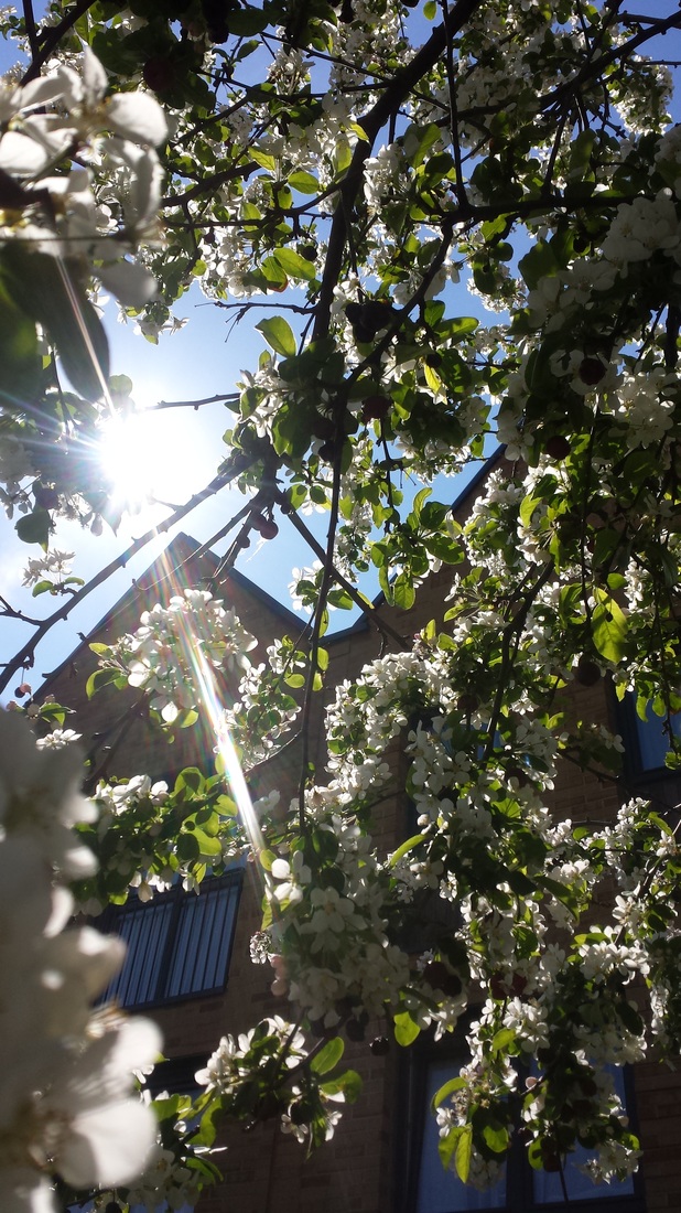
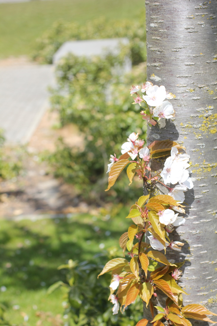
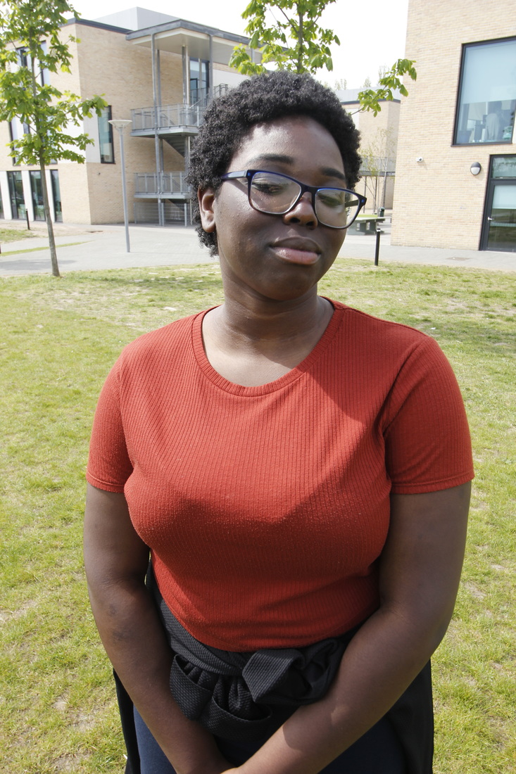
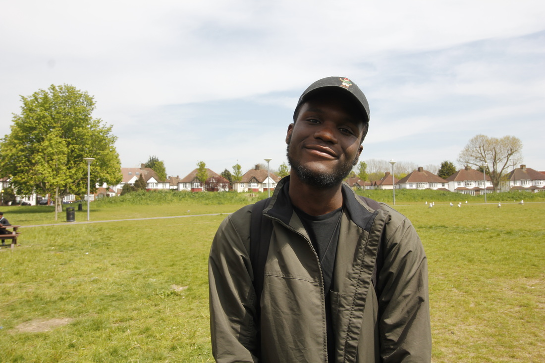
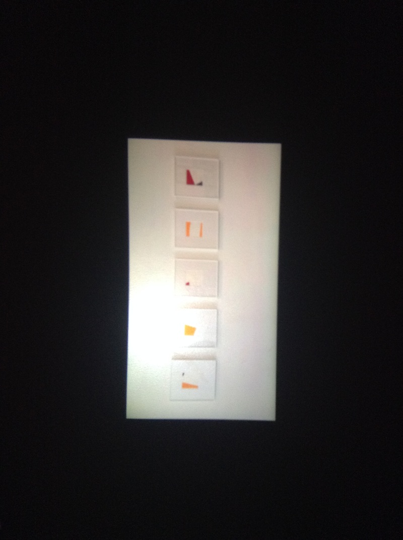
Threshold Concepts ...
'Threshold Concepts are the BIG IDEAS that will help students develop a deeper understanding of photography. They are not meant to be instantly understood. Once opened, they introduce students to troublesome knowledge; a new way of seeing the subject they are studying. As students become more confident, working their way across the threshold, they will begin to recognise and understand these big ideas. They will become more useful in helping them think hard about what they do, whether that's looking at other people's photographs or making their own.'
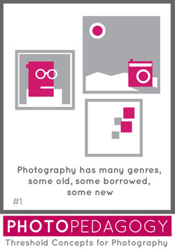
"Some photographs are special to photography. Artists/photographers often play with our expectations about genre for creative purposes."
|
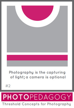
" All photography is the capturing of light (radiant energy). This includes the properties of the photographic print or digital image and the way it is presented to the viewer."
|
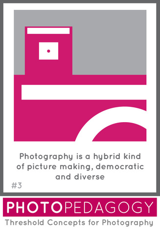
"Photography crosses different disciplines both in theory and practice, it's the most diverse and democratic of the visual arts and has multiple functions, contexts and meanings."
|
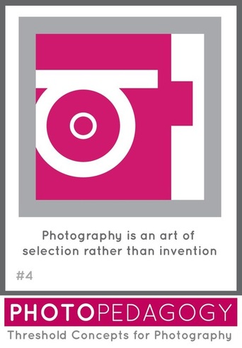
" Photography is unlike other visual arts in that it begins with a world full of things rather than with a blank slate."
|
"Cameras ‘see’ the world differently to the way we see the world with our eyes. We tend to see only the subject depicted rather than the photograph itself. However, all photographs are, to some extent, abstractions."
|
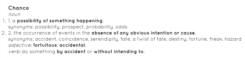
"Chance is very important in photography. You can fight chance, tolerate it or embrace it. To some extent, all photographs are the result of chance processes.
" |
"The meaning of photographs are never fixed and rely on a combination of the viewers sensitivity, knowledge and understanding of the specific context in which the image is seen."
|
"Photographs consist of formal and visual elements These formal and visual elements (such as line, shape, repetition, rhythm, balance etc.) are shared with other works of art."
|
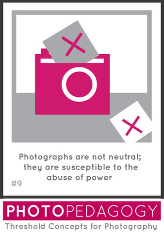
"Photographs communicate powerful ideas about the world. They can be used to promote both good and bad attitudes."
|
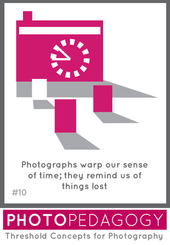
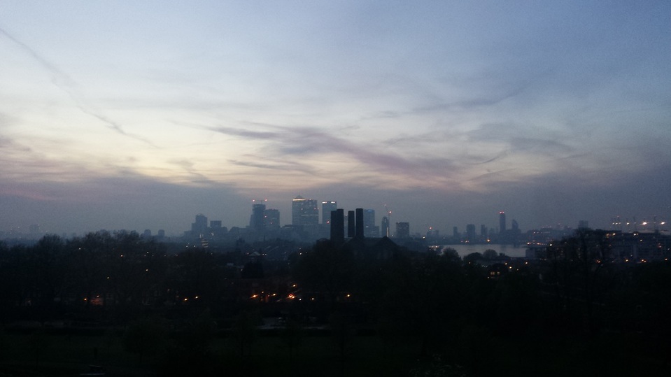
"Photographs record what has been lost, what no longer exists, or what still exists but will be lost at some point in the future."
|

|
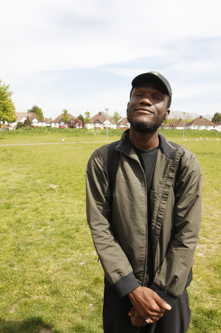
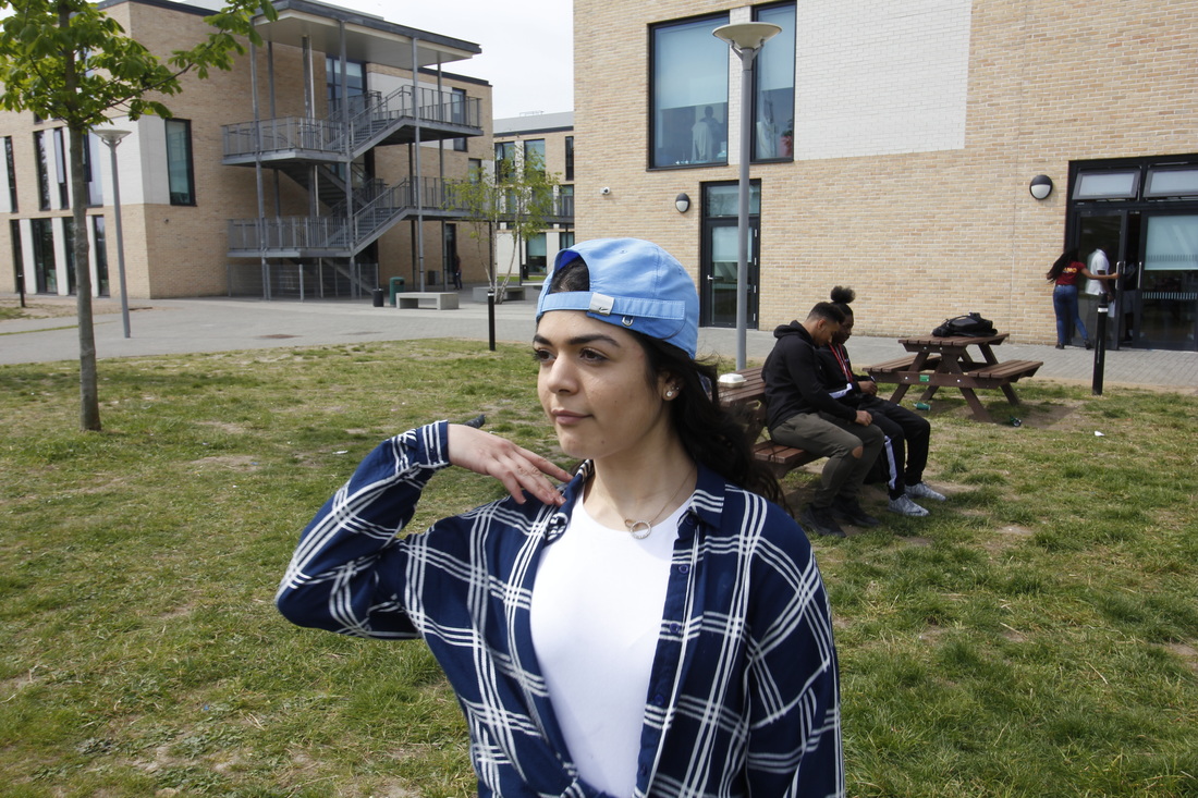
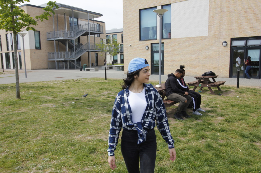
I have decided to go with threshold #6 because it relates to the type of photography that I enjoy taking; images by chance. Every image I take is taken by chance even if I decide to take it within a studio. It's all counted as chance because no matter how 'perfect' I set up and plan my subject the camera will always capture it differently. I find when I take street photography I am deliberately relying on chance, because you never know what will be in the camera frame once the shutter has been clicked.
|
Starting My Research
|
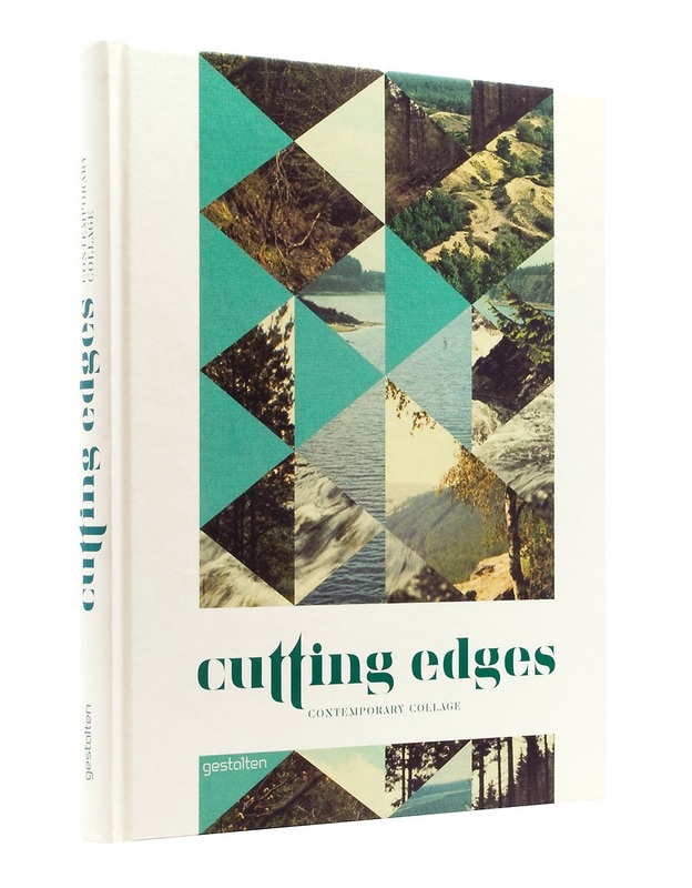
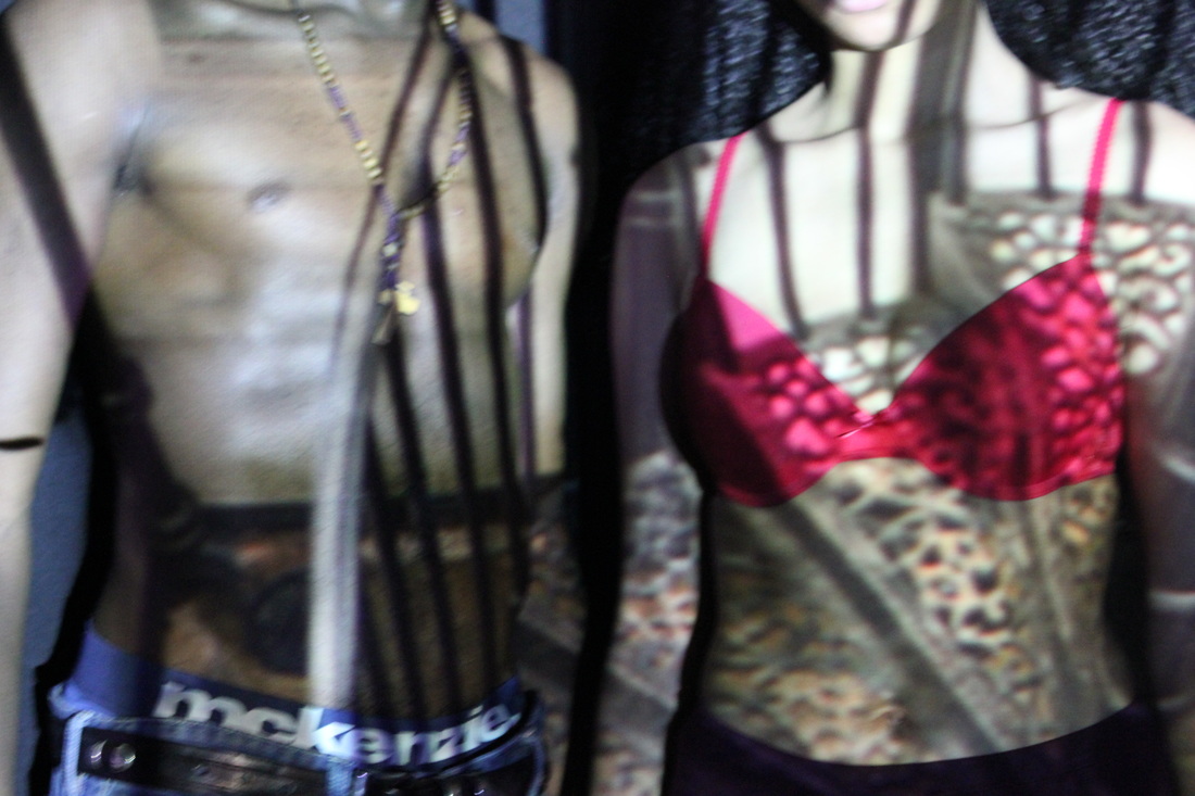
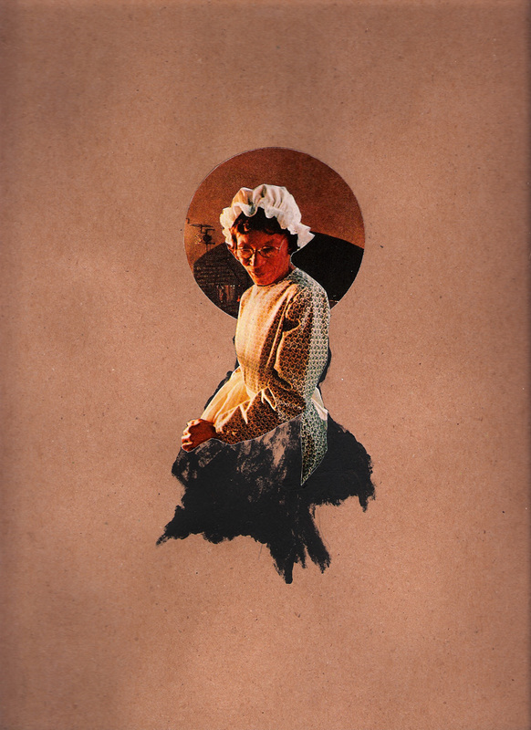
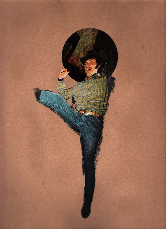
To start my research I looked at various photography books, from ones the photographers / artists themselves had published, to photo books, to Wikipedia books that contain multiple artists and their work. The book that caught my eye and I automatically took interest to was called 'Cutting edges - contemporary college'. This book is a college of traditional yet modern visual art(s), it's influenced by surrealism as well as constructivism; this technique was established as an art form in the early 1920's and 1930's and was carried out by artists such as: Hannah Höch, Ophelia Chong, Jelle Martens and El Lissitzky. To start my personal investigation I had chosen an artist / photographer from this book called Ophelia Chong. Ophelia Chong was the founder and manager partner of the first person to open a Cannabis-related stock photo agency serving the needs of the emerging Cannabis economy. |
|
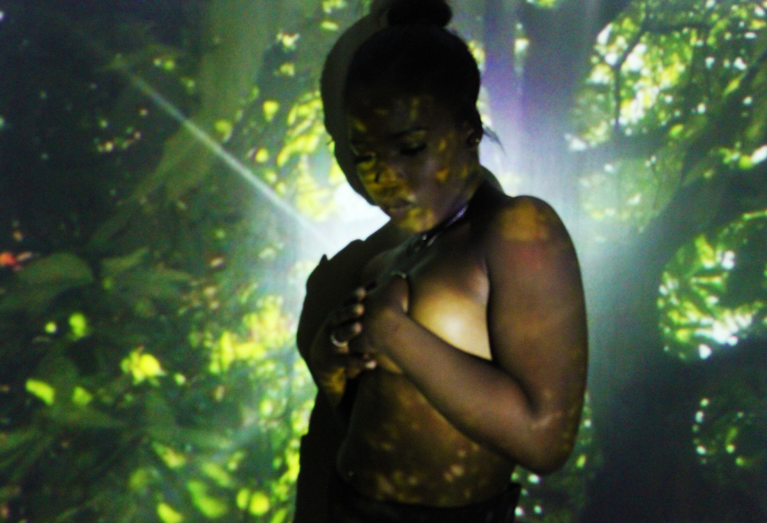
Here are some of the images of Ophelia Chong that I had gotten from this book to which inspired me resulting in me doing a response to them.
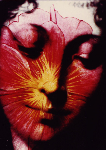
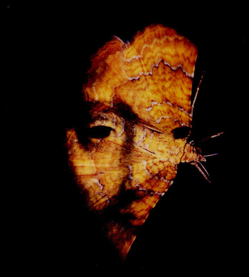
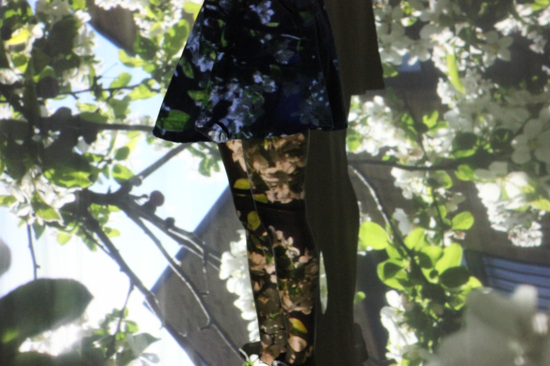
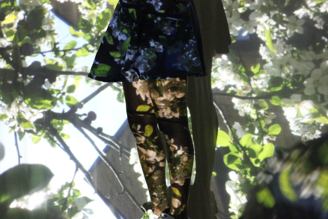
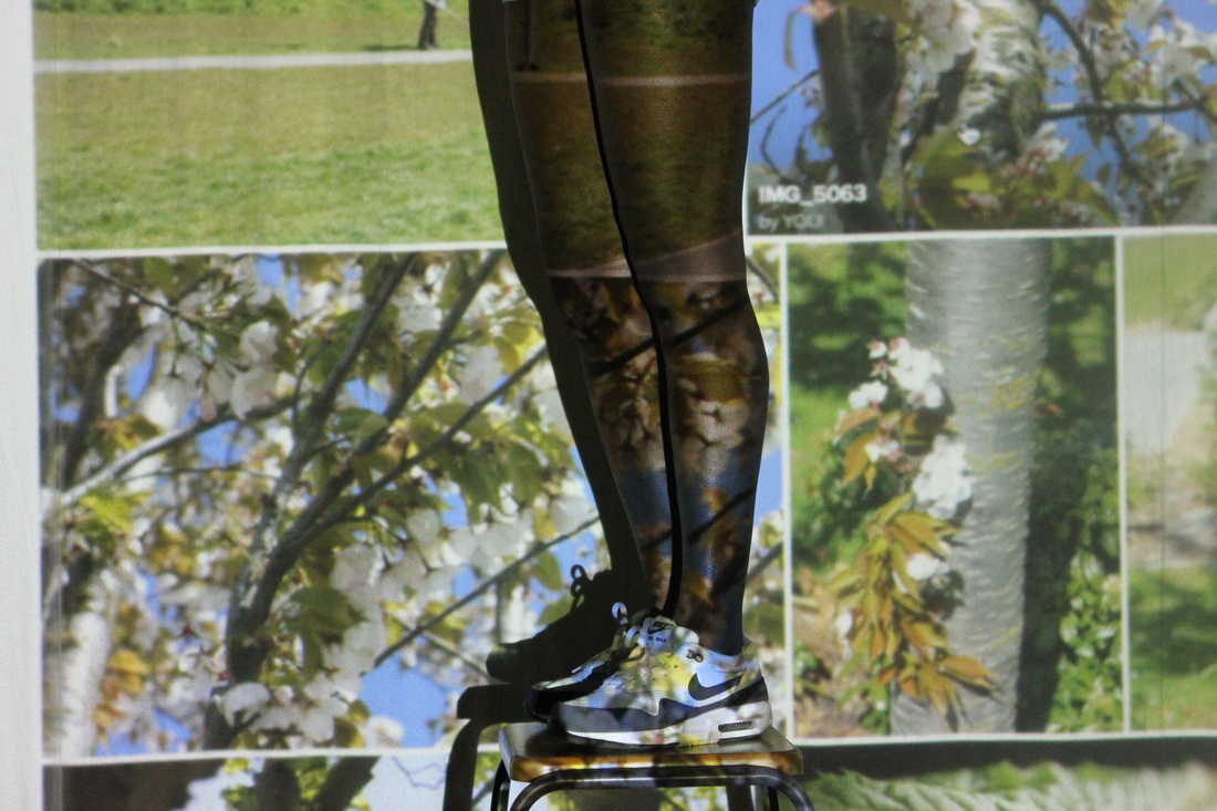
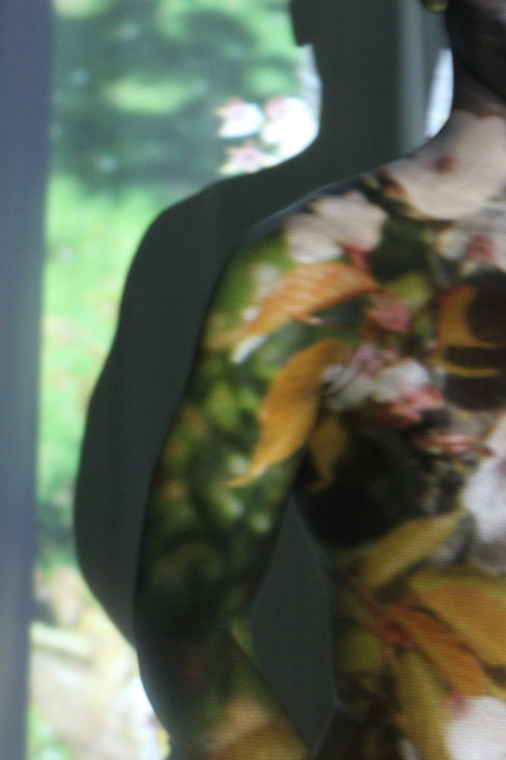
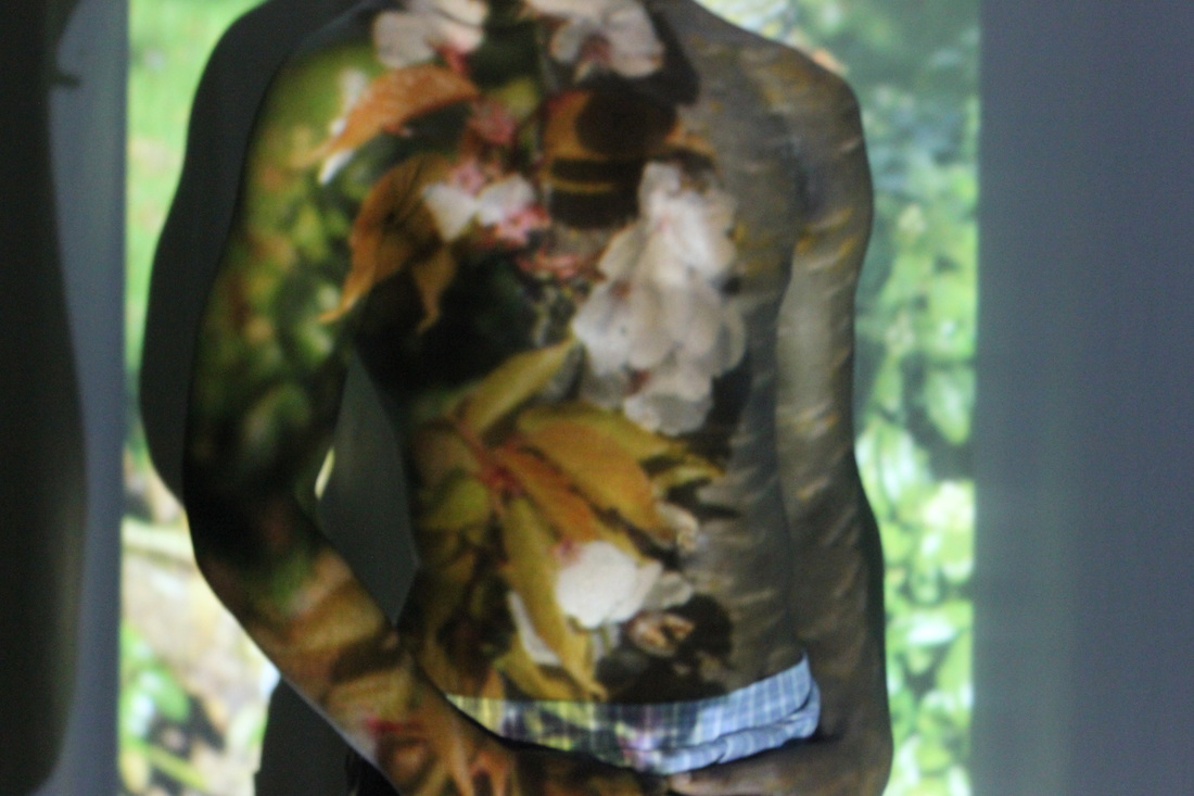
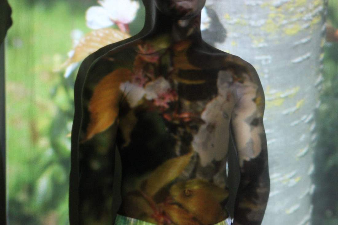
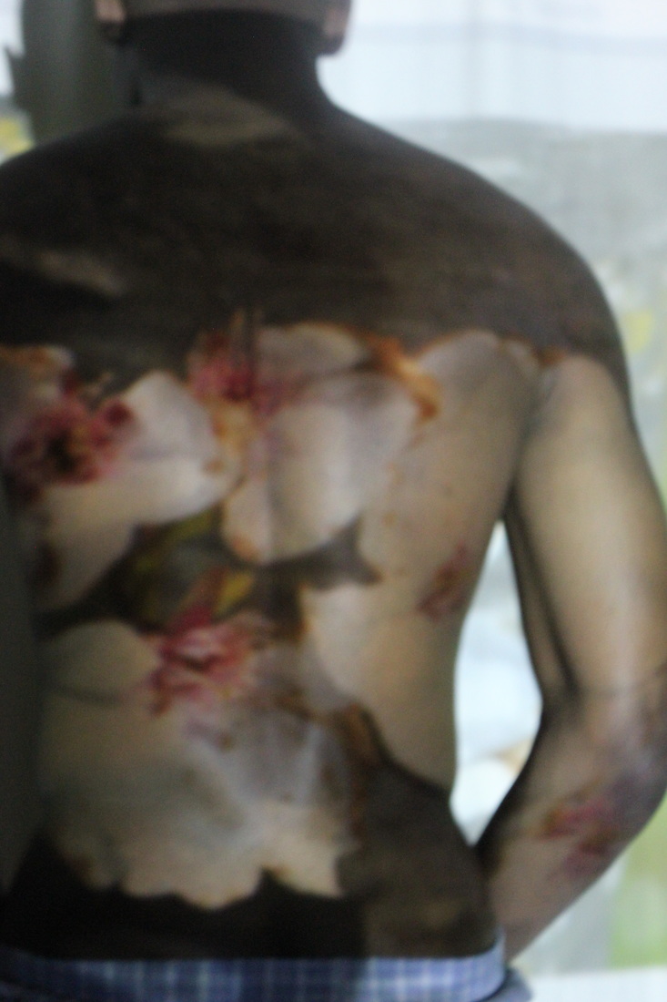
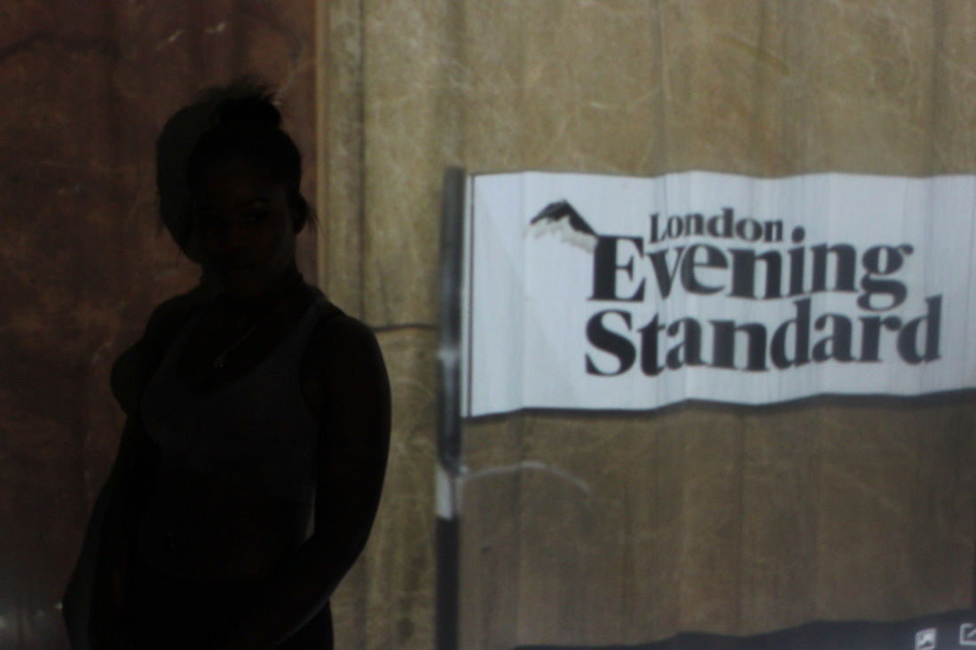
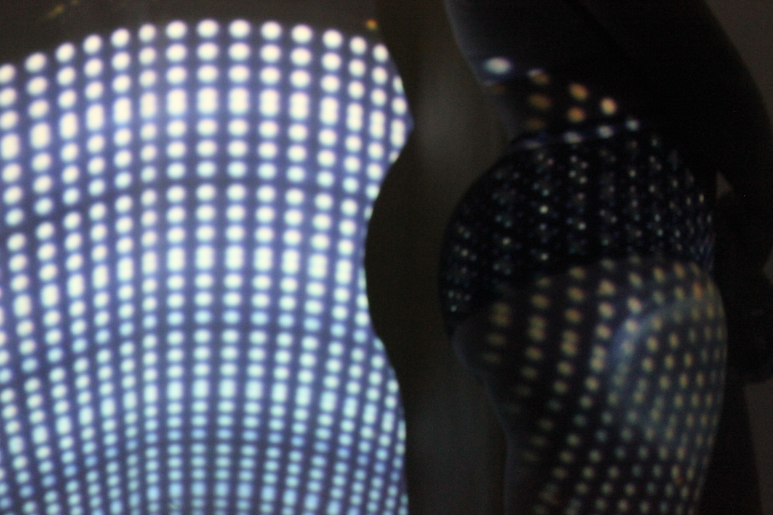
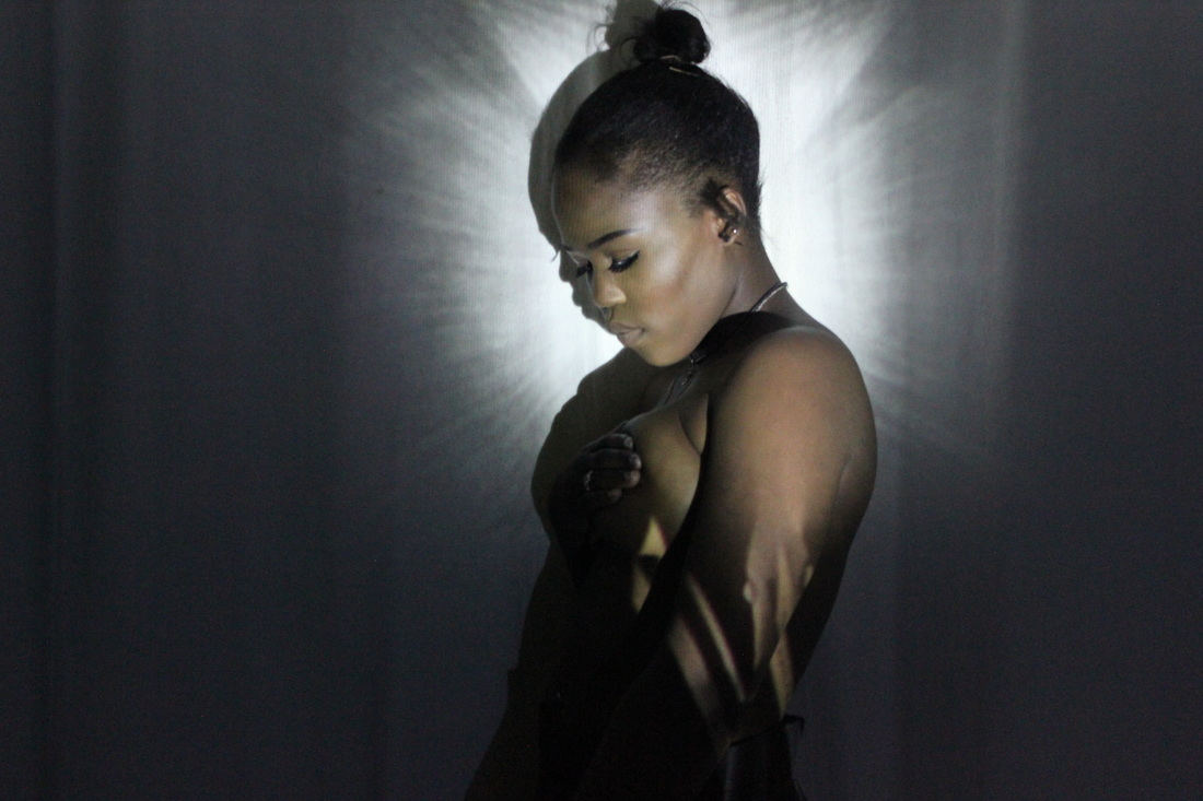
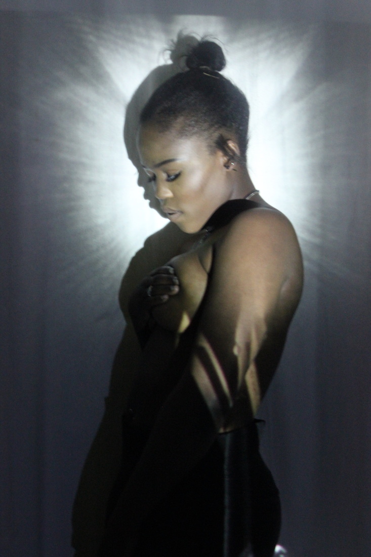
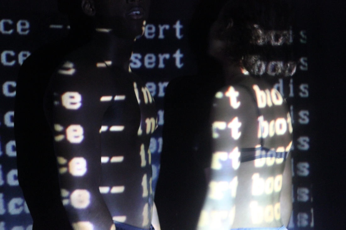
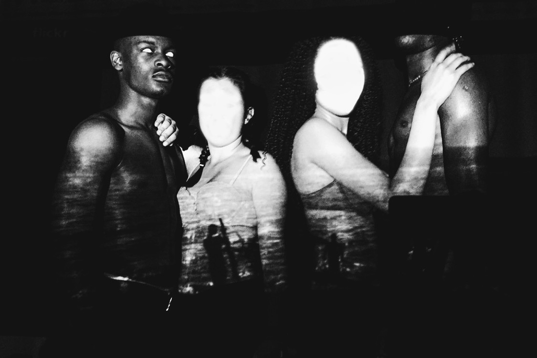
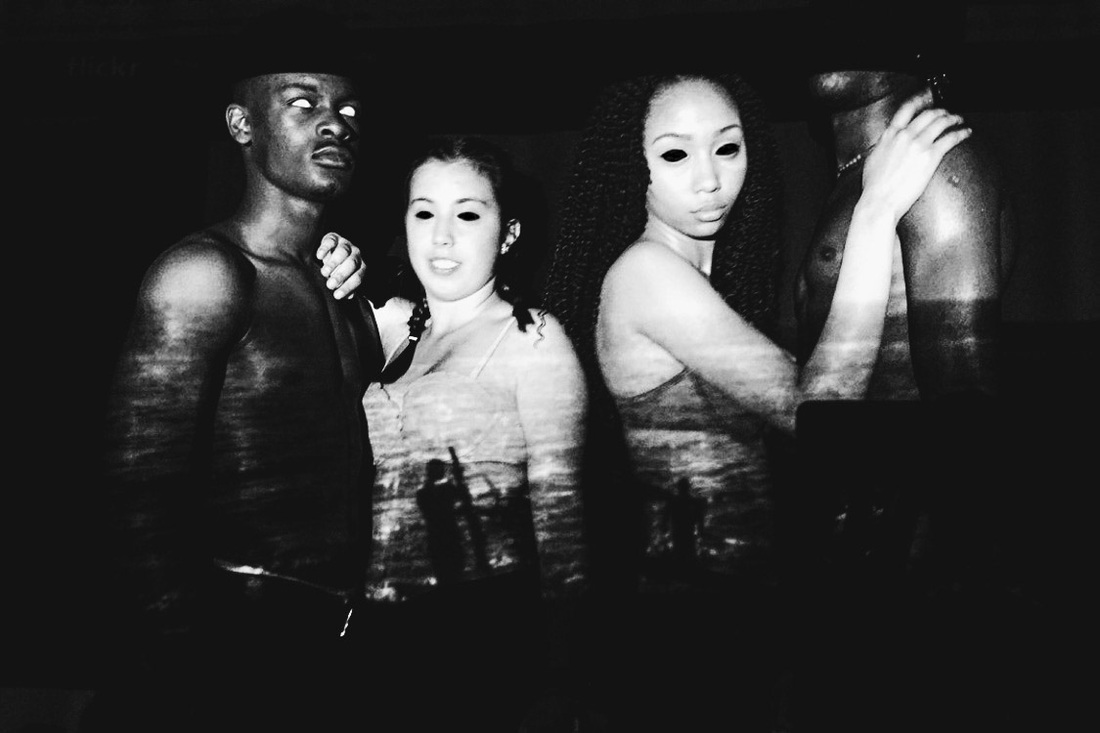
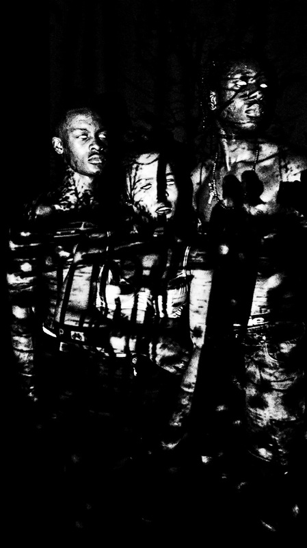
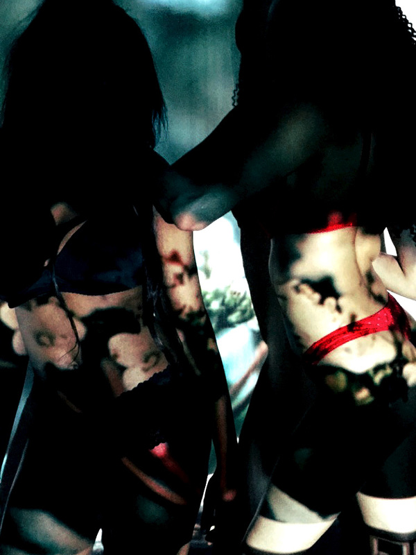
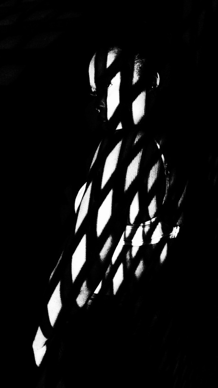
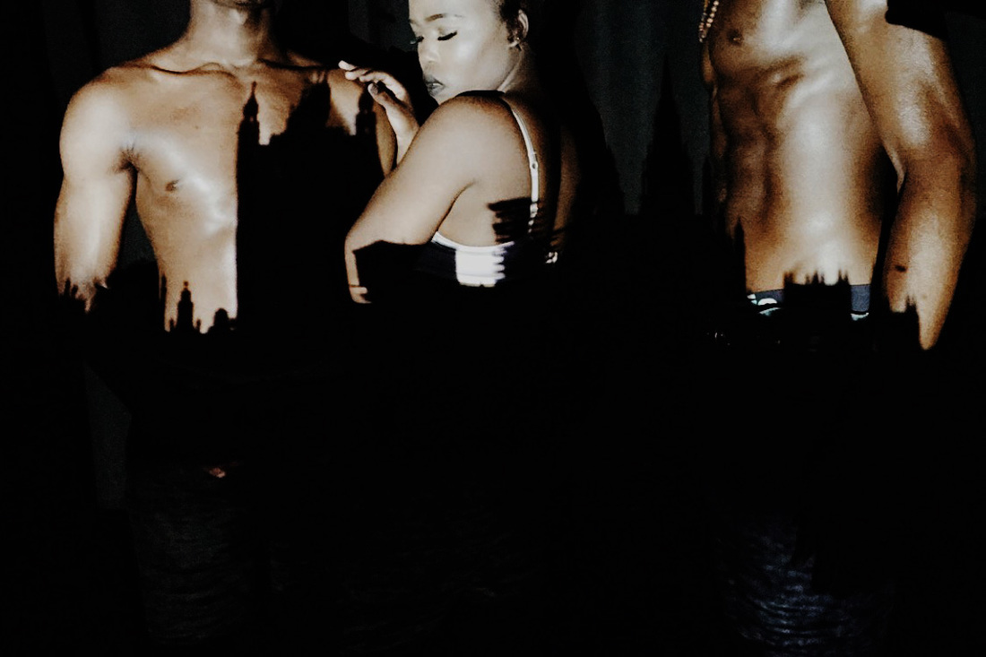
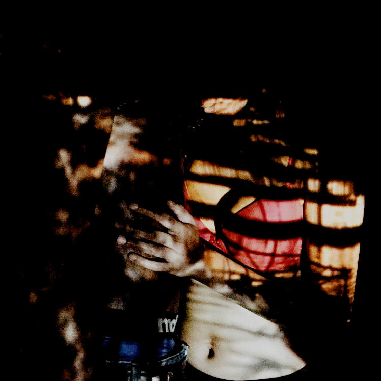
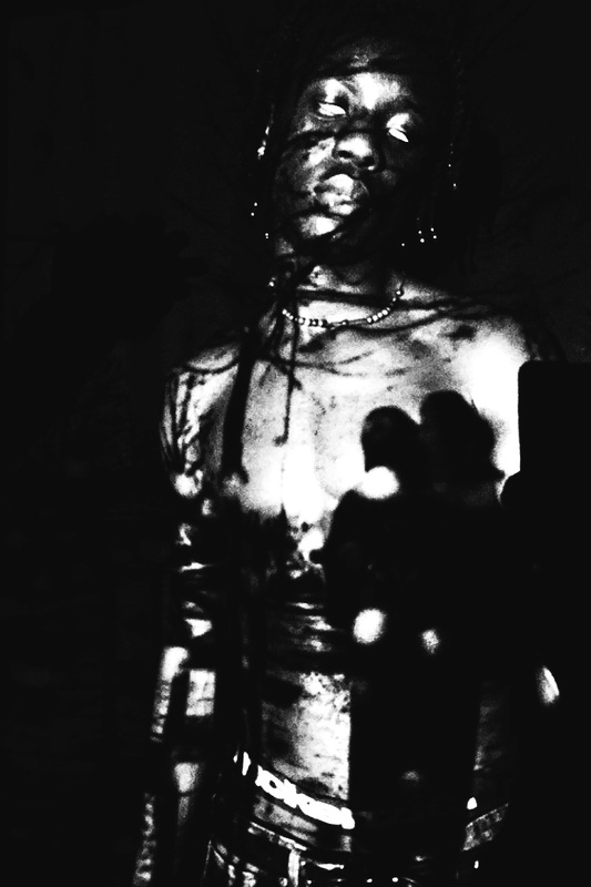
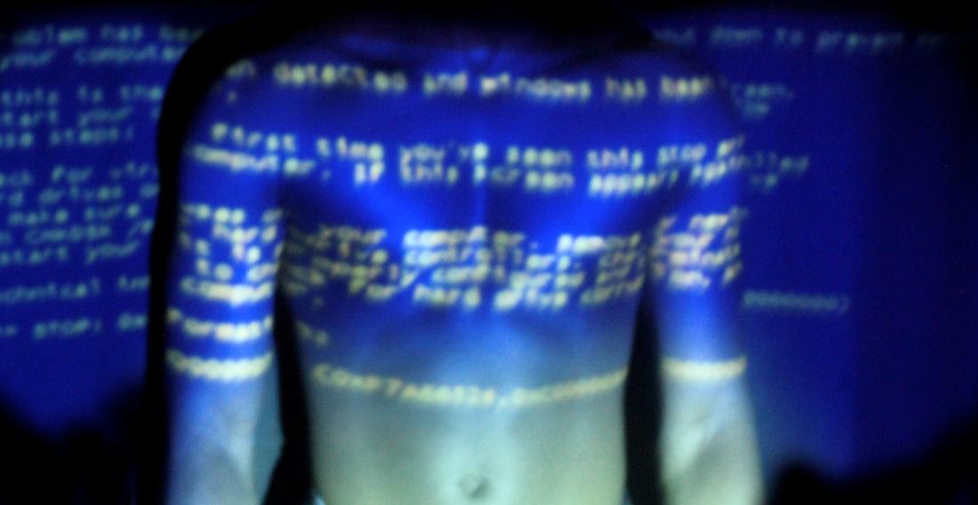
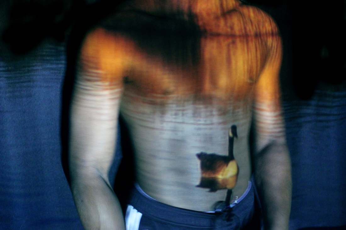
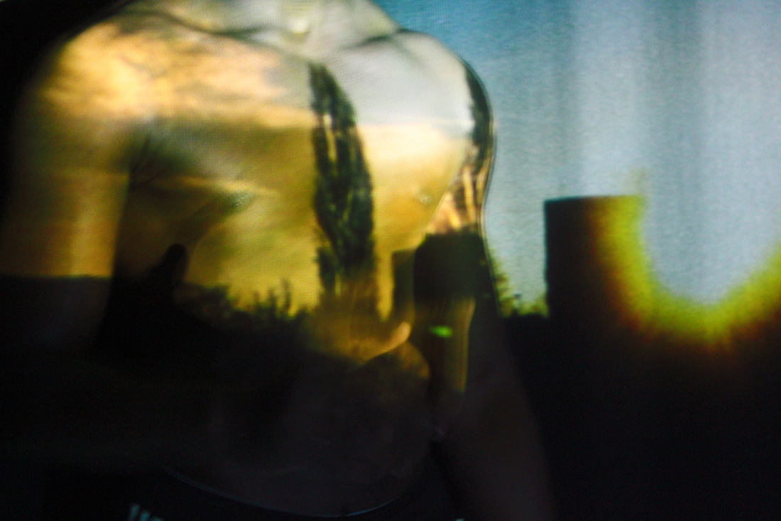
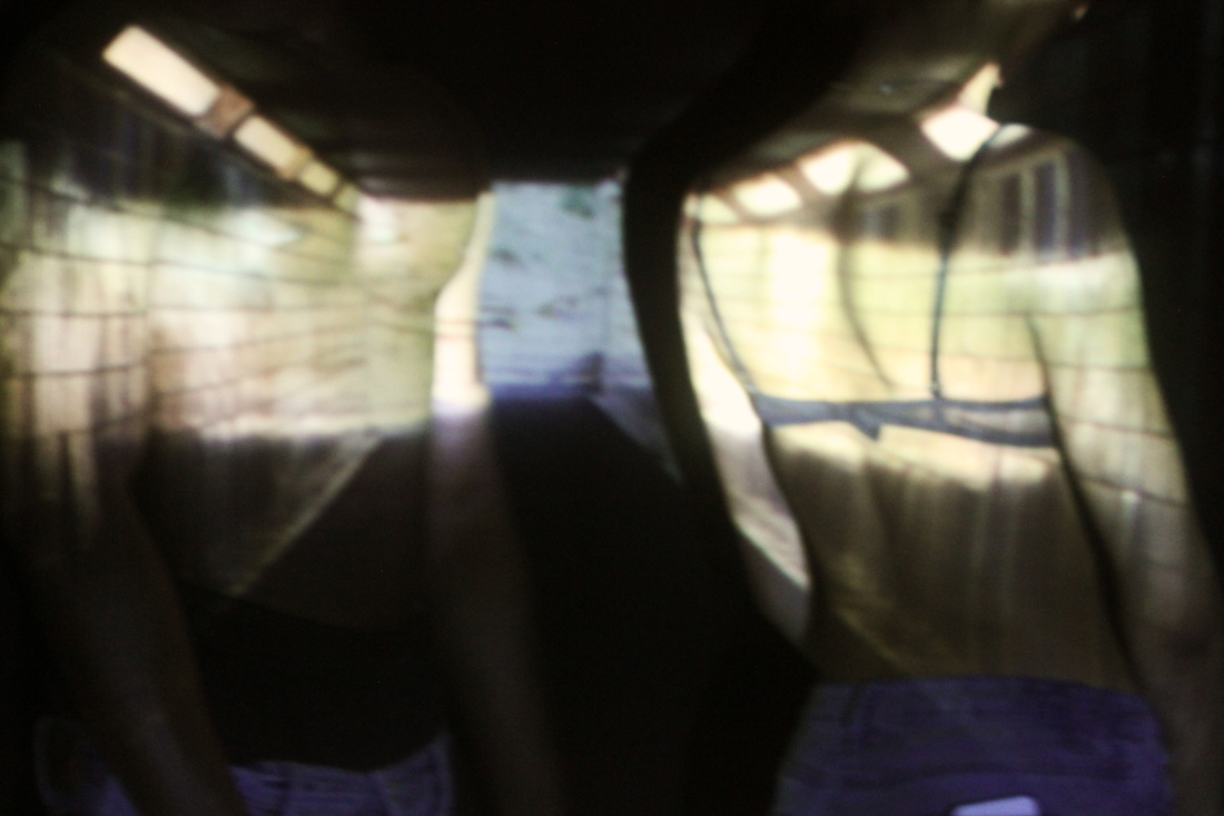
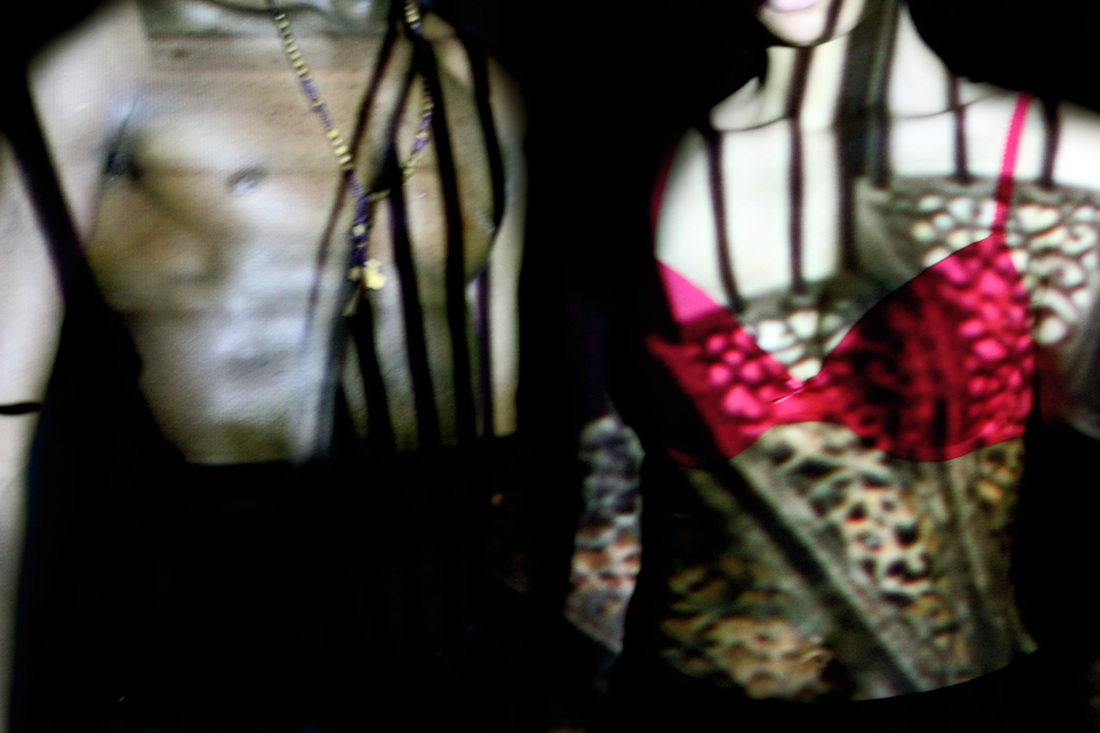
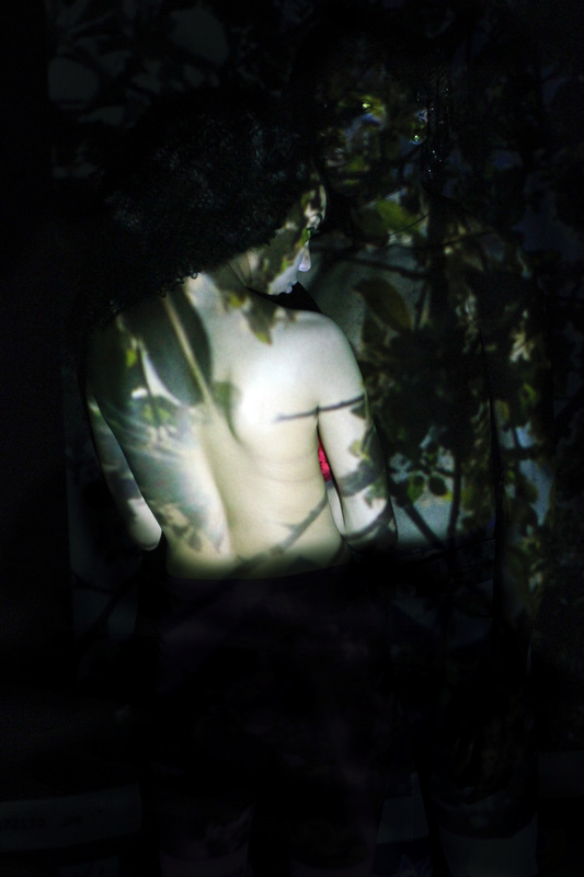
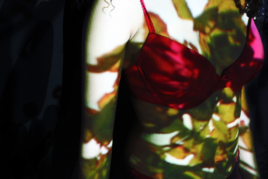
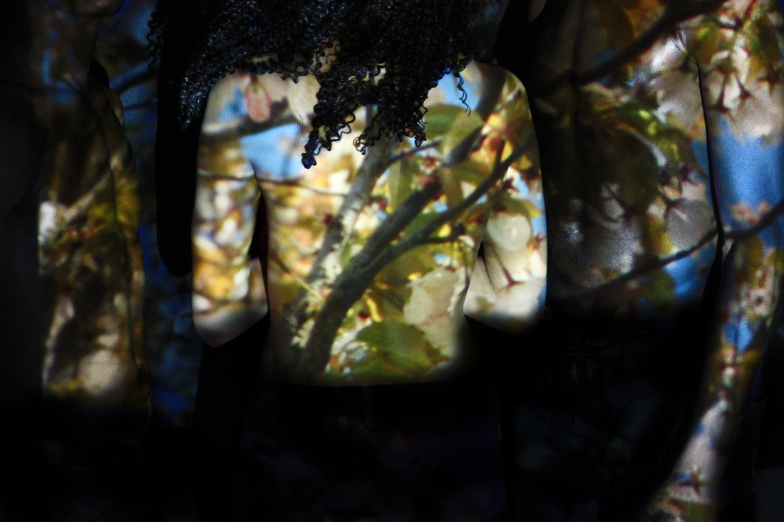
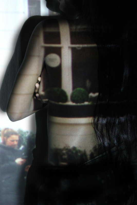
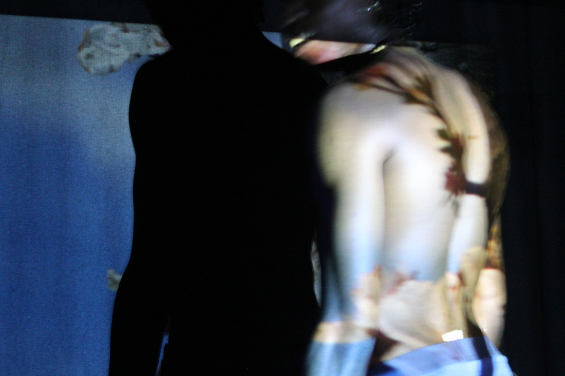
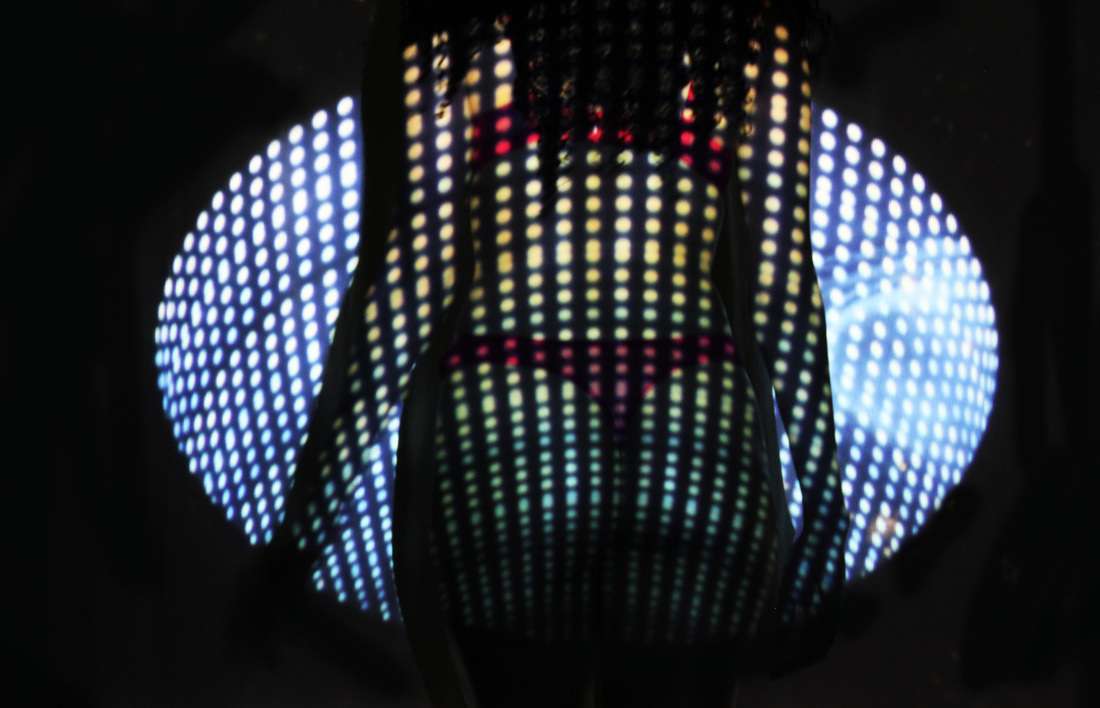
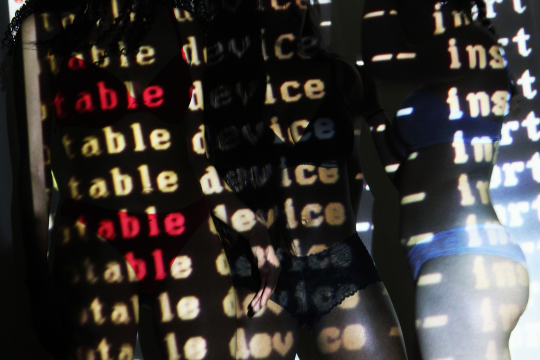
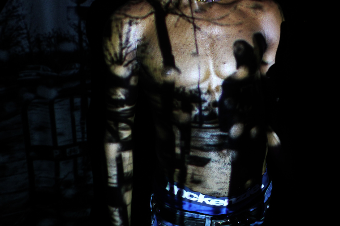
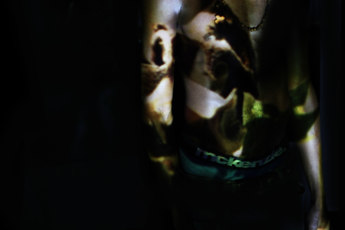
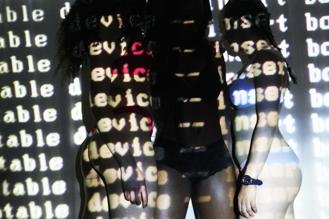
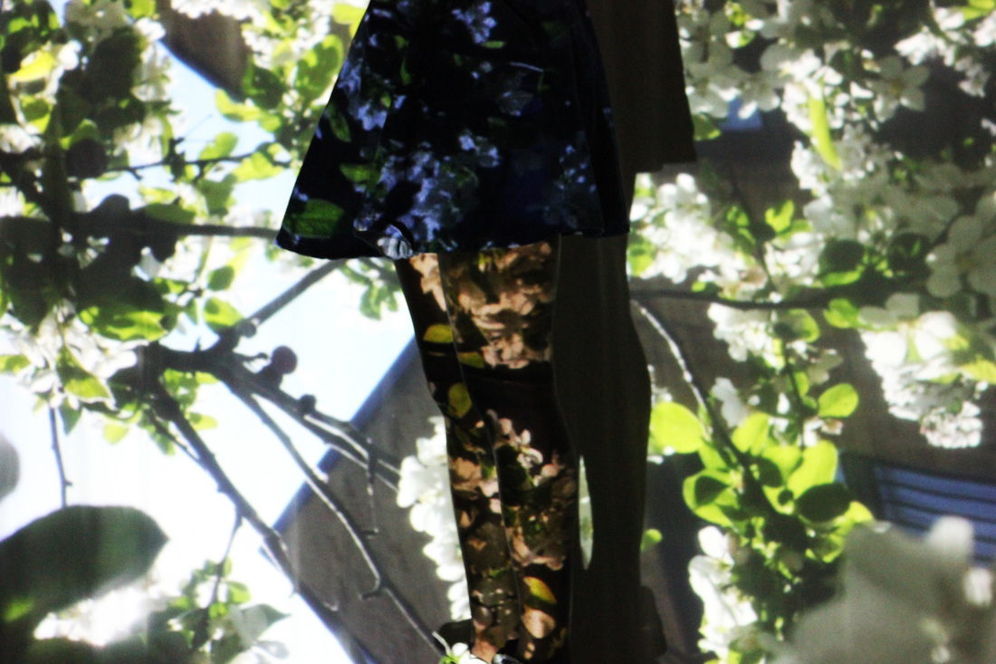
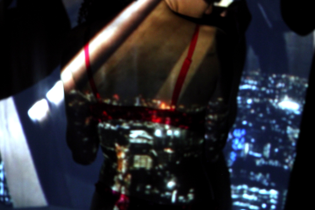
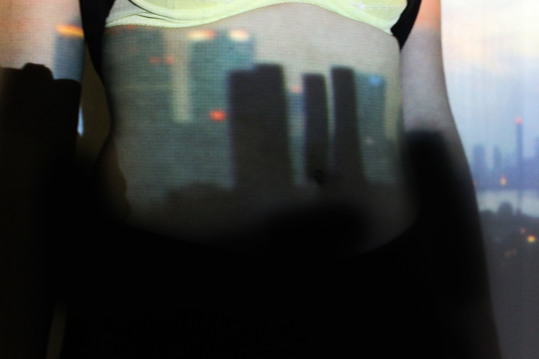
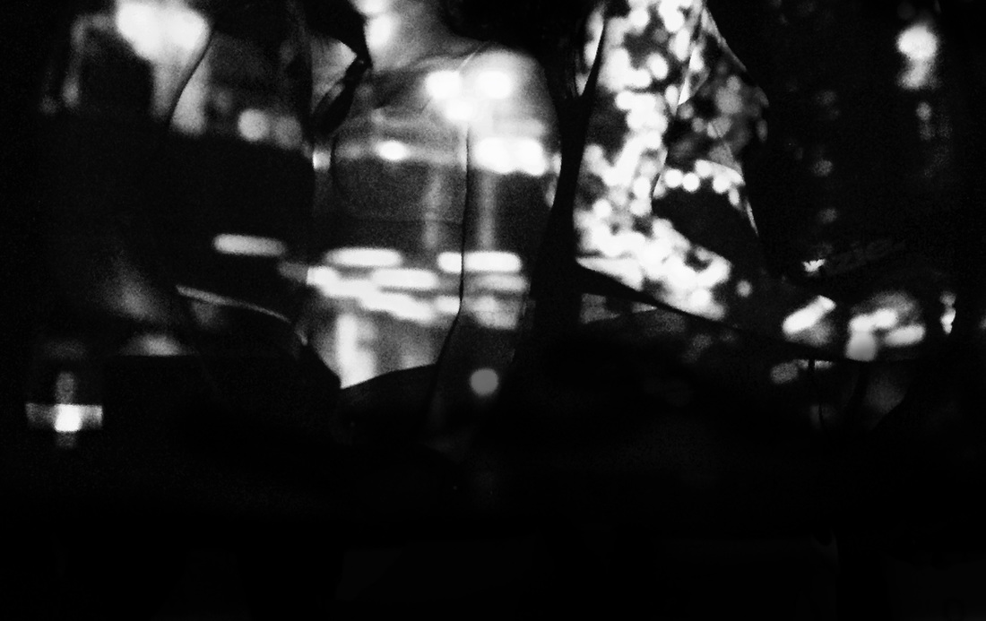
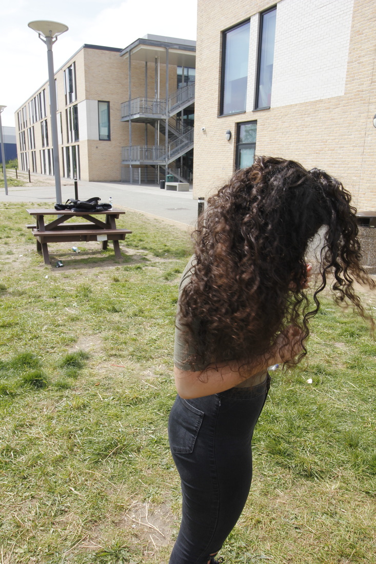
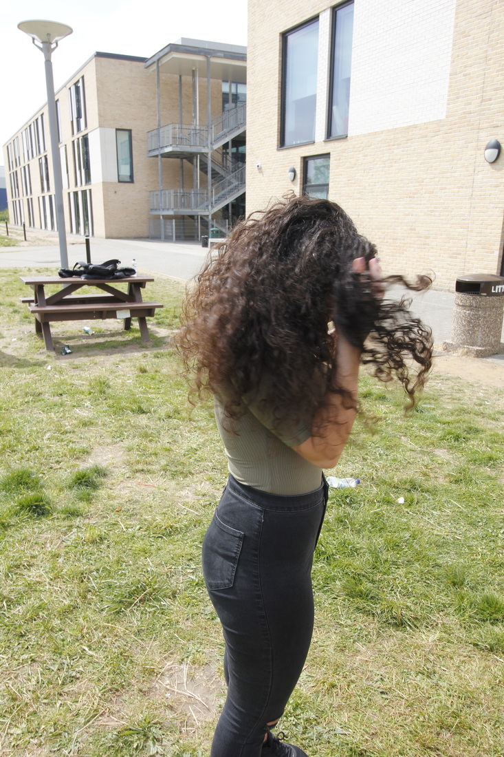
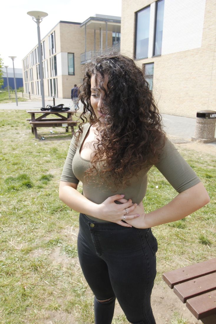
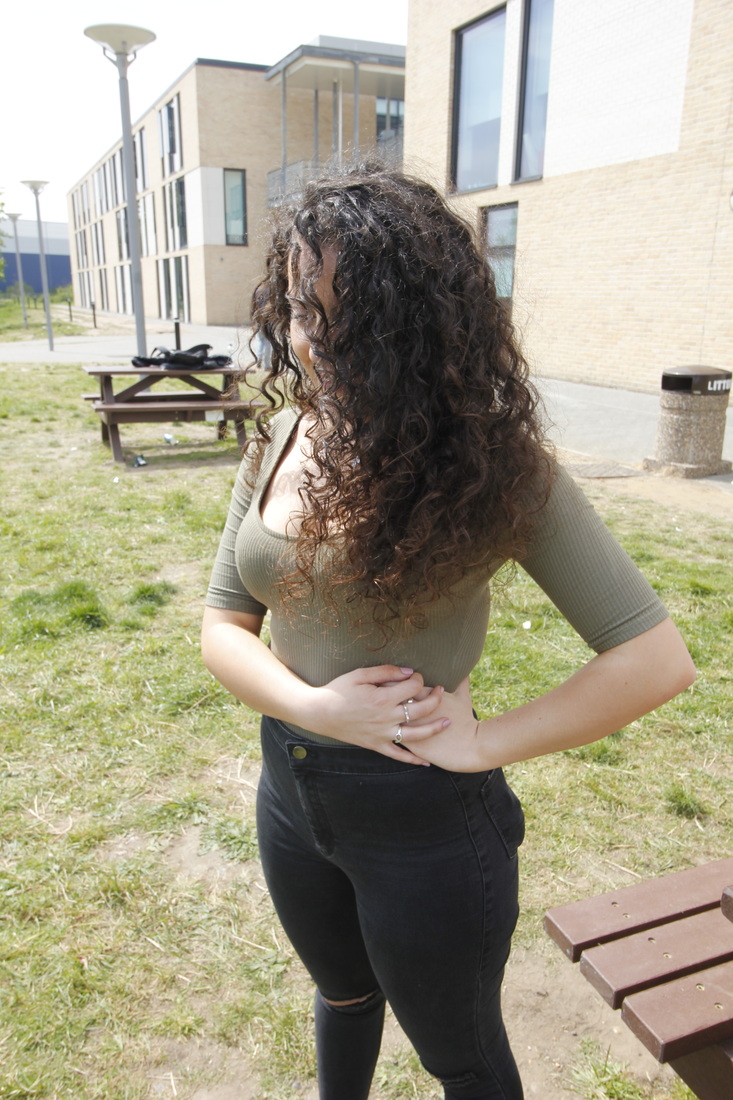
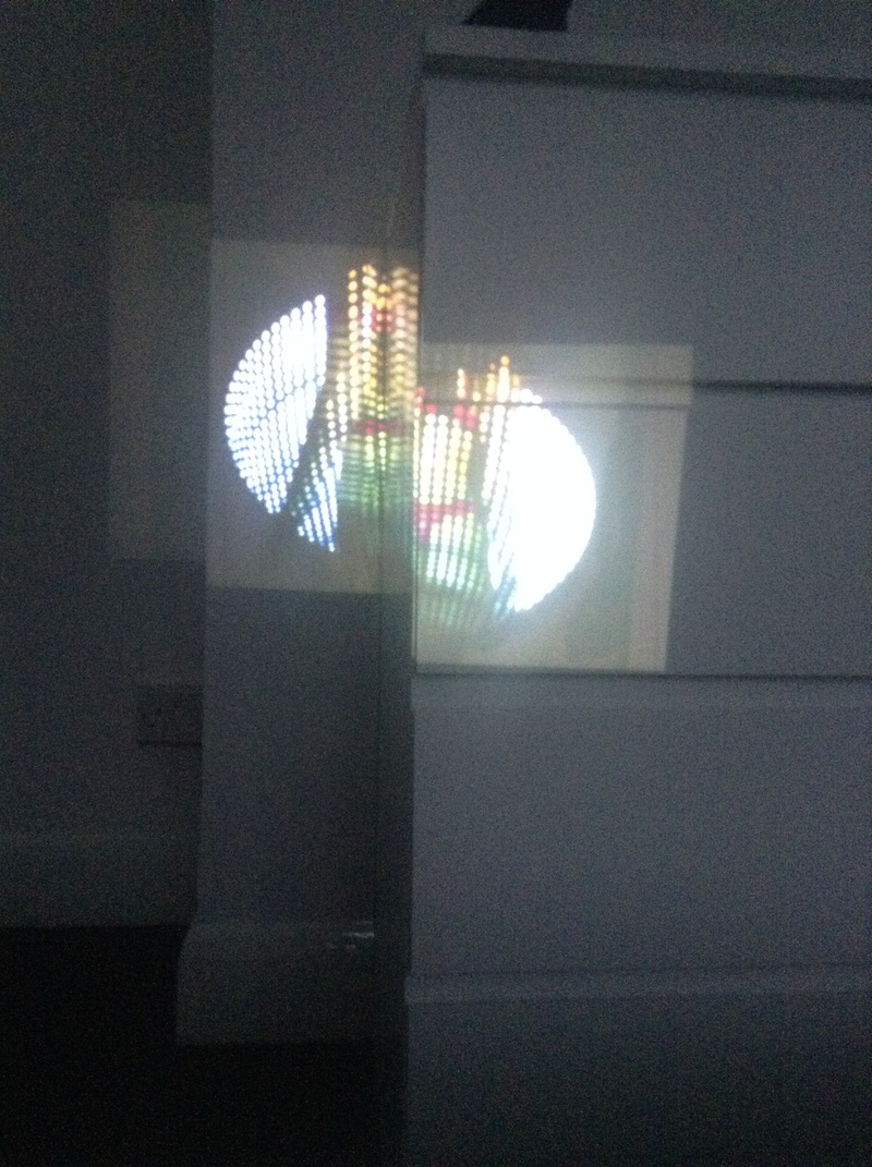
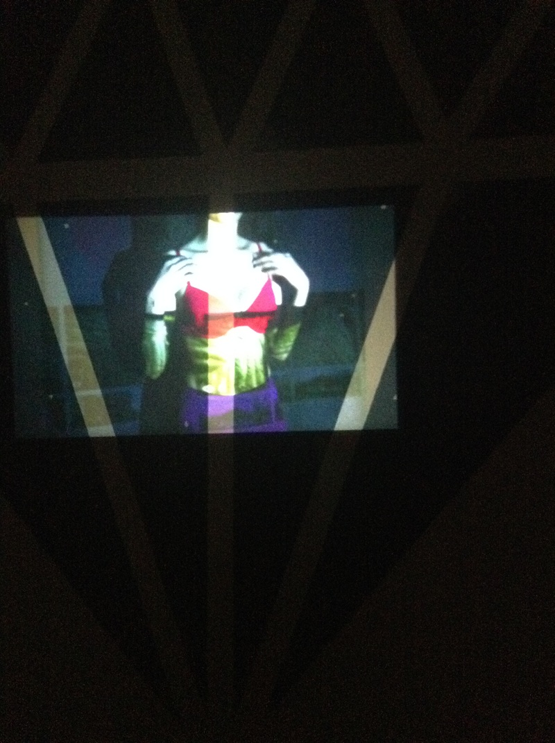
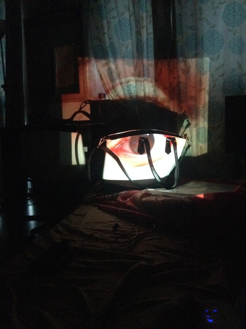
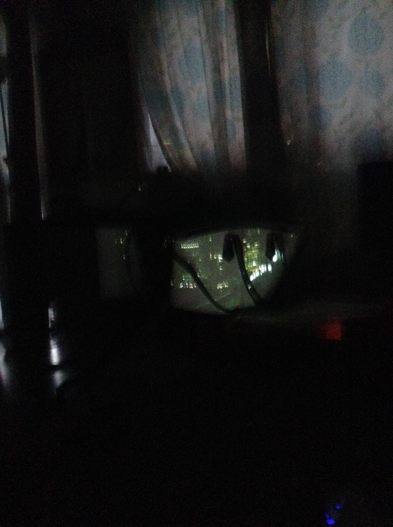
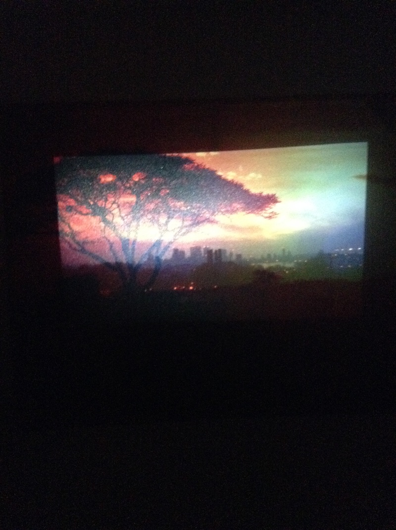
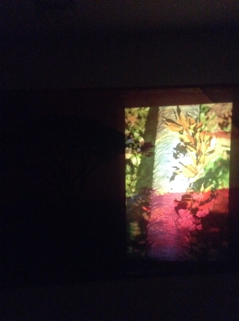
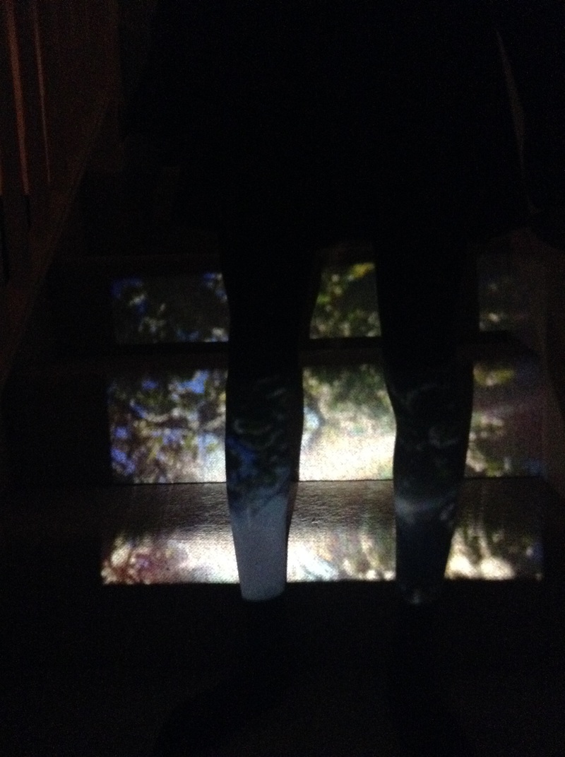
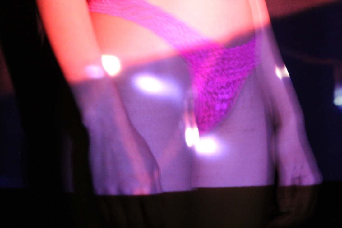
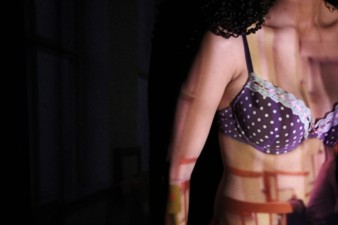
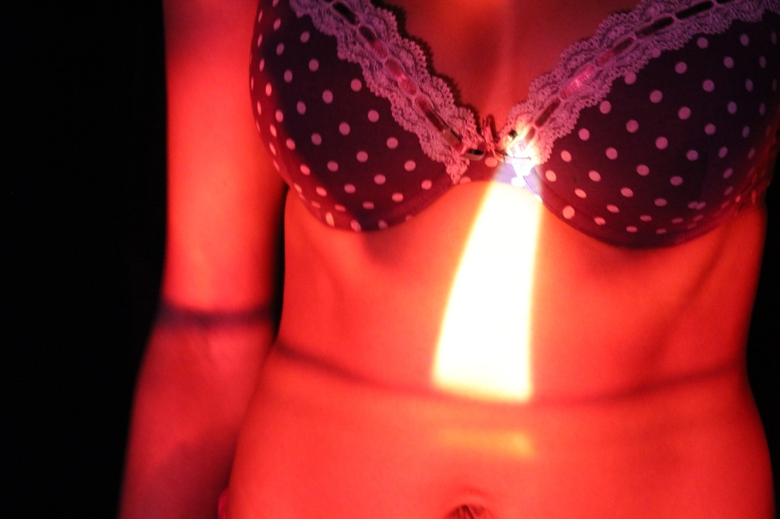
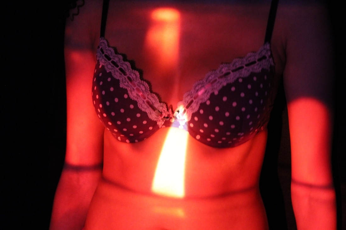
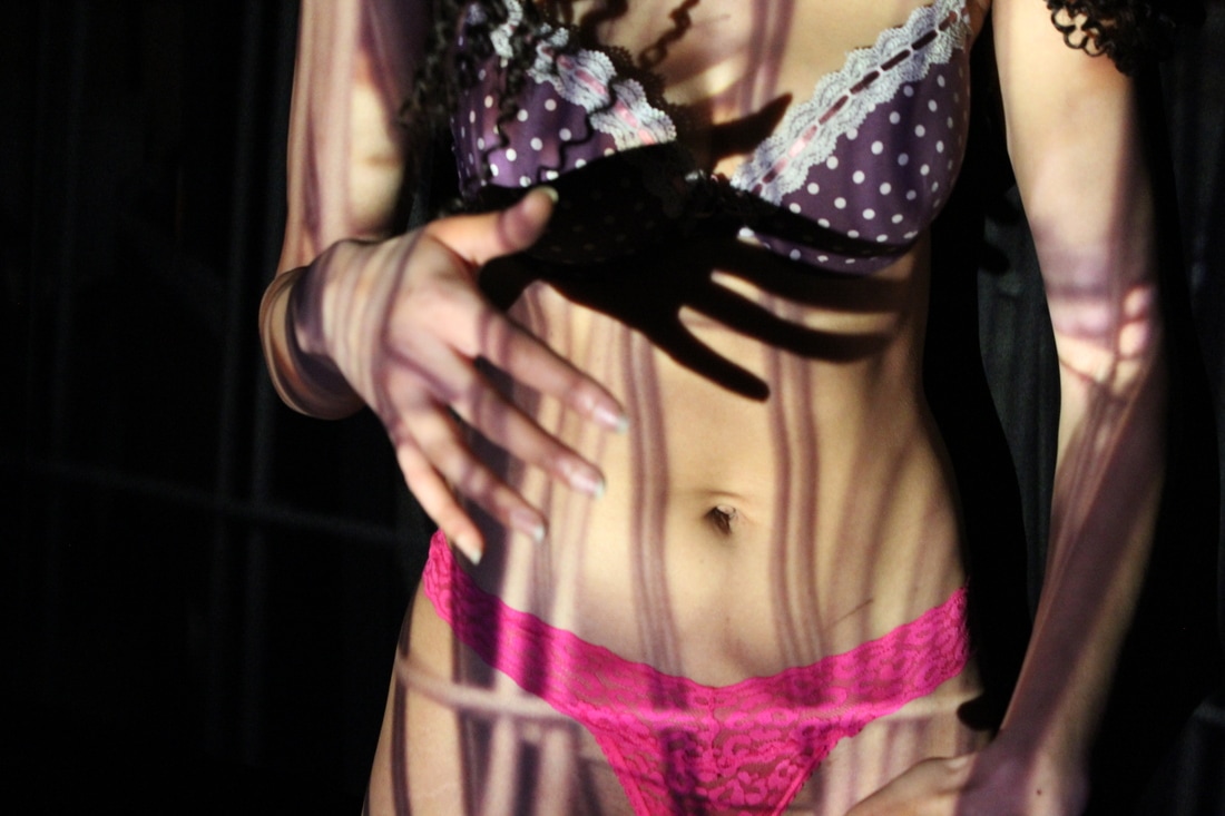
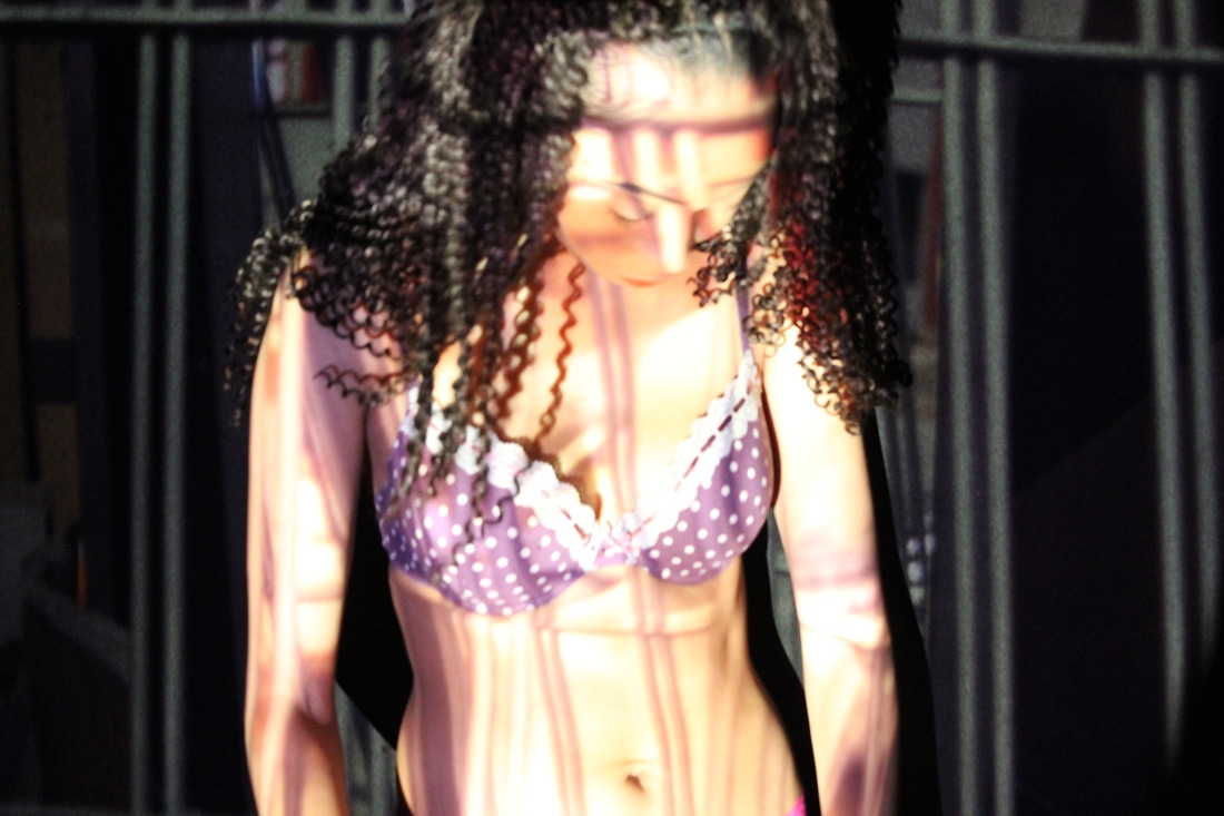
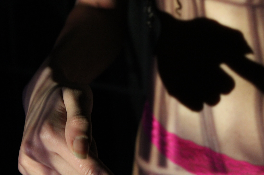
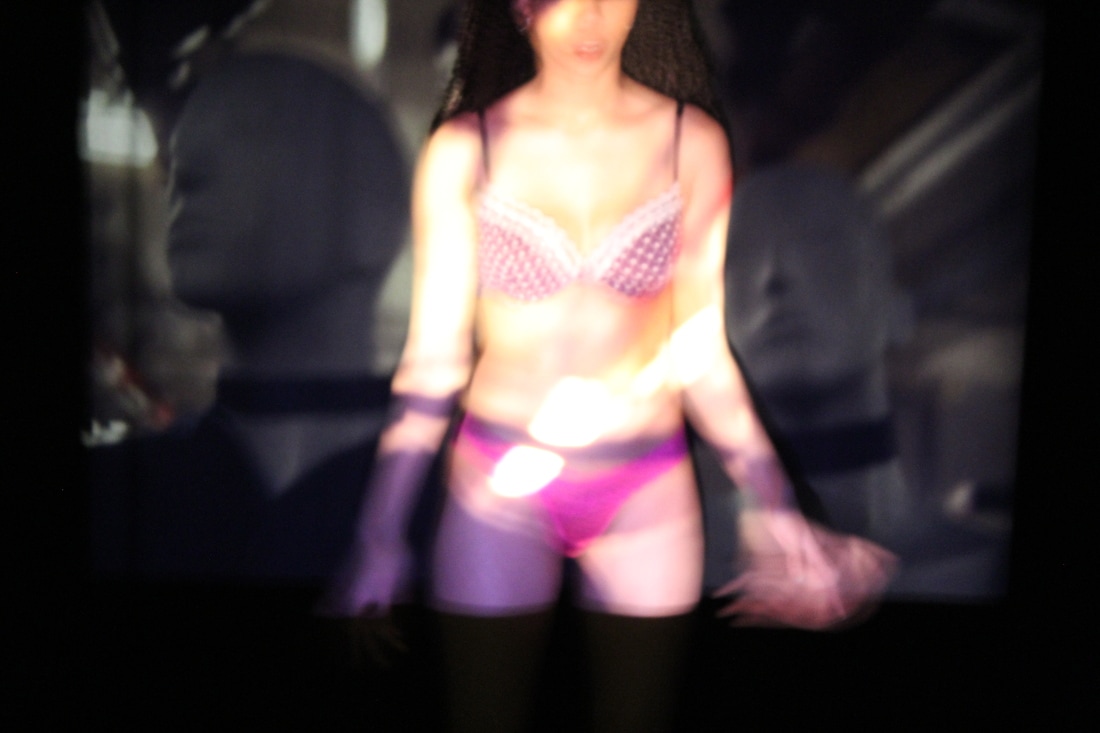
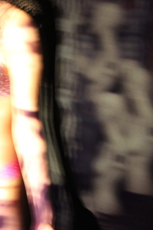
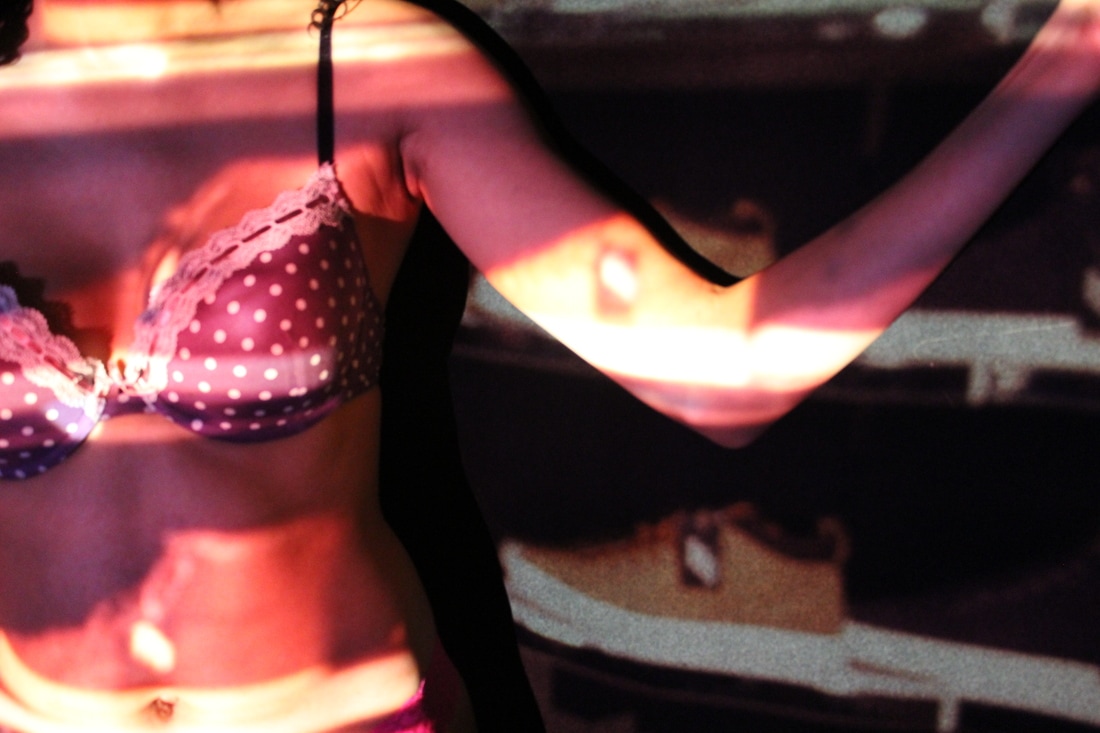
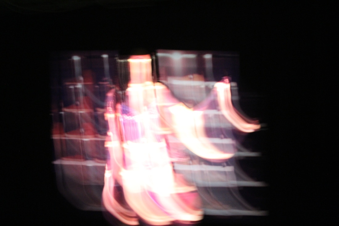
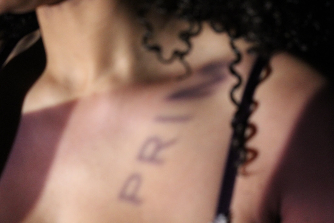
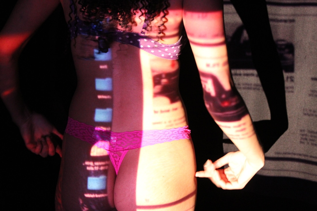
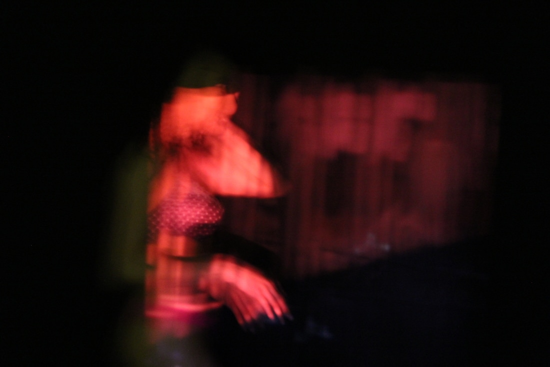
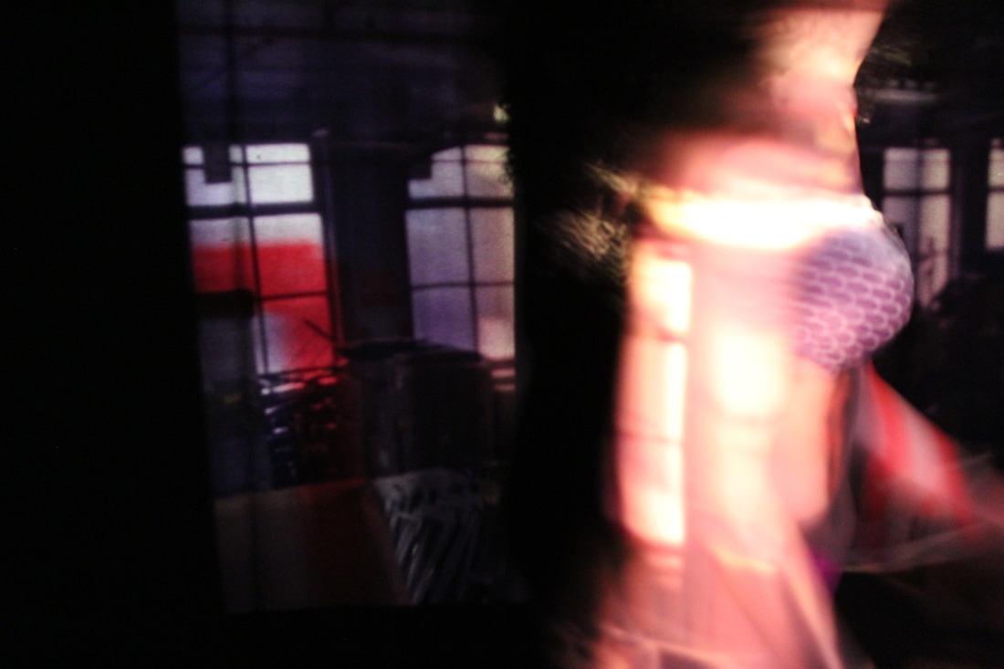
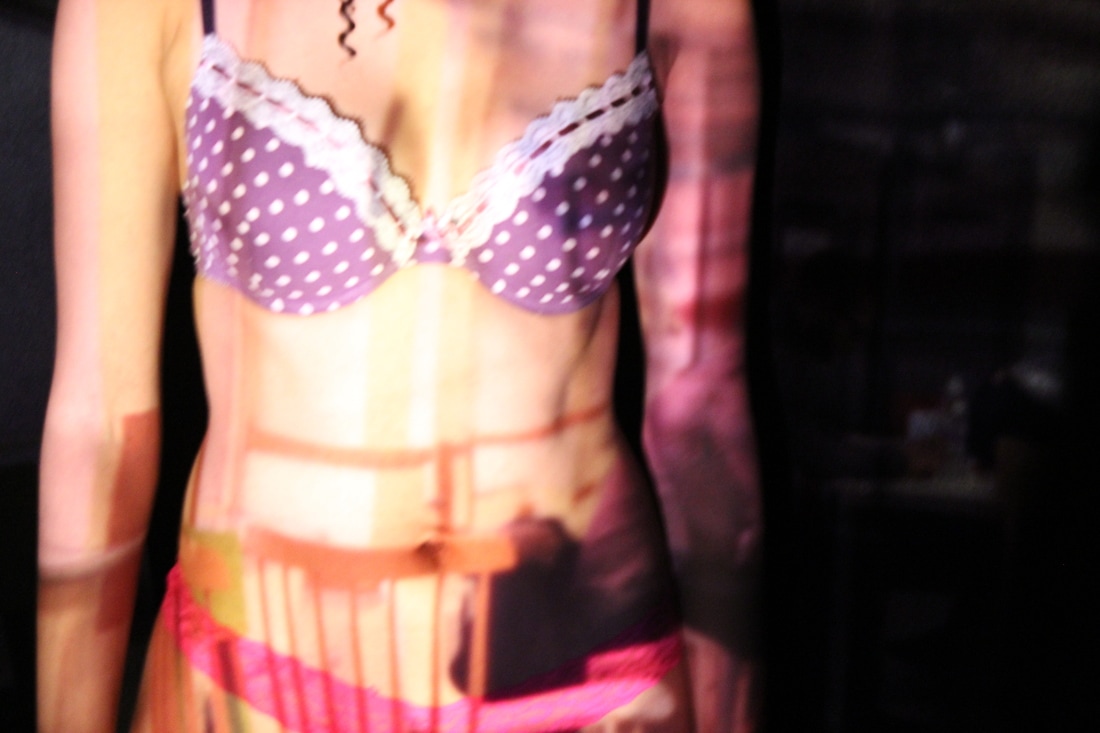
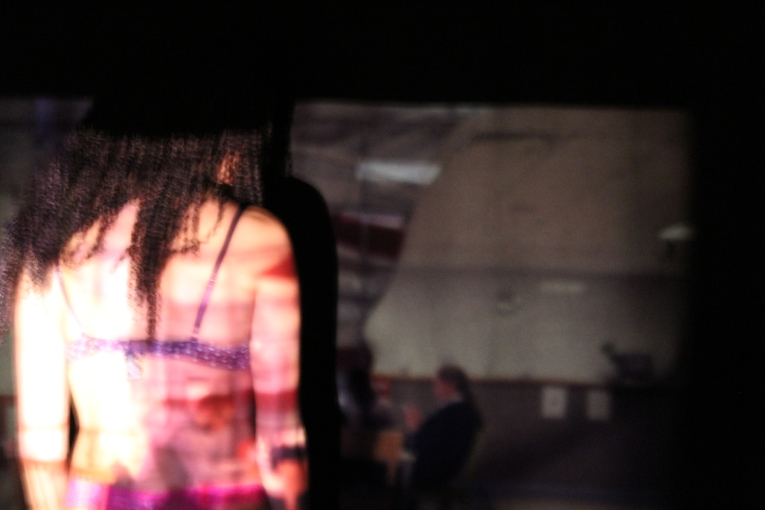
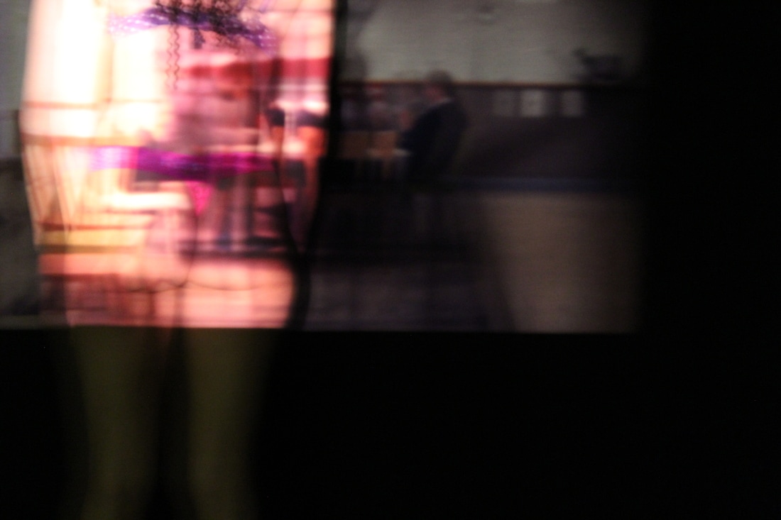
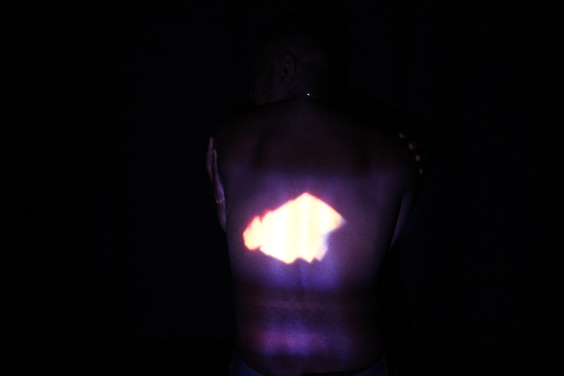
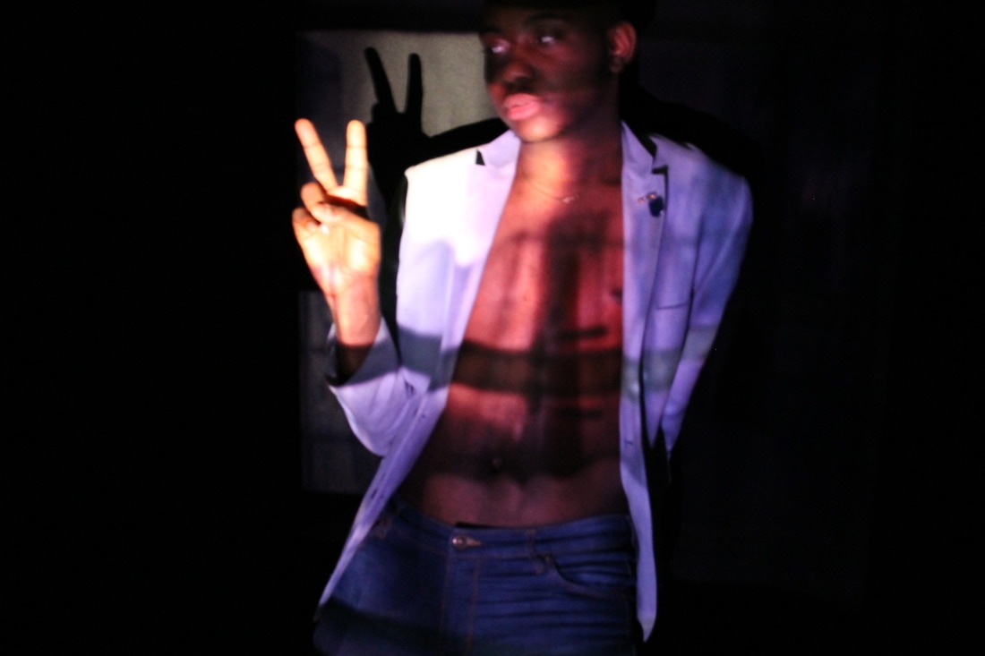
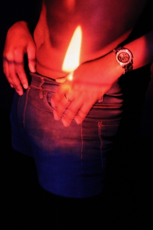
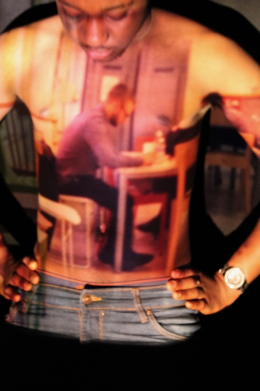
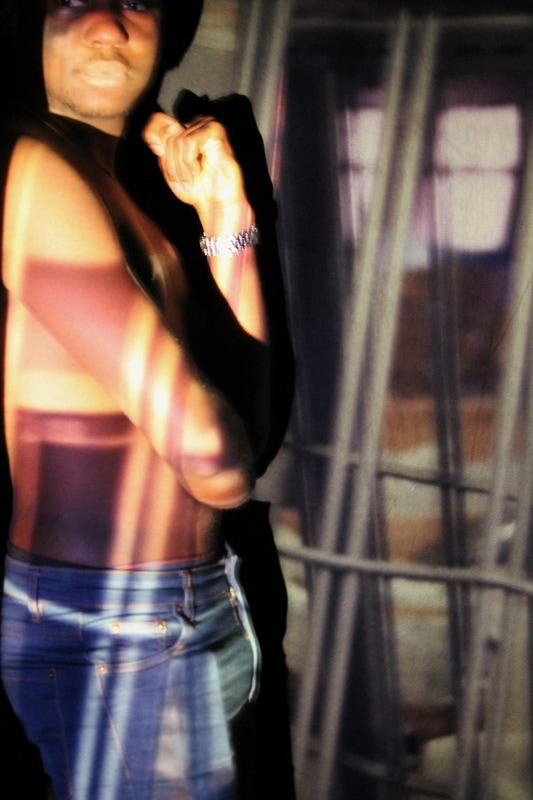
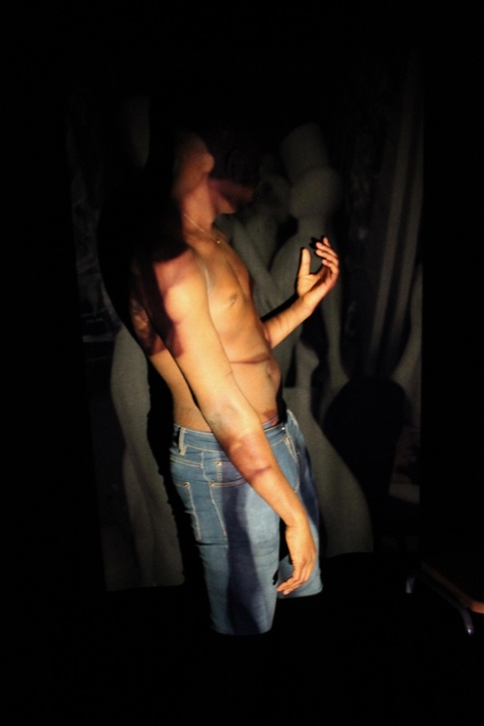
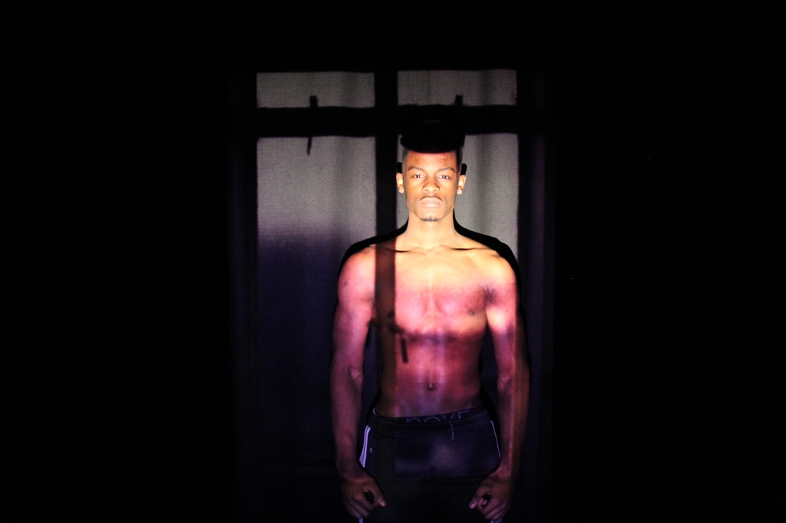
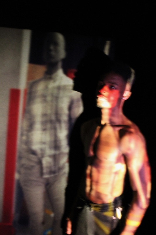
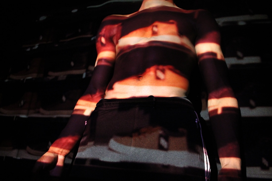
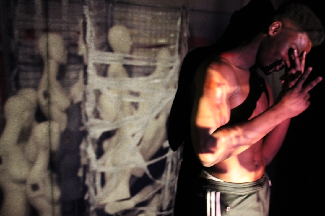
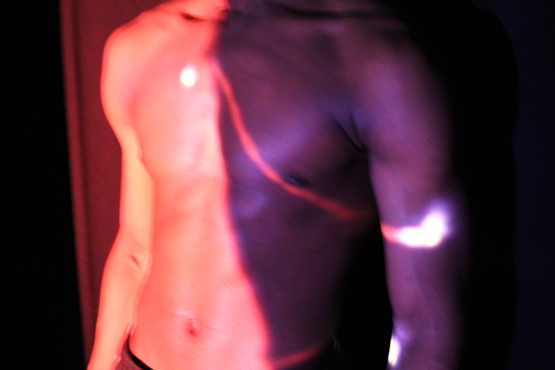
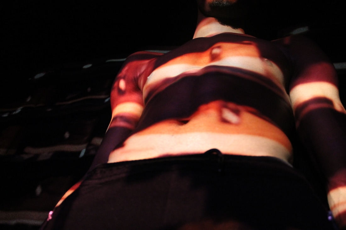
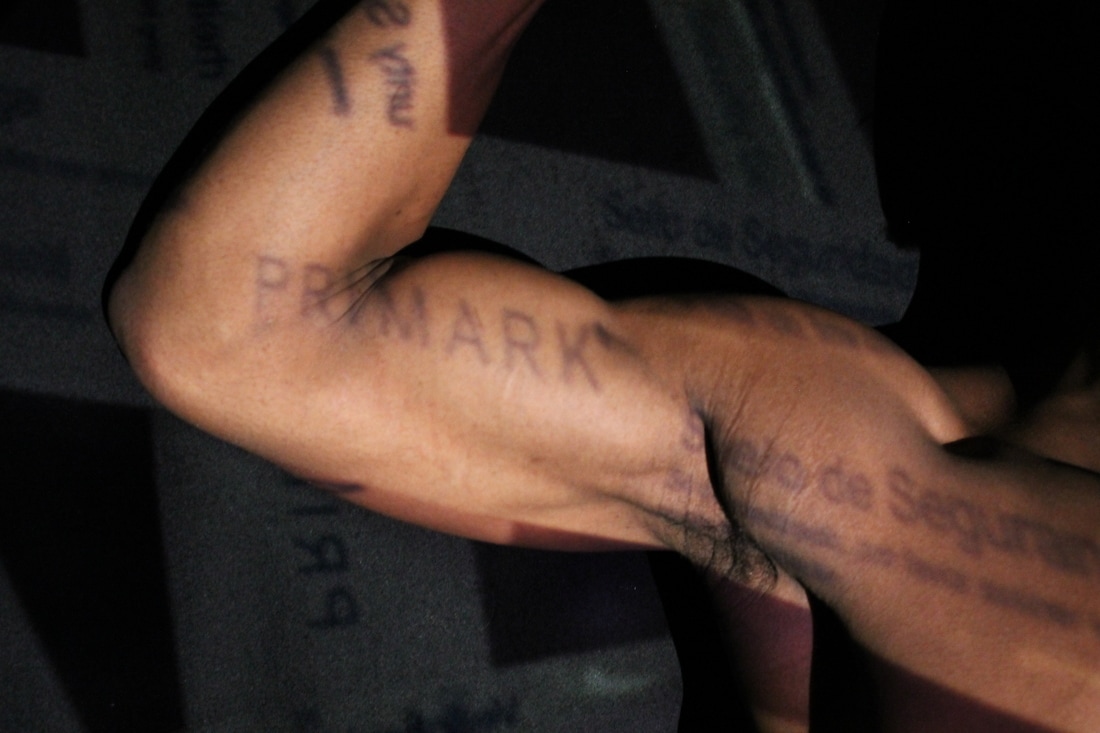
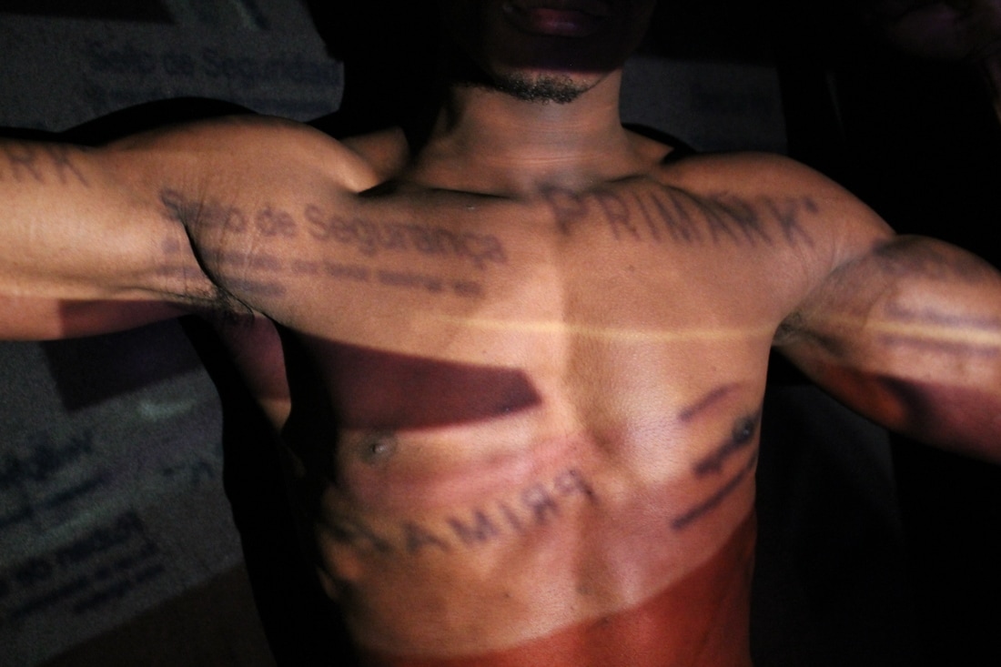
Here are the first set of my images that I took in response to Chong's work. Using the broadcasting studio and a projector I had used images that I had taken previously of plants, flowers, trees etc. and projected it one the models body (all of the projected images are on my flickr ). Here is the out come of that photo shoot.


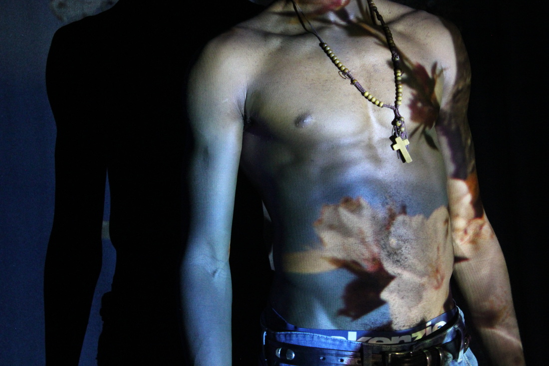
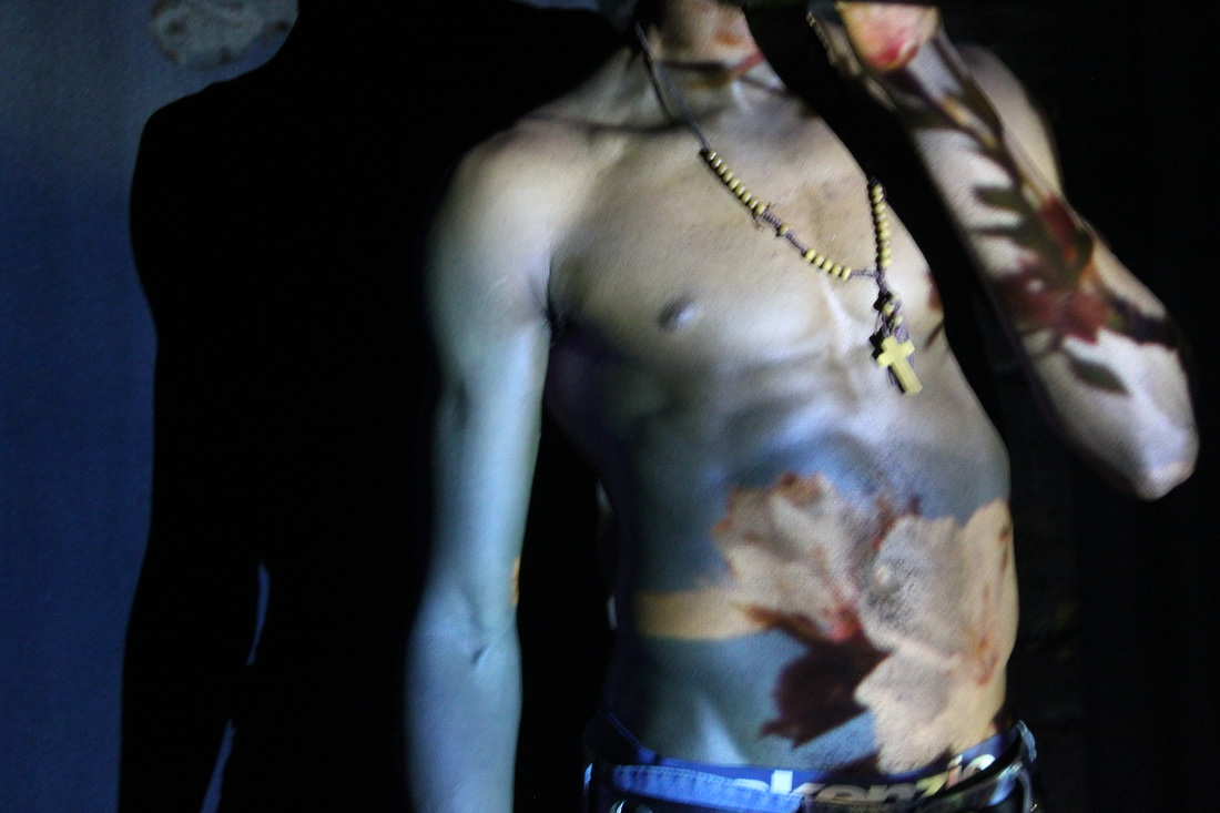
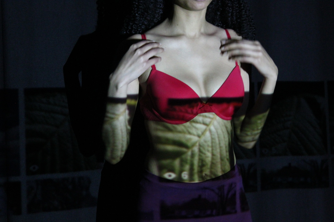
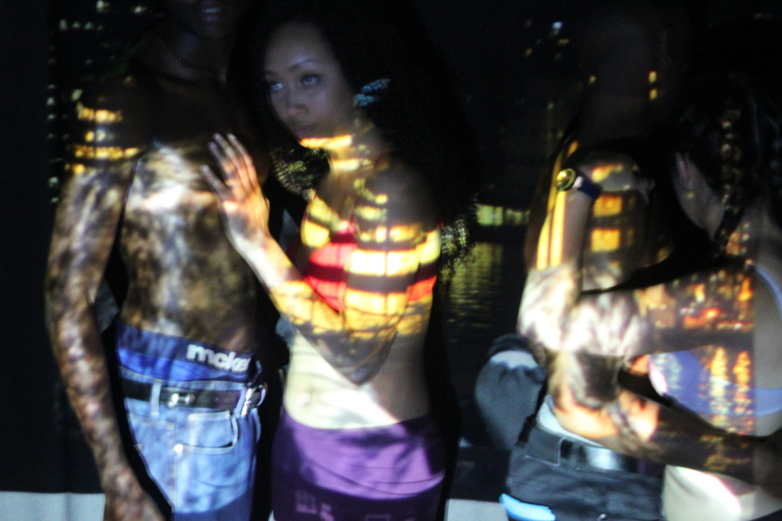
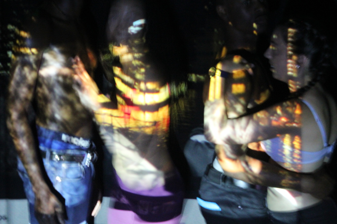
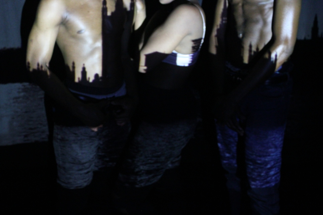
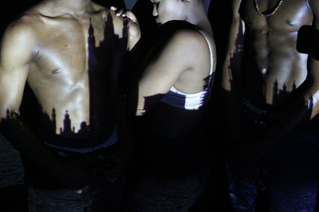
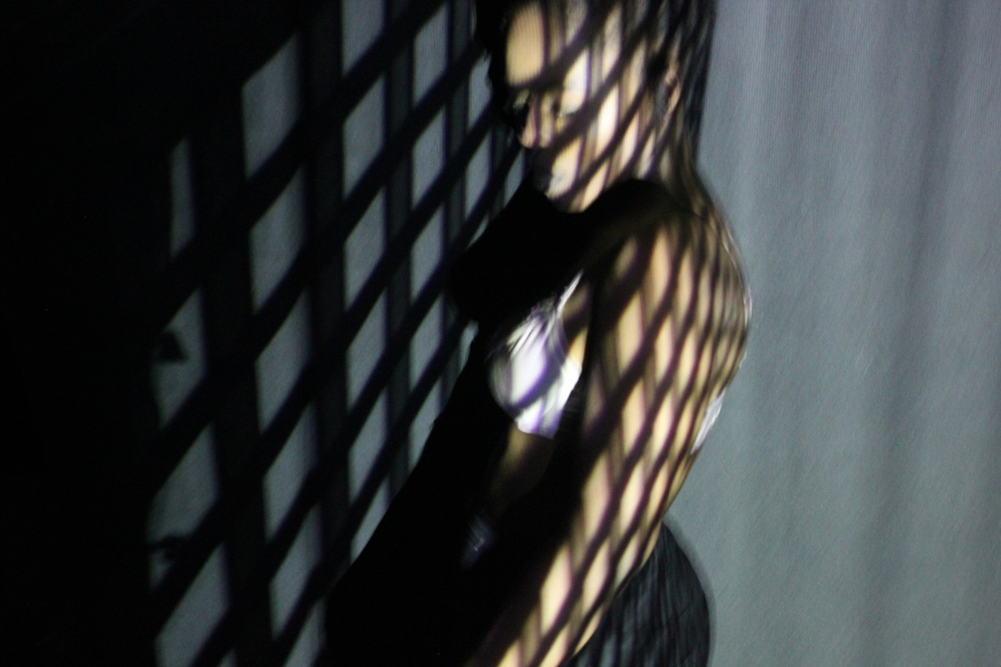
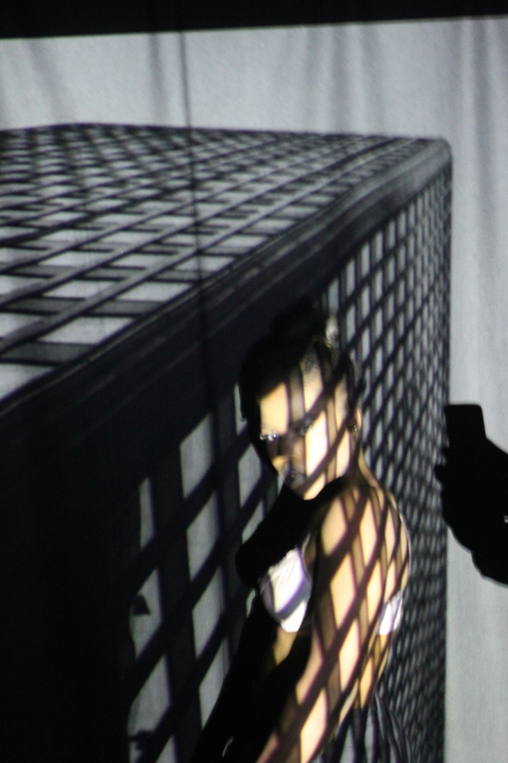
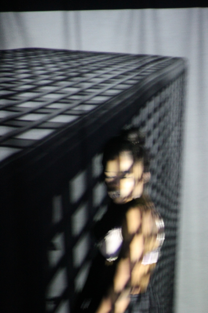
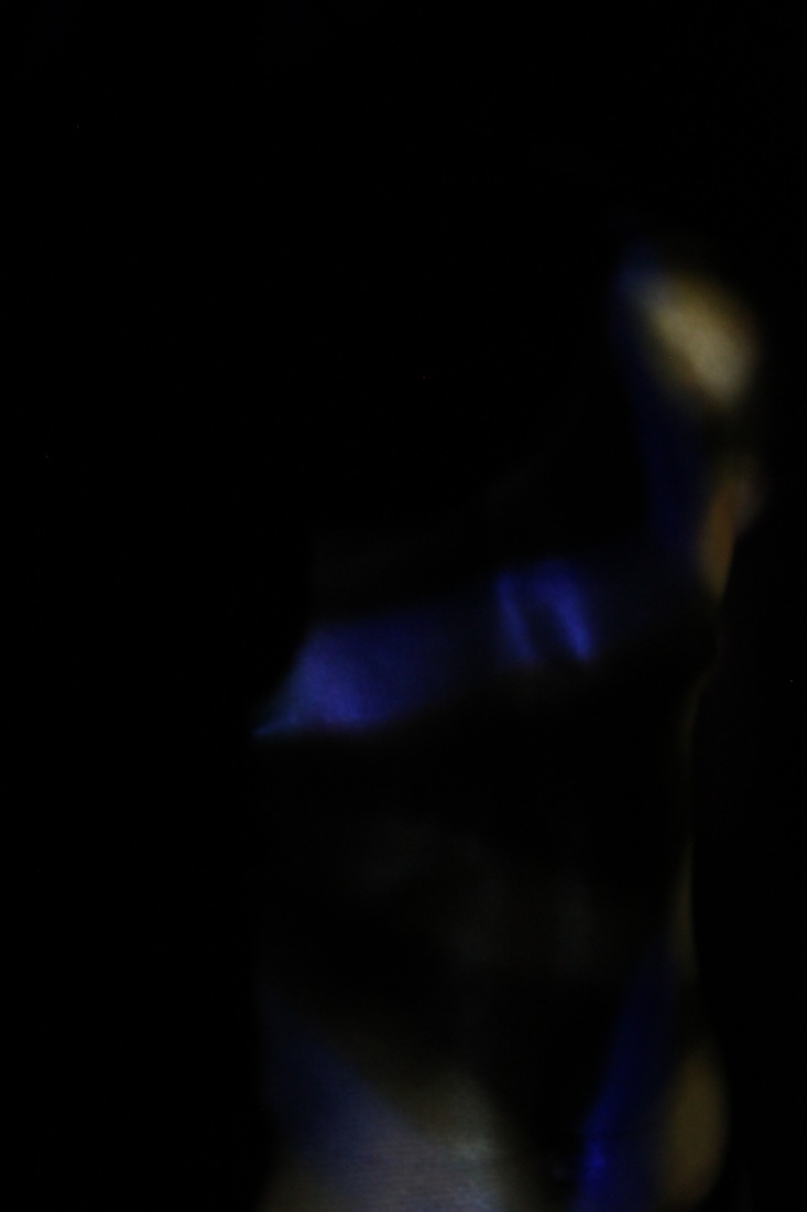
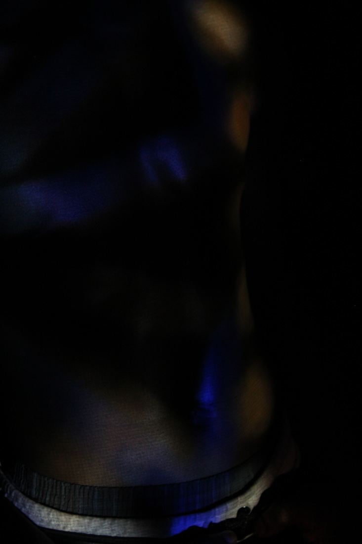
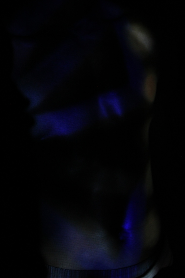
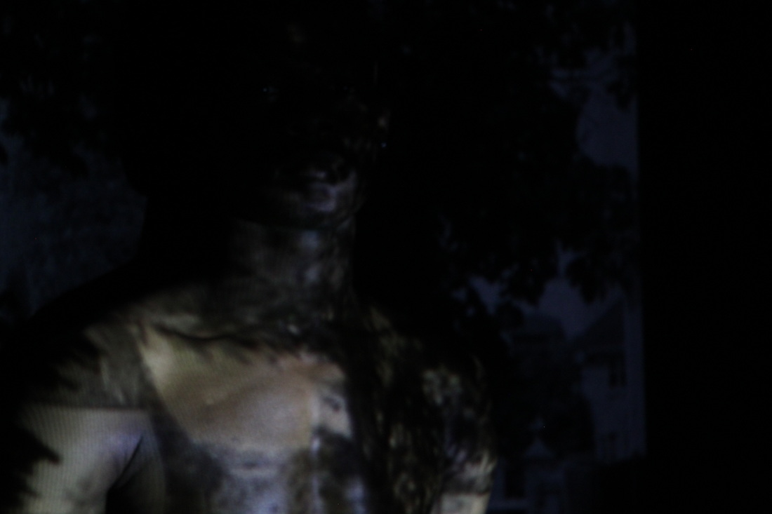
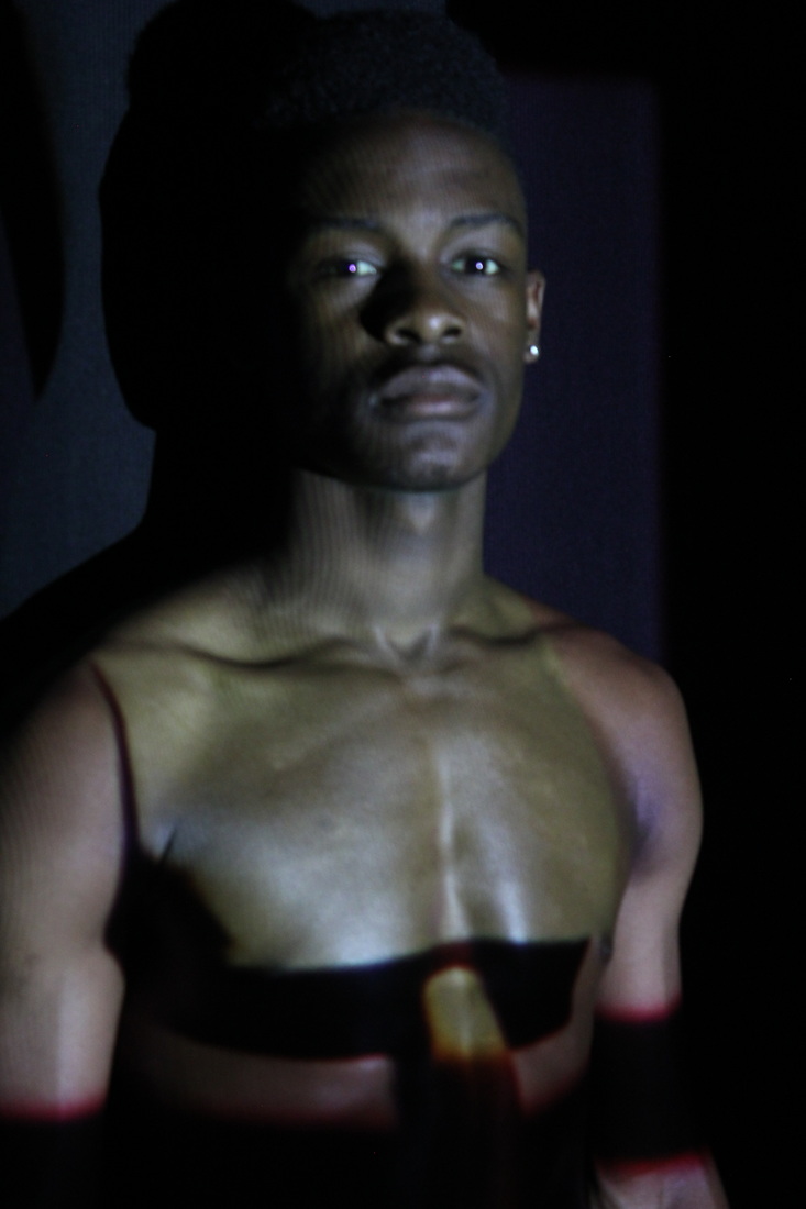
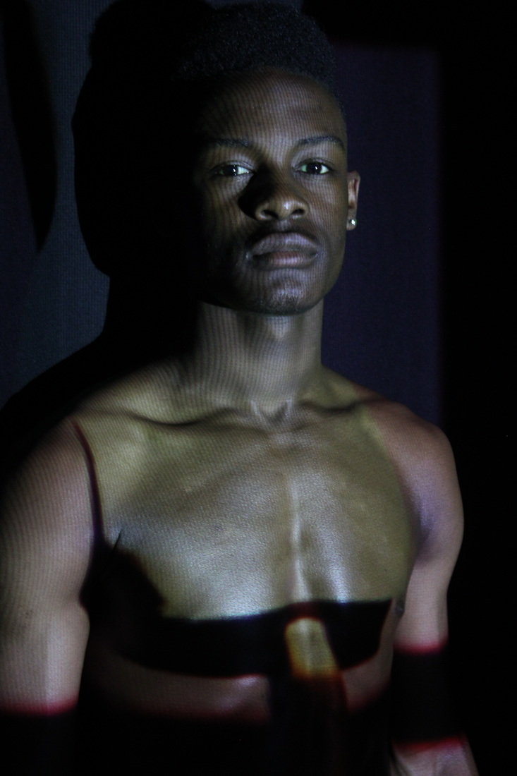
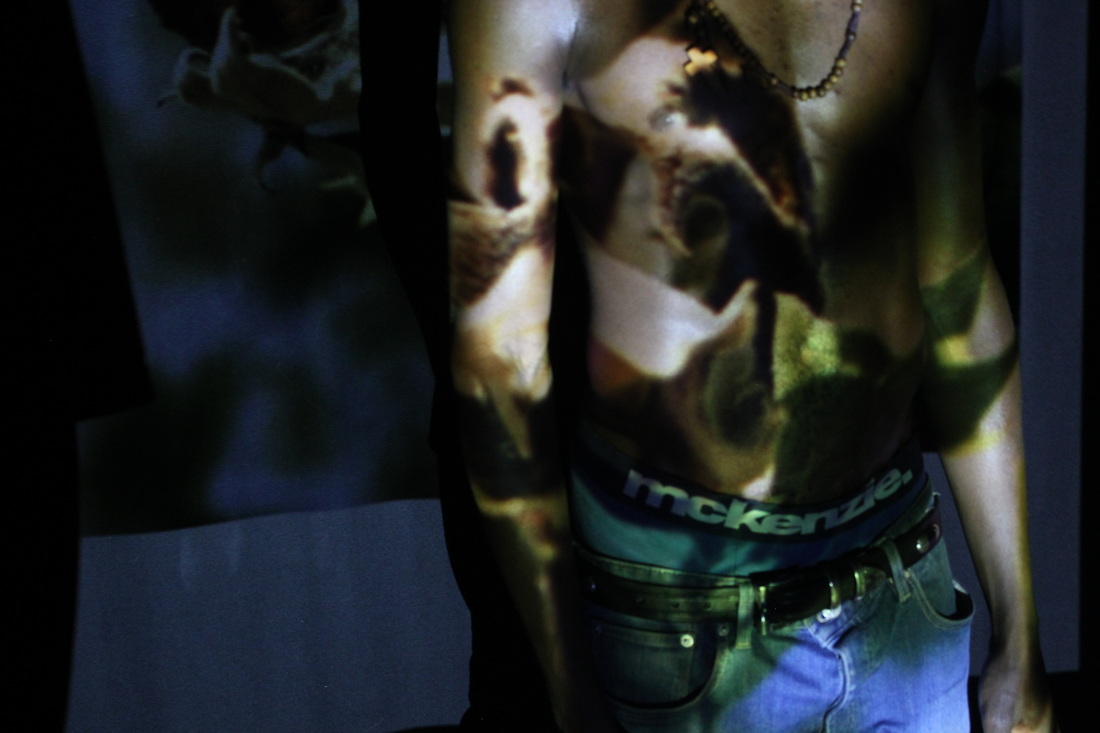
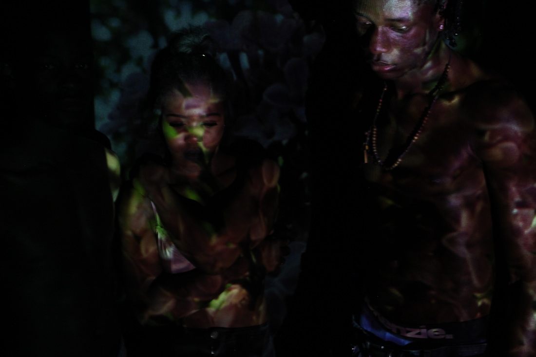
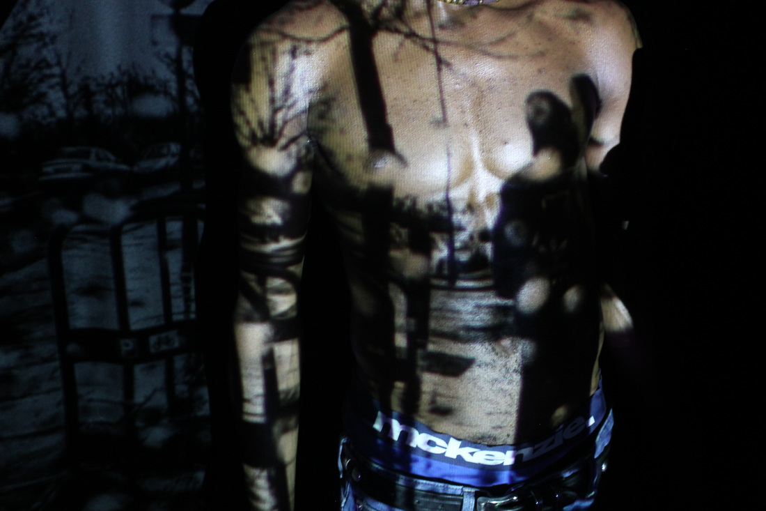
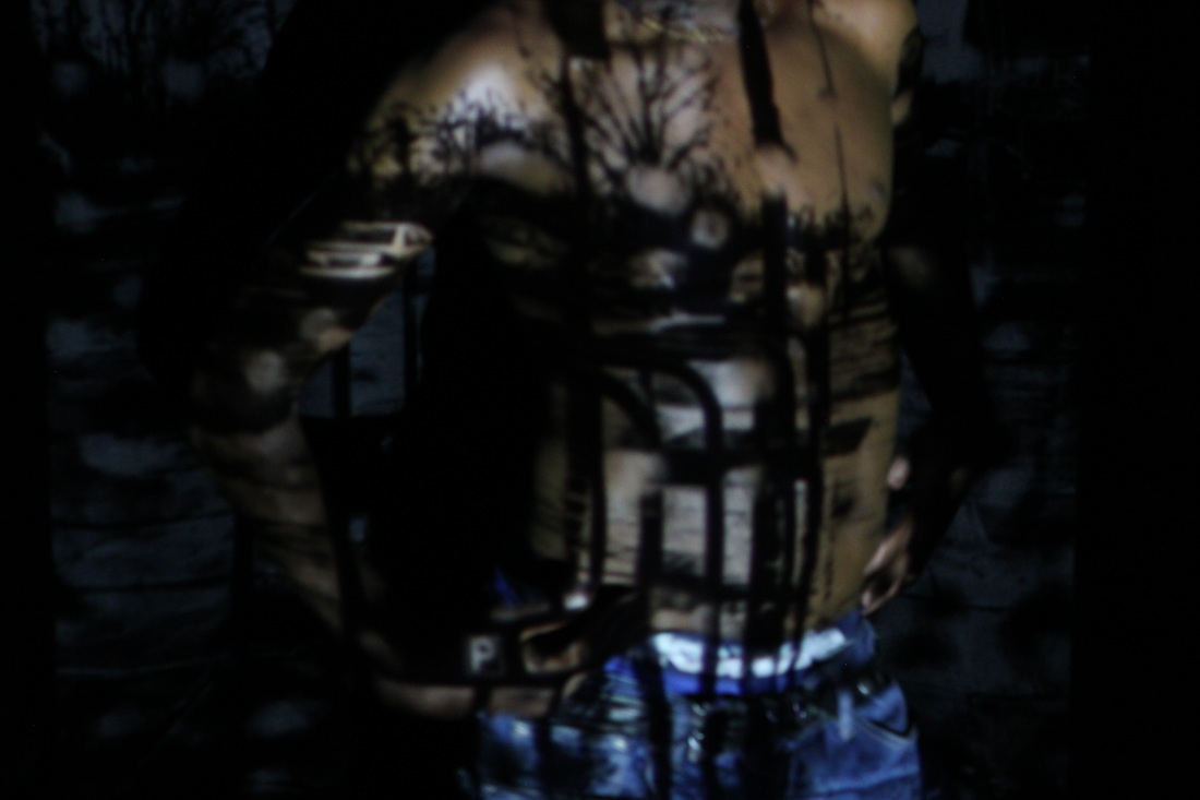
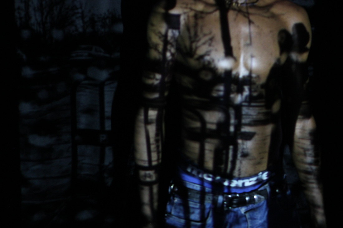
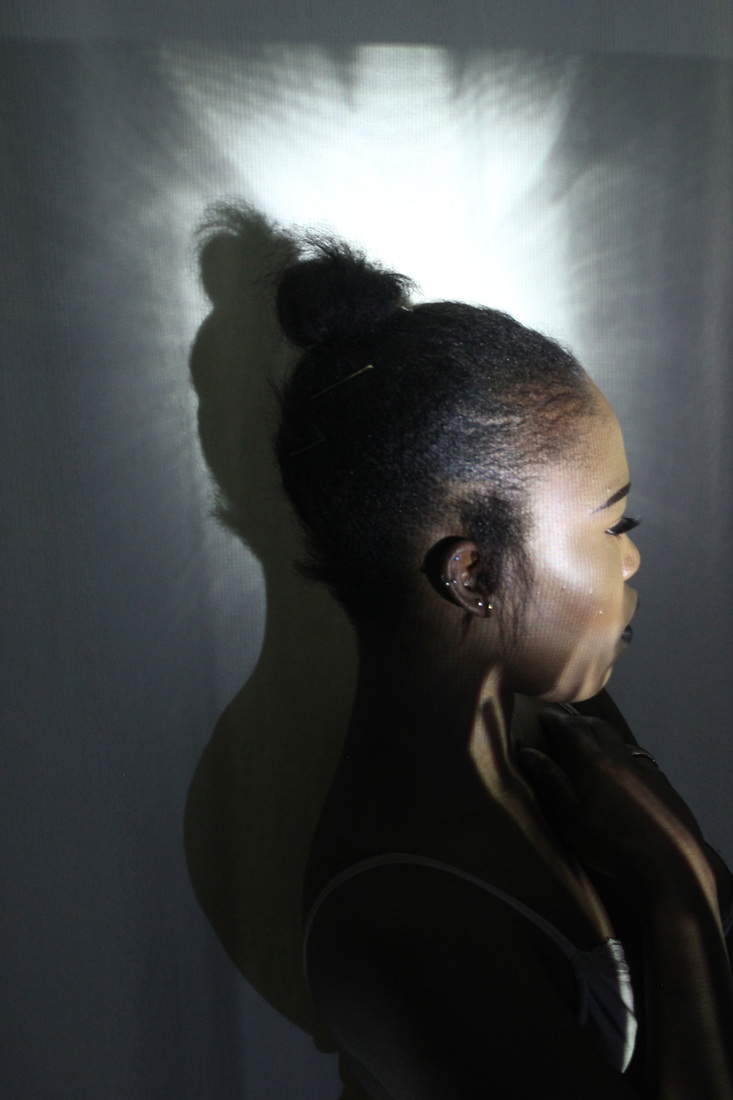
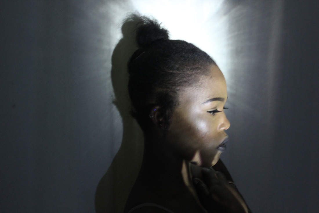
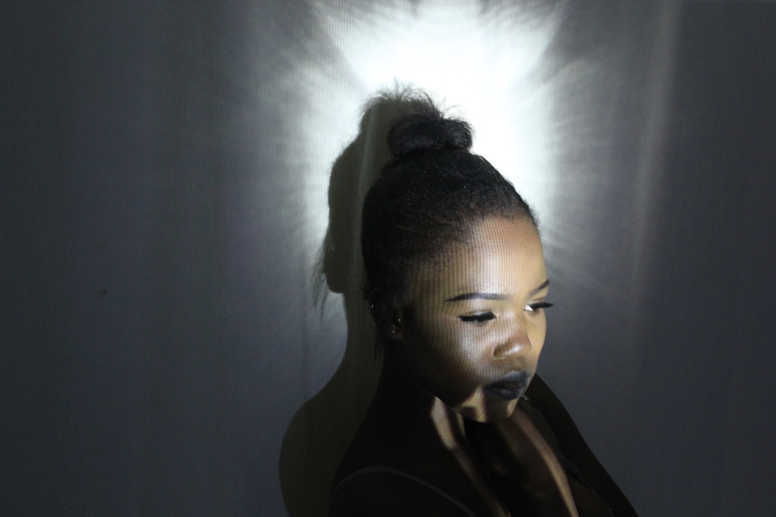
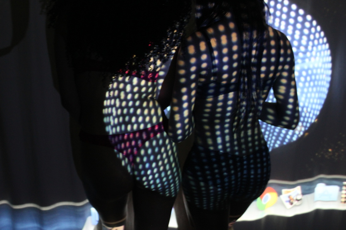
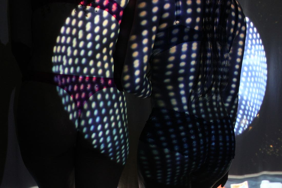
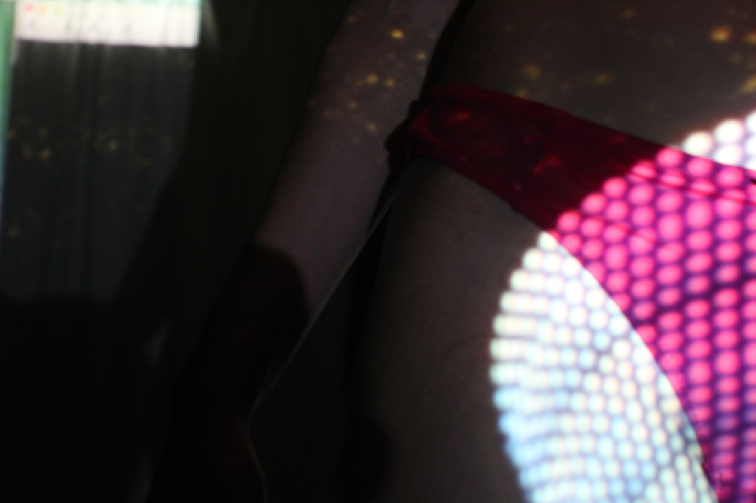
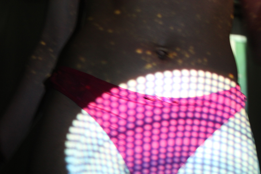
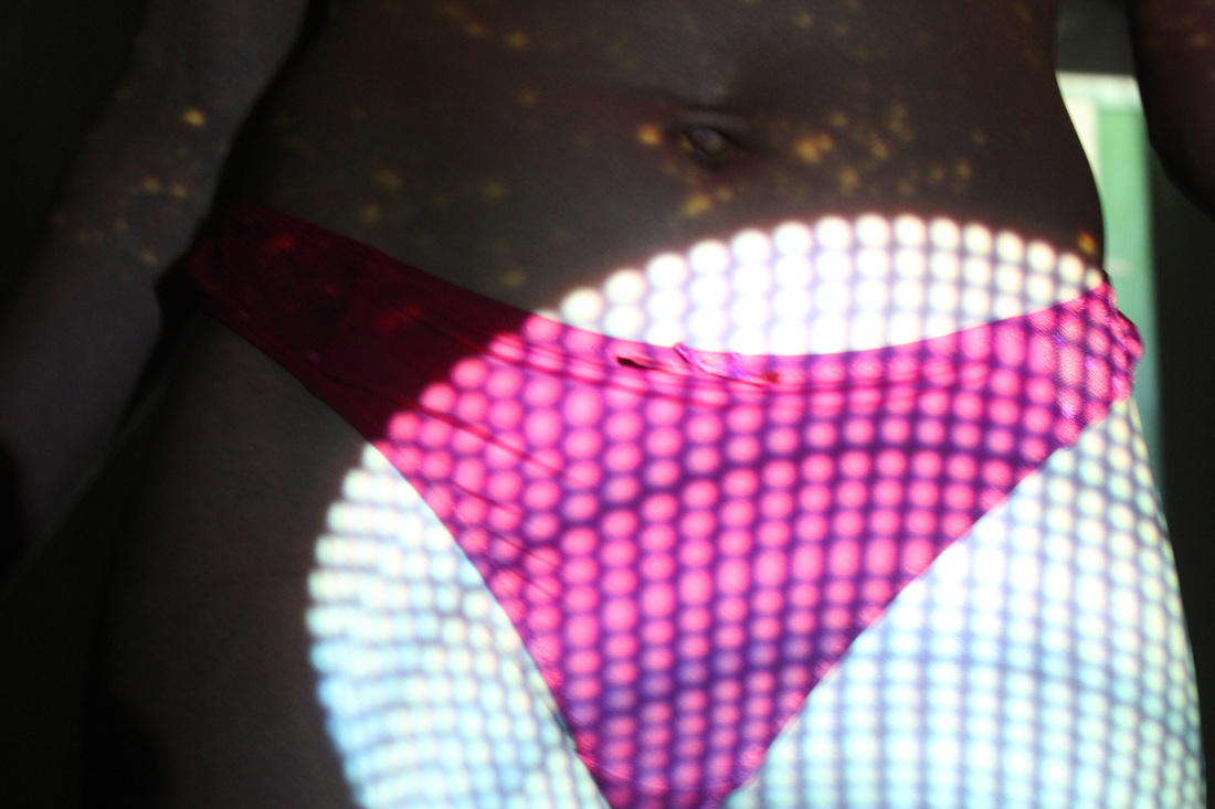
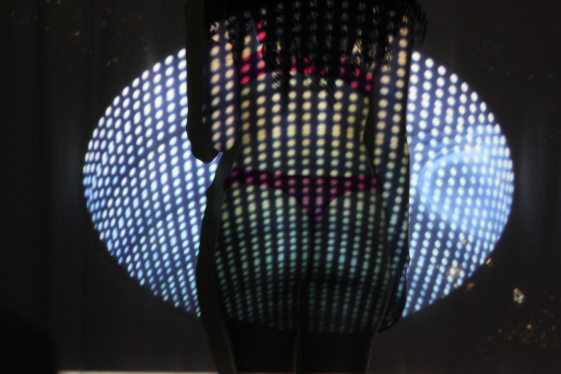
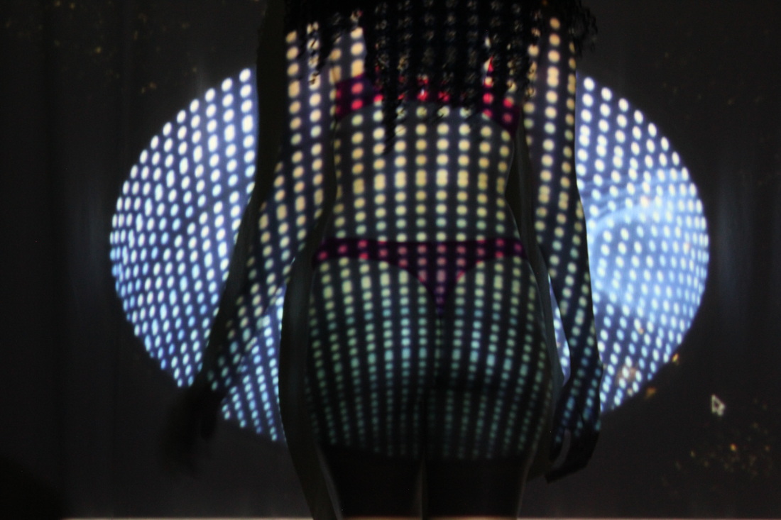
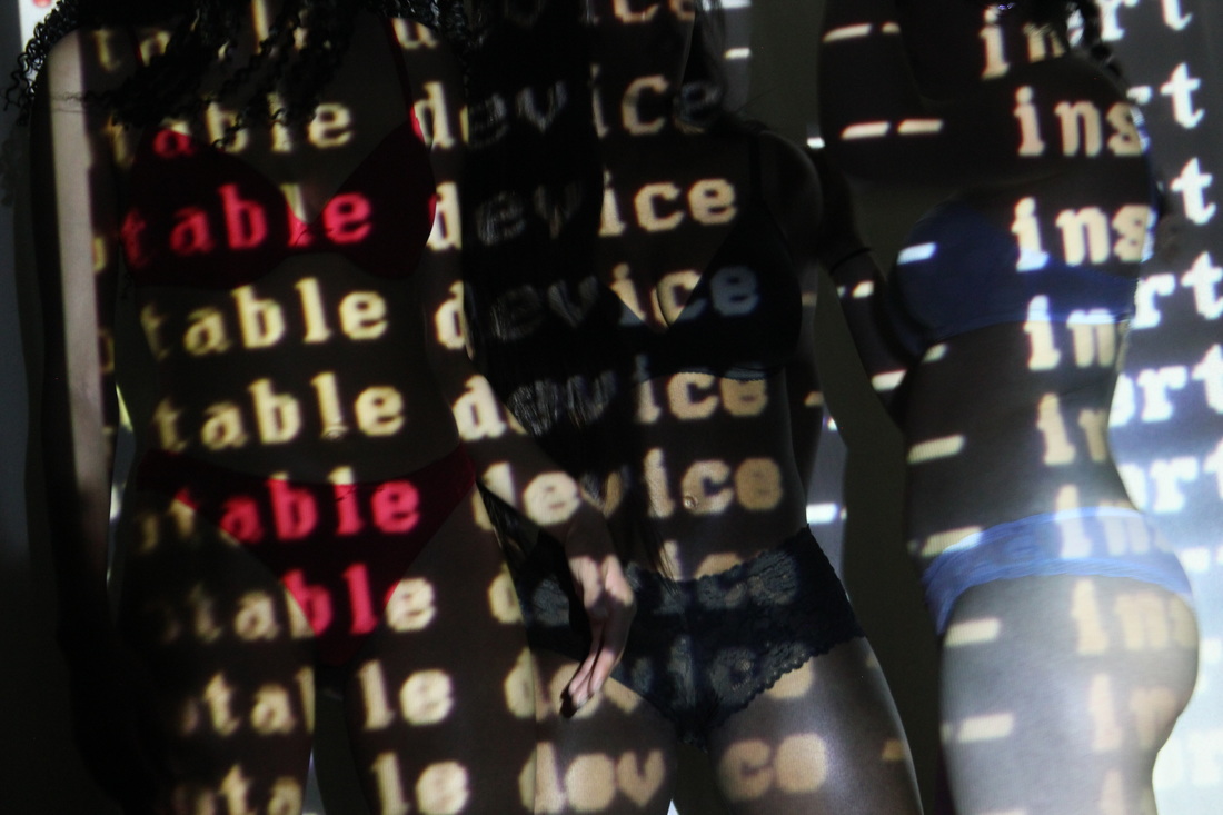
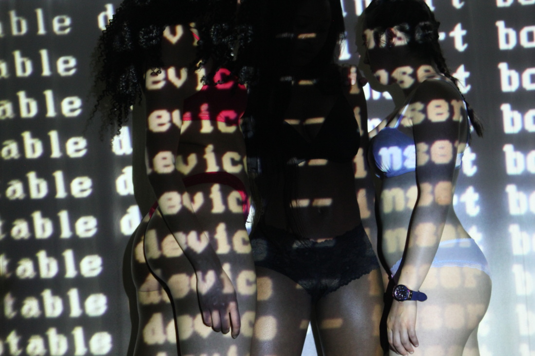
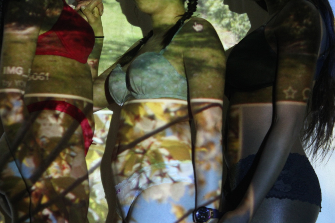
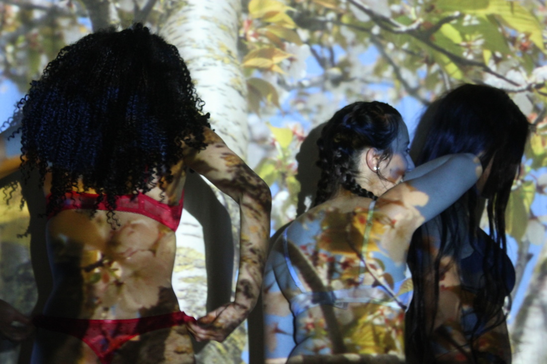
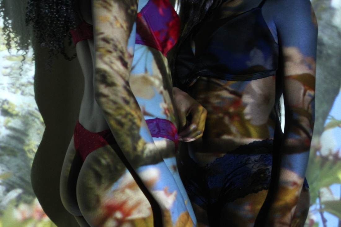
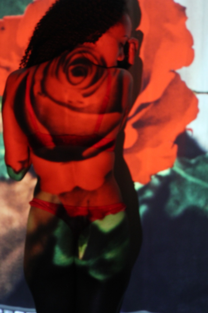
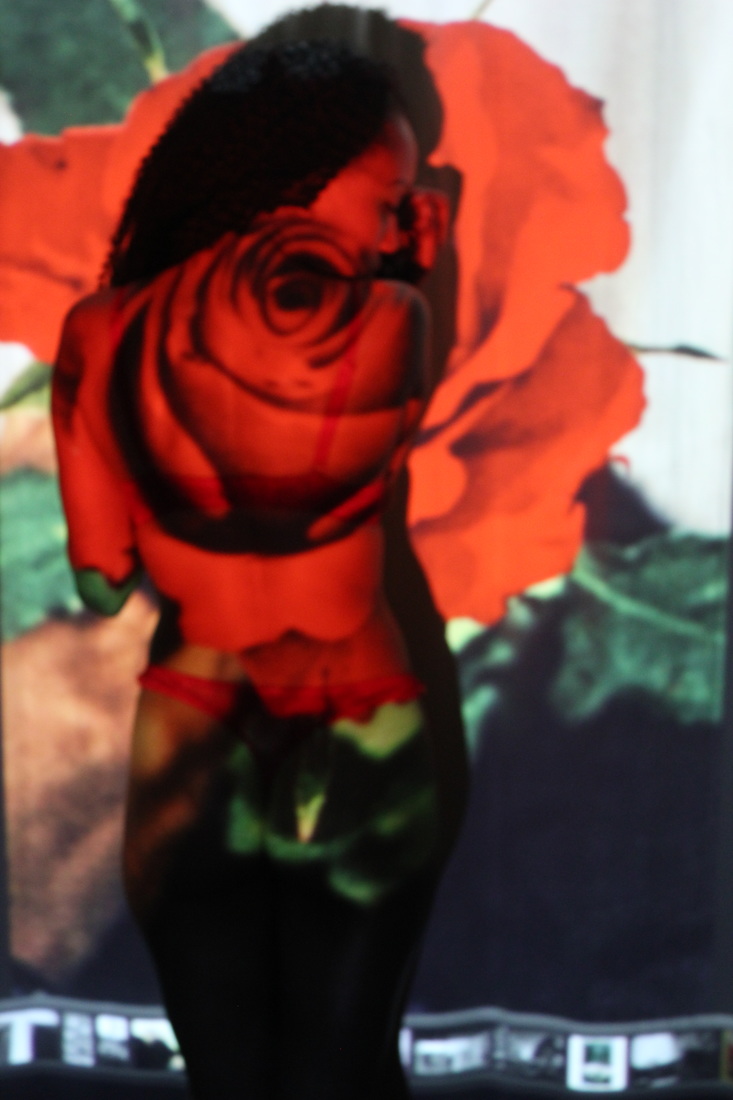
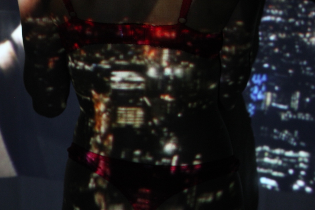
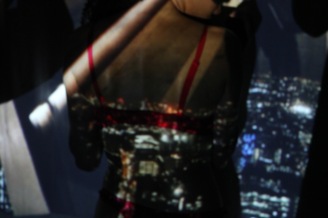
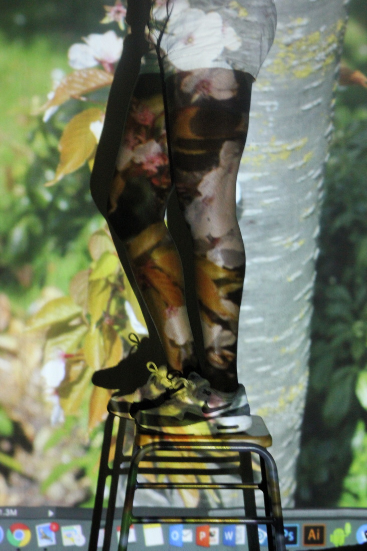
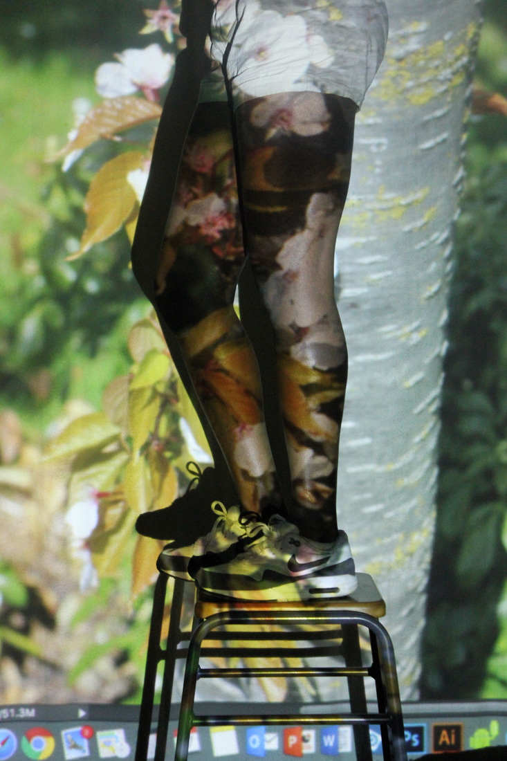
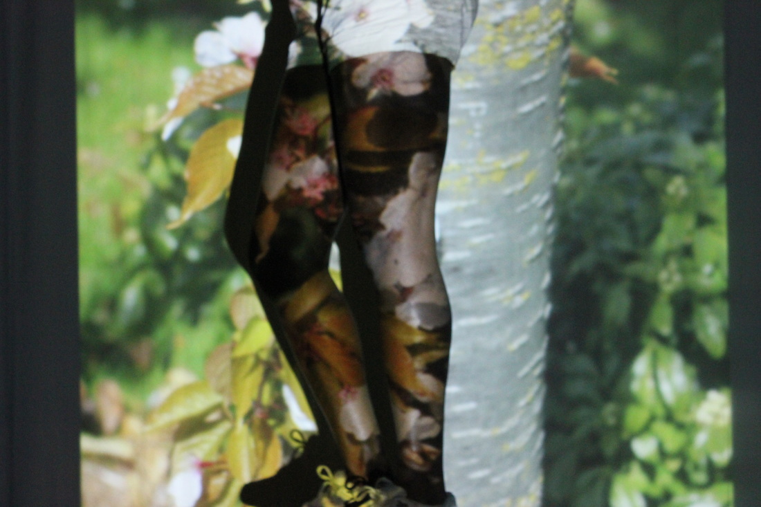
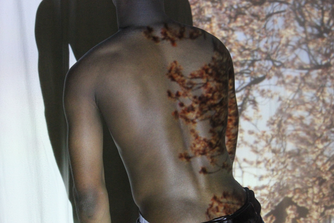
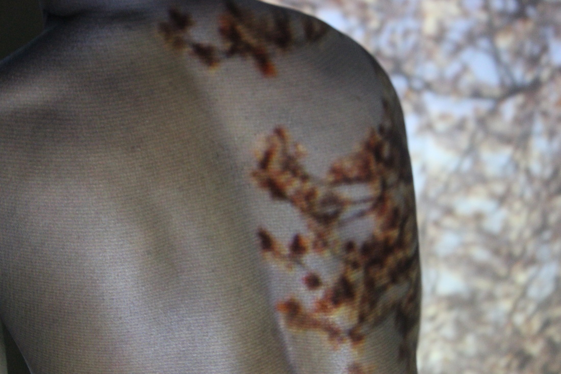
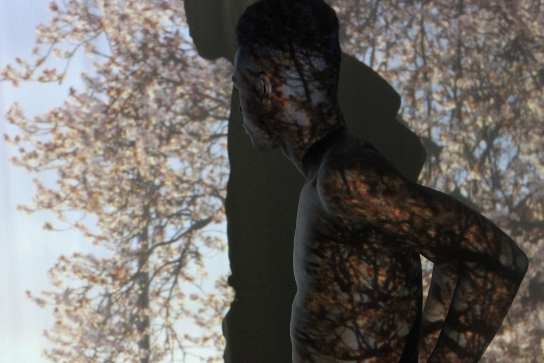
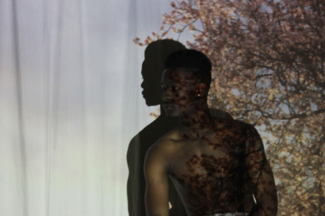
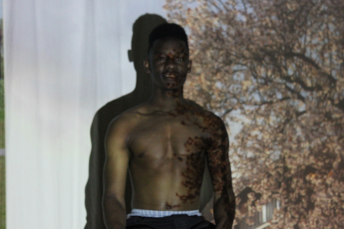
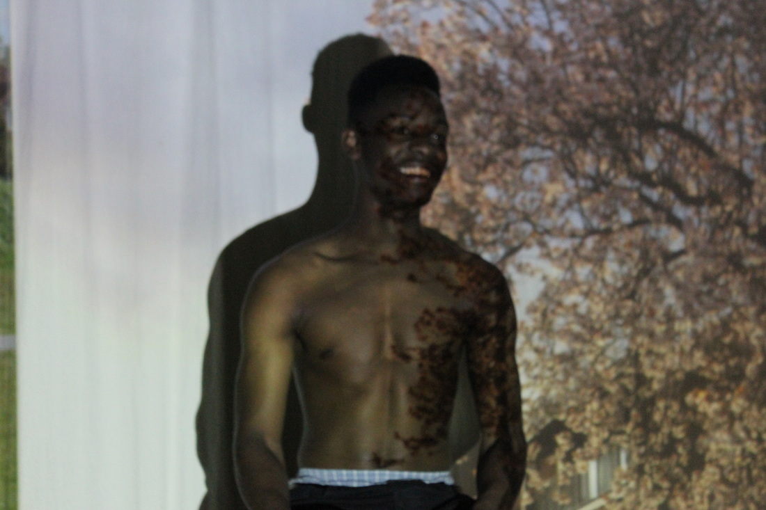
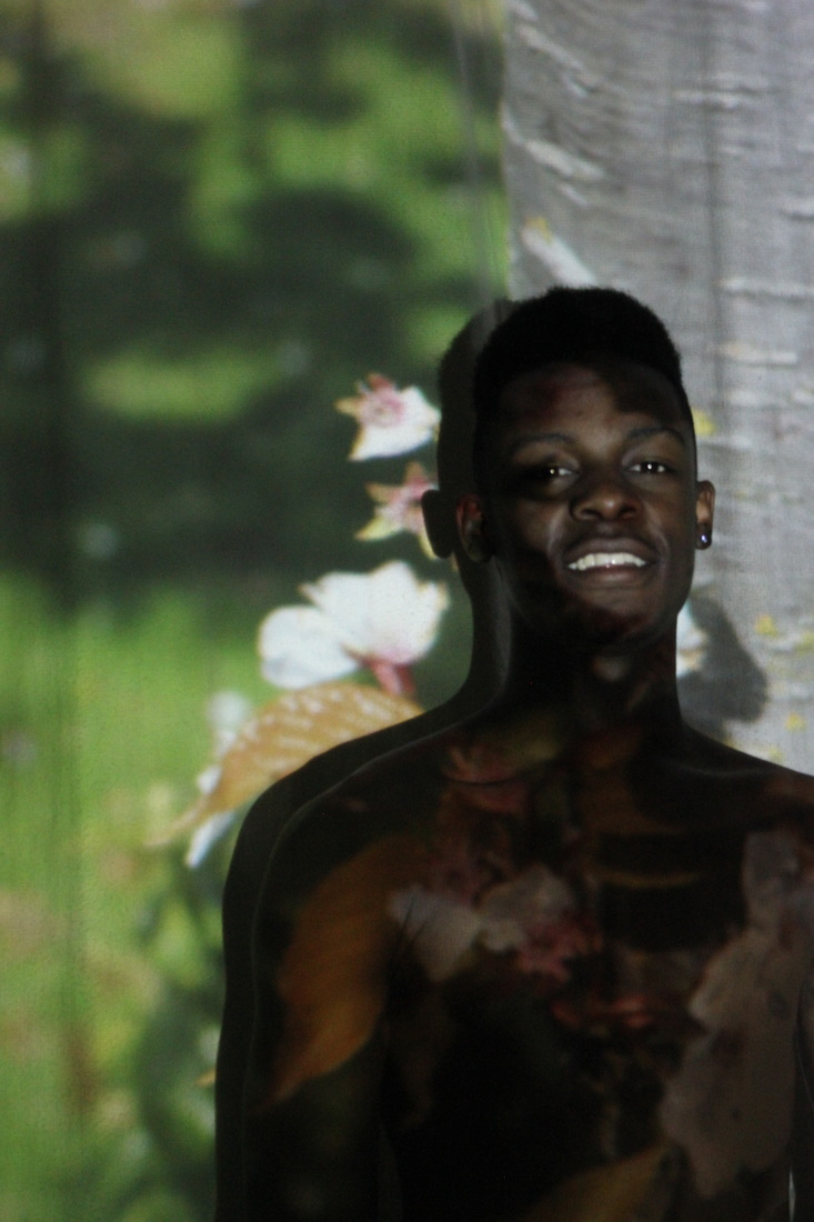
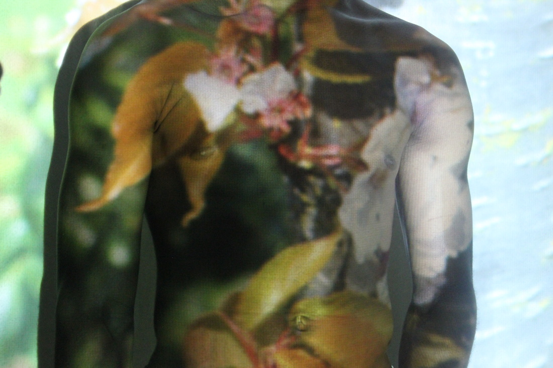
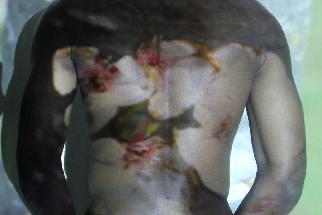
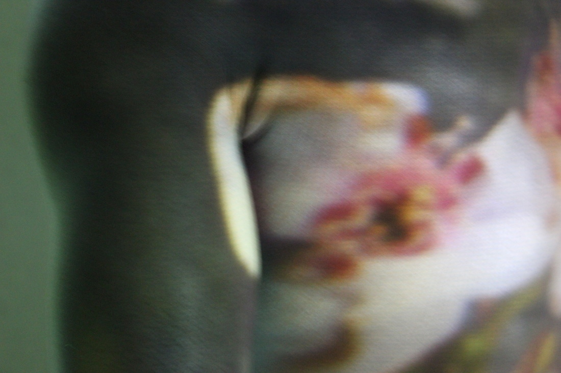
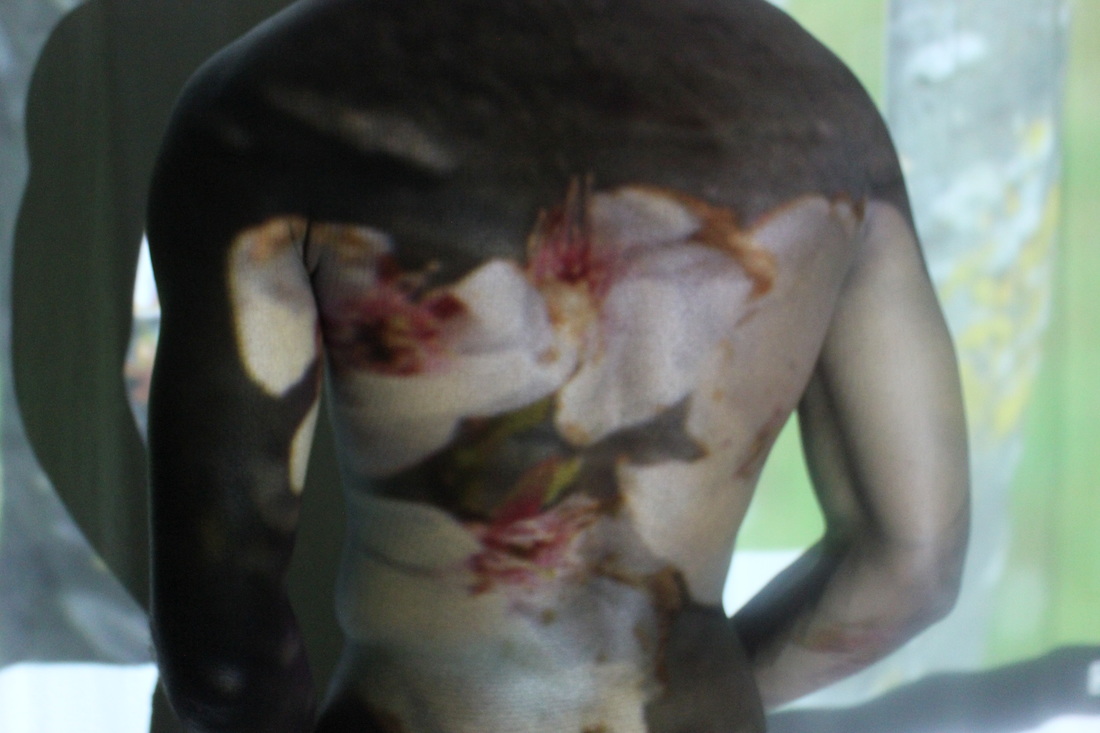
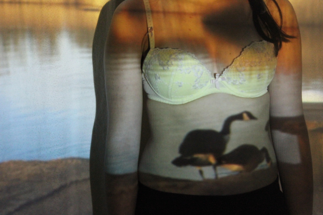
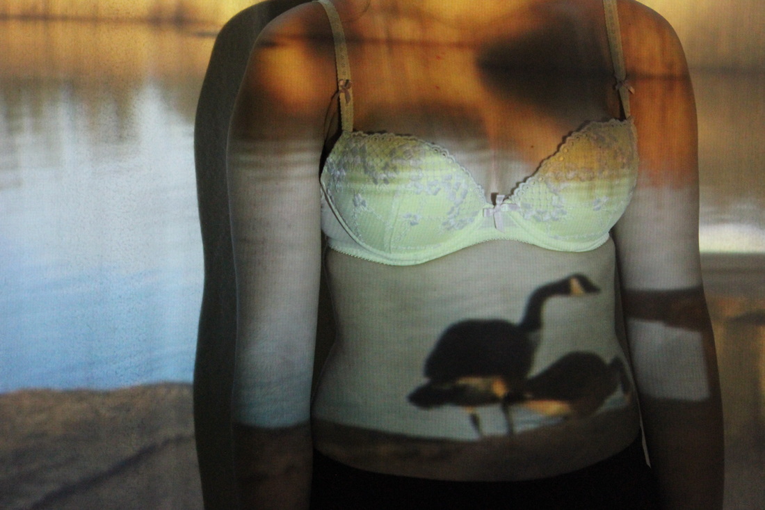
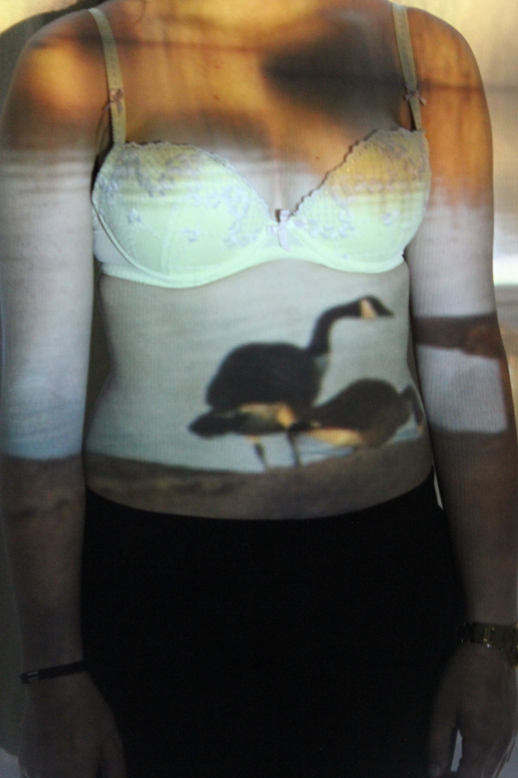
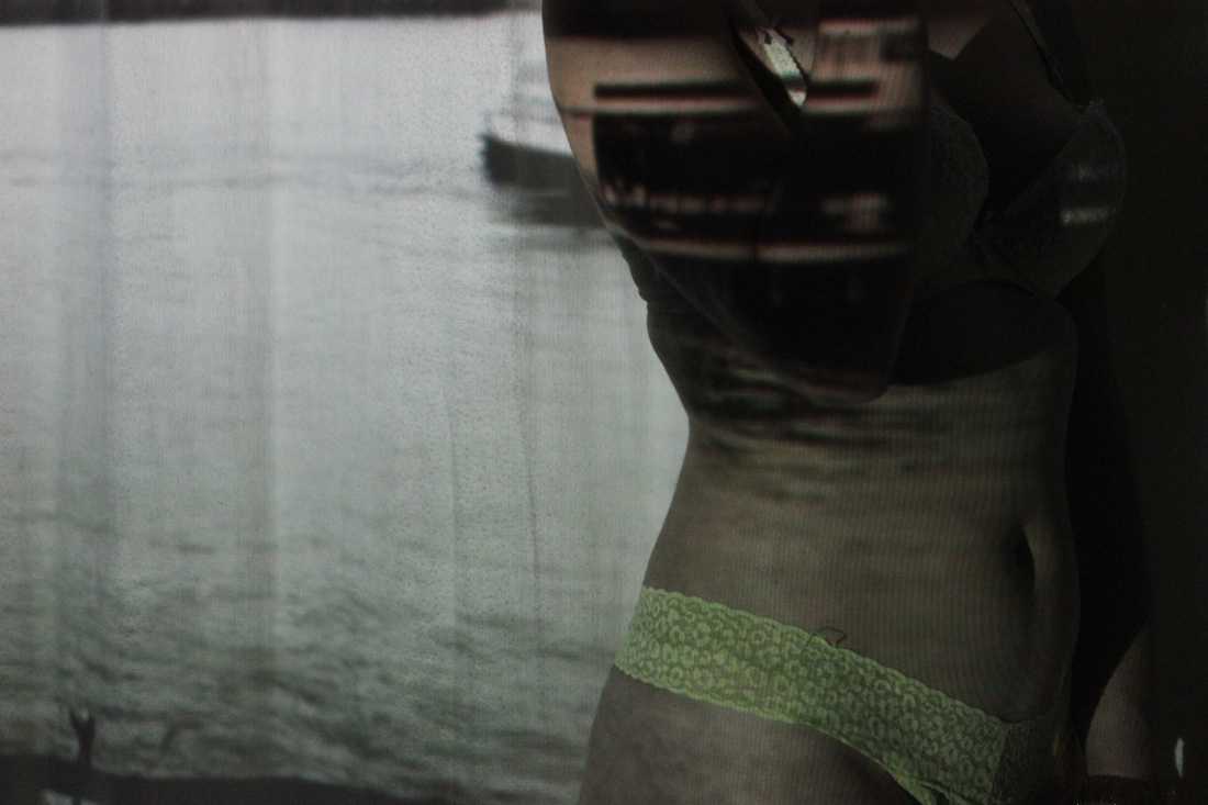
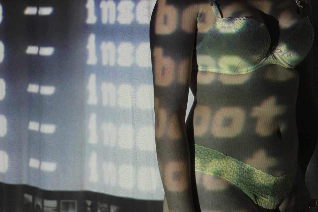
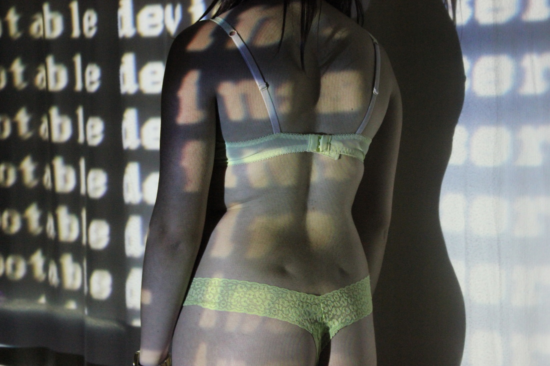
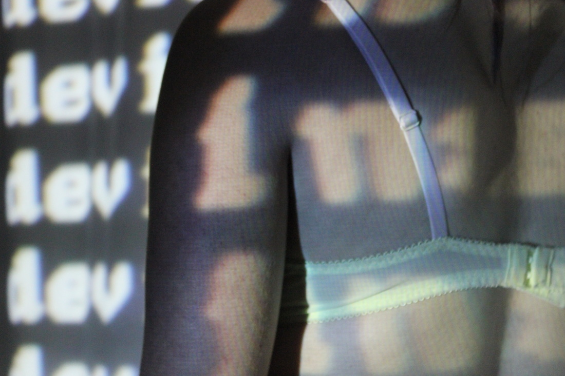
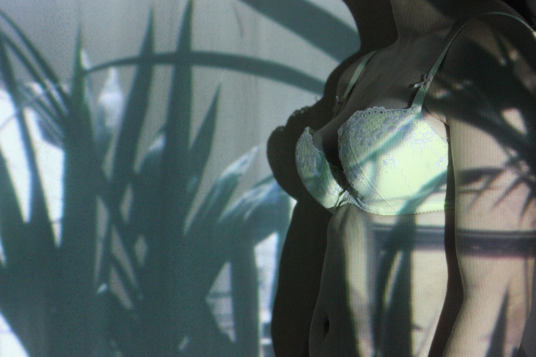
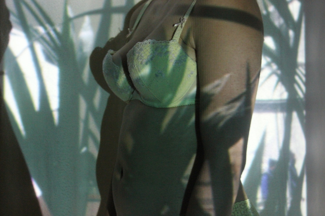
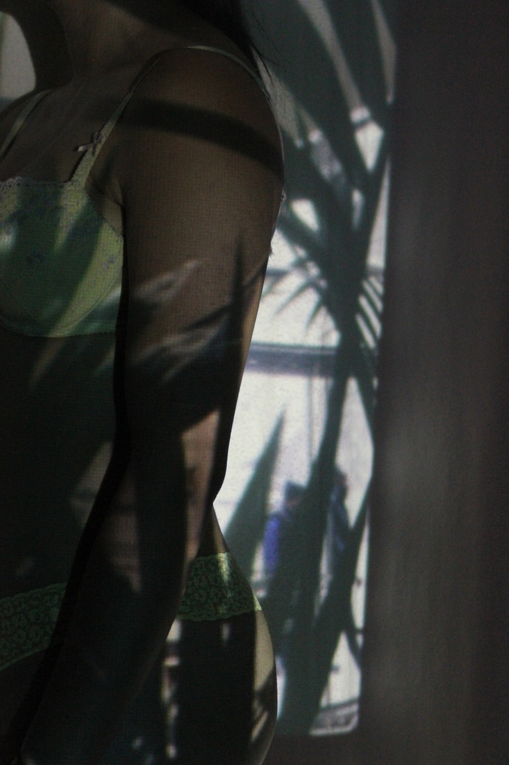
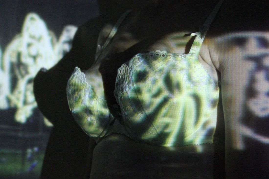
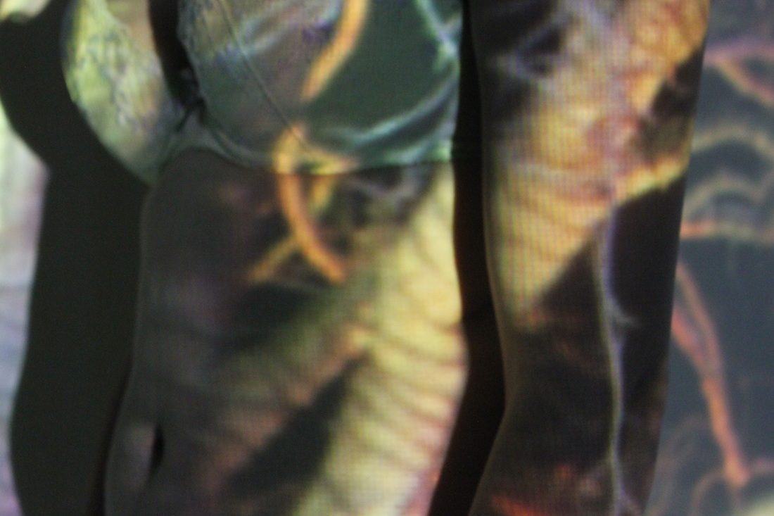
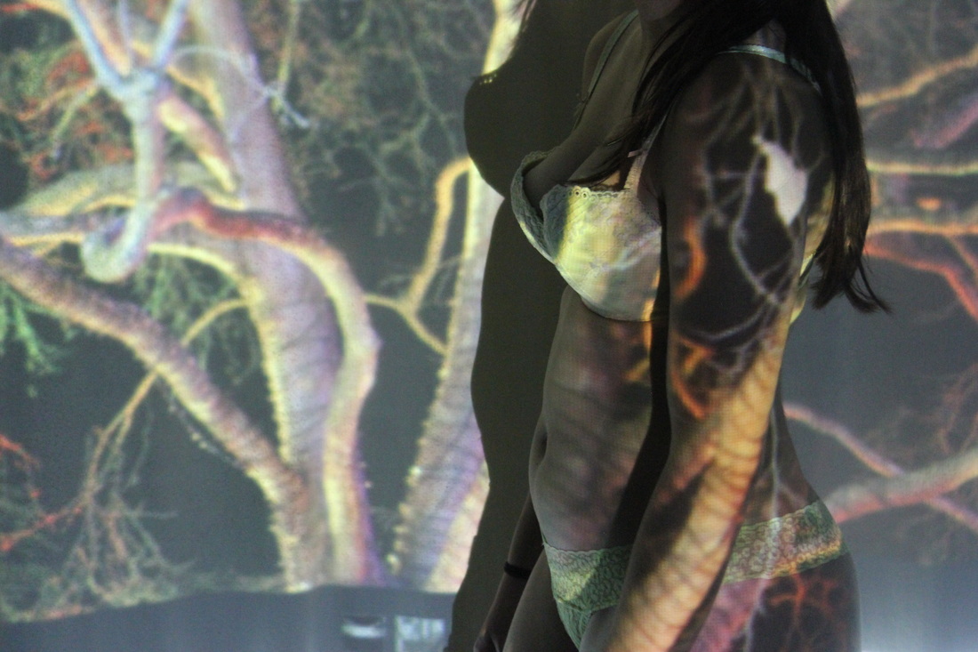
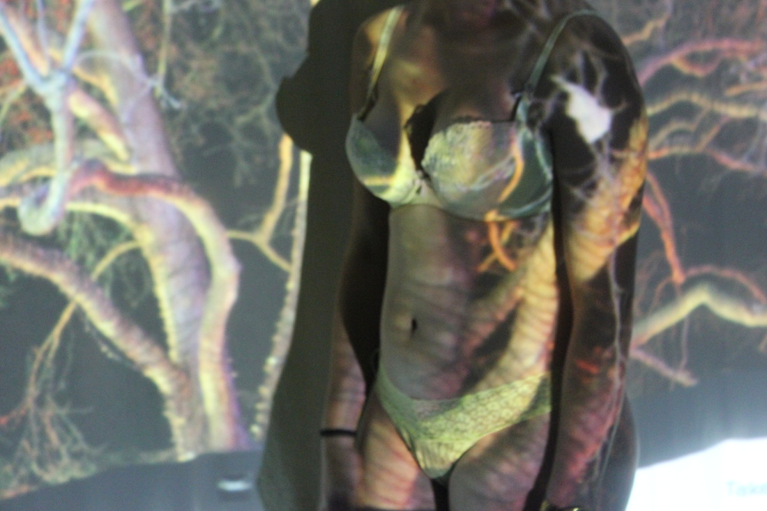
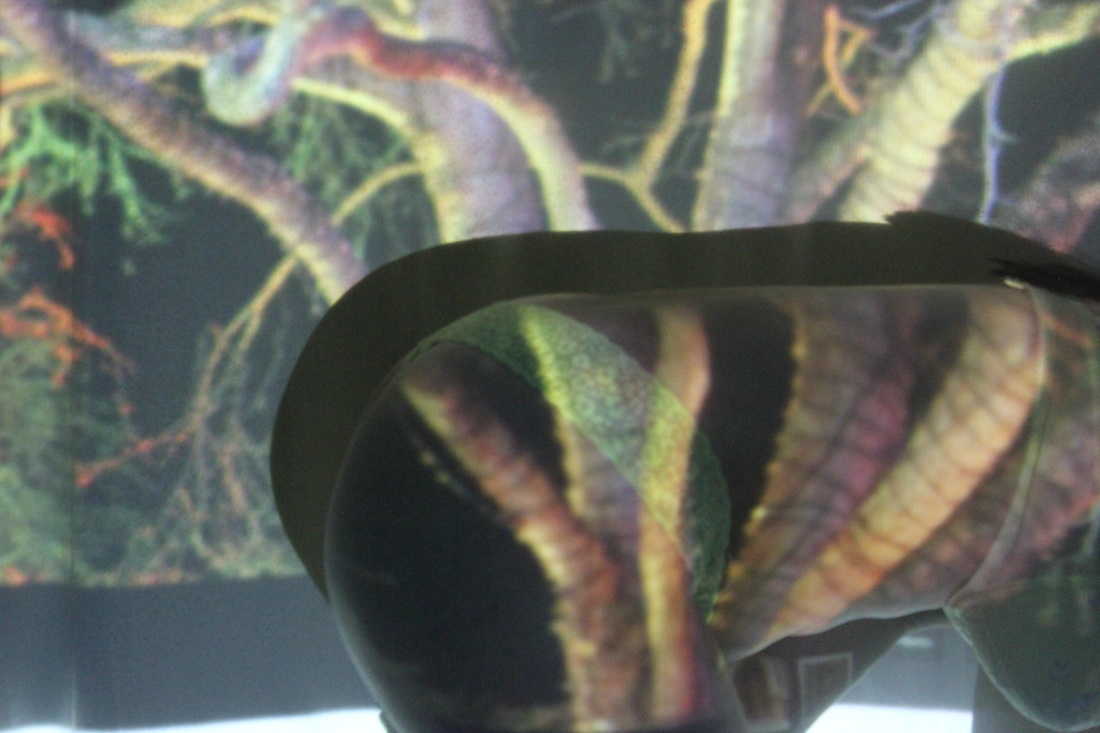
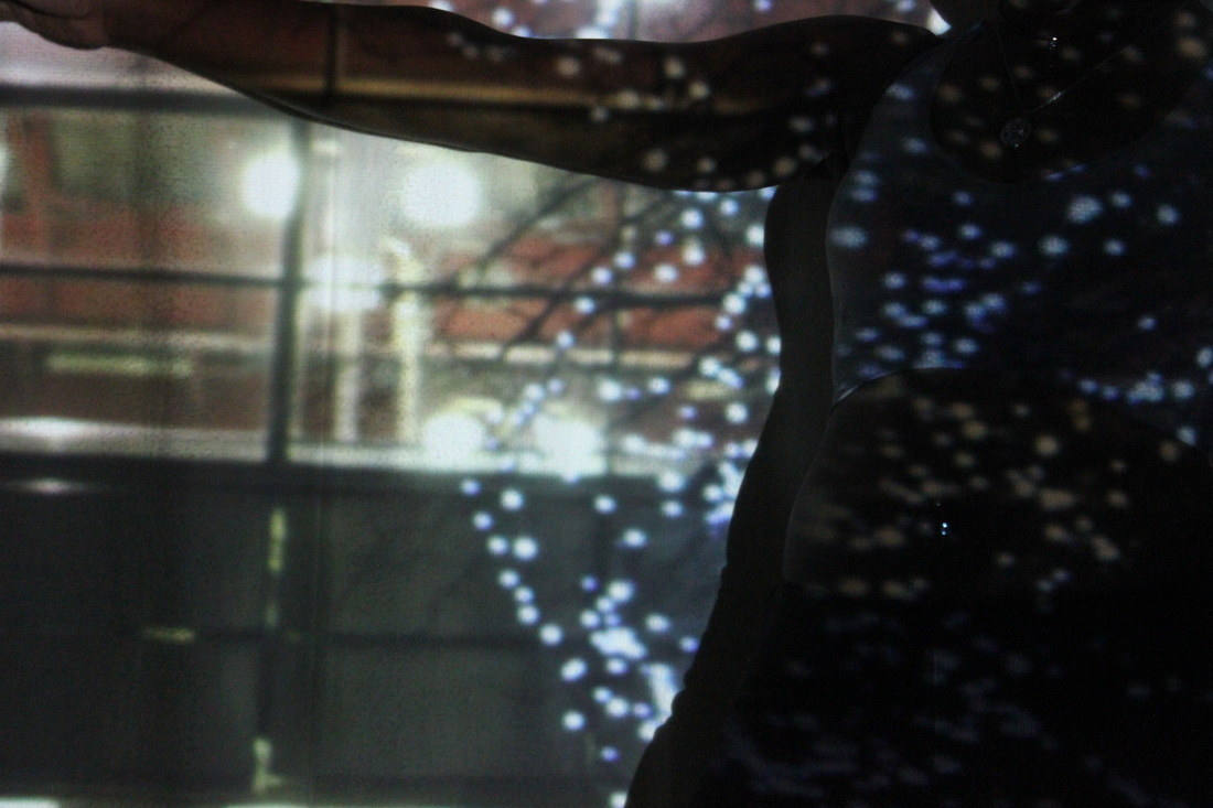
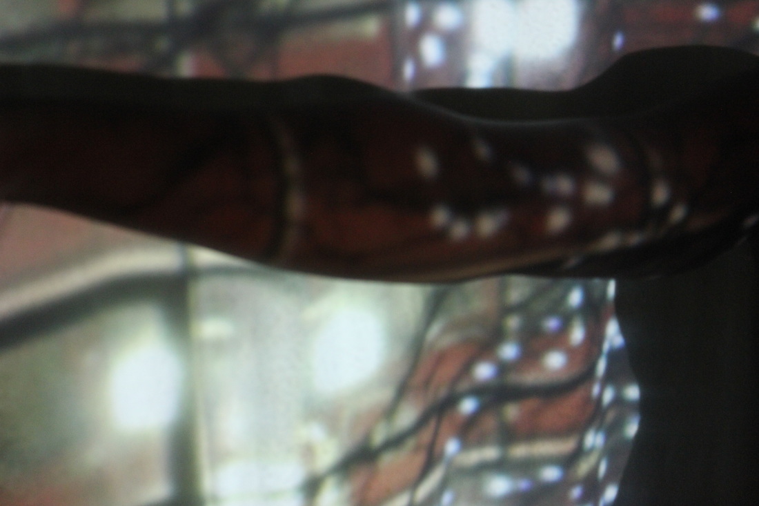
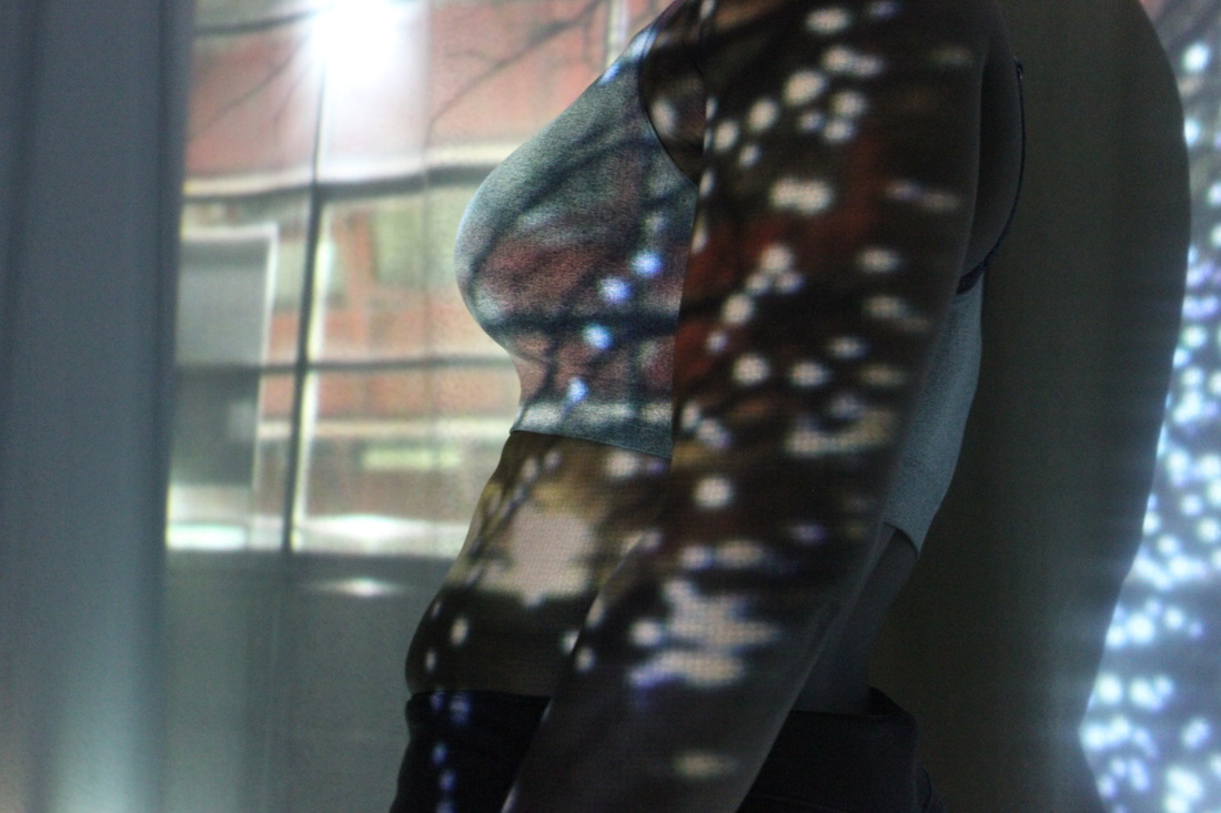
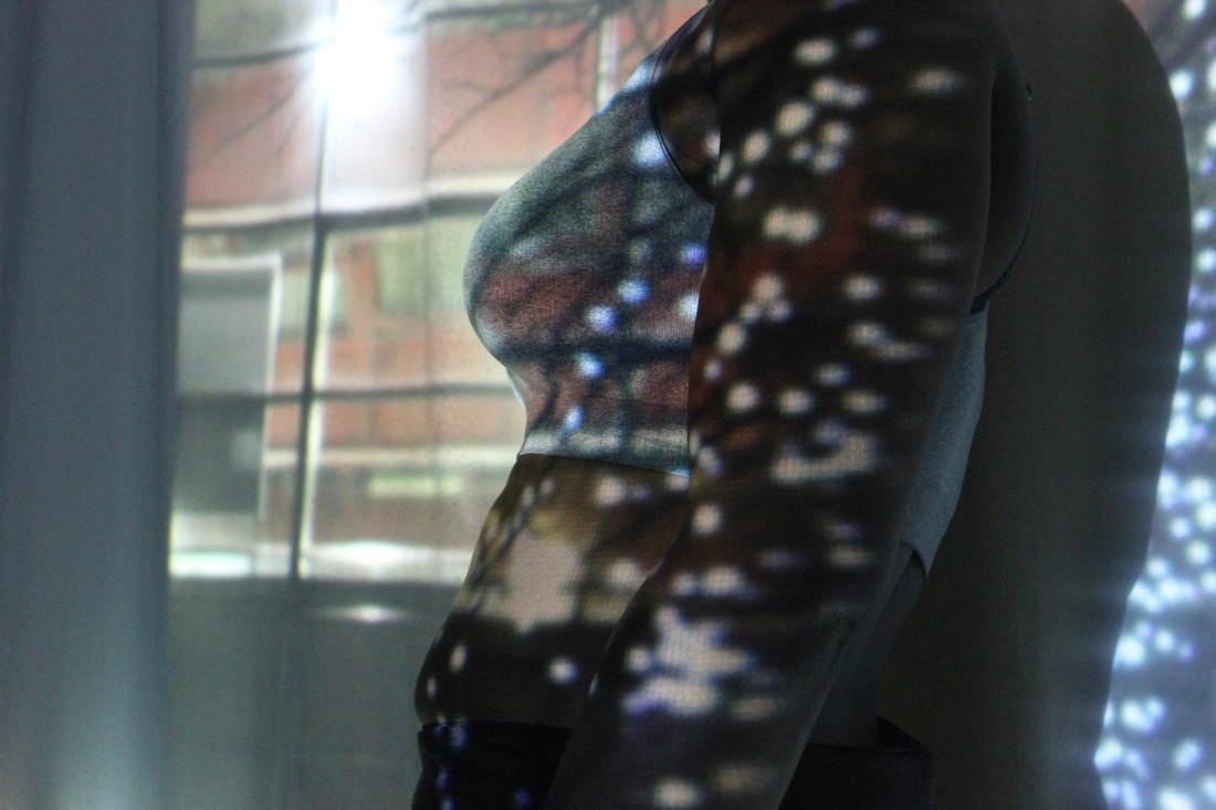
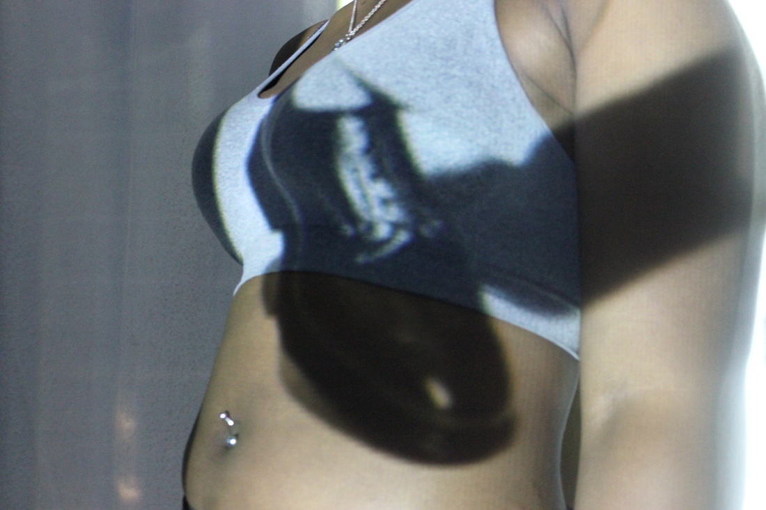
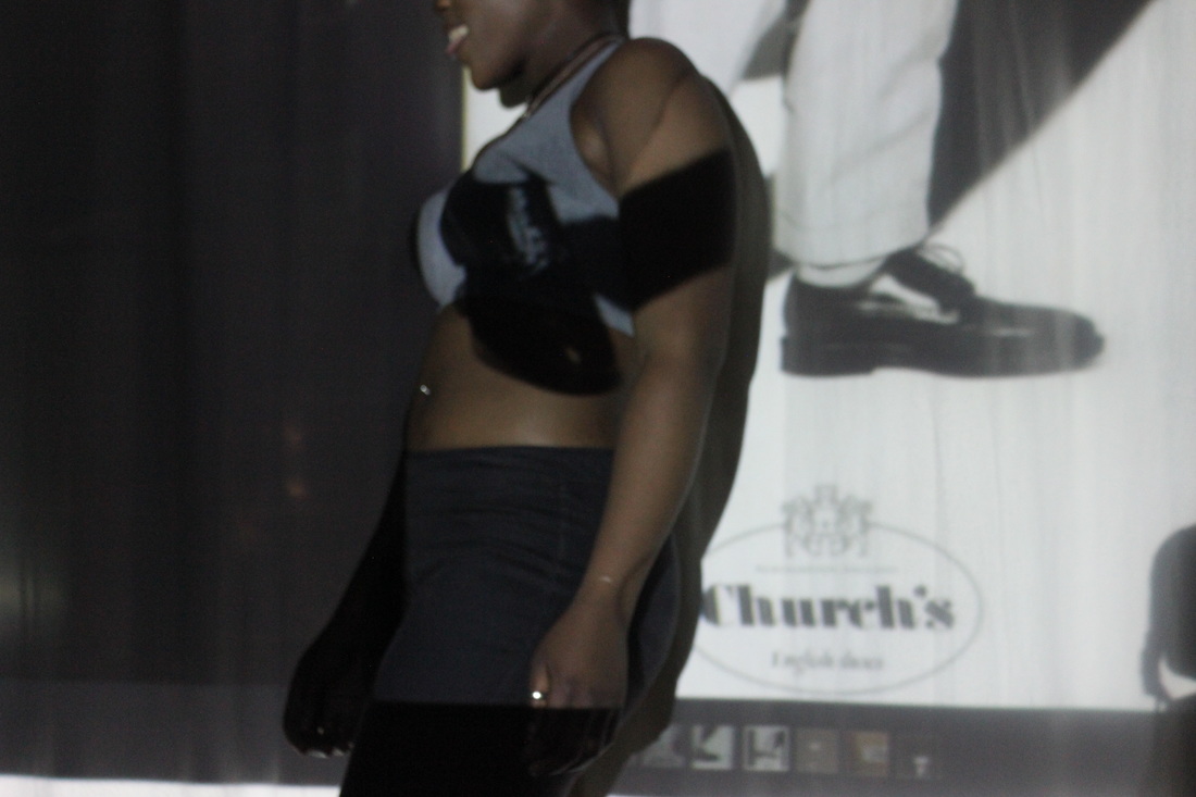


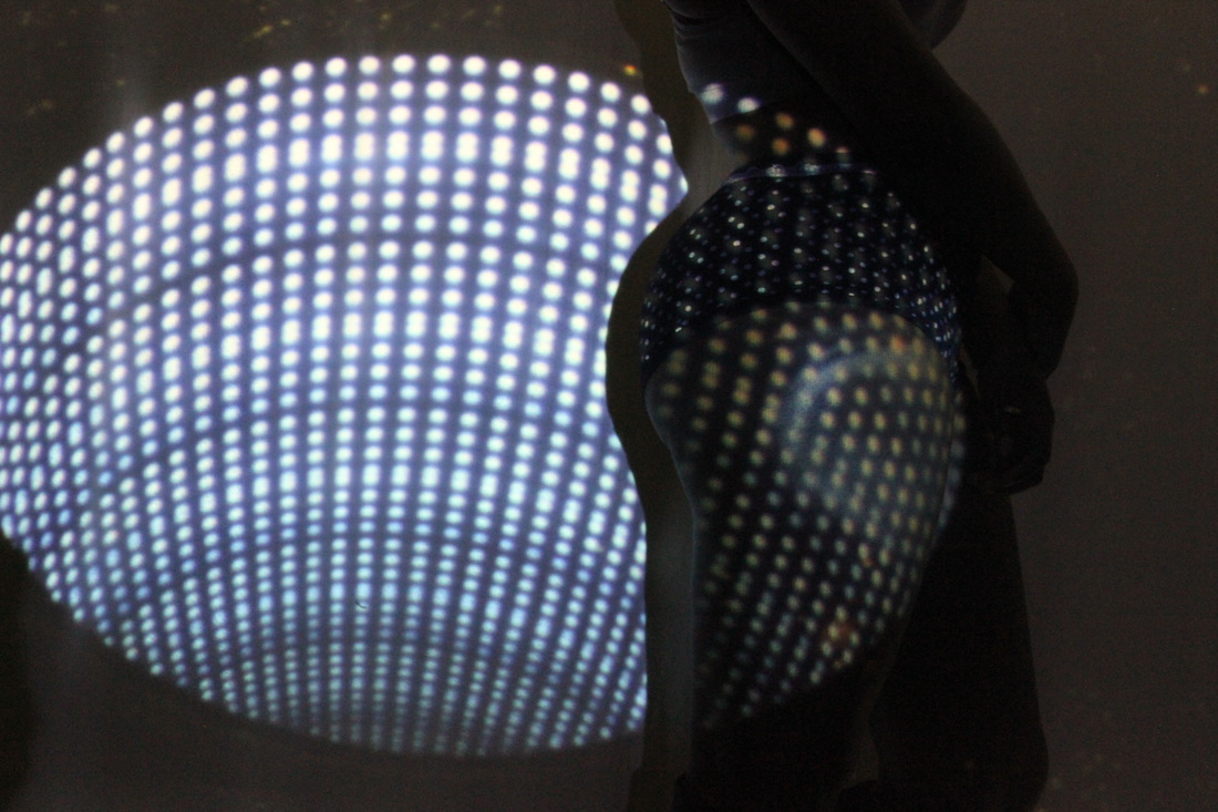
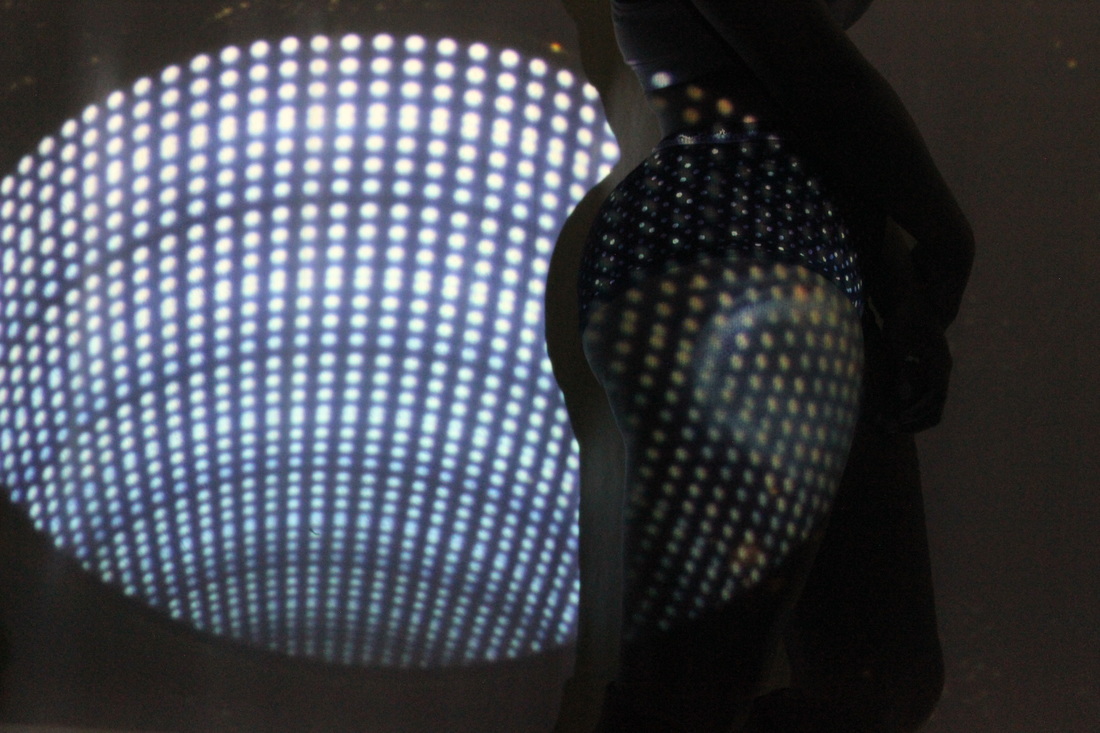
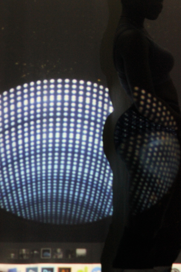
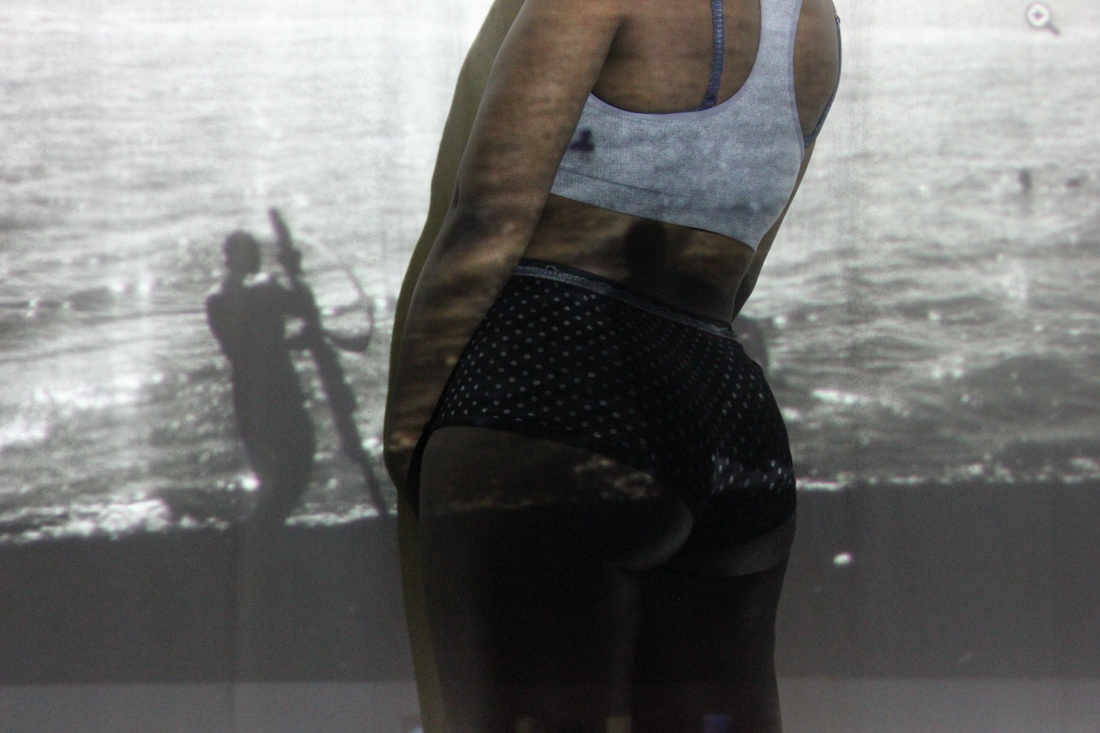
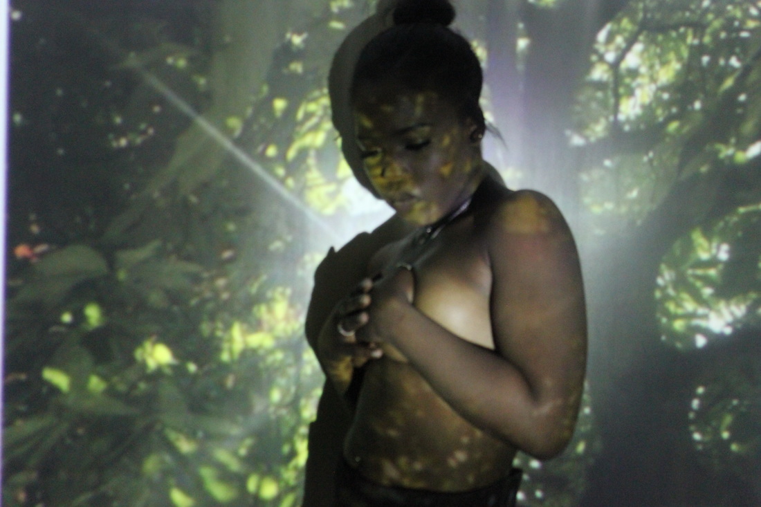
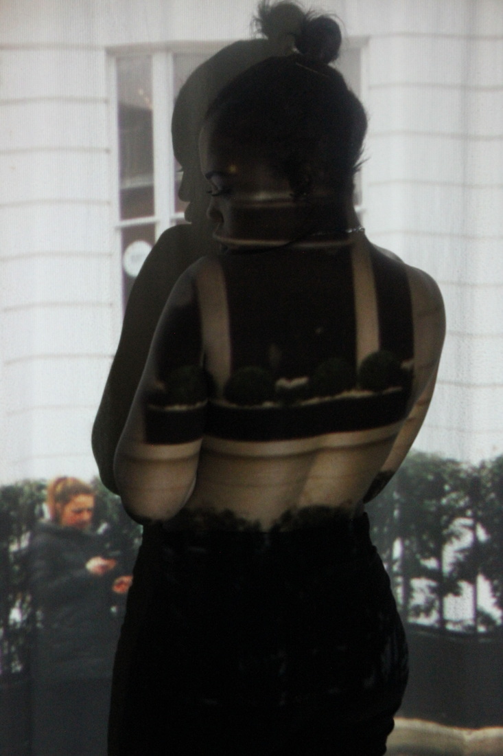
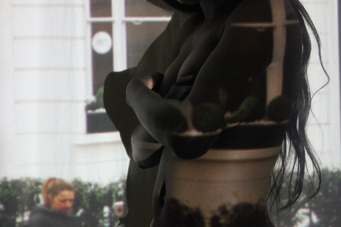
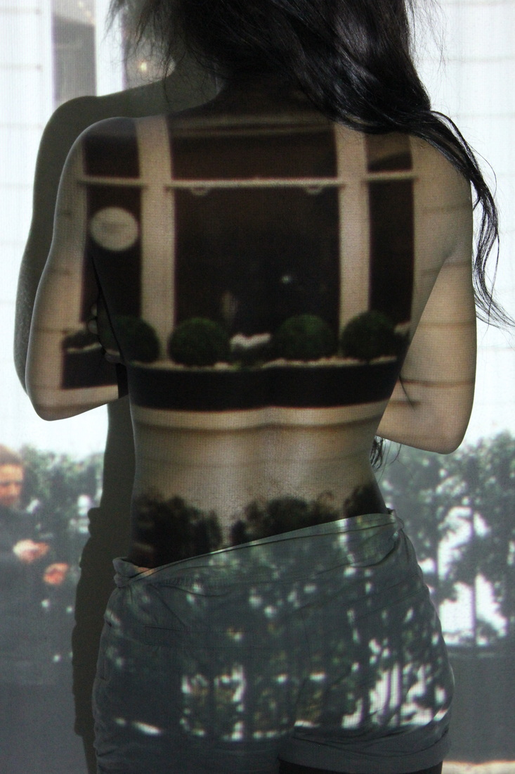
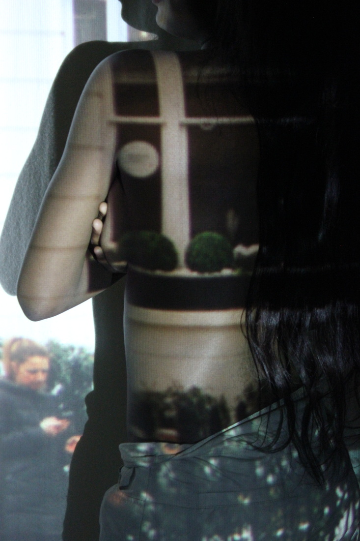
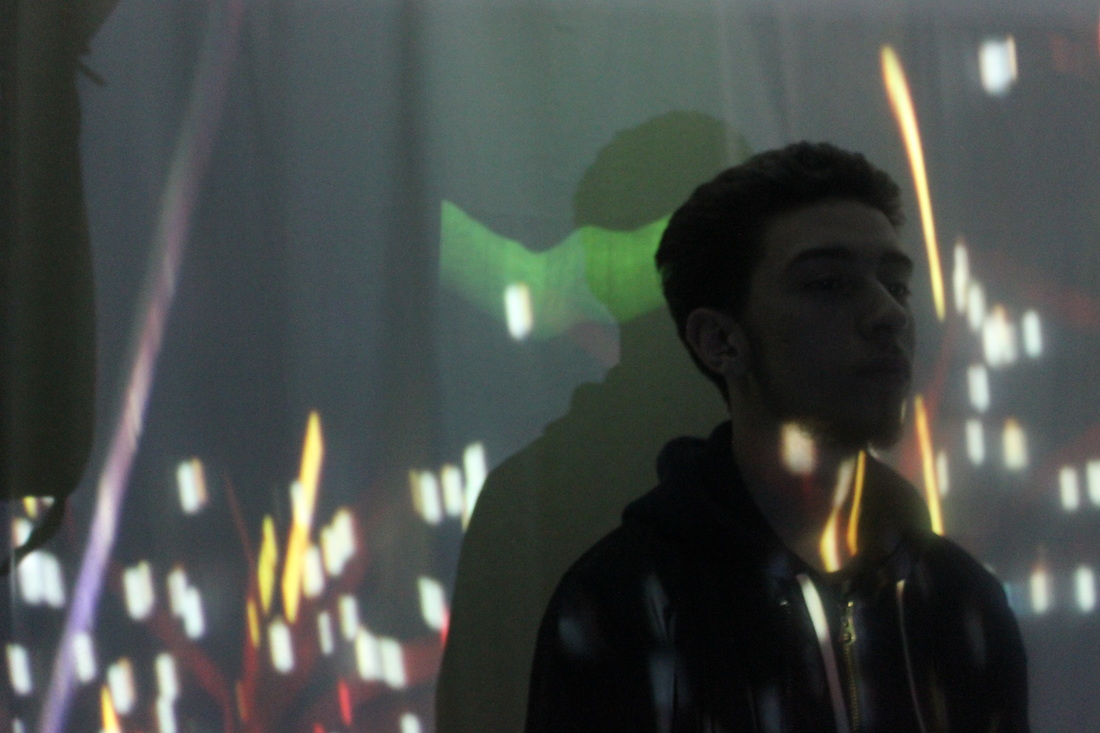
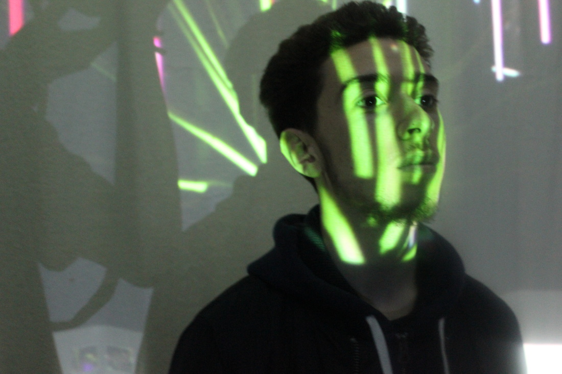
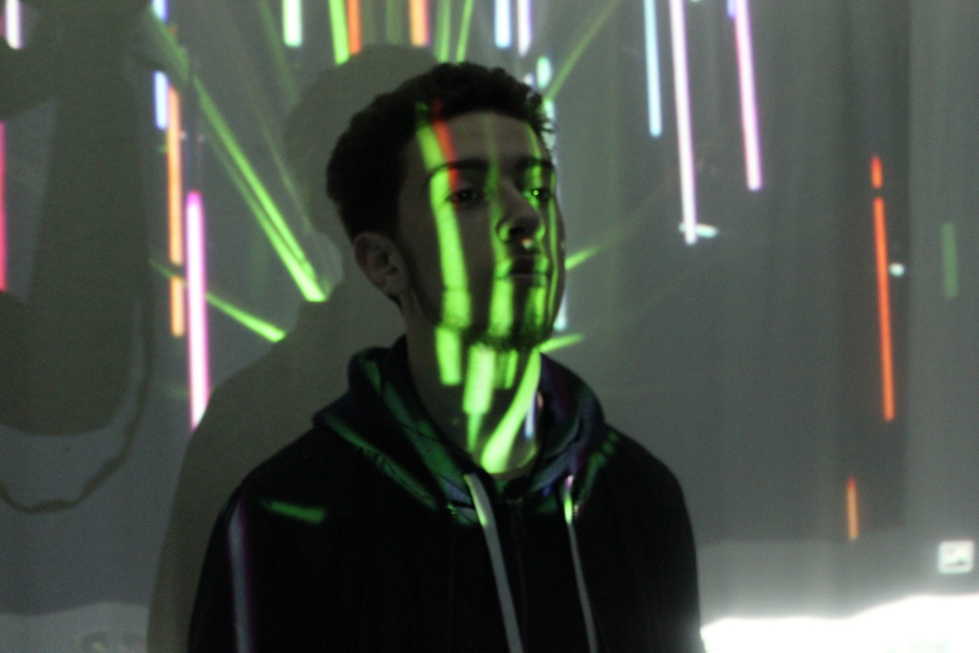
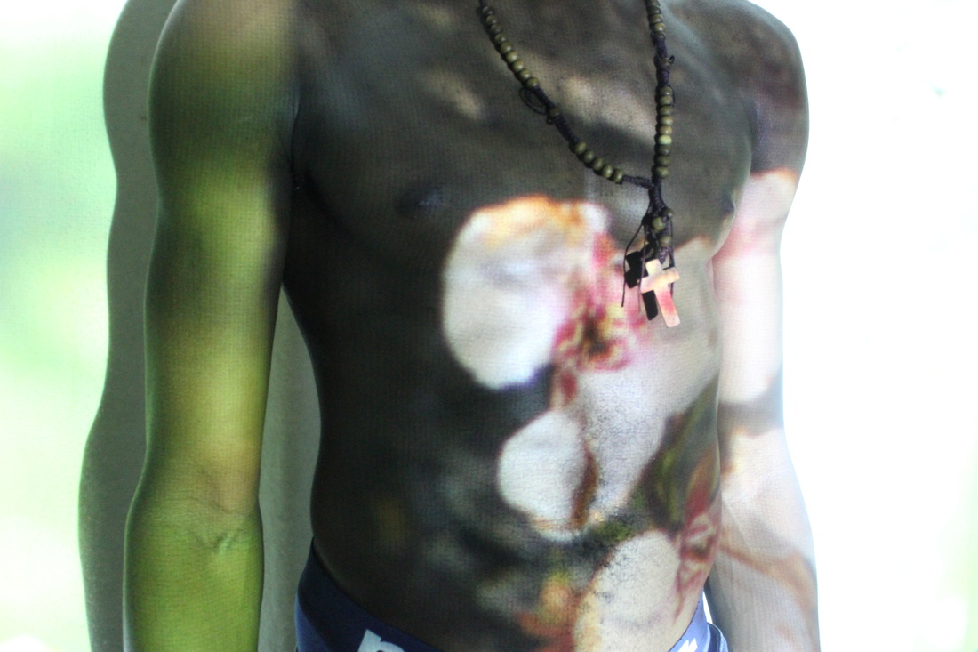
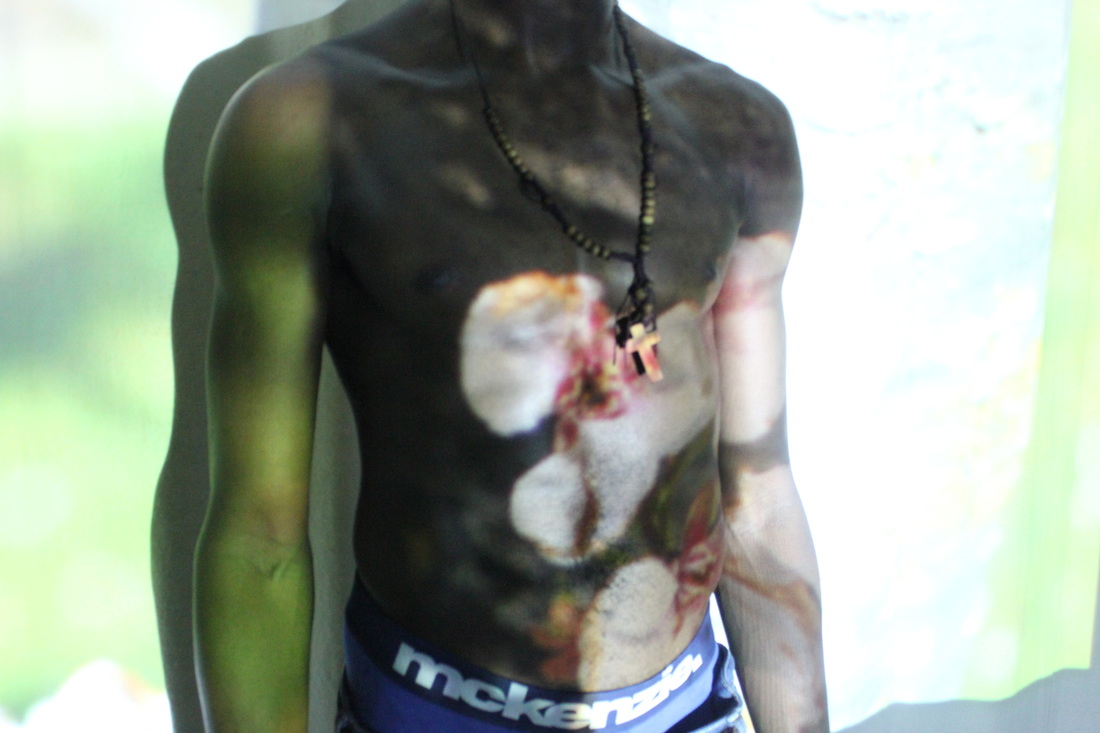
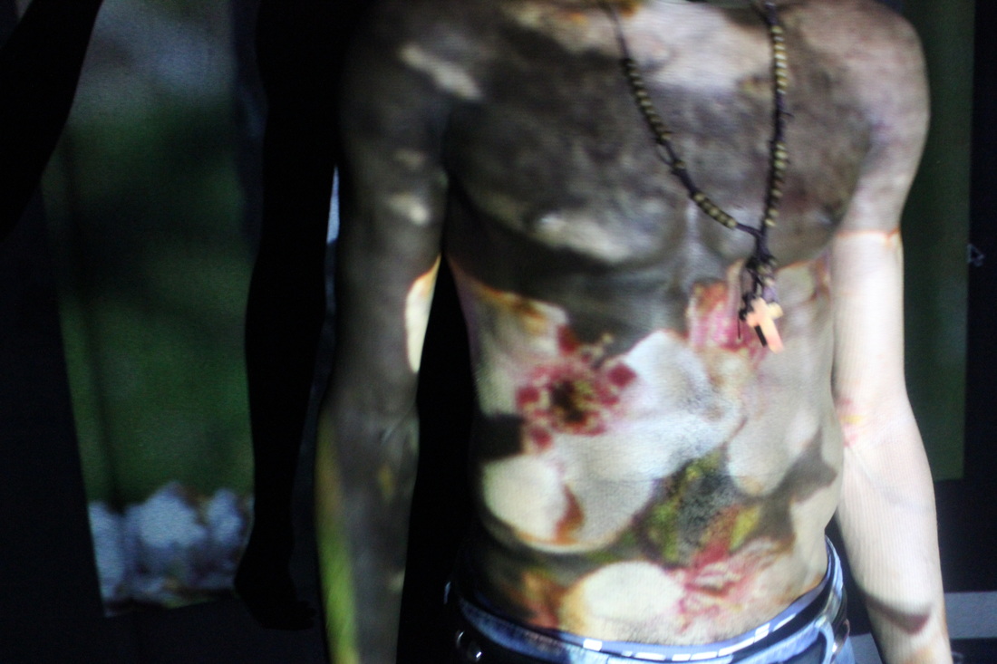
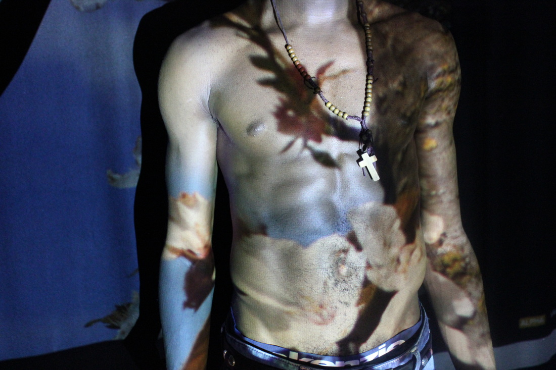
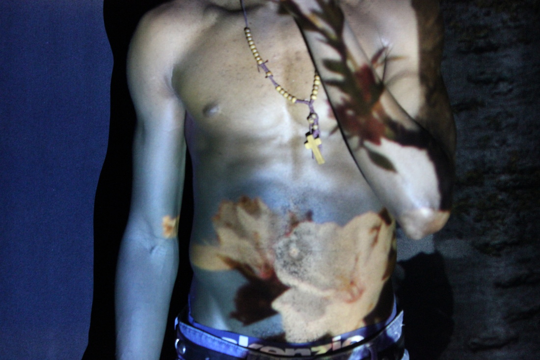
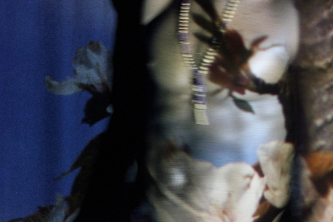
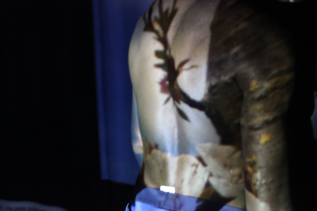
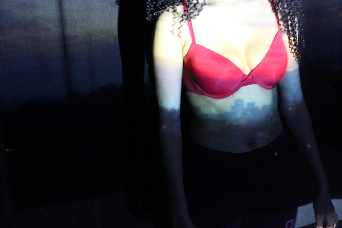
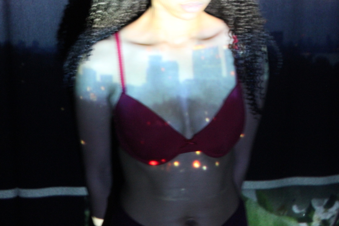
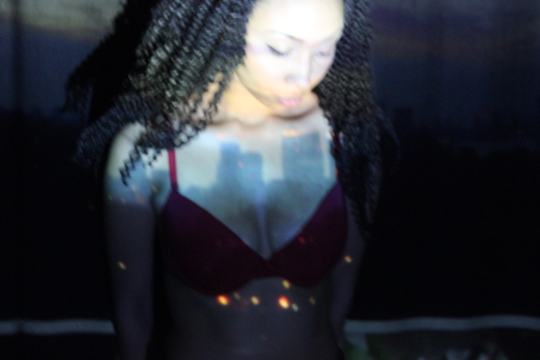
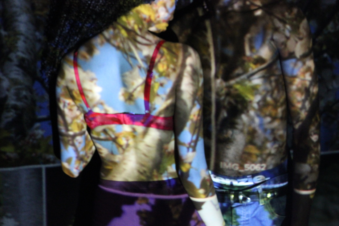
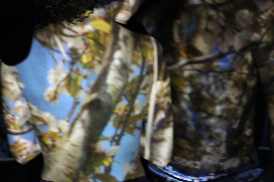
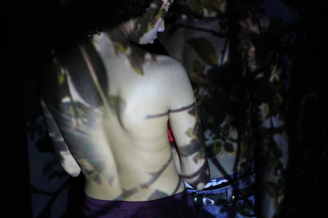
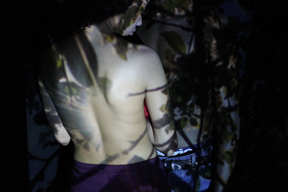
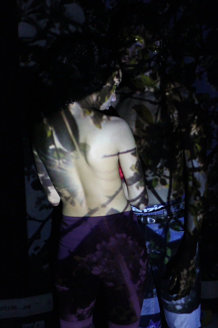
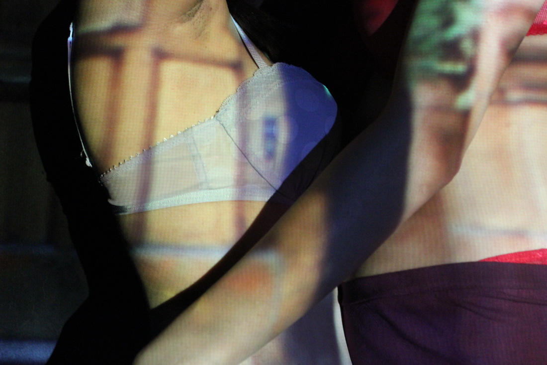
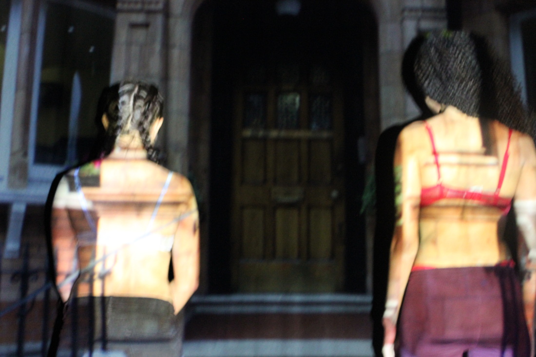
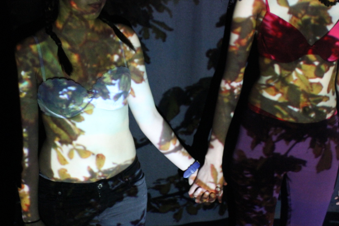
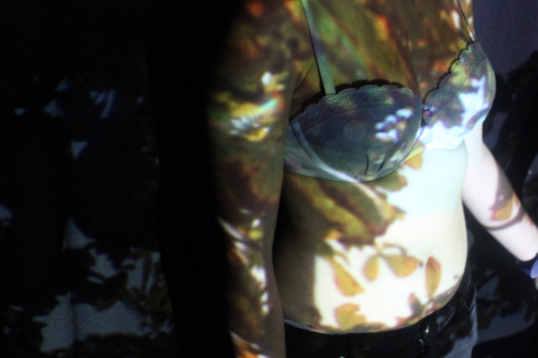
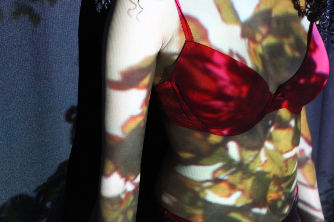
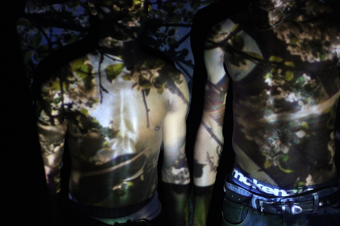
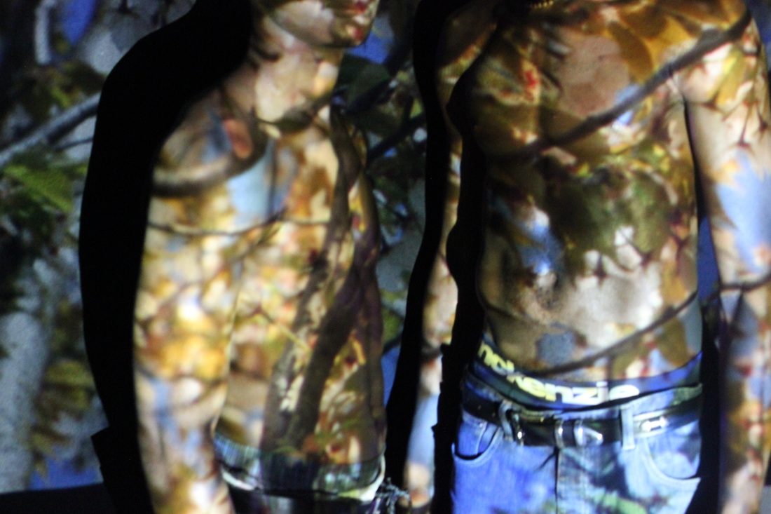
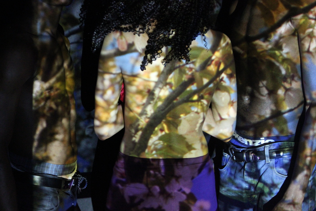
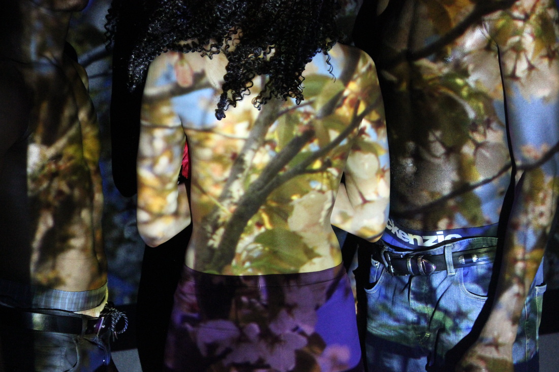
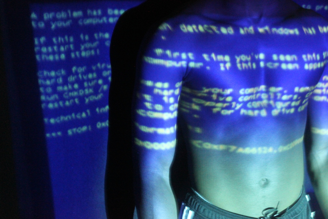
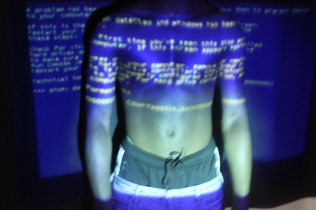
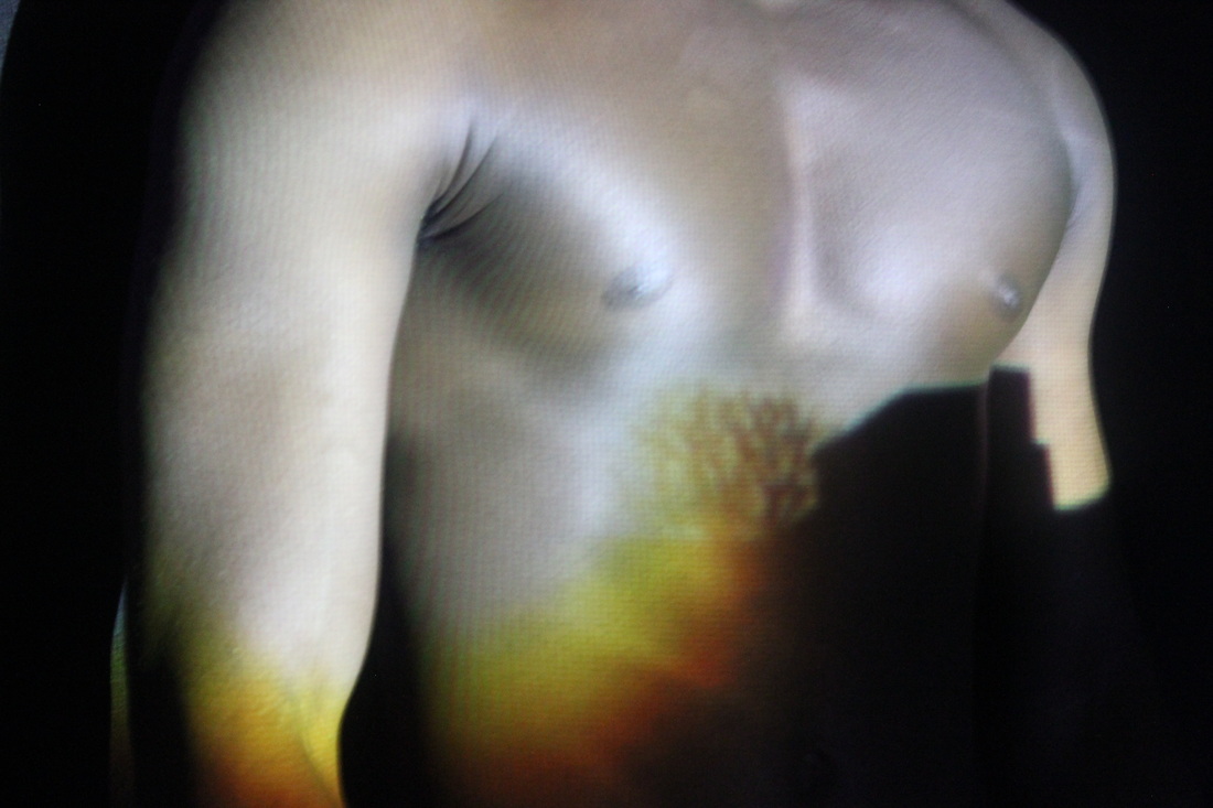
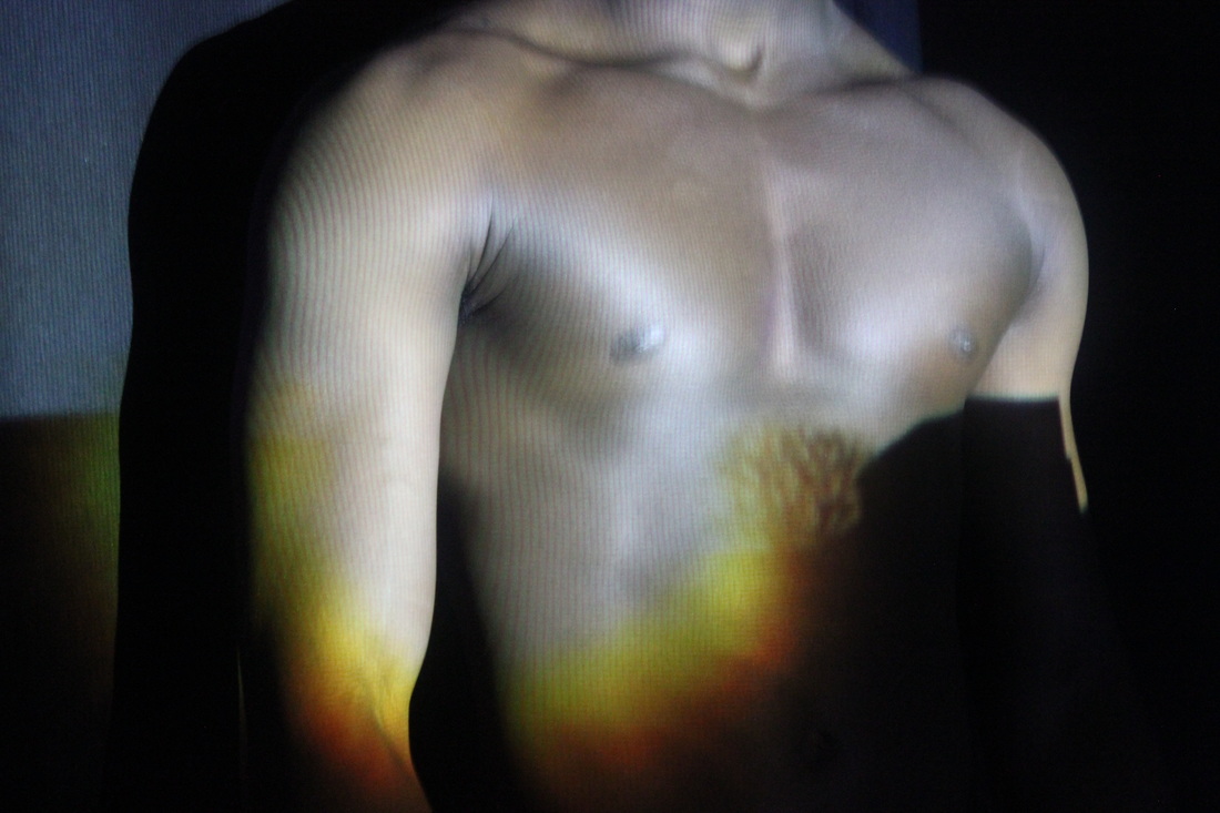
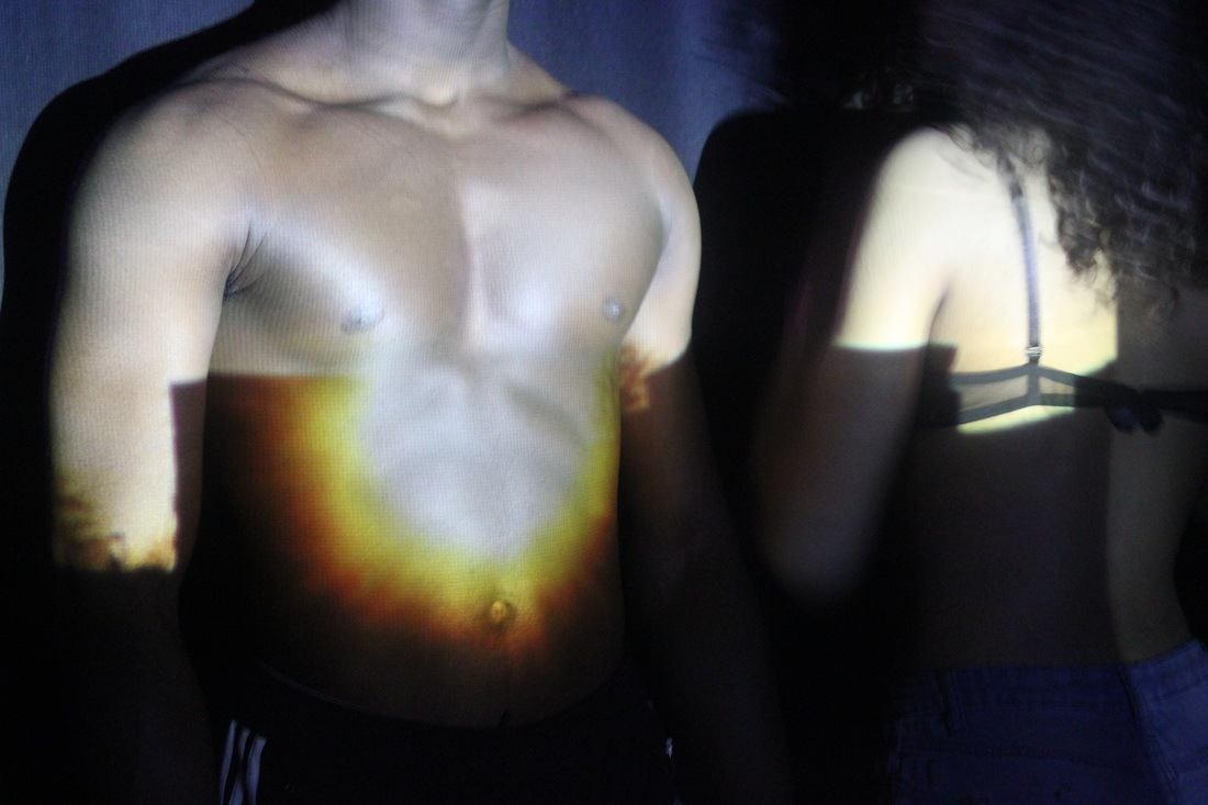
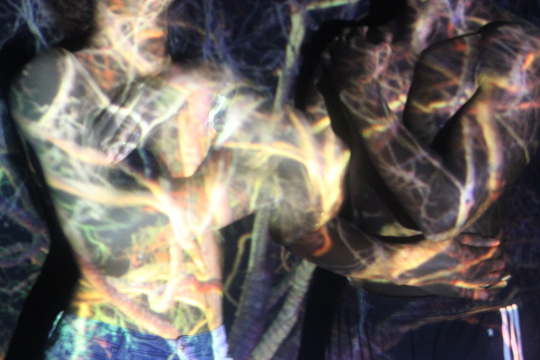
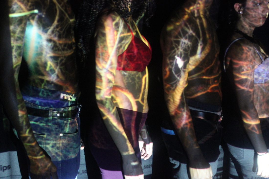
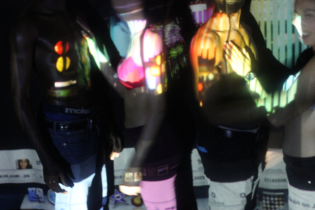
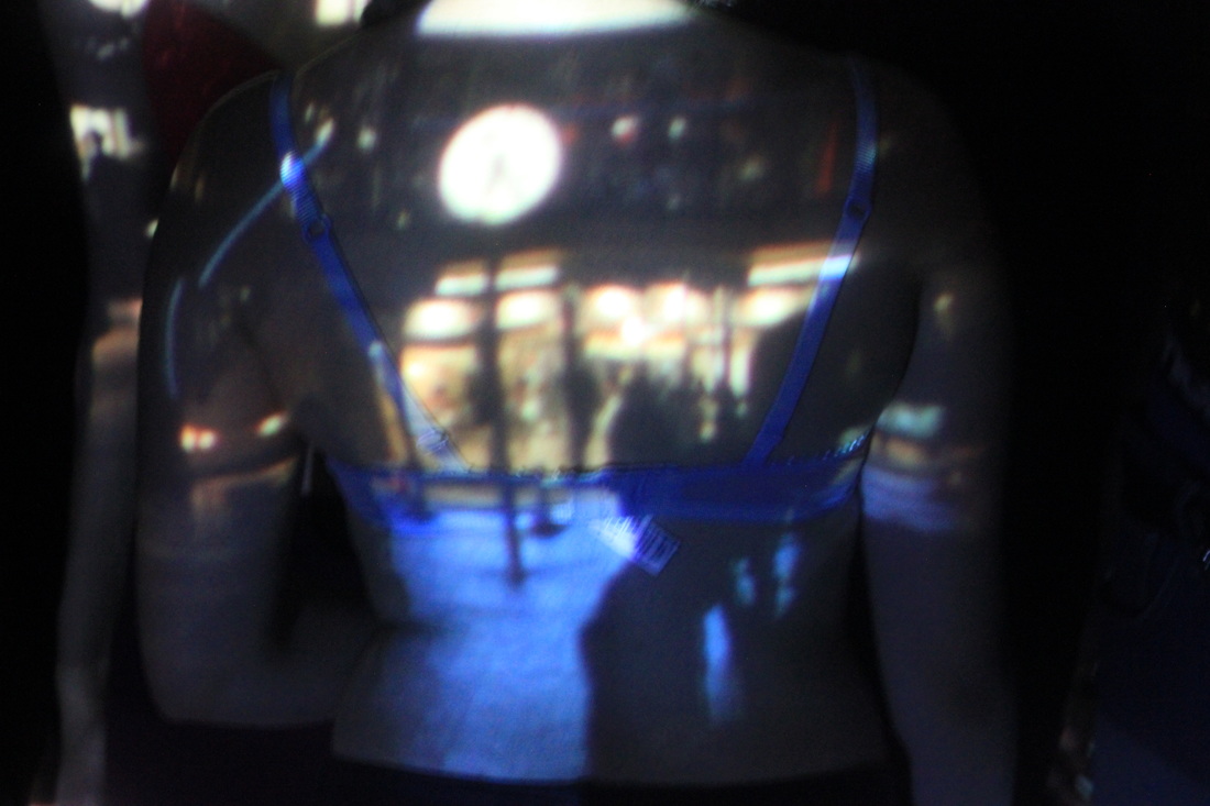
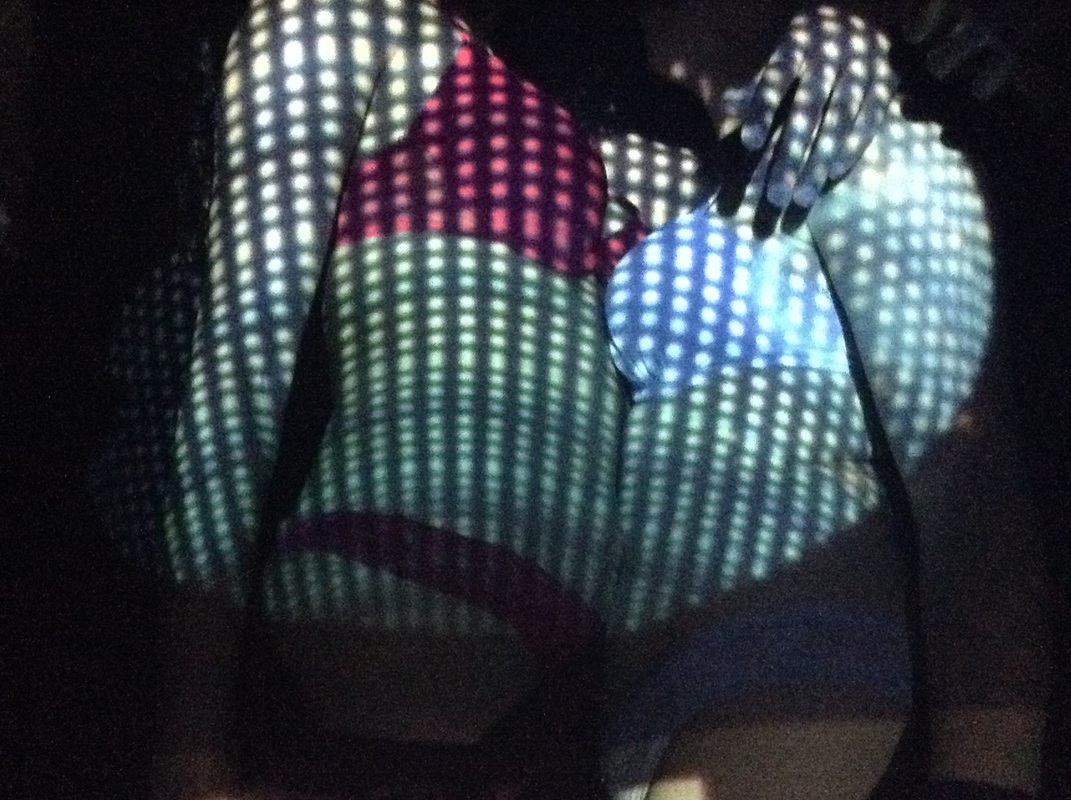
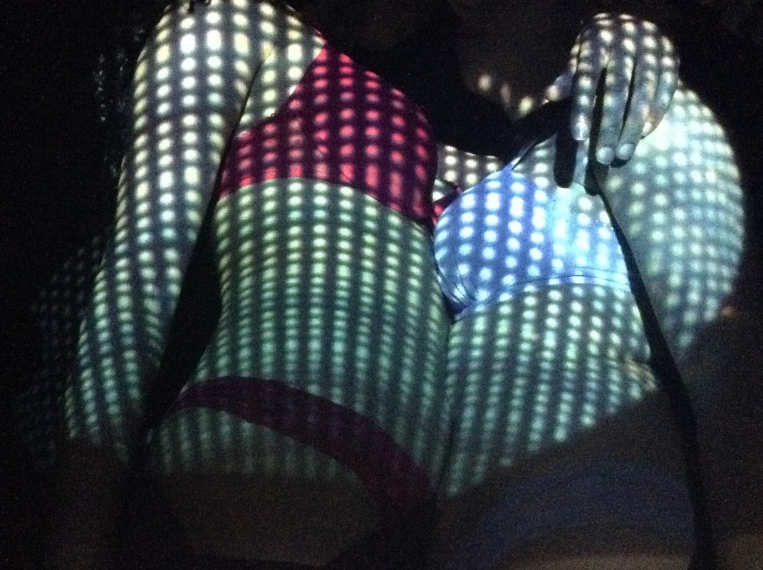
Before I had taken the pictures I had made it aware to all models that I would be posting these images onto my website and that the images will be used for educational purposes only, they had all agreed and was happy with these conditions. Most of the images I had taken didn't need editing, however the ones I did edit were all edited in the same way, using the same tools. I started by using the colour mixer to increase the intensity of certain colours, for example blue, green and red. I then used the curves tools which had resulted in the darker colours such as black to go darker while making the other colours bolder, this makes the projected image(s) more obvious on the body. Because most of the models didn't want to be identified through the images I had taken of them I had experimented on different ways I could remove their face out the image(s) without cropping, this was all done in photo shop. After some research I had decided it was either me removing the eyes by putting one solid colour in it or removing their facial features, however for some images for example the one on the right it was quite hare to remove certain models faces therefore I came to the conclusion that depending on the image and how the models faces look I will vary on the ways on how I will remove them.
|
|
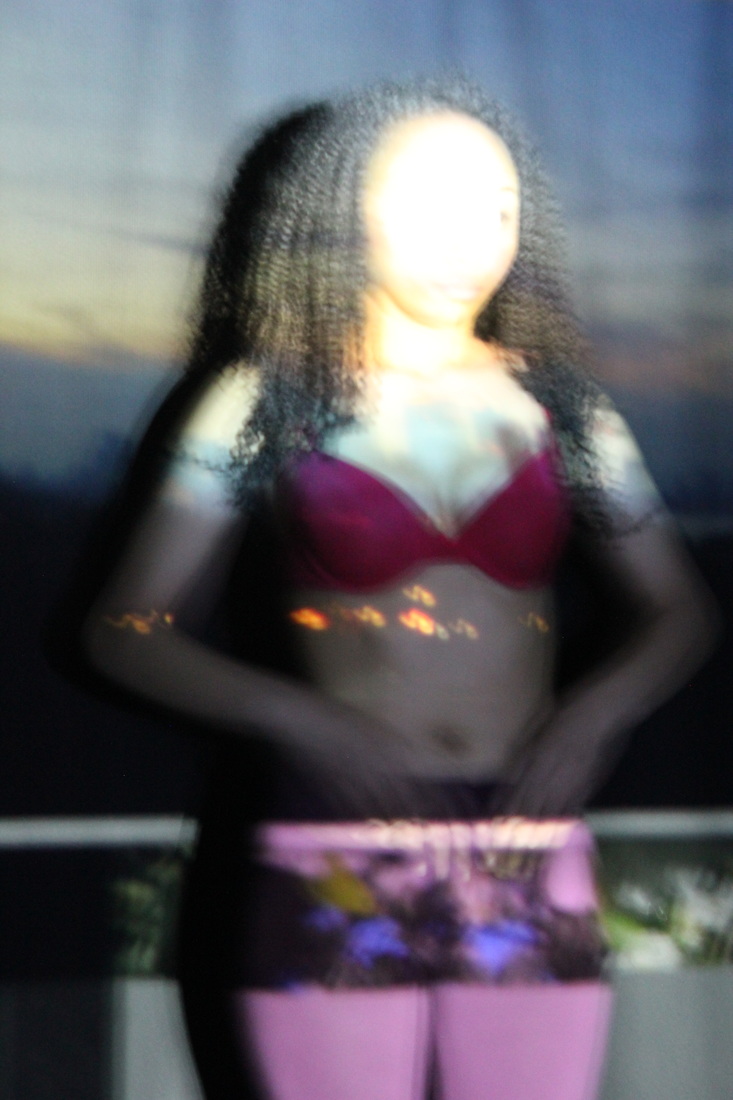
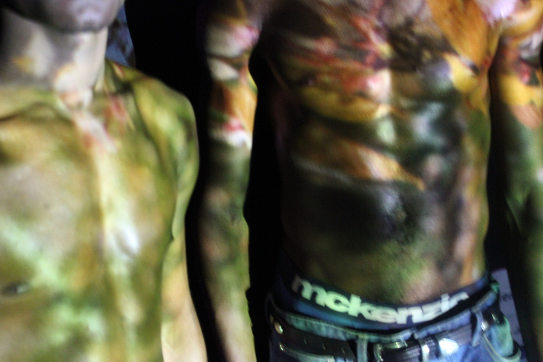
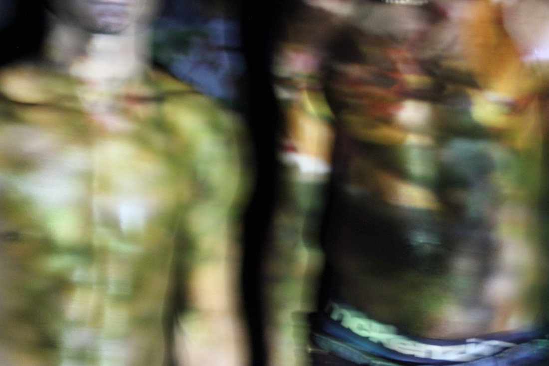
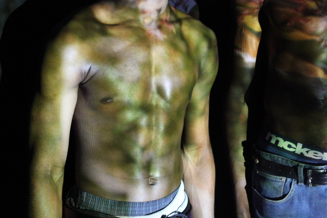
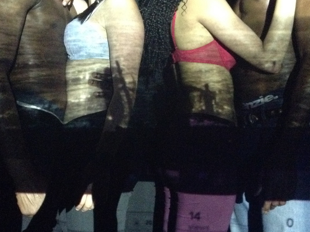
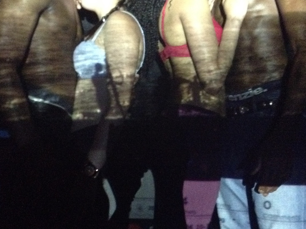
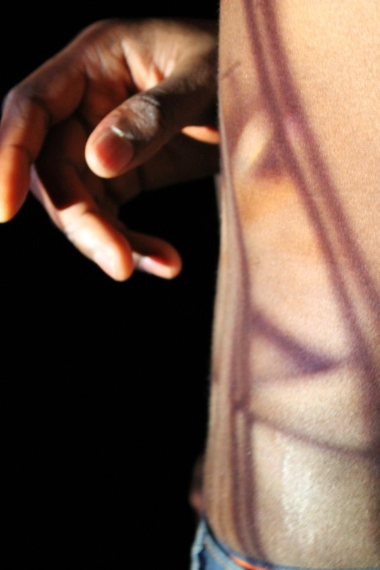
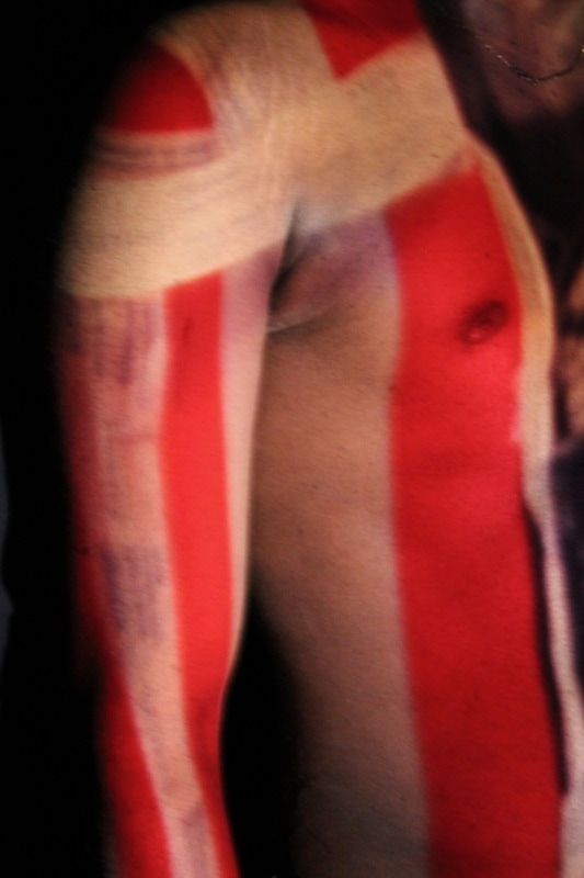
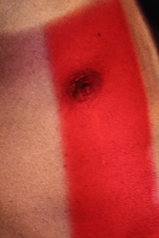
Below are the images I had felt needed editing from the first photoshoot.
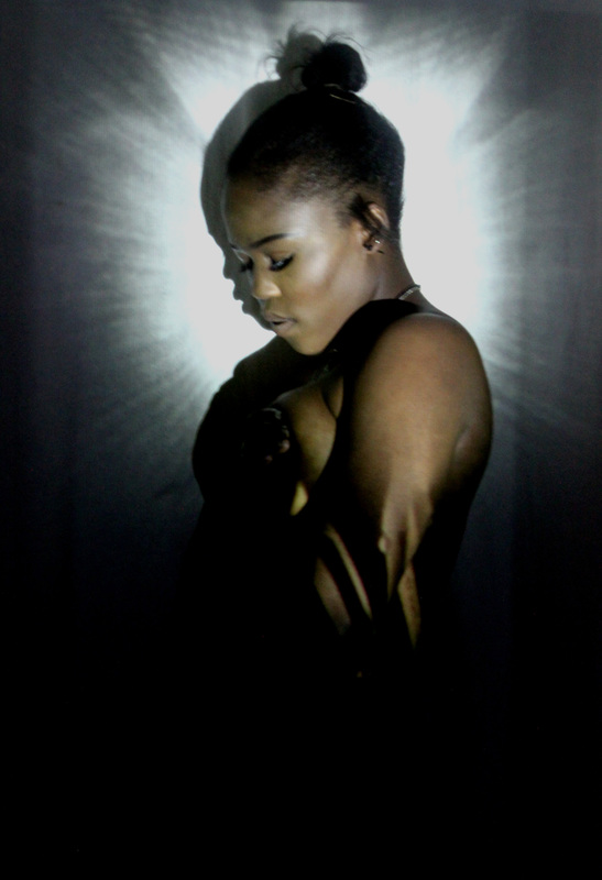


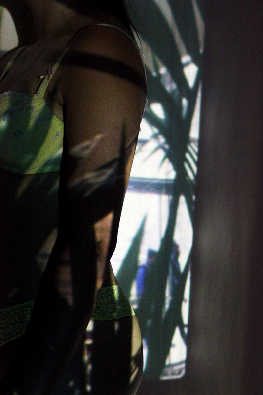
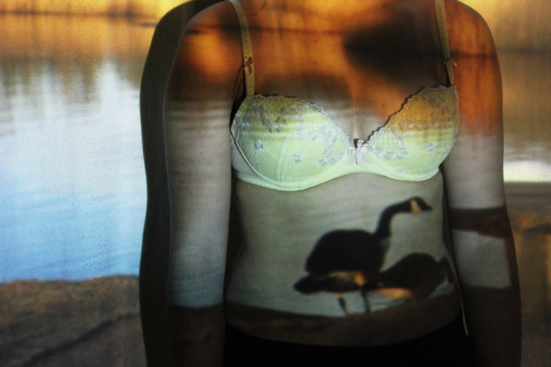
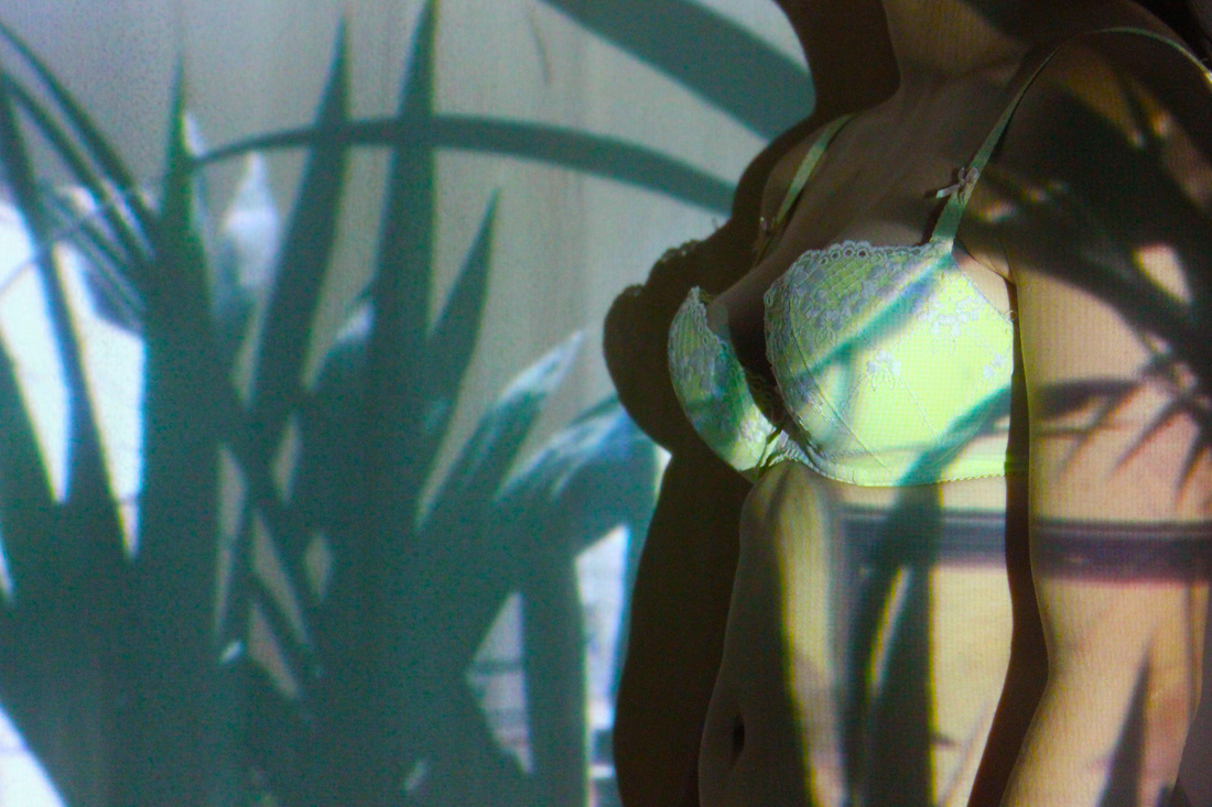

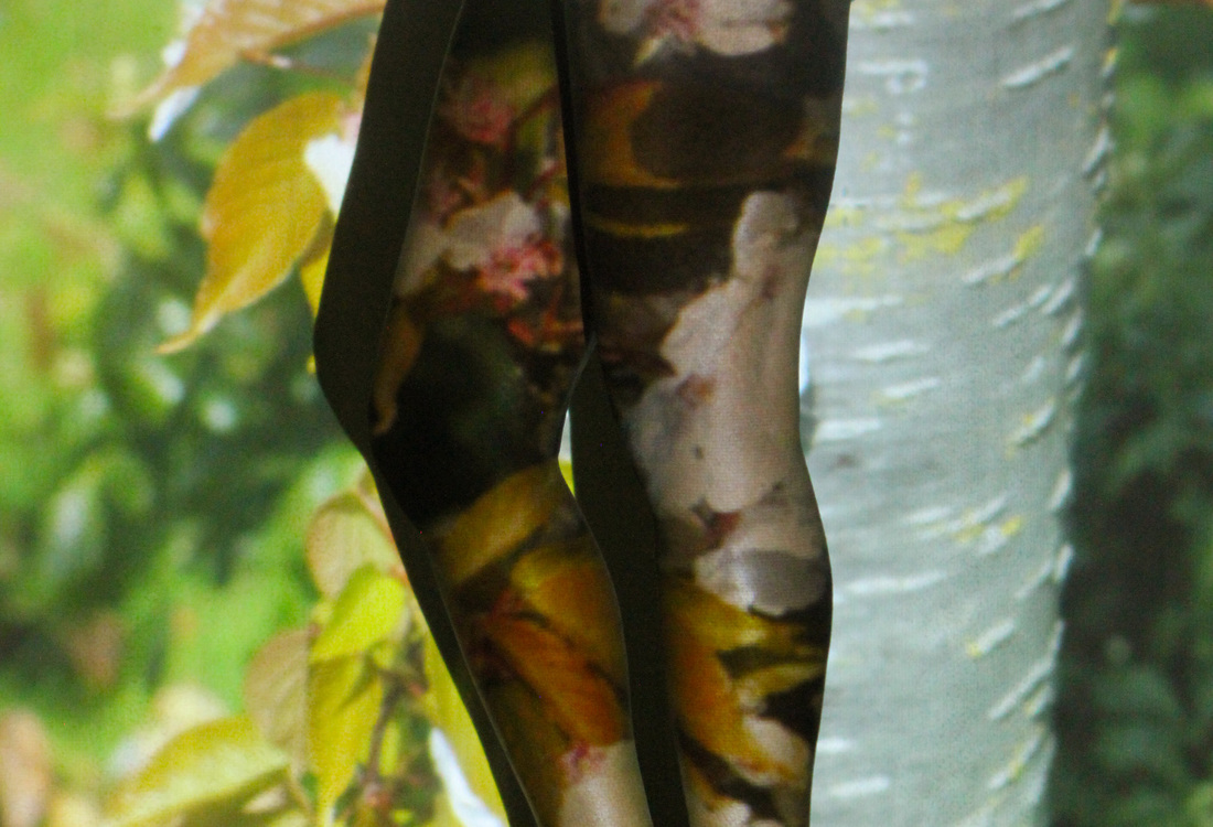

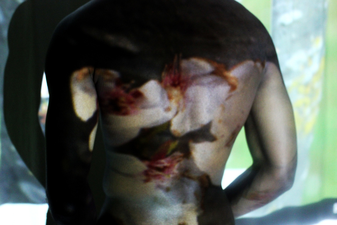
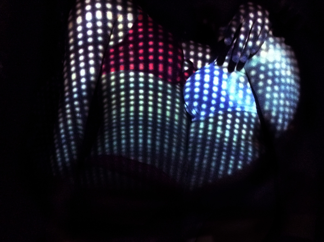
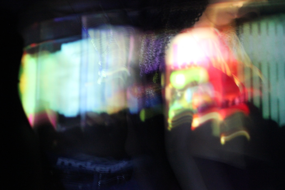
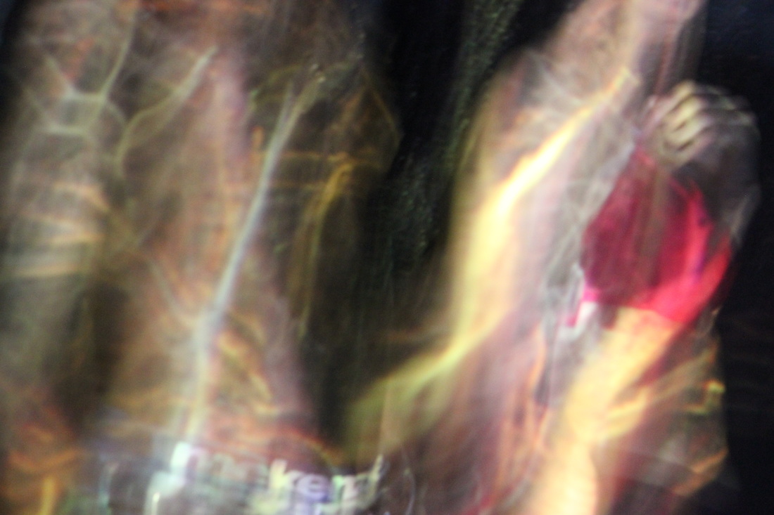
I'm happy with how all of these images came out, from the photo shoot and the final product (s). I am positive that I will be using these for my final pieces. However to improve them I could try and take some of the images in focus because I know a lot of them had came out blurry; as well as focusing on the lighting and the angles at which I take the images, for example in some of them you can either see my hand, the tripod or even the cameras shadow.
Jelle Martens
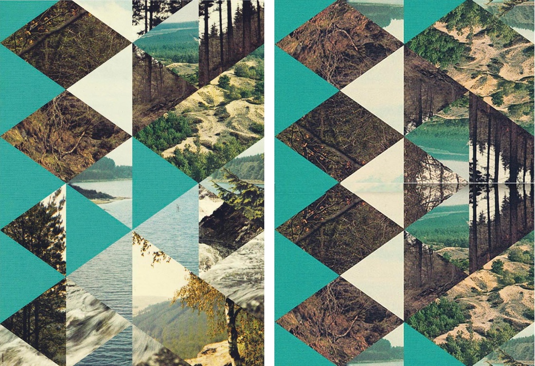
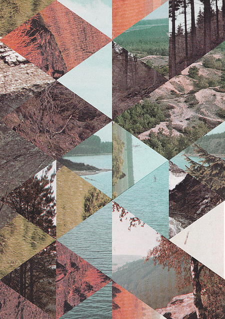
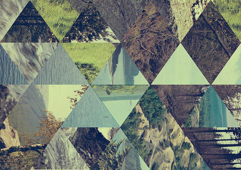
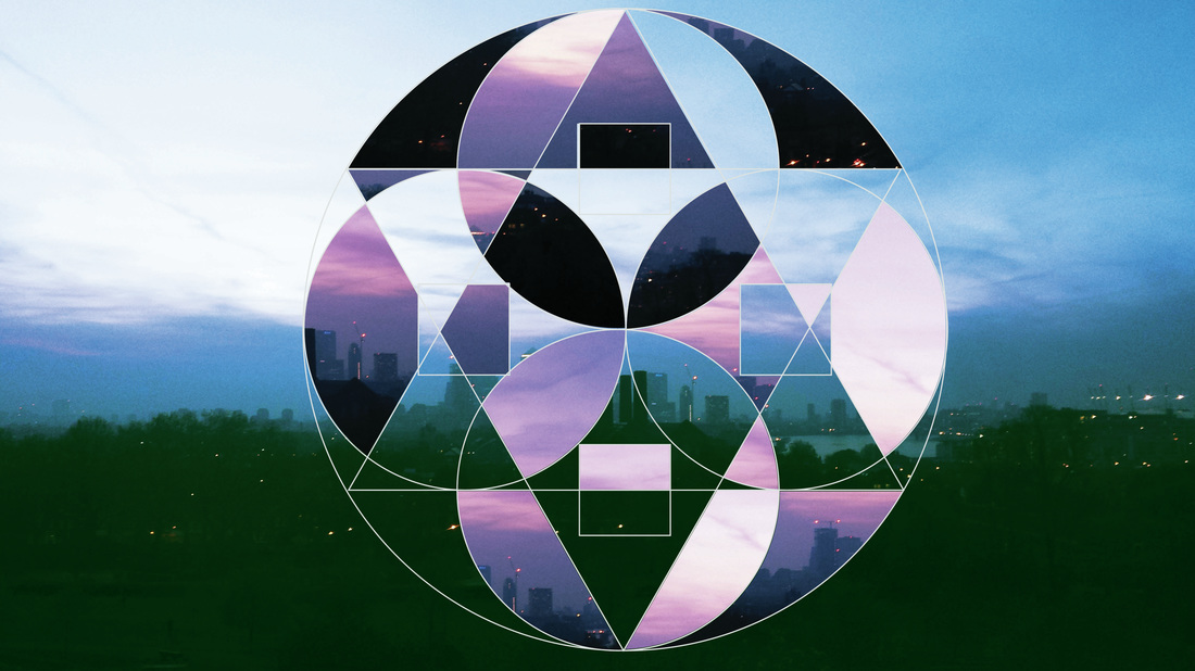
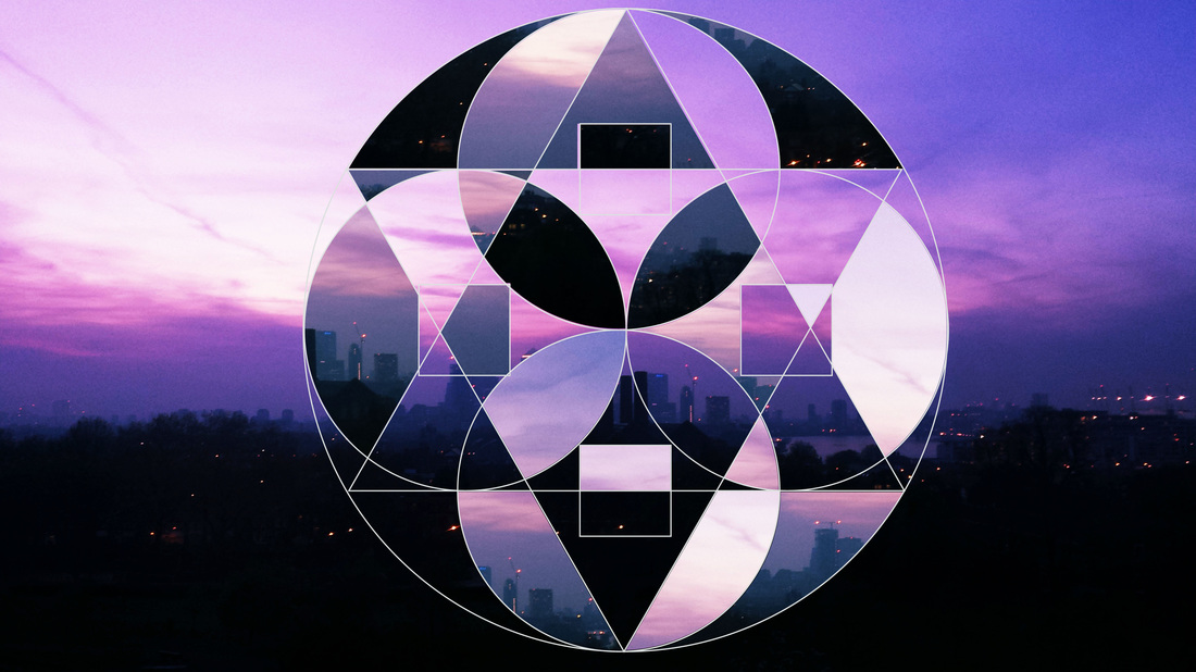
Doing further research into the 'cutting edges - contemporary college' I found another artist called Jelle Martens. Martens had created a series of images that he called 'Surface & surface', his work was a combination of strong block colours that are interlinked together into an almost grainy effect using images of nature. Below is a quote from his website, a list of what he thinks about and suggests whats his work is about and or represents.
“Shape, music, image, tone, triangle, colour, collage, paper, texture, pattern, old, wallpaper, sticker, book, illustration, drawing, graphic, pen, paper, pencil, face, beer, circle, diamond, illustrator, symmetry, geometry, black, white, light and contrast.”
“Shape, music, image, tone, triangle, colour, collage, paper, texture, pattern, old, wallpaper, sticker, book, illustration, drawing, graphic, pen, paper, pencil, face, beer, circle, diamond, illustrator, symmetry, geometry, black, white, light and contrast.”
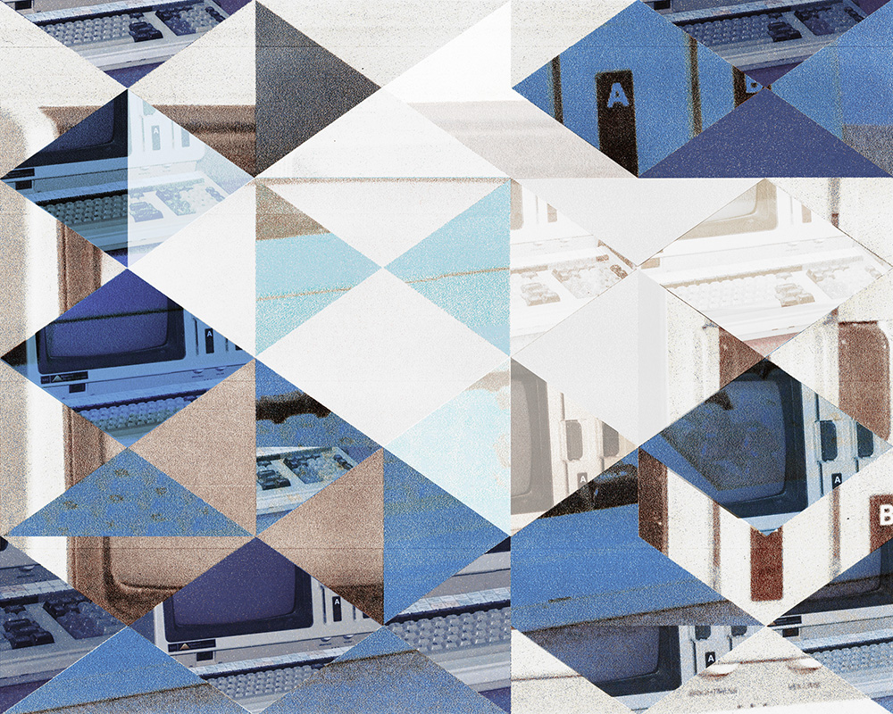
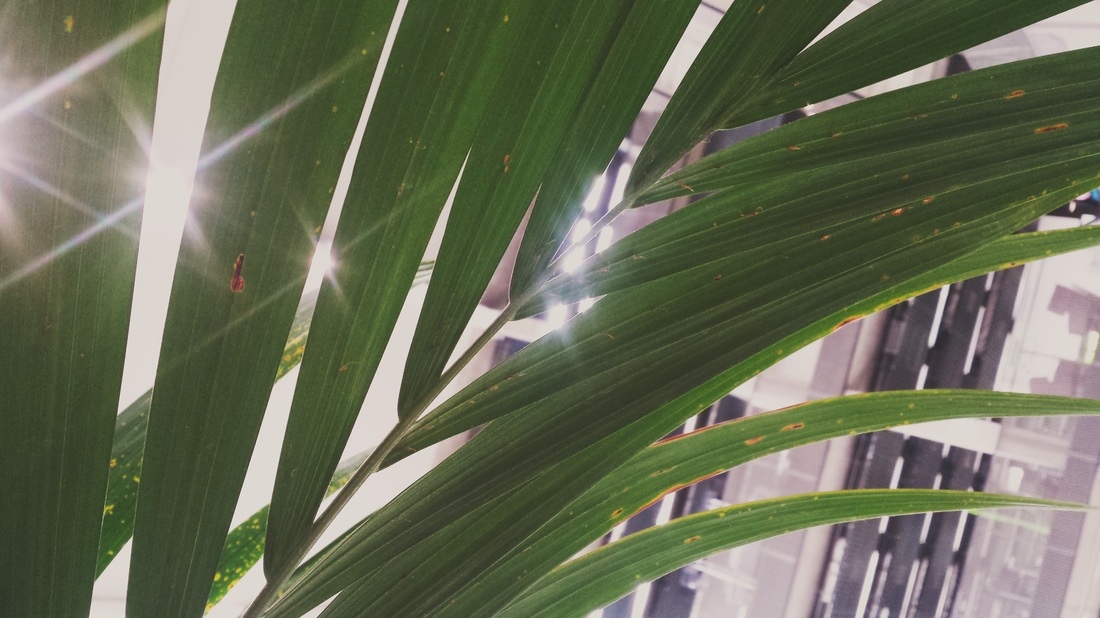
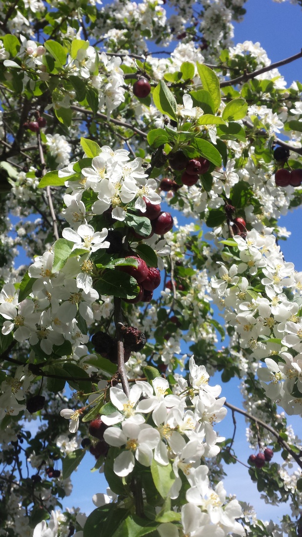
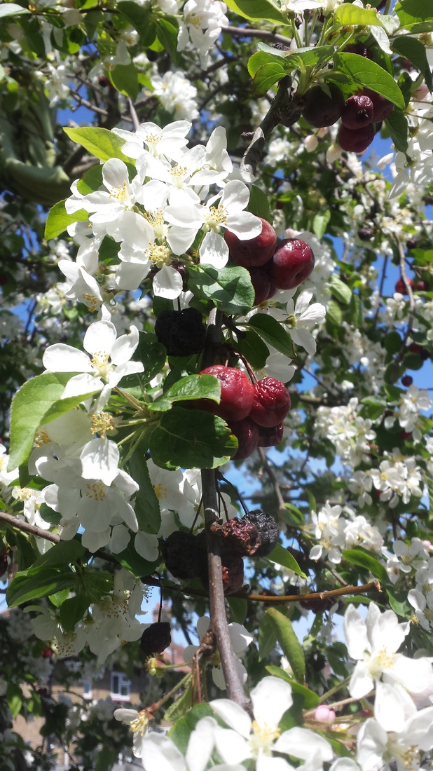
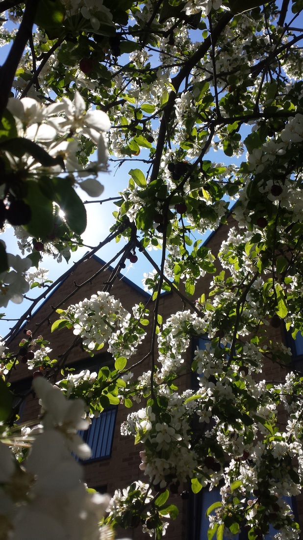
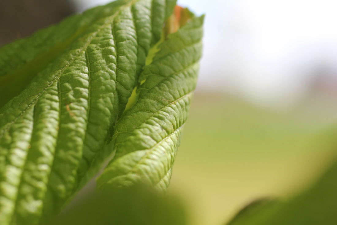
I thought that this would be an interesting type of photography to look into and to experiment with. I don't normally edit images with blocks of colours, or even layer them with other images so to start off I took a series of images of organic substances such as grass, plants, flowers etc. to start me as a base of how I'm going to start a response to Jelle's work. These are the same Images that I had used for my first projections photoshoot, I believe that these images would coincide with the response I'm going to do for Jelle Martens work.
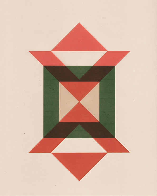
I think that the easiest way I could edit my images would be on photoshop, so I had started by planning what bold colour I wanted to put on one of the images I had take from the gallery above. Once I opened up the application I had used the gradient tool to make an ombre affect

|

|
of blues and turquoise. Ideally I wanted the colours that were going to be bold to have some correlate to my image for example, if I use the image where the plants are a bright green and the sky is a bold blue I would use those two colours because they are more dominant within that image, however I might want to use a colour that may not coincide with it making it more bold. This would be part of my experimenting stage to see what I like and what works well witch each of the pictures I edit. I decided to do a full page of an ombre colour because when I am making the triangles I could just use different sections of this image rather than
|
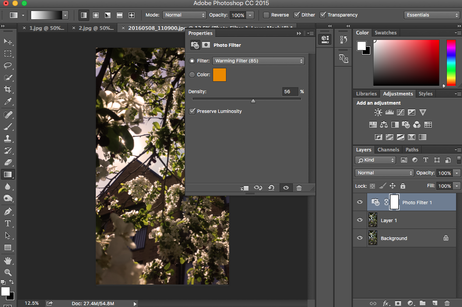
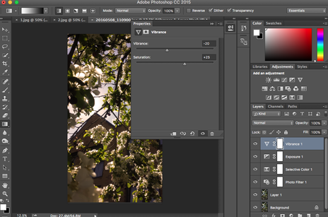
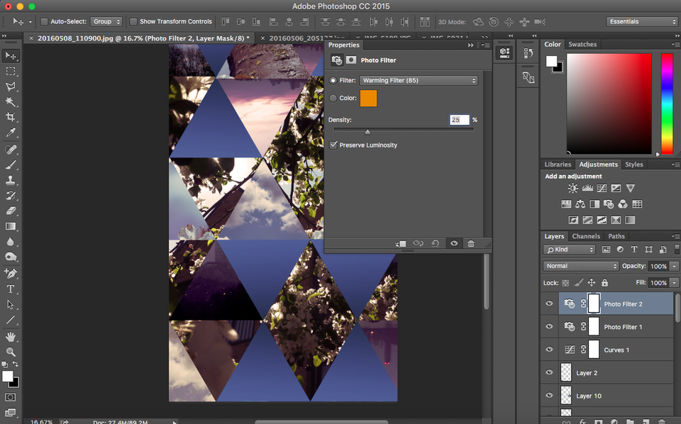
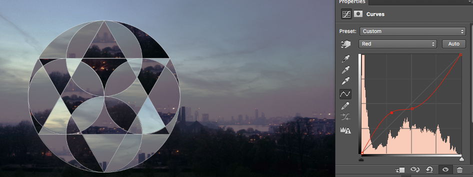
continuously going back and forth creating a new shade of one colour every time I need a new triangle. For my first image I decide to put an effect on it to give it that retro, grainy effect to it. I done this by adding a warming filter and increased the intensity by 56% to give it that urban look. I then increased the saturation of the image while decreasing the vibrance which then gave it a less warming but more cool effect to it. To get the shapes I wanted I used adobe illustrator in order to create them and dragged the shapes into adobe photoshop. I placed the shapes in the ombre colours I have previously created as well as the second image that I'm going to mix with my first image. Once I put the shape onto a favoured background I then copied and pasted it to my main image, placing it some were on the image. I done this repeatedly to create my final piece.
|
|
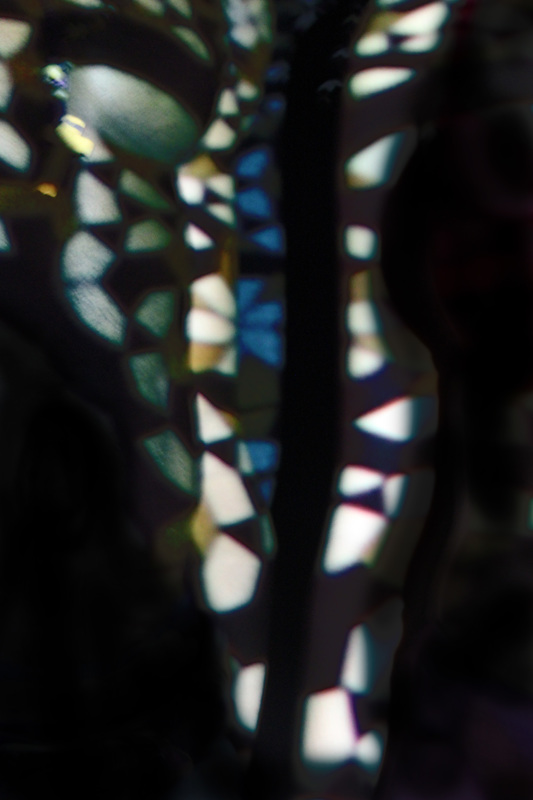
- I then decided to experiment with using different shapes, while copying and pasting them so I decided to make a pattern in illustrator and dragged it into photoshop onto my desired image.
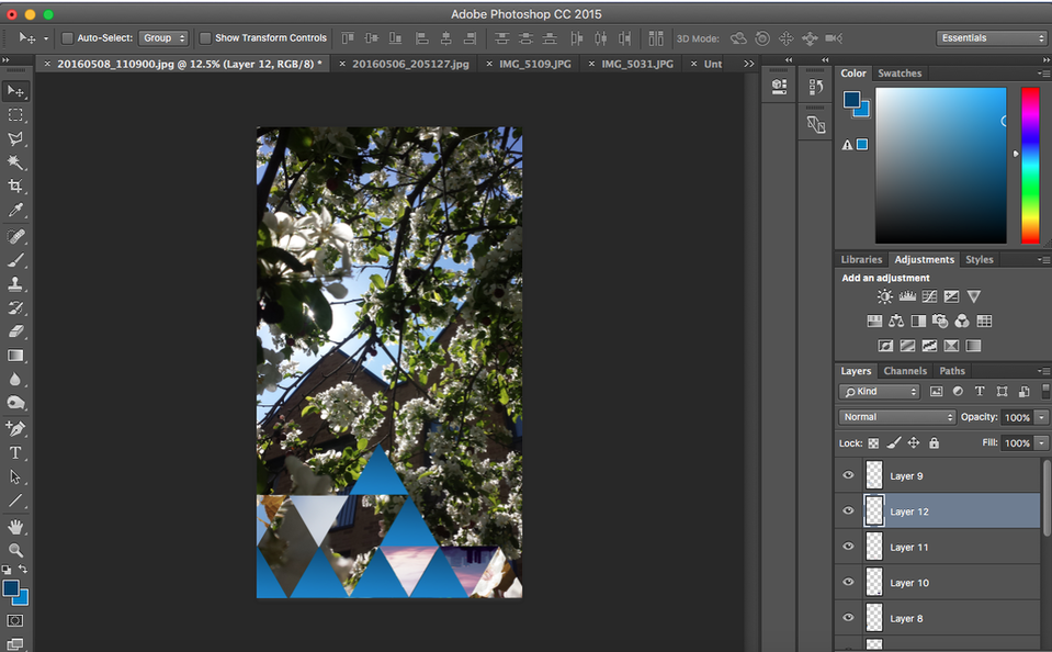
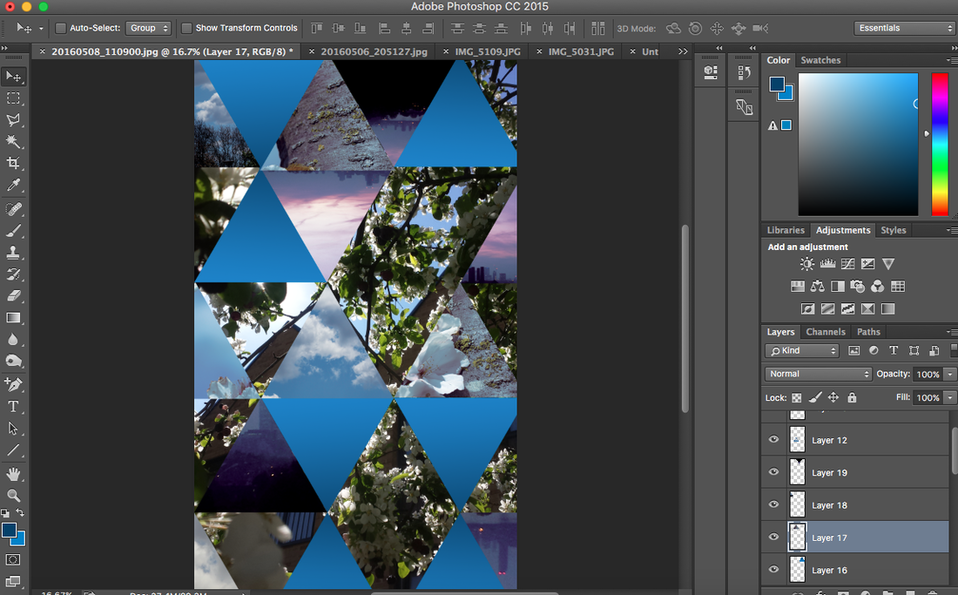
- Once I filled my image with all the different triangles I wanted to give it a urban look, so I used the curves tool and played around with the RGB settings as well as the filtering settings.
Final Outcome
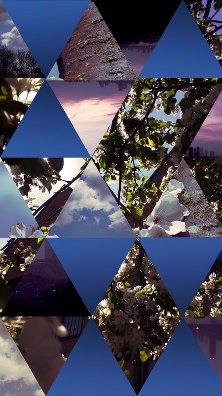
What I thought went well about this first experiment was that I liked how the final outcome was. Normally when I try experimenting with different techniques whether thats on a computer using photoshop or in the dark room experimenting with the chemicals and the enlargers, I don't really like how the first outcome looks and eventually I improve the more I do it however with this one I am very proud on how my first final piece came out. I am most likely going to carry this out for future projects because I enjoyed doing it.
Experimenting...
I wanted to experiment a bit more and decided to do the same thing however instead of using just triangles I could make a pattern with it. I created my desired pattern in Adobe Illustrator and dragged it into photoshop onto my image. From there I repeated the same steps as I had done previously.
- Use the wand tool and select a section of my geometric shape, once its selected I dragged it to an area on the original image and pressed copy.
- I then dragged the selected shape back to it's original place and pressed paste.
- I then repeated these steps selecting and changing the image of every single section of the geometric shape.
- I then used the curves too to make it look more retro and give it more of an urban vibe to it.
- Once I've edited it to how I like it I used a texture image and places it as the background of the whole image, this gave it more of an old grainy effect.
Final Outcome(s)
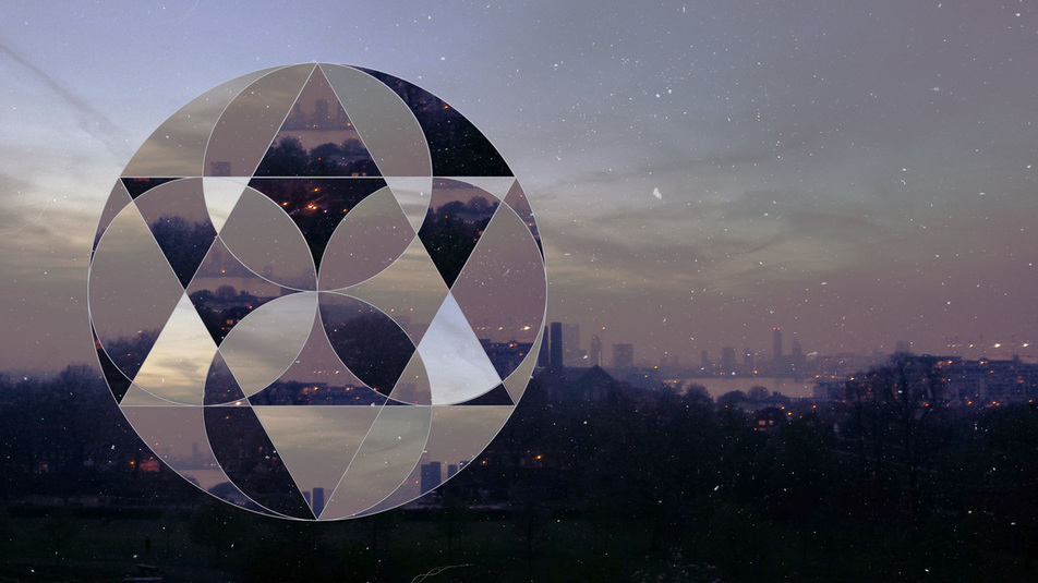
I liked how once I added the grainy background it made a huge difference, when I had experimented with the curves tool; changing the, reds, greens and blues. I'm happy with the over all look of the final image and I think it came out better than the first edit that I had done. However to improve it I cold try to use different shapes, not just circles and try to experiment more using the wand tool and the other editing tools such as levels, hue/saturation etc.
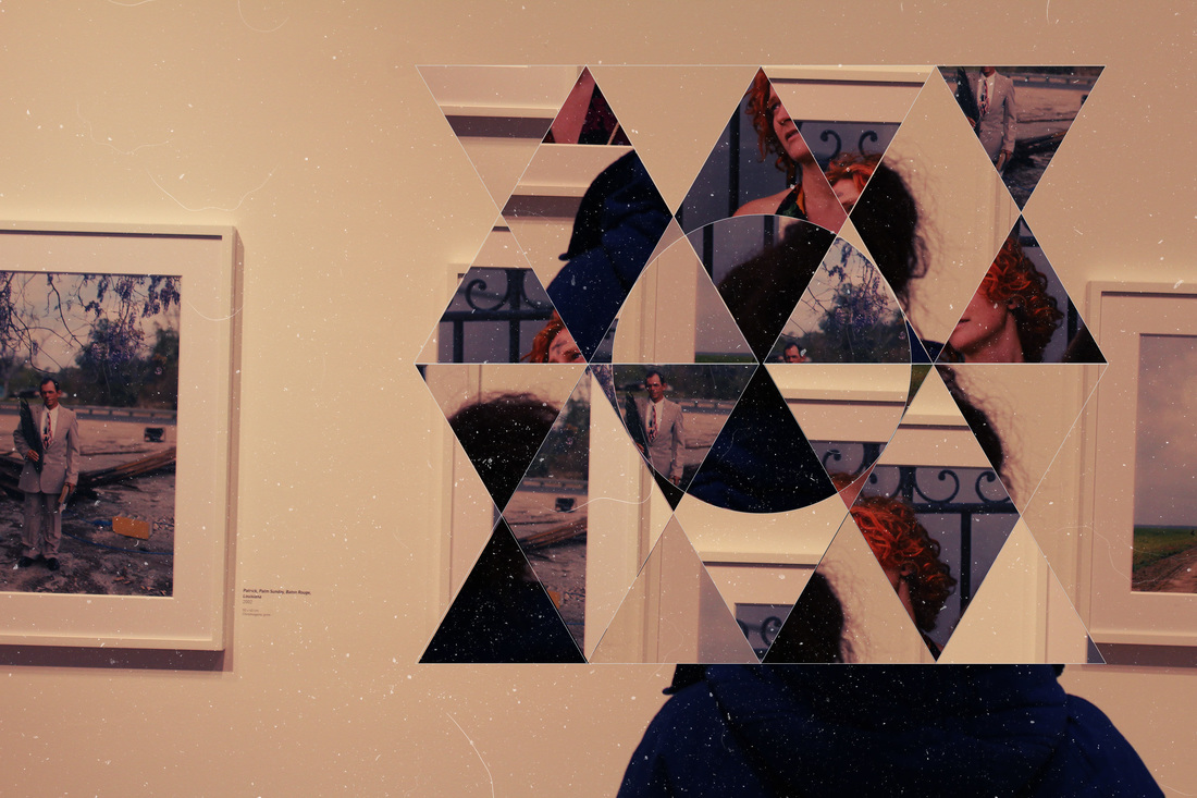
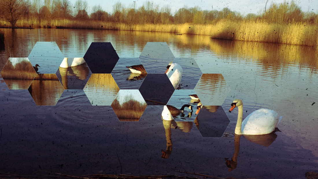
Here are some more examples I had done using different shapes but the same technique.
Here are some more examples I had done using different shapes but the same technique.
Nathaniel Whitcomb
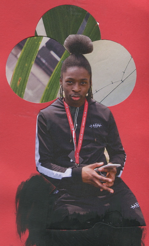
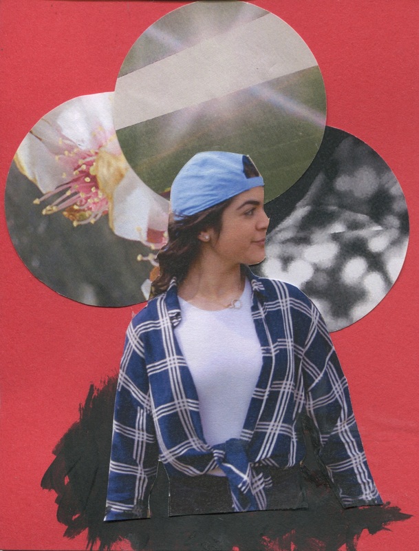
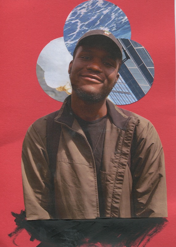
Continuing with my research from the cutting edges book, the next photographer that I had automatically took an interest with is Nathaniel Whitcomb's series of images named - Though orbs. " What began as a collage study became a study on human experience, each isolates a figure and displays one small portion of their environment, thus framing a very real moment to observe. We're able to see their thoughts, even if it is merely a millisecond as they survey their surroundings."
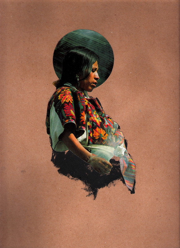
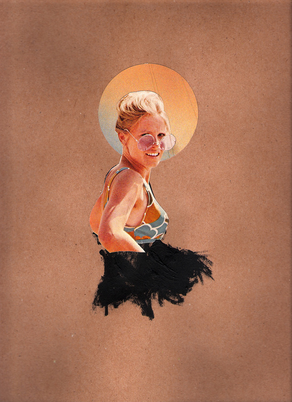
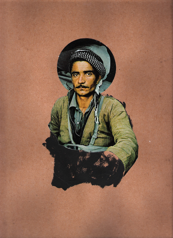
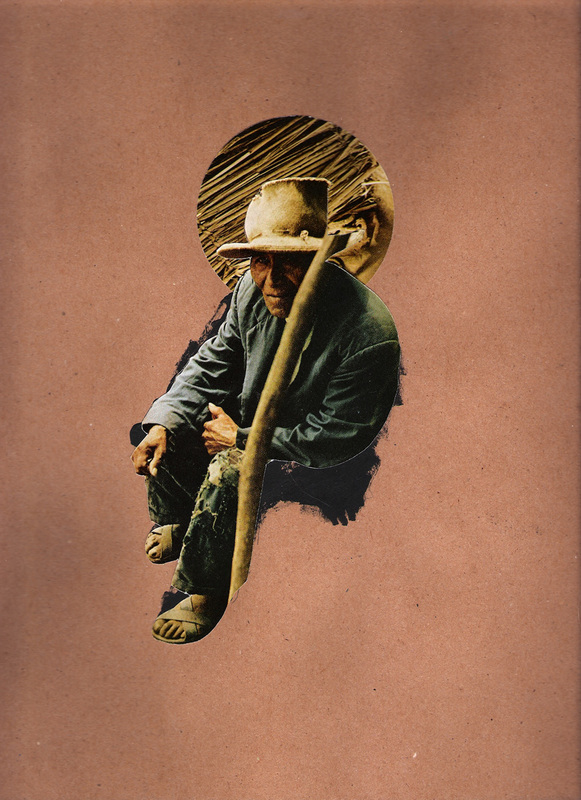
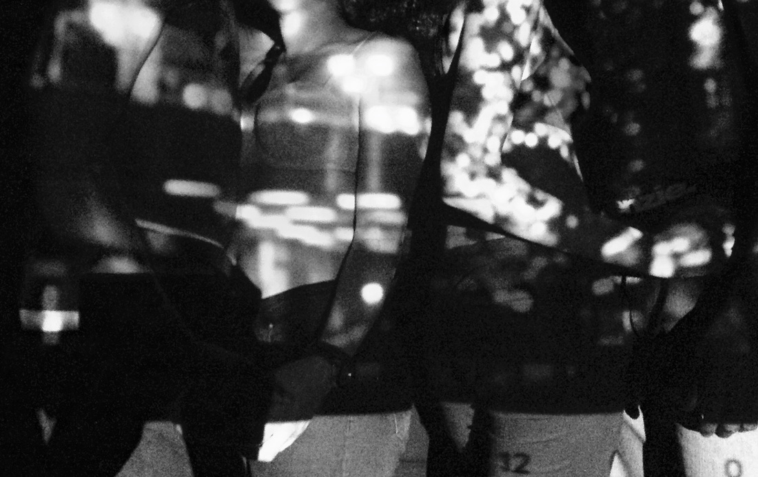
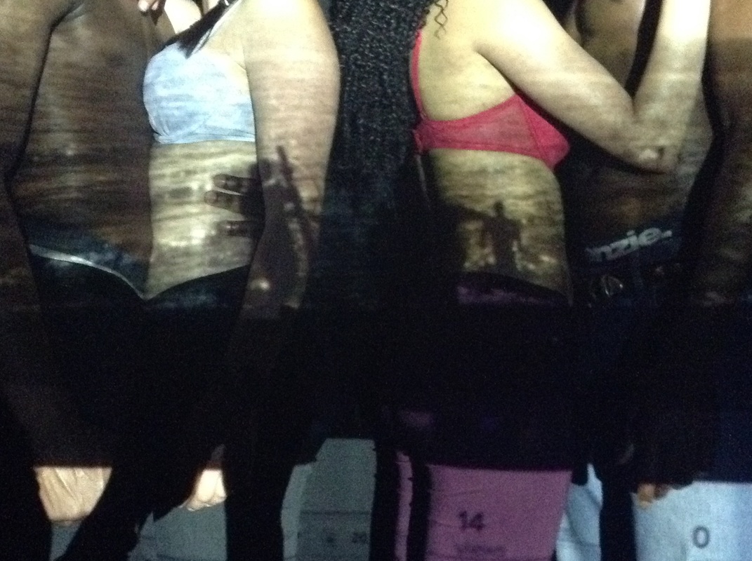
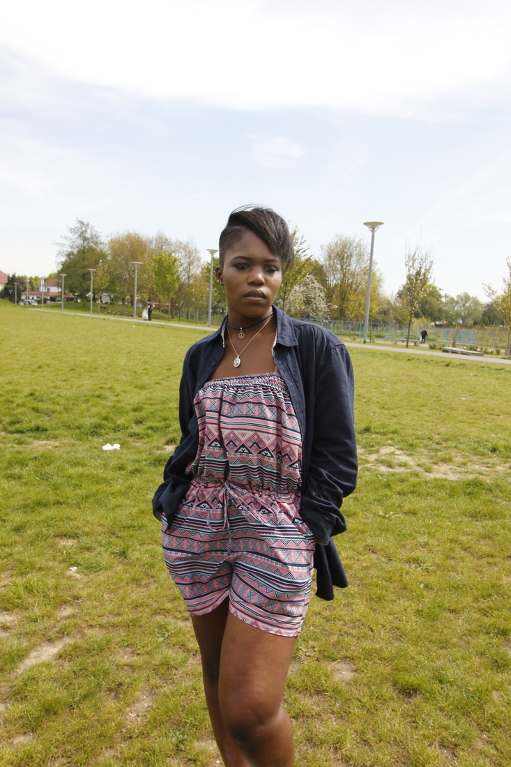
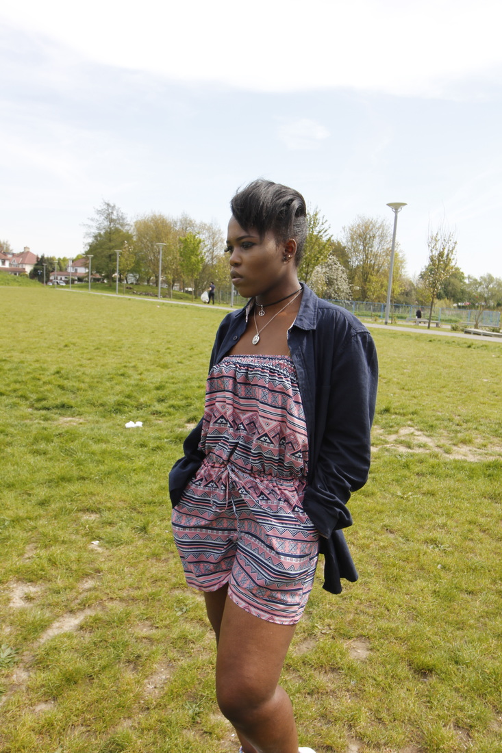
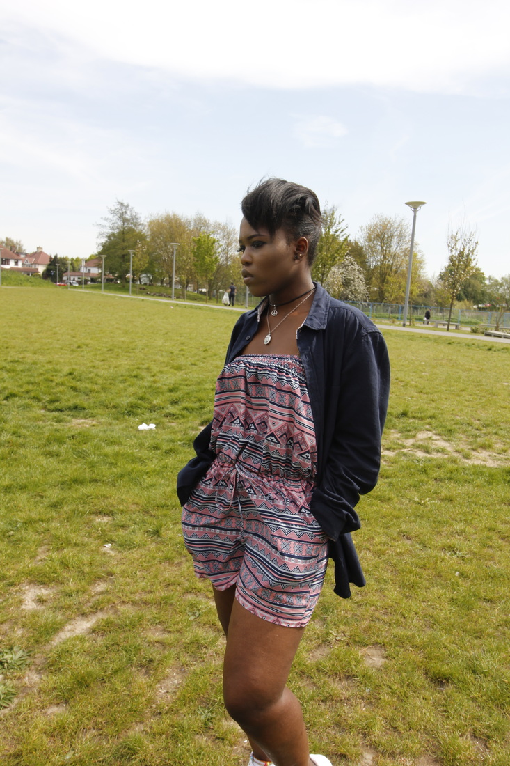
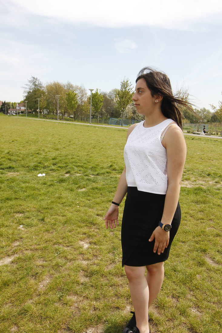
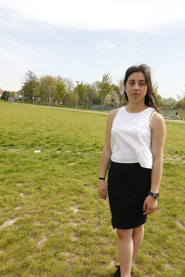
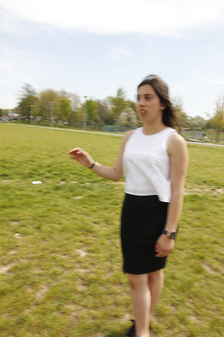
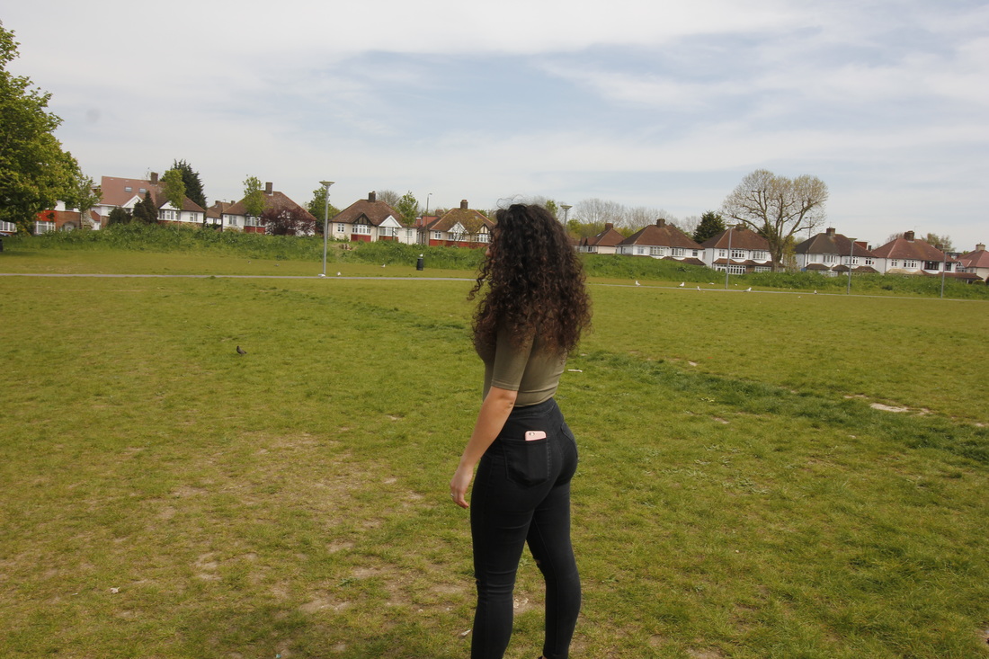
I thought this was an interesting way to see how he presents people through the orb that is behind their head. With an image inside about that particular person. When taking my set of images I had pre planned how I was gong to create the images. After I have taken an picture of my subject Im going to ask them do they have a specific place that is special to them, for example a space in a park, graveyard etc. and if they did then we would go there and the image(s) I take of their special place would go behind their head in their orb. If one of my subjects didn't have a special place then I would ask a follow up question of what they like, most of them would give me answers such as flowers, sunsets etc. For the ones that said an object like flowers I looked for a bunch of those specific flowers and the resulting image would again go behind that specific models head. here are my start off images, just of the models bodies, initially the base of the image.
As for the coloured background I was going to ask each model what their favourite colour was and that would be the colour of the background, however I then thought if I was to display these images in an exhibition the different colours wouldn't look good and would probably take effect away from the images so I made a tally chart of three colours and again asked the models which out of the three colours did they like. The one with the most votes would get to be the colour for all backgrounds, the colour that was the most popular was red. As I am also doing a collage with these images I have to find sturdy cartridge paper or coloured card to place the images below.
As for the coloured background I was going to ask each model what their favourite colour was and that would be the colour of the background, however I then thought if I was to display these images in an exhibition the different colours wouldn't look good and would probably take effect away from the images so I made a tally chart of three colours and again asked the models which out of the three colours did they like. The one with the most votes would get to be the colour for all backgrounds, the colour that was the most popular was red. As I am also doing a collage with these images I have to find sturdy cartridge paper or coloured card to place the images below.


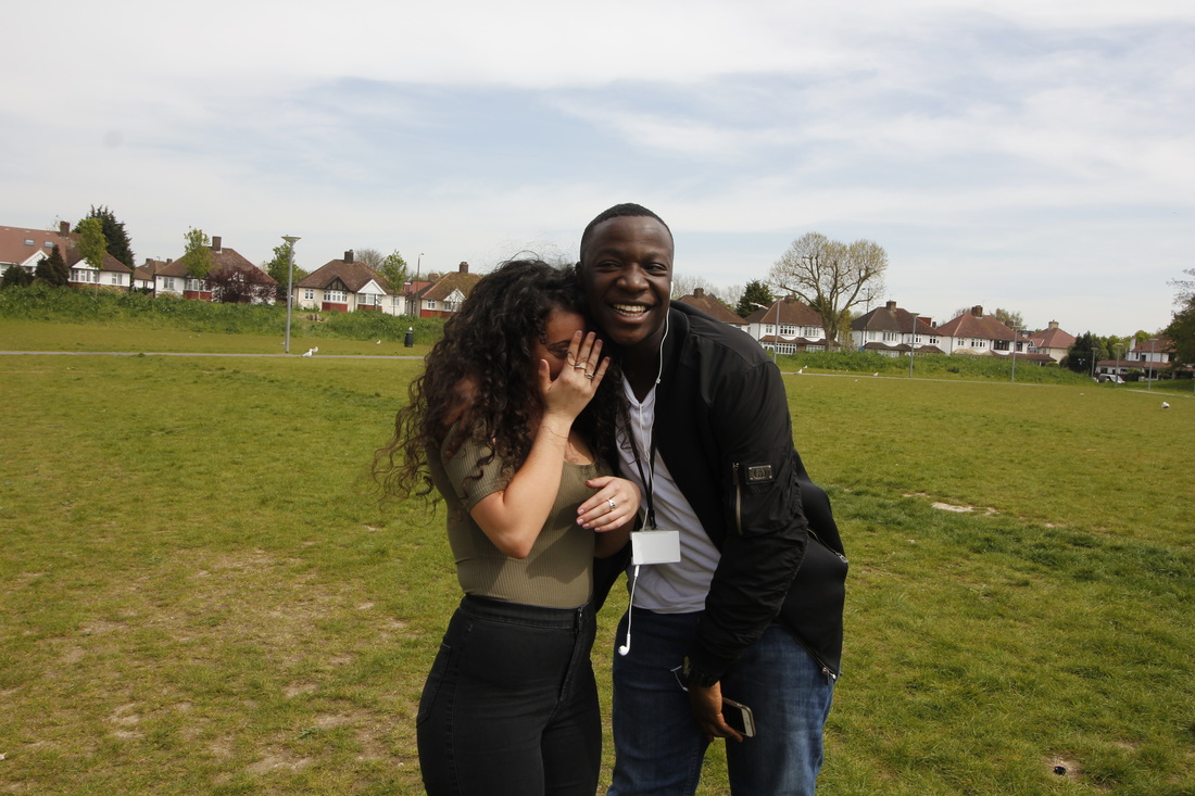
Any images were I needed less of the background and more of the models themselves I used photo shop to crop them, from there I didn't do anything else to the images, no editing, enhancing the images, nothing. Here are my final collages cut out onto colour card, with the body of only my model(s) and black acrylic paint going along the bottom.
Below are my final outcomes, for the first one I didn't cut out the area between the models arms and her hair, this is because I wanted to see if would make any difference to how the audience sees it; unfortunately I didn't like how it came out because I feel like there's too much going on in the image and too man colours: the sunset back ground, the red background, the black paint, the brown hair, her khaki top and the green grass. This led me to cut the background for my other final outcomes.
Before I around the body of the models I experimented the the circle cutter looking for the perfect halo that would go underneath the models head.
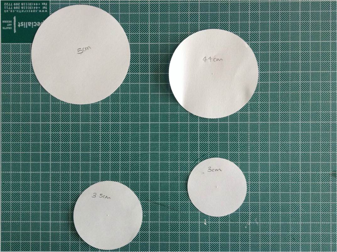
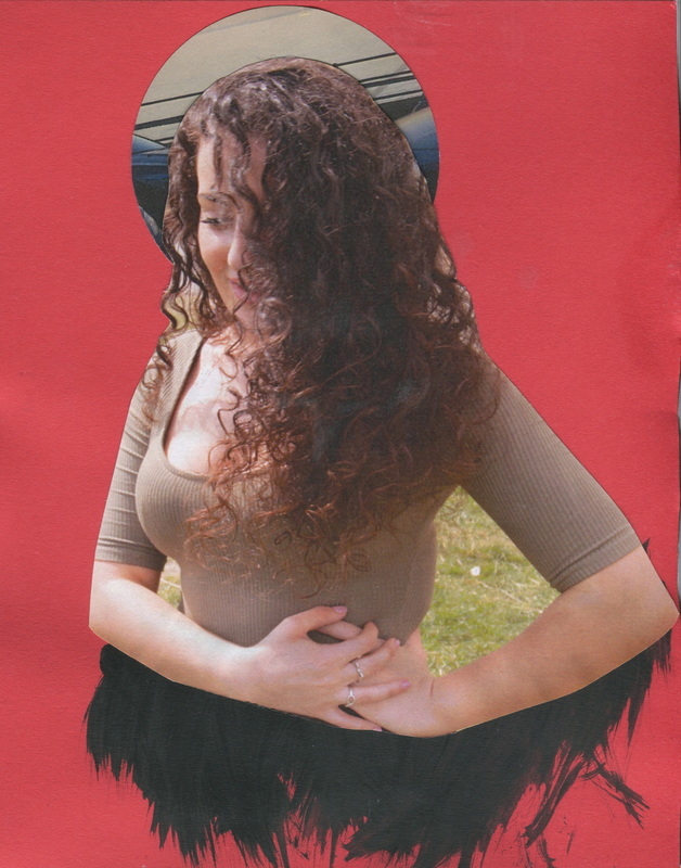
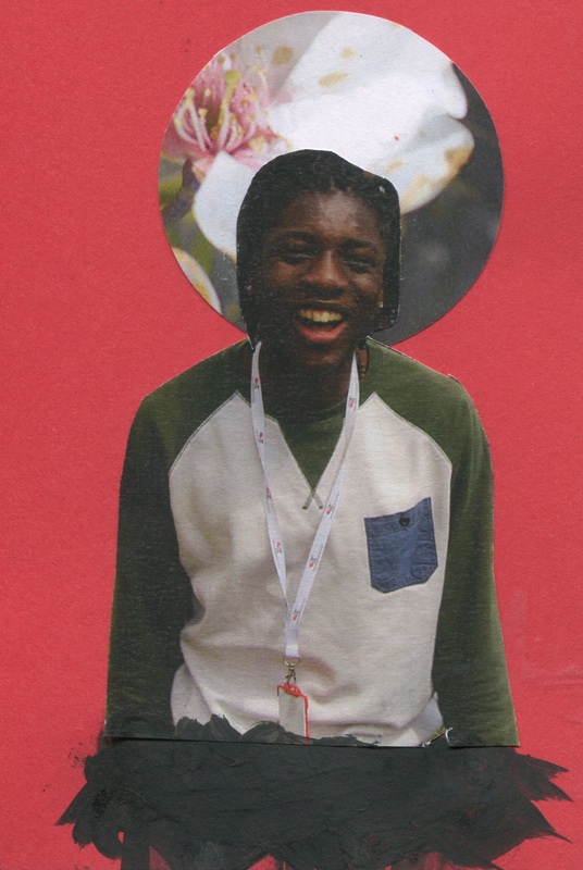
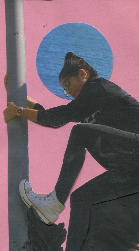
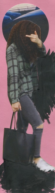
I then experimented with the halos that are above the models heads. For these final pieces I had combined three of them and put them in the middle where all three of the circles met, again cutting out the backgrounds and adding black acrylic paint to the bottom.
Continuing My Research
I didn't know how I could pick up from my last photo shoot of projecting the images onto the naked body so I done some more research via books. The book that I had found and taken an interest in is called, 'Photo Art' by thames & Hudson. Looking through this, I was searching for artists that may relate to my personal investigation or any artist that inspire me.
Two artists that had motivated me from this book is Heidi Specker and Ricarda Roggan. I decided to focus more on Ricarda Roggan than Specker because I feel like I could relate to her work more and personally it was just a bit more interest, nonetheless I did analyse both artists and their work.
Two artists that had motivated me from this book is Heidi Specker and Ricarda Roggan. I decided to focus more on Ricarda Roggan than Specker because I feel like I could relate to her work more and personally it was just a bit more interest, nonetheless I did analyse both artists and their work.
Heidi Specker
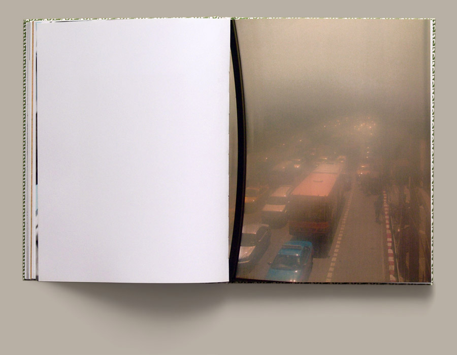
Heidi Specker is a german contemporary artist who both lived and worked in Berlin, she got a diploma in design and visual communication. Since then she has done one exhibition called,' In front of photography'. Shes's got about 10 photo books all with different themes throughout them all from 2005 - 2015. The images that I was inspired by in 'Photo art' was images from one of the photo books she had produced in 2005 called 'Bangkok' its 160 pages containing 66 images, here are only a few of the pages she had posted on her website.
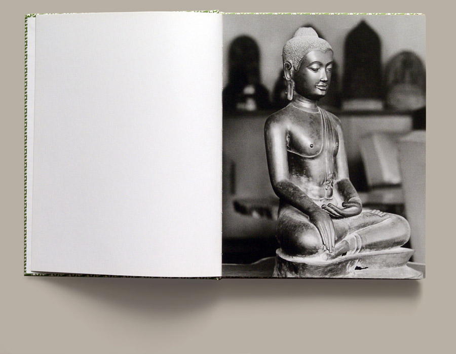
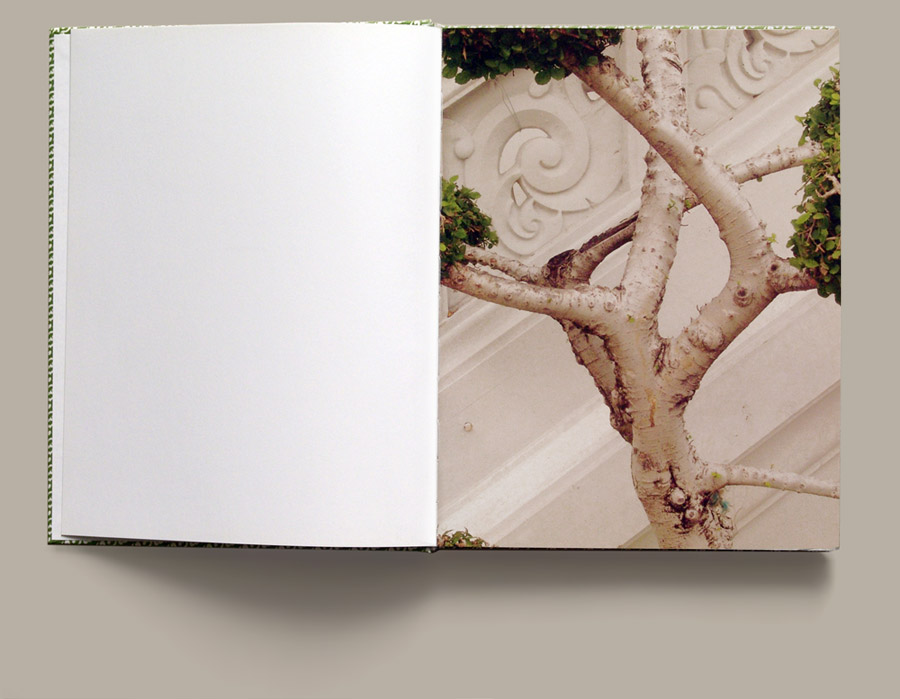
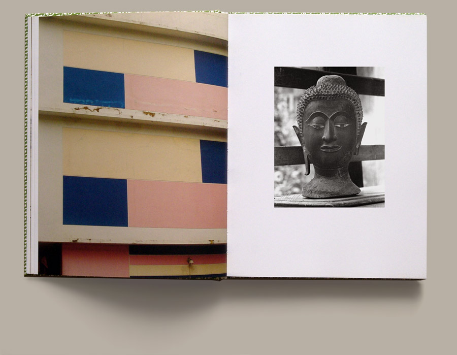
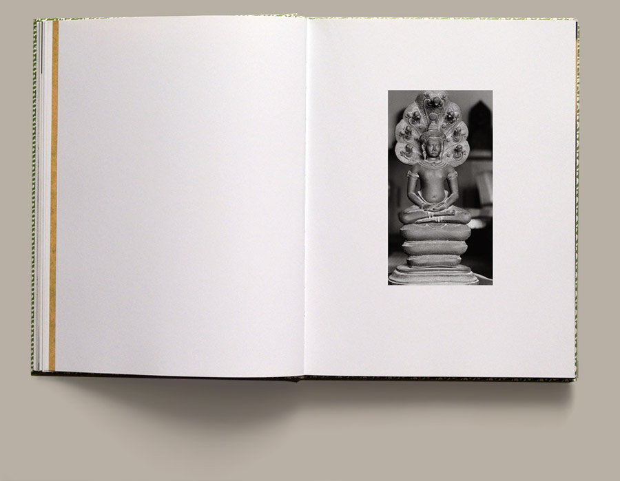
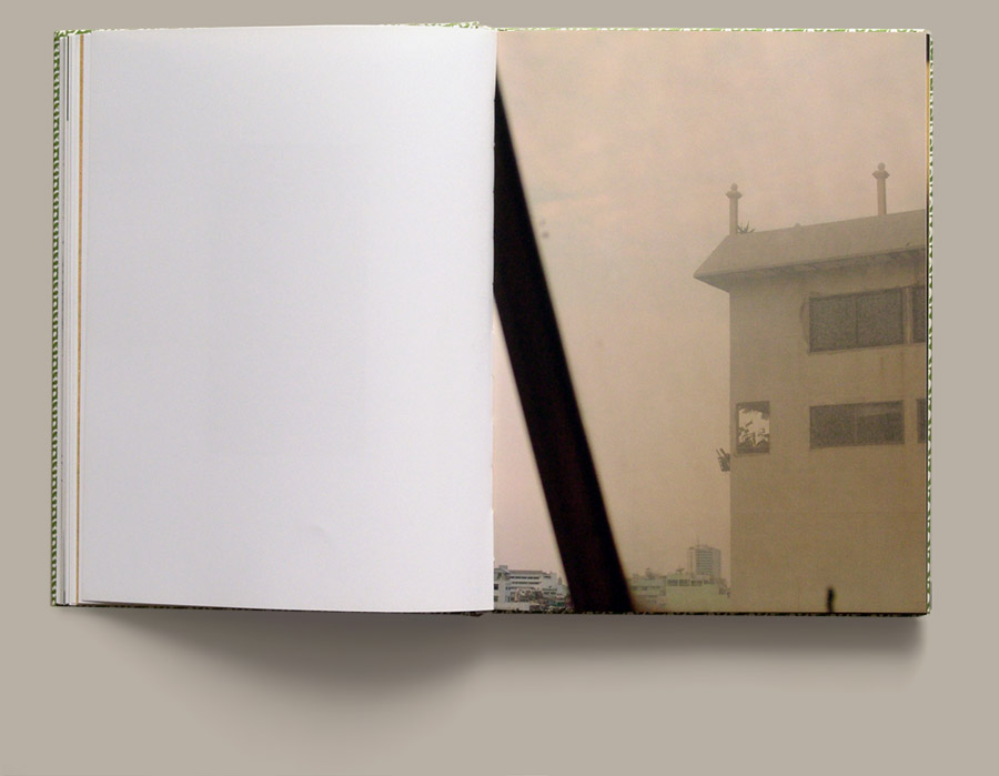
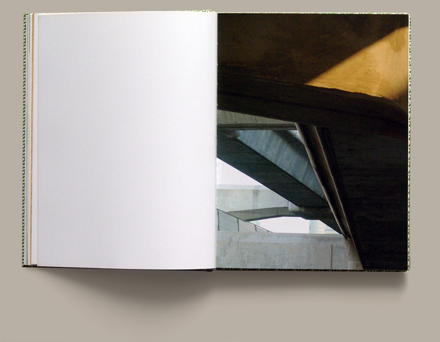
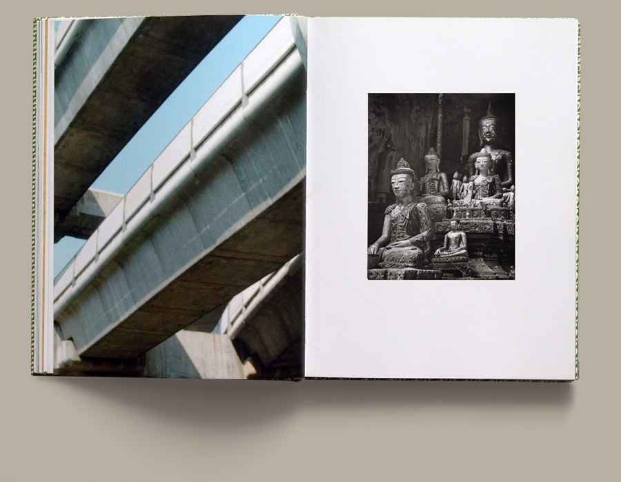
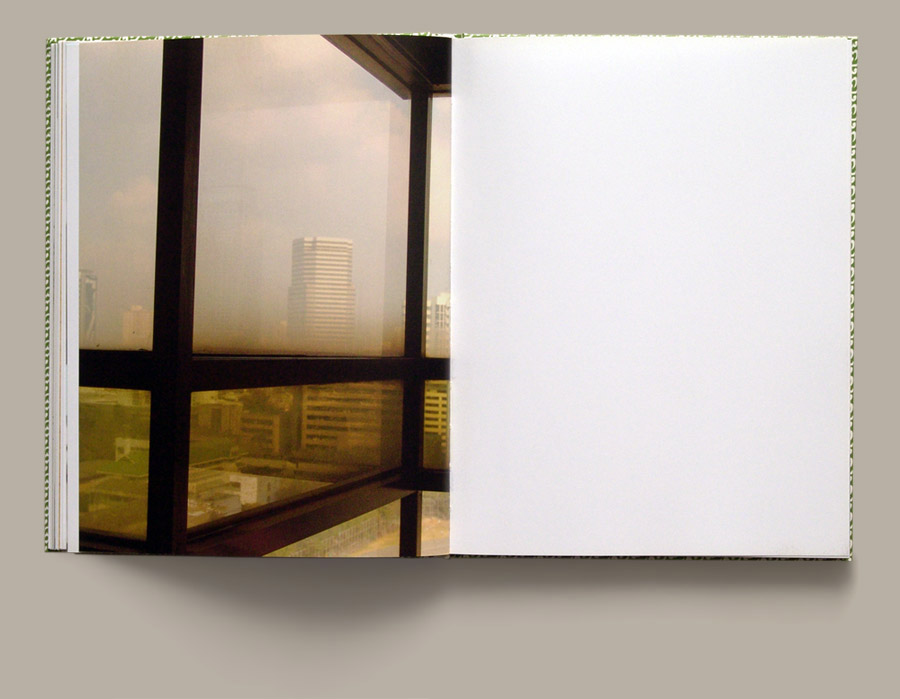
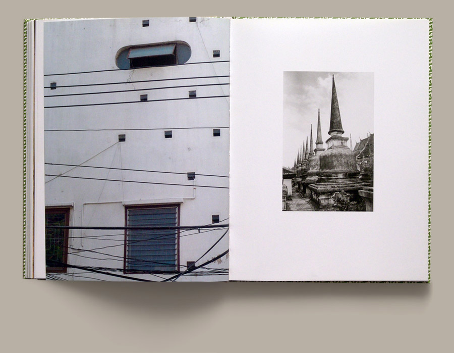
I really like her work because it has a warm, urban effect to it. She focuses her work on more of architecture and organic objects. I like how all of her photo books some how relate to each other, for example she has images of both trees, buildings and sculptures in this photo book and in one of her other ones she has just organic objects; similar to the organic ones in this book. I'm also a big fan of how she edits them, using a filter to give it that warm effect, specifically on the organic images such as the trees. Another aspect in her images that had intrigued me is the fact that she crops her images instead of using the full image; I think this puts an affect on the audience making them want to see more of the image, encouraging them to turn the page(s). I do like her work however I don't think I'm going to do a response on her work because she doesn't necessarily coincide with my personal investigation, nonetheless I may refer back to her for future projects.
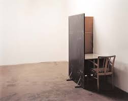
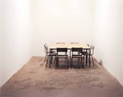
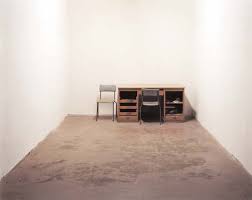
Ricarda Roggan
|
|
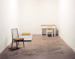
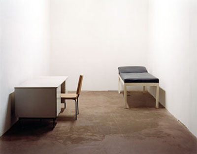
Ricarda Roggan was also a german photographer who studied photography in 1996, which then lead him to be a professor at the state academy of fine arts in Stuttgart from 2013. Since 1999 - 2008 he has had at least 7 awards that very from scholarships to his work of is photo books.
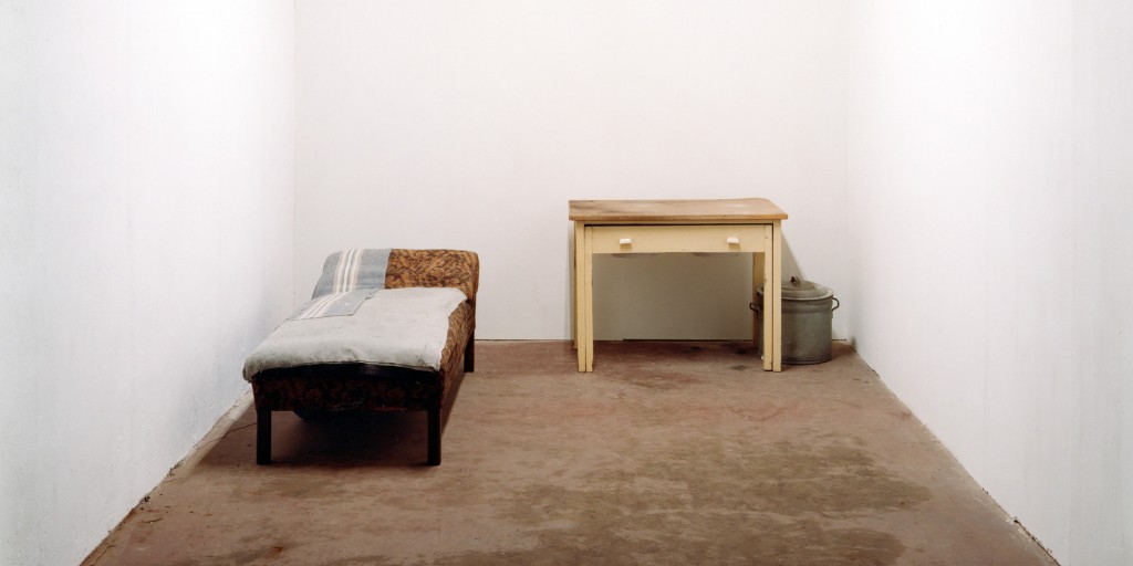
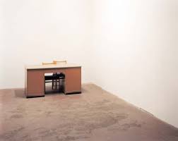
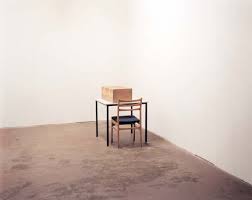
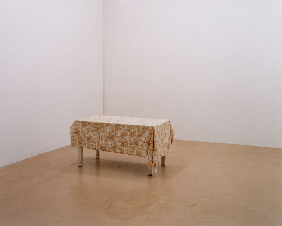
He has a series of photo books with the same sort of theme and topic that constantly appears throughout all five books, and thats emptiness and contrast. His images that were in the 'Photo art', inspired me because of the clean, plain emptiness feeling you get when looking at his images. I'm going to do a response to him because out of all the research artists I have evaluated and analysed he was one of the ones that had stood out to me the most. |
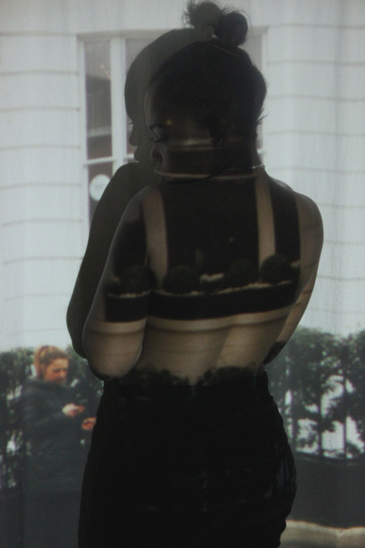
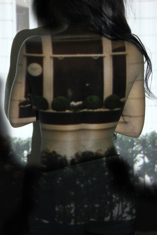
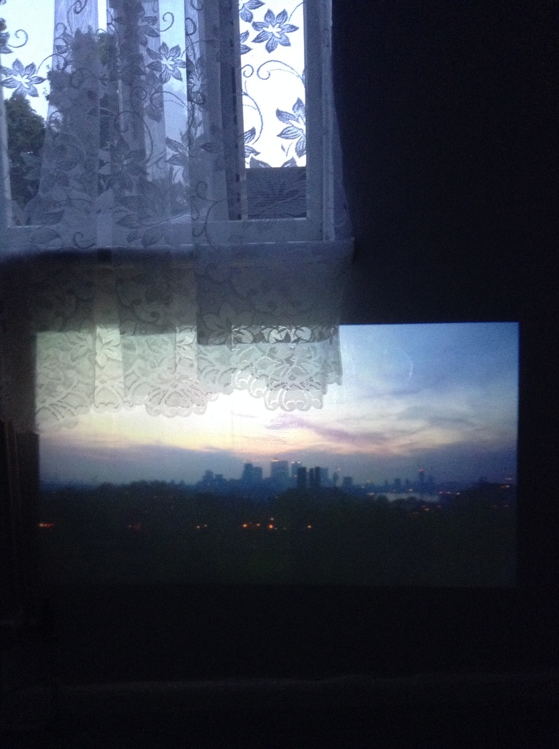
My Response
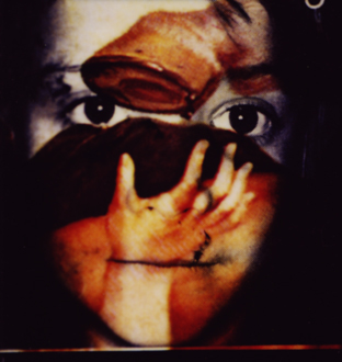
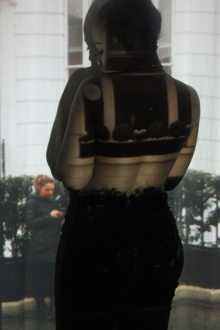
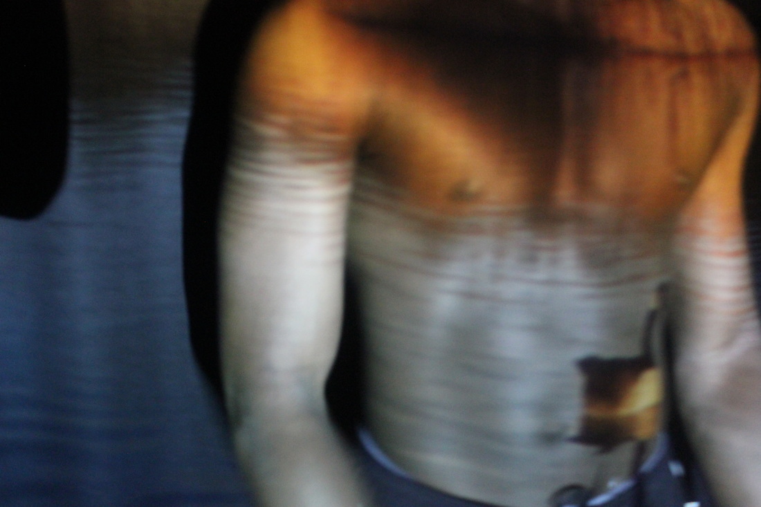
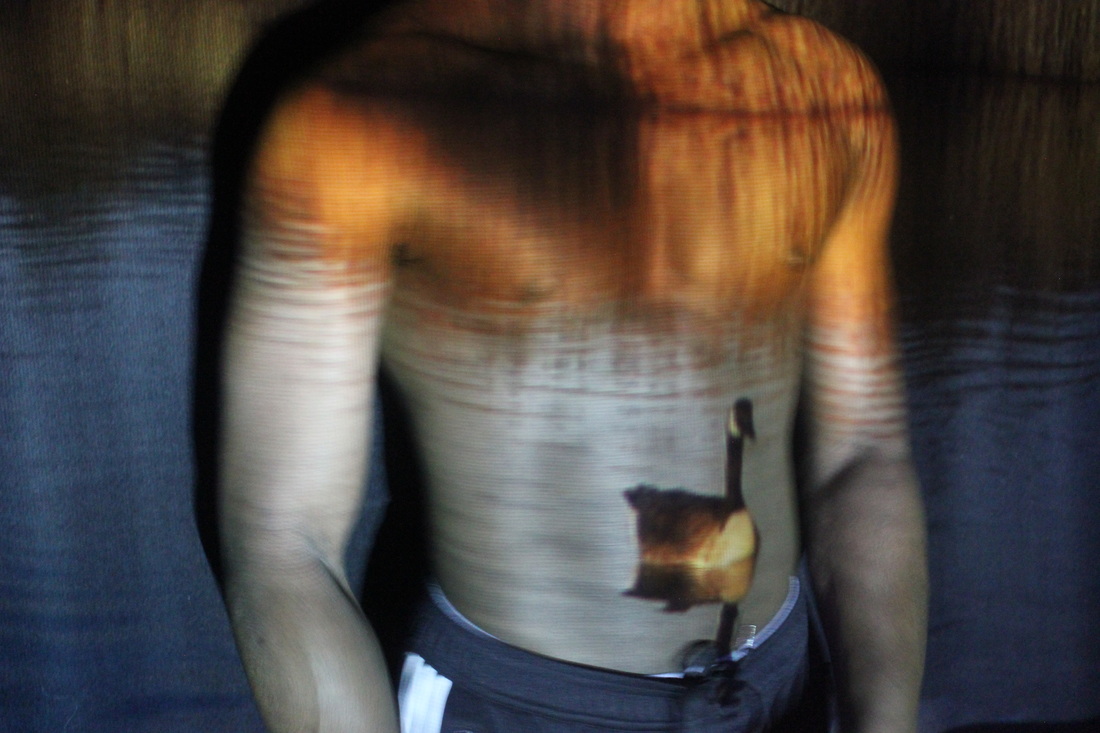
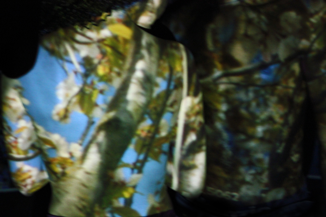
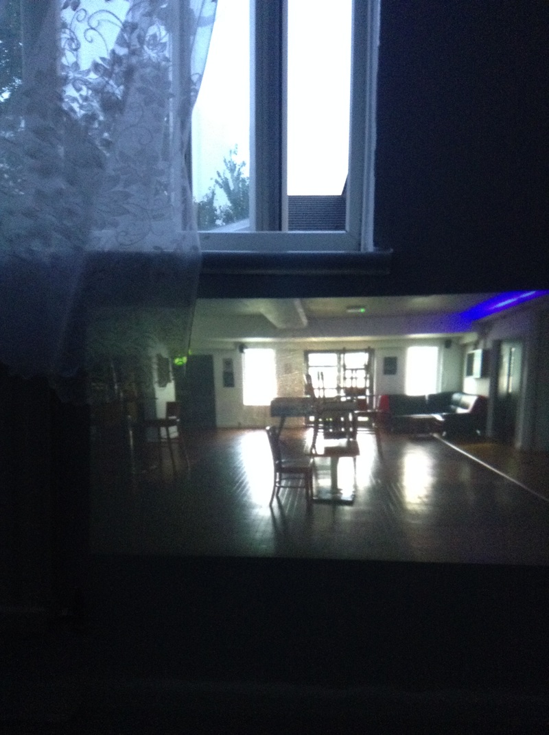
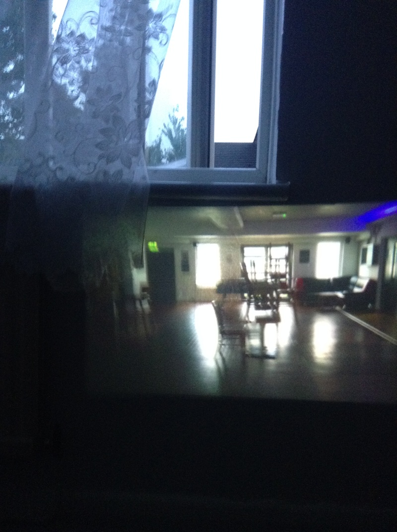
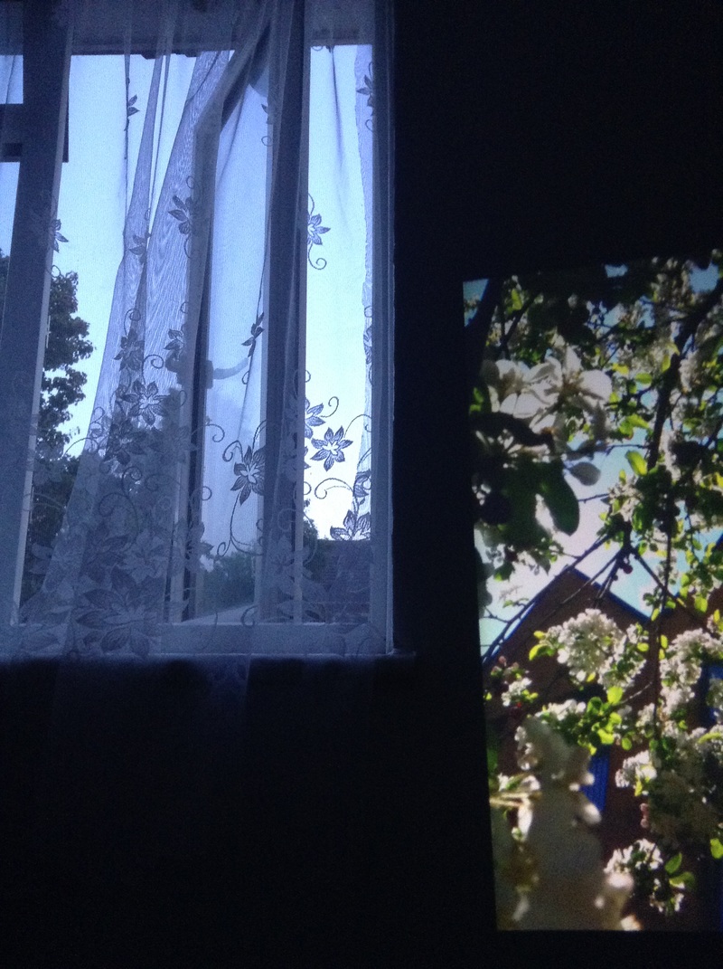
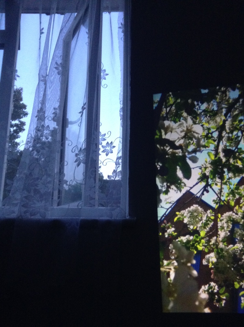
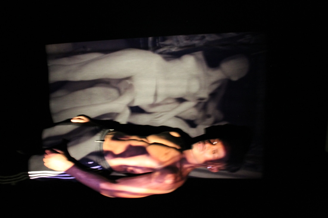
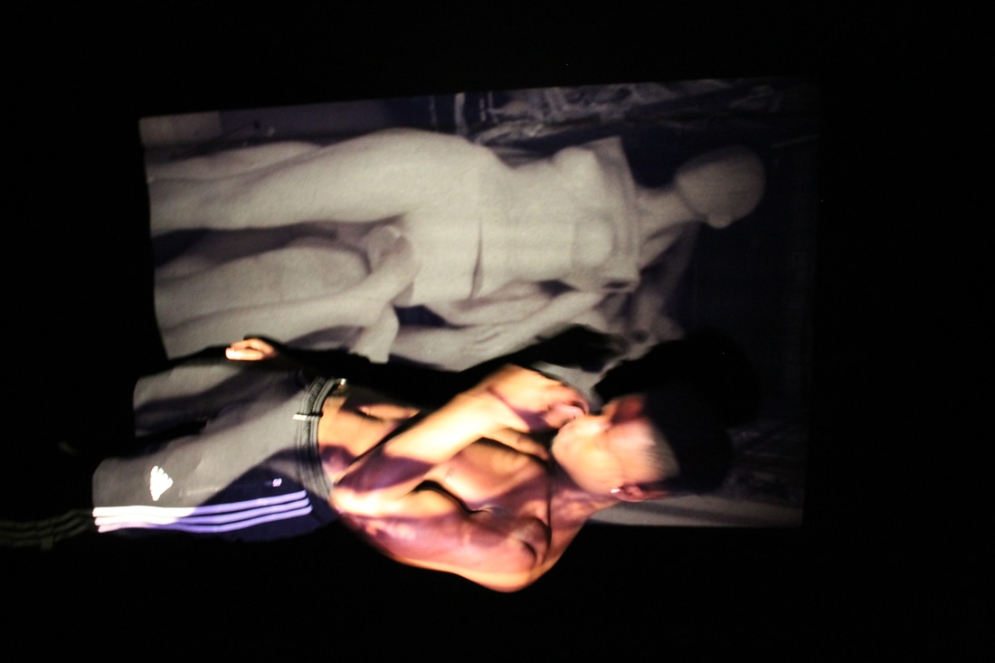
Here is my response to her work. I looked for empty spaces around both mine and friends houses, however her images of rooms are completely empty with no colour whats so ever and this task, making this harder because the houses I went to all had some sort of colour in the room and multiple types of furniture in the room. I then though that the emptiness sometimes makes people feel uncomfortable and prefer to have the room full of different objects. This lead me back to my first experiment with projecting images onto the body. The body in those images was used as a plain canvas and the images that I projected onto them was the painting, this made me think that i should do exactly the same thing; projecting those projected images onto one of the semi empty rooms. I used both my images from the projected photo shoot and some images I've taken previously in the year. Here are the results :

Photographer visits
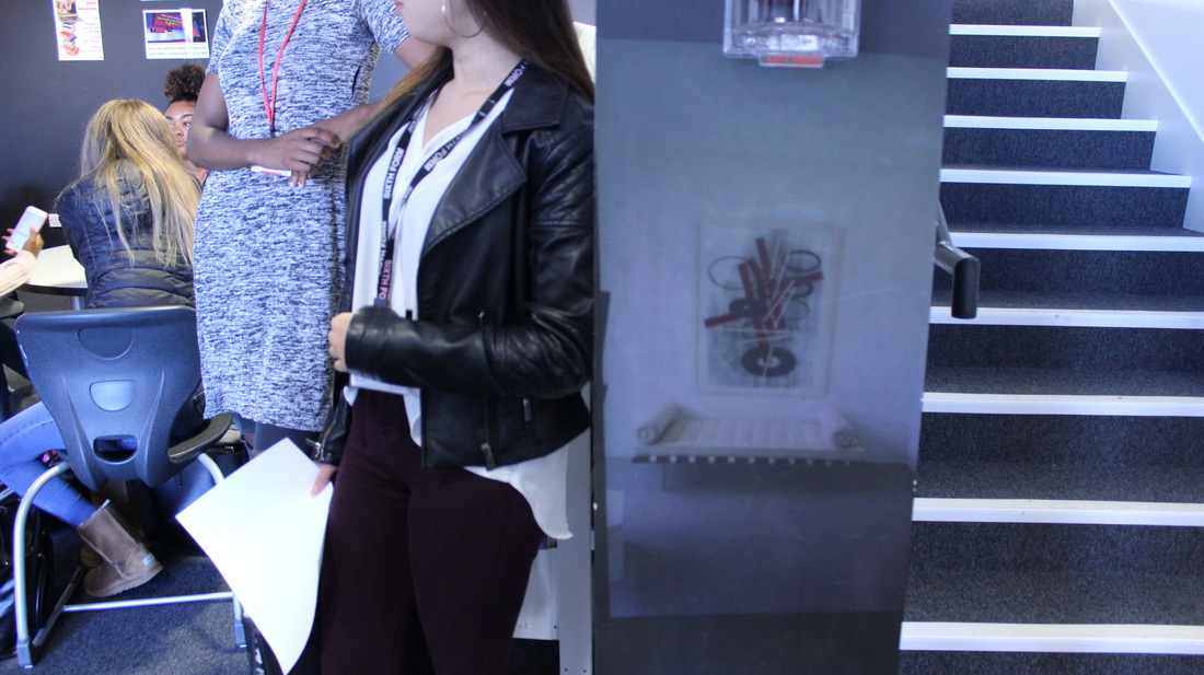
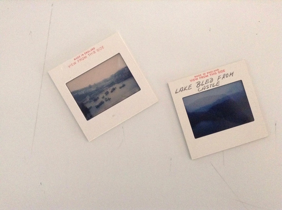
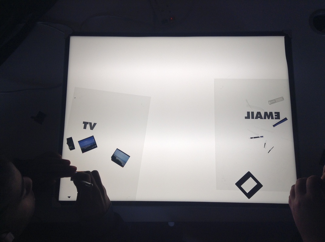
A photographer named Dafna Talmor had come into our school and had talked to us about her work and how she was inspired to do what she does.
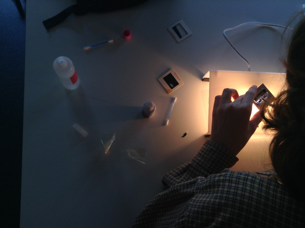
She had bought a selection of slides and told us to pick via the slide projectors, however at the particular point the slider projectors had stopped working which means we just had to pick one of the slides from random. This was quite thought - provoking because at that point we had no idea what our slide(s) would look like until we used the light box and sometimes we weren't even able to see the whole image because it was too small.
She had bought a selection of slides and told us to pick via the slide projectors, however at the particular point the slider projectors had stopped working which means we just had to pick one of the slides from random. This was quite thought - provoking because at that point we had no idea what our slide(s) would look like until we used the light box and sometimes we weren't even able to see the whole image because it was too small.
|
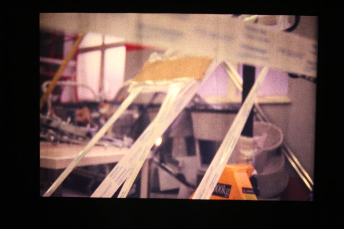
We were provided a wide range of products to almost destroy our selected slide with, which is similar to what ... does, like creating a new image from one other image. There was light boxes so we were able to see the slide better and the materials that were given was things such as paint, acetone, scalpels, white tip-ex, permanent pens and acetate sheets to protect the light box when we are cutting into the slides. I enjoyed doing this however I didn't like the though of destroying someone else work just to create one other image. I had an idea to layer some of the slide film however instead I had just carried out the task and destroyed the slides. |
The final outcomes of my slides.
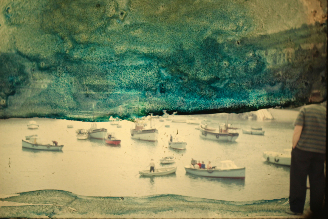
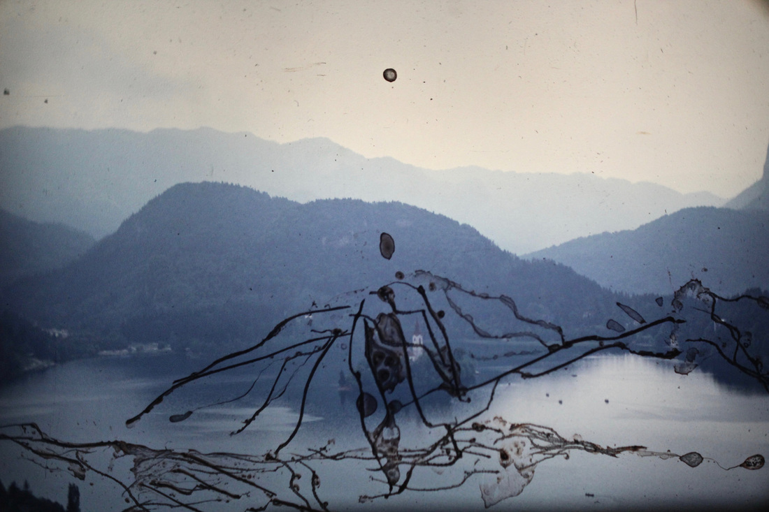
I was inspired by Talmor's work and enjoy the task we had done in the lesson with her, seeing as how we were using a slide projector to see the images from a larger perspective I though that it would correlate to my personal investigation. However Talmor destroyed her slides to create new art, I personally don't feel comfortable with doing this deed with my slides, however because I know that I'm most likely going to get slides that won't come out perfect I'll be happy to 'destroy' those ones. However I may do this closer to the end, when I don't necessarily need the slides as much.
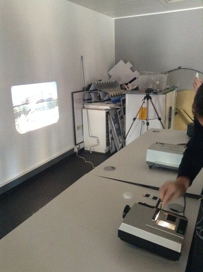
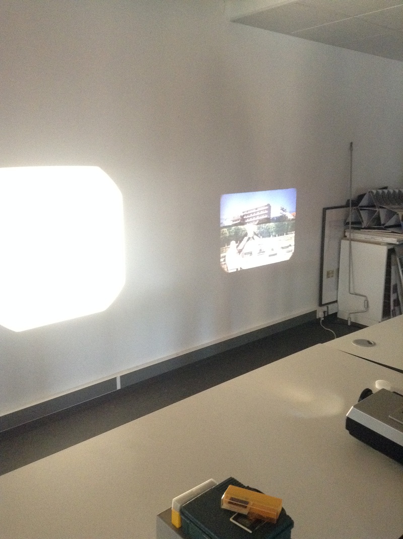
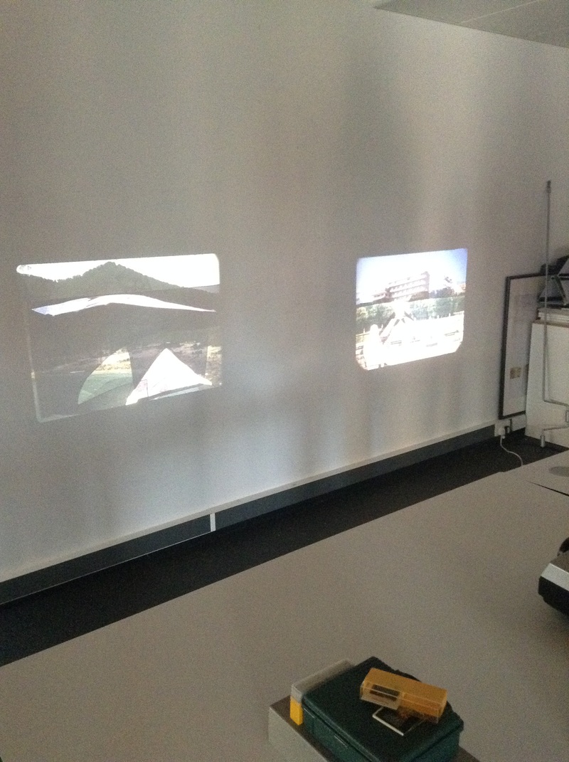
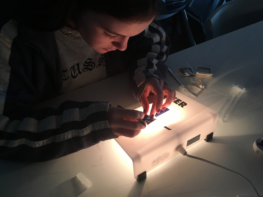
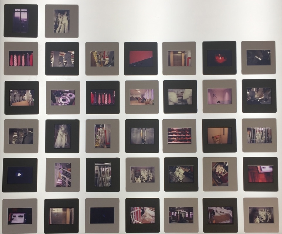
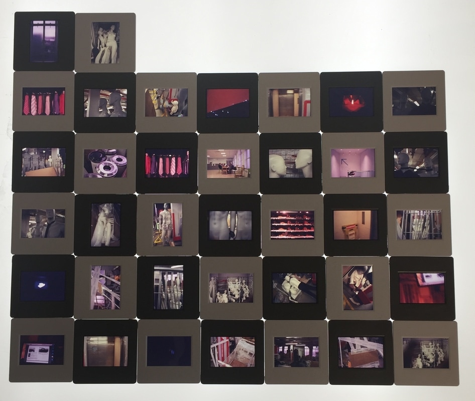
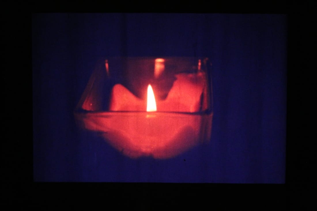
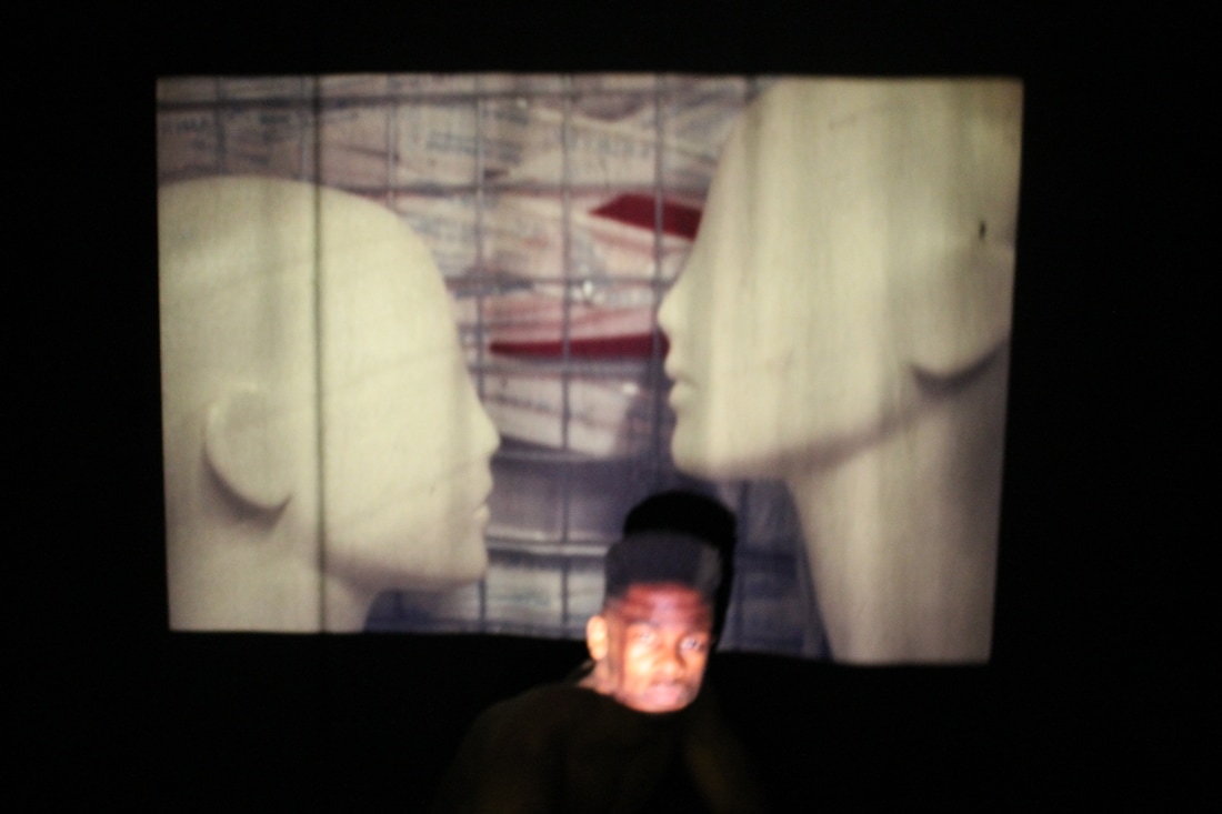
To started off I bought 35mm slide coloured film and began to take images using a Nikon F-301. I didn't know what I wanted to take images of so I went to work and just took images of the stock room, after getting them developed and put into slides, I used a slide projector to see them more clearly. To make a contact sheet I had put all of my slides onto a light box, that way you're able to see each slide individually.
To started off I bought 35mm slide coloured film and began to take images using a Nikon F-301. I didn't know what I wanted to take images of so I went to work and just took images of the stock room, after getting them developed and put into slides, I used a slide projector to see them more clearly. To make a contact sheet I had put all of my slides onto a light box, that way you're able to see each slide individually.
|
|
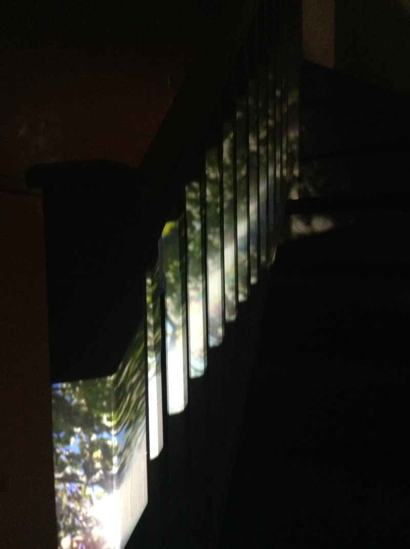
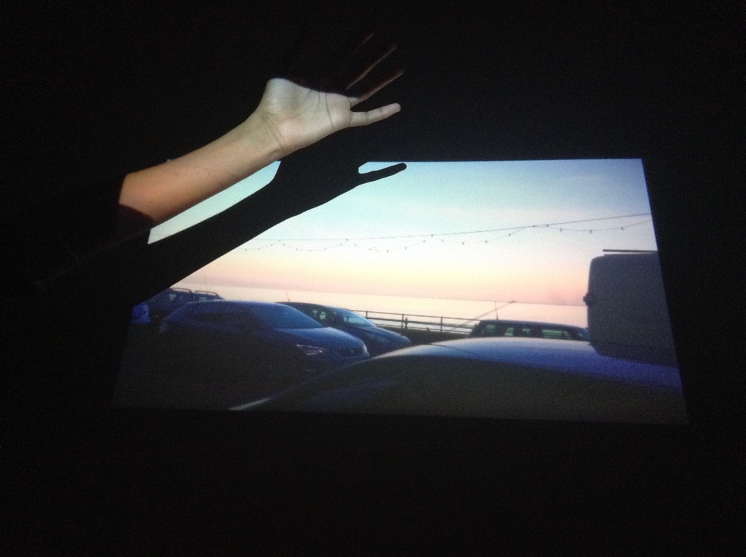
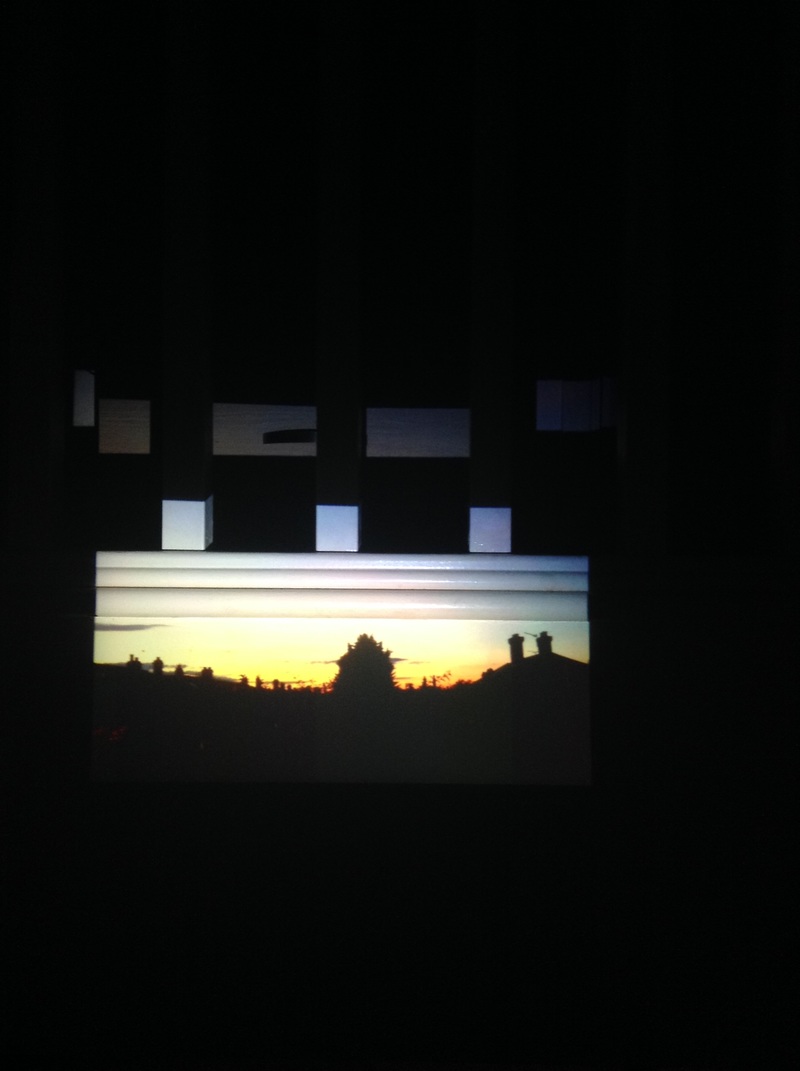
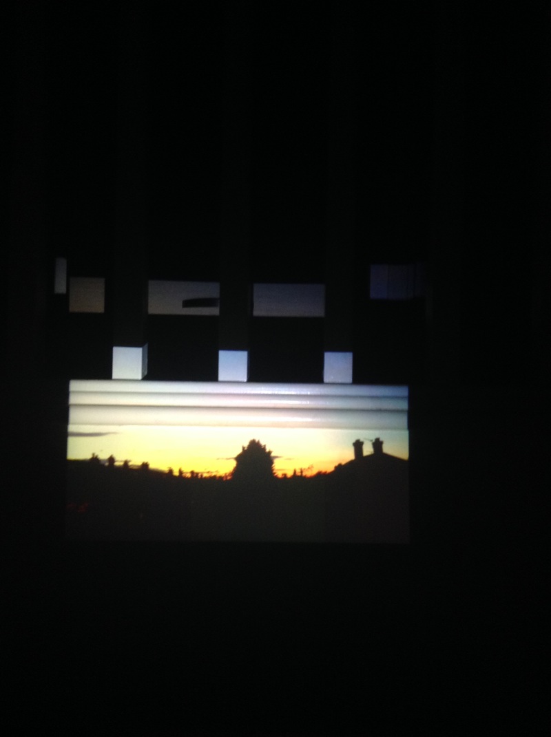
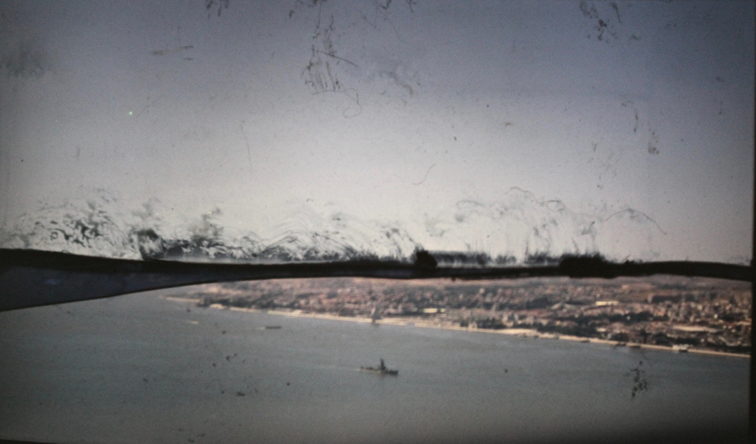
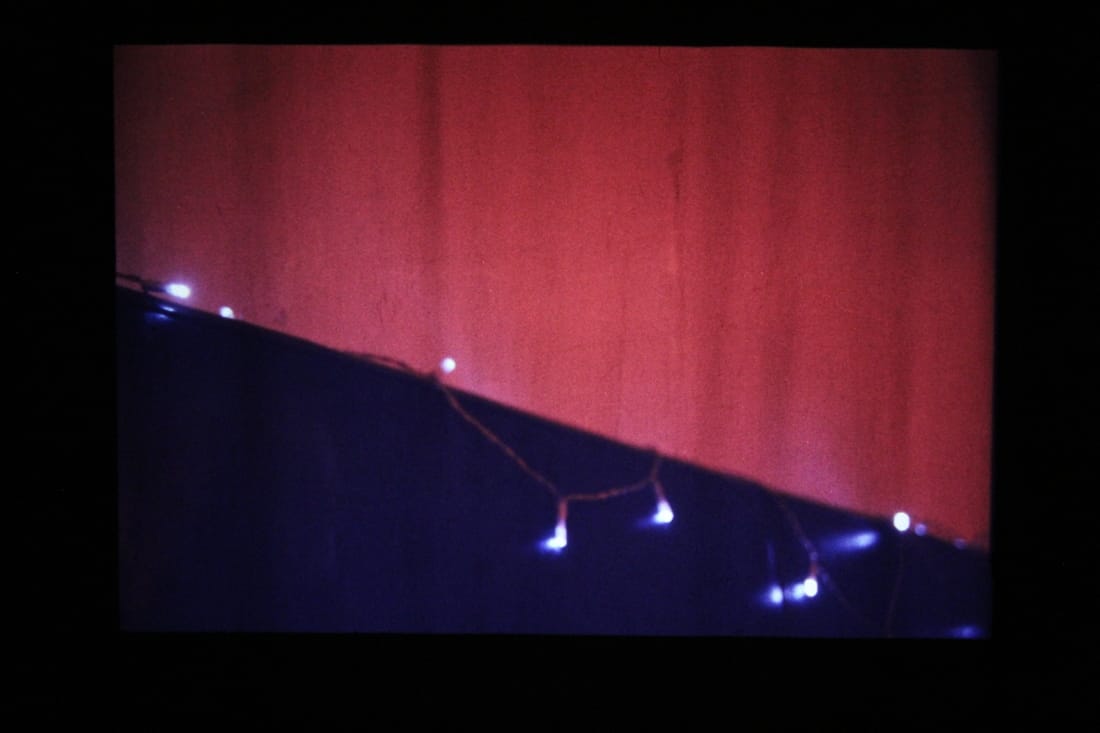
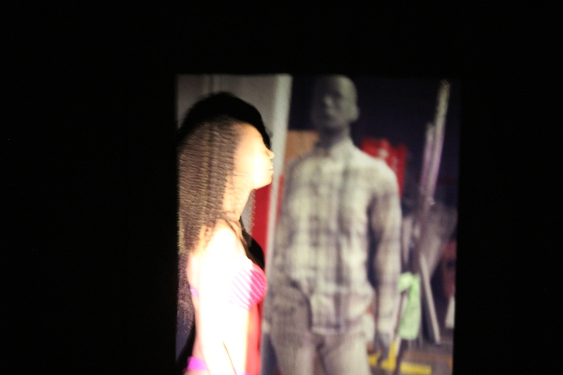
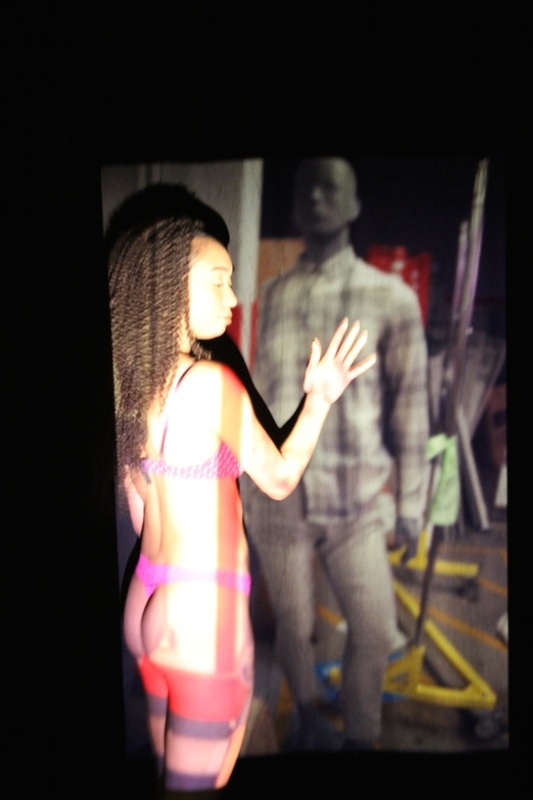
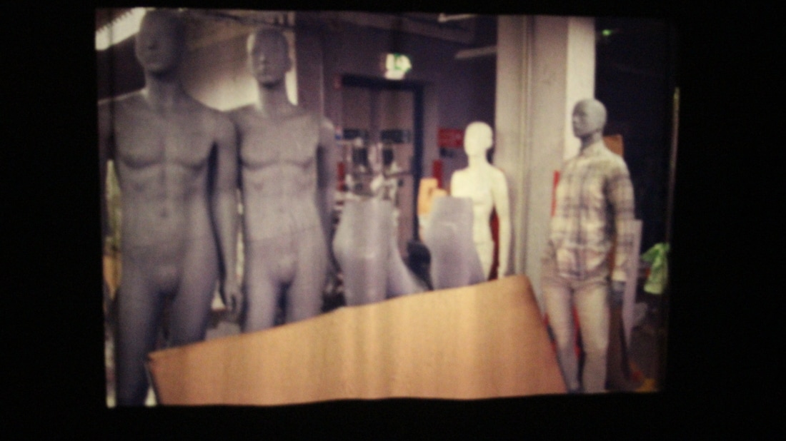
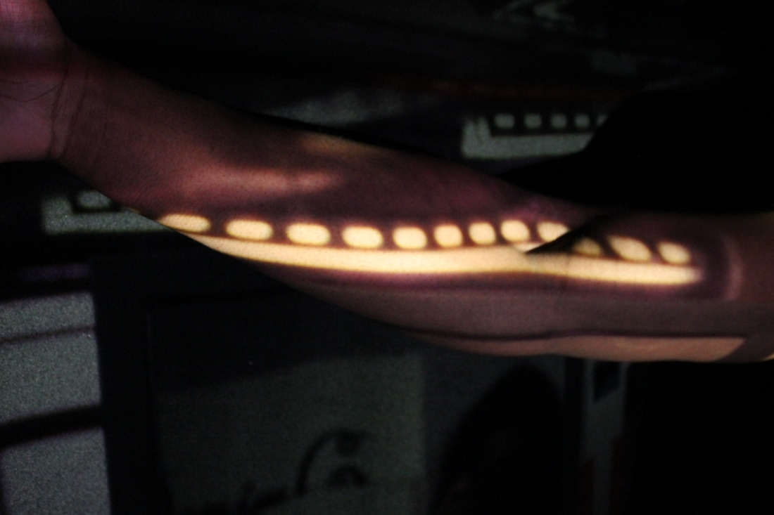
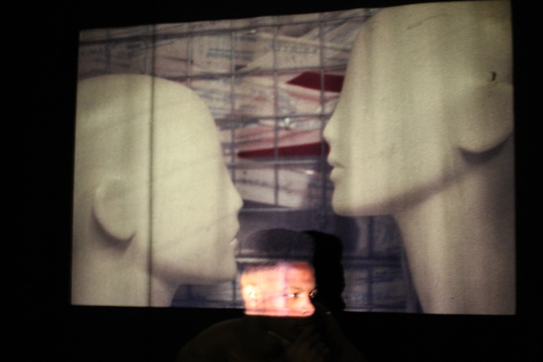
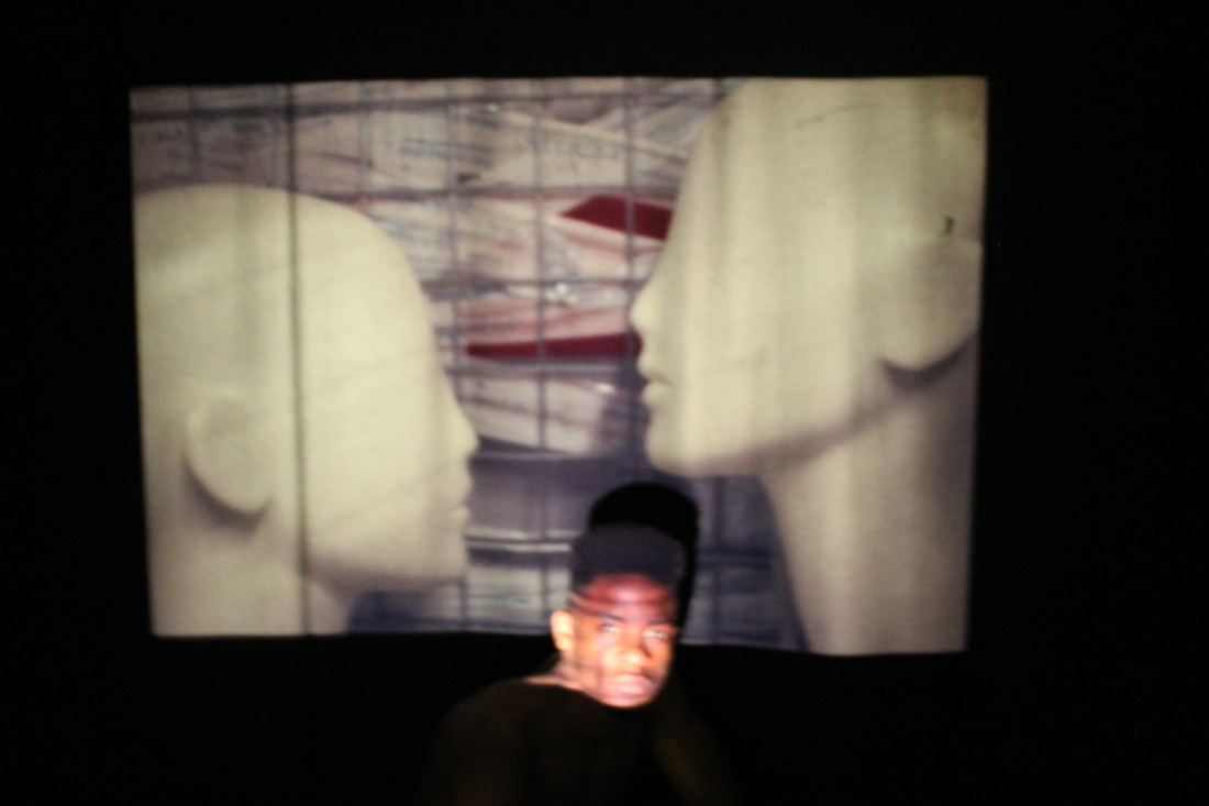
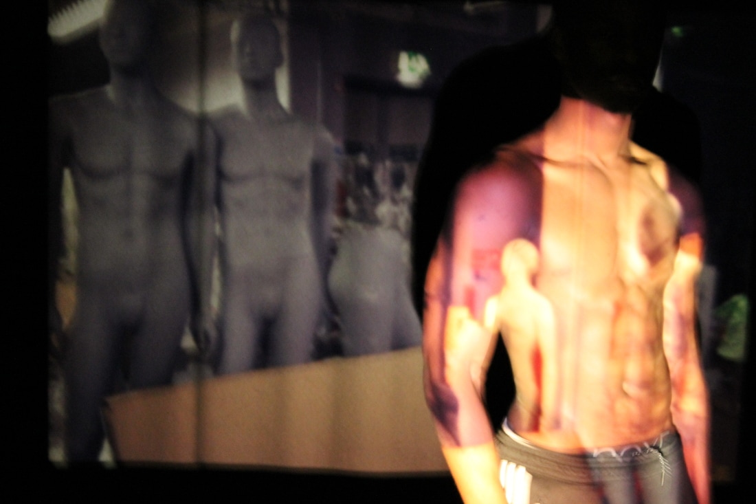
I had then used a slide projector and taken images of slide blown up, therefore you're able to see how it looks when it's projected.
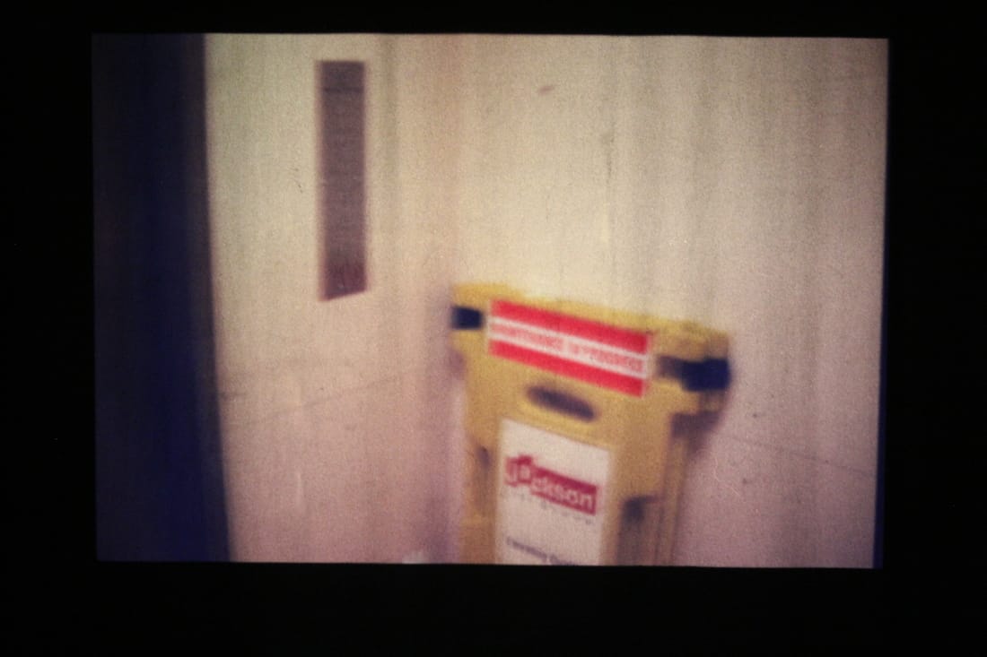
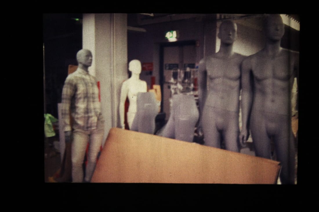
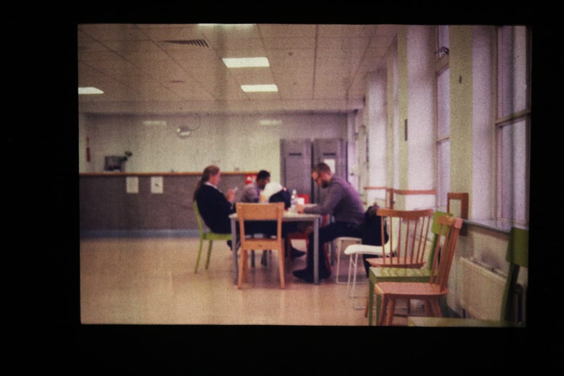
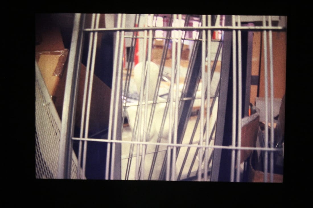
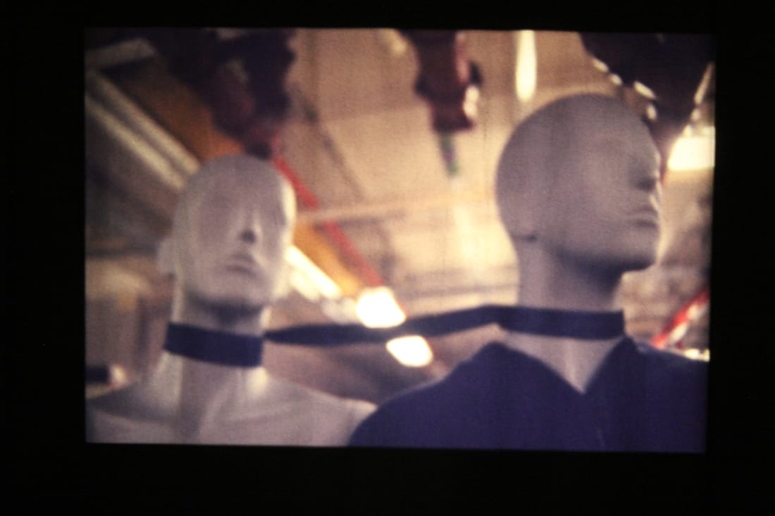
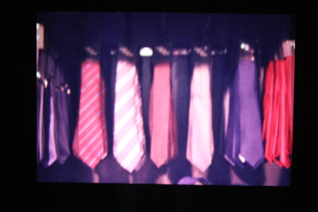
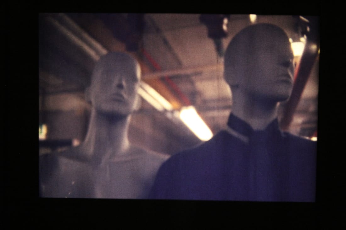
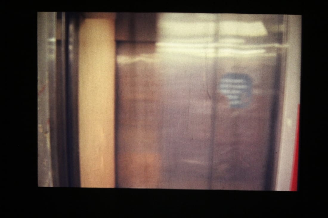
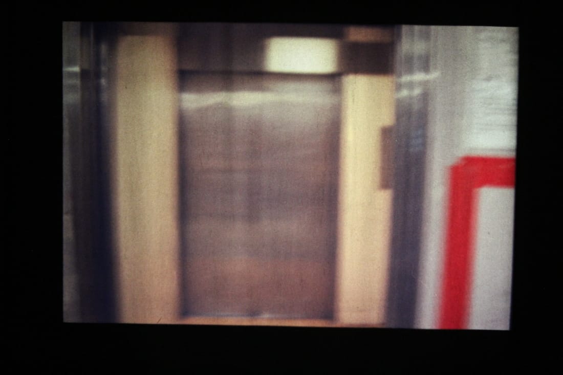
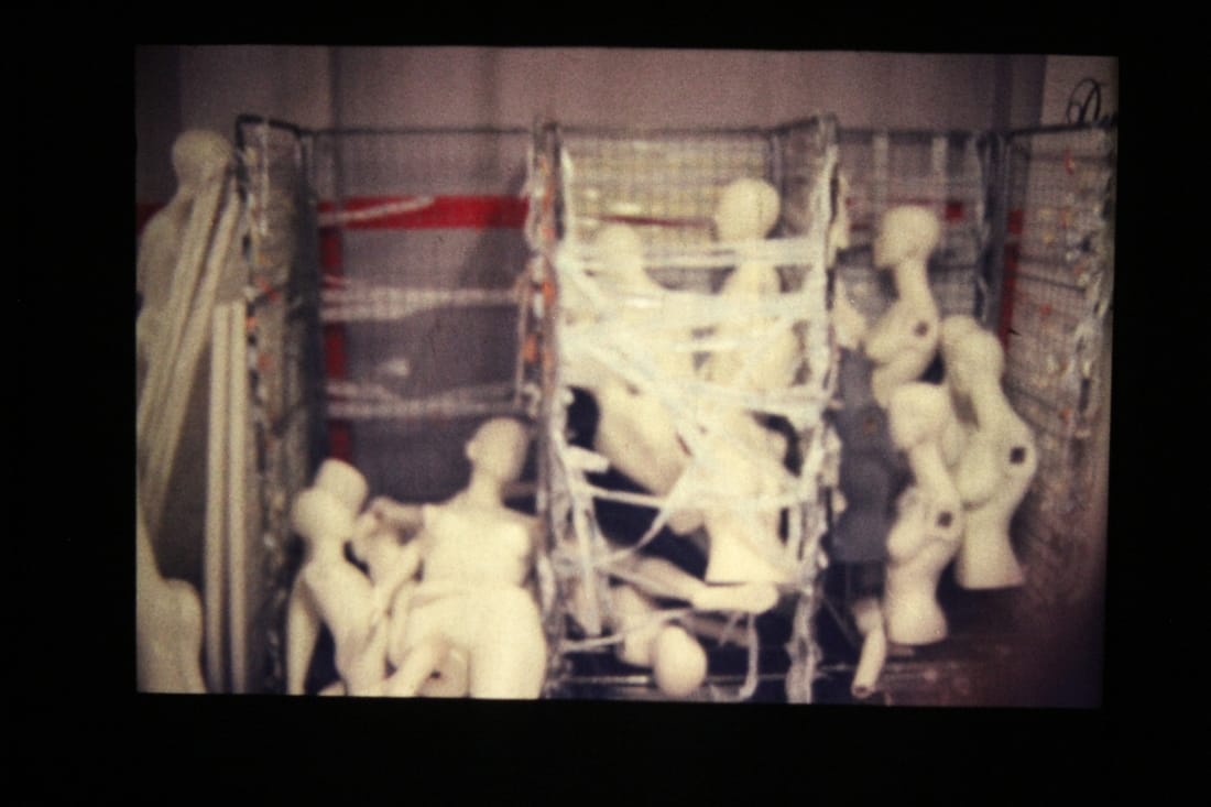
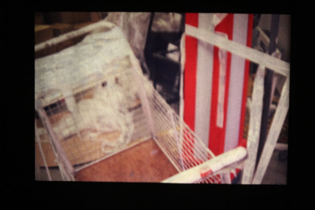
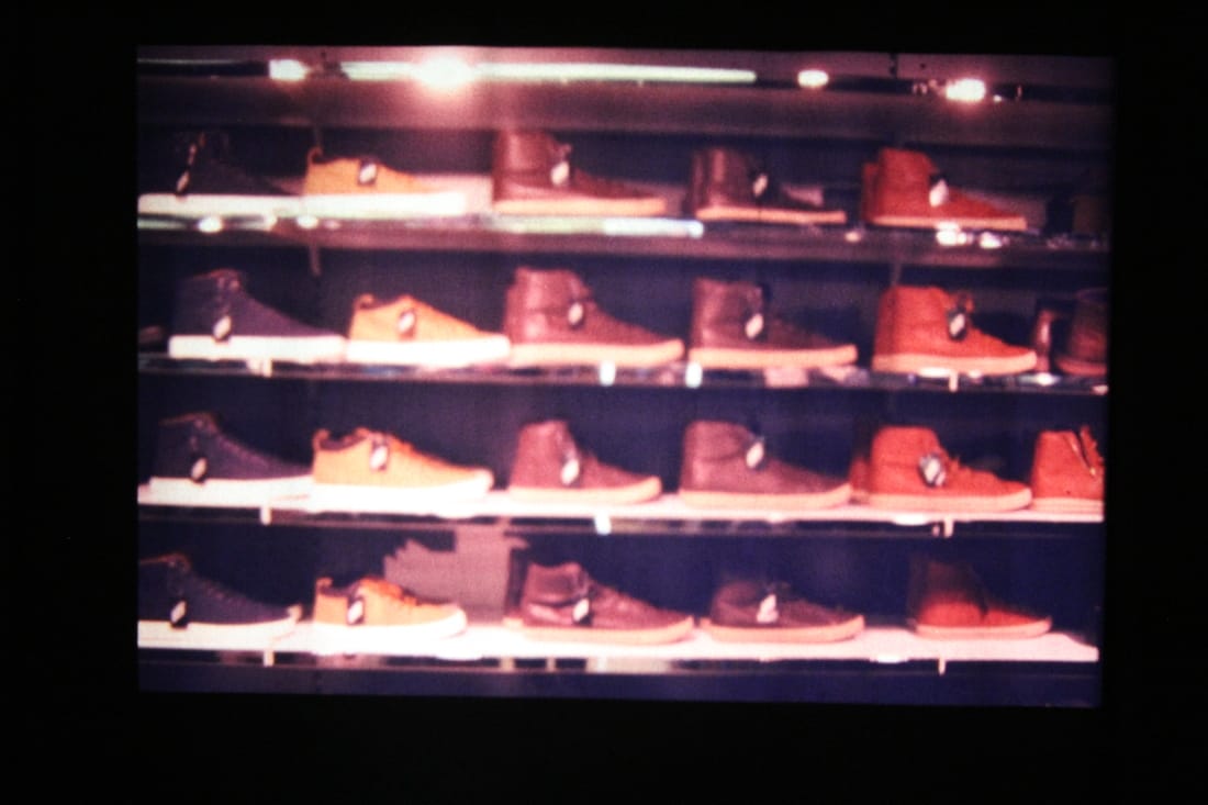
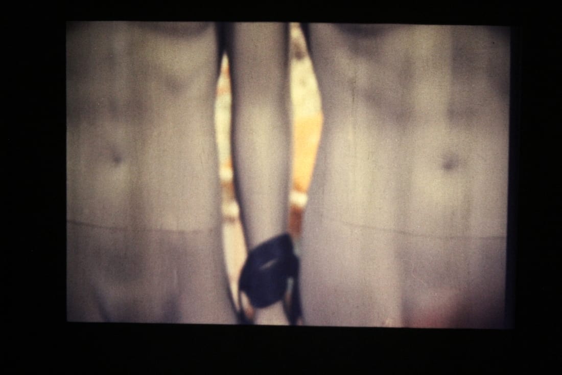
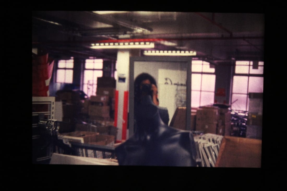
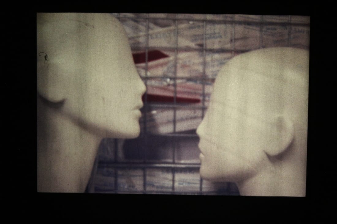
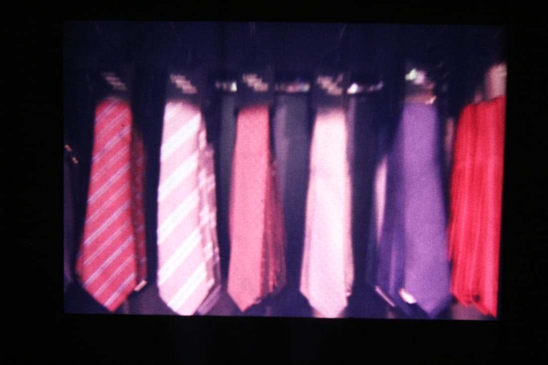
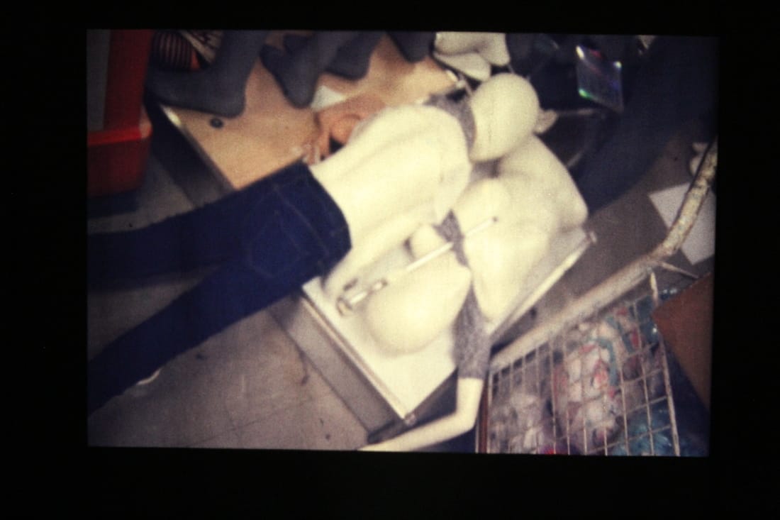
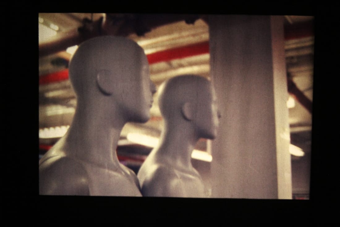
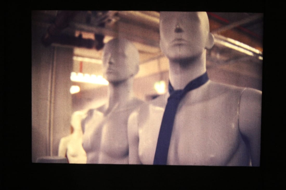
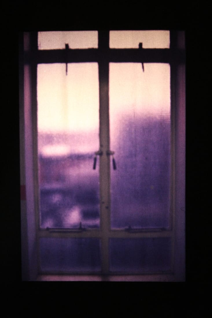
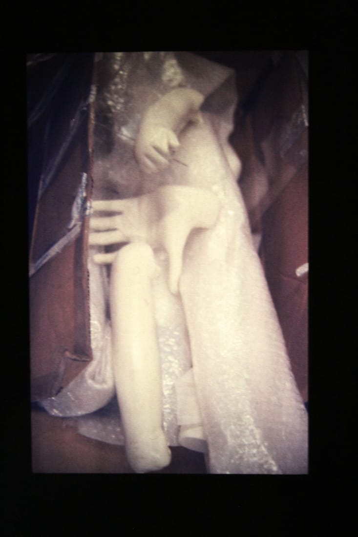
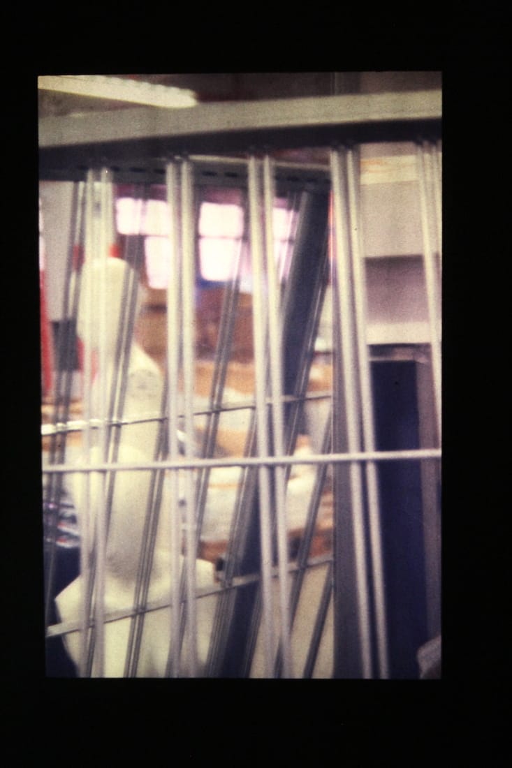
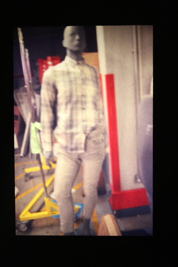
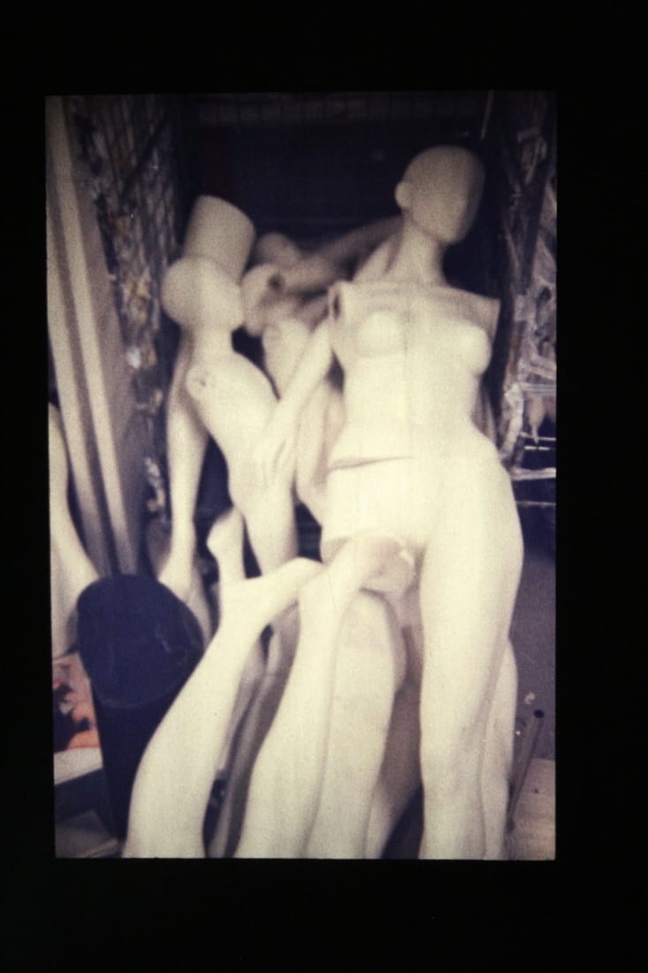
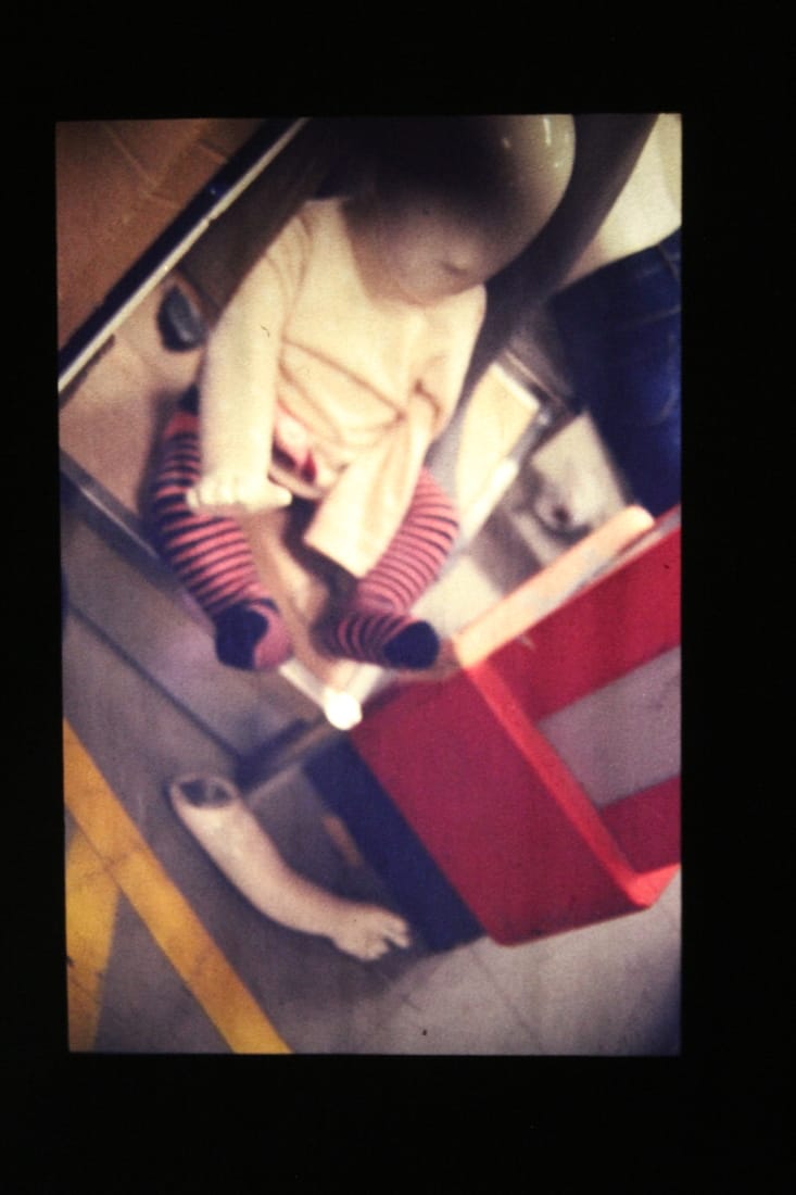
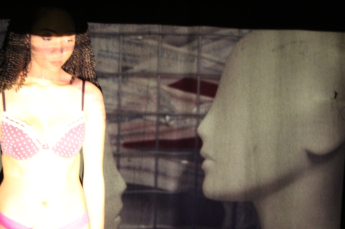
I like how my film images came out because they have a retro feel towards them. For most of the film I tried to get an abandoned theme which is why I used mannequins, both their single body parts and them fitted together. For the rest of the film there's a couple odd ones were I was experimenting with the camera trying to get a feel of how it works. On the other hand some of the images where still at my place of work but just not i the stock room. I took these photographs because I had completed my task of taking images of the mannequins however I had film left over so when I got to the shop for I decided to finish the film by taking images around the shop floor.
To improve my images I could focus them, most of them are strangely not in focused which confused me slightly when I found out because when I took the images I thought they were in focus; now I have to concentrate more when looking through the view finder and make sure that the object I want is in focus insetead of trying to get everything in focus.
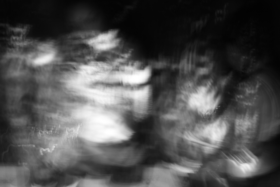
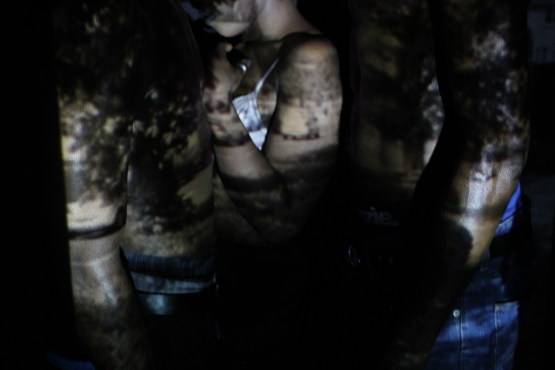
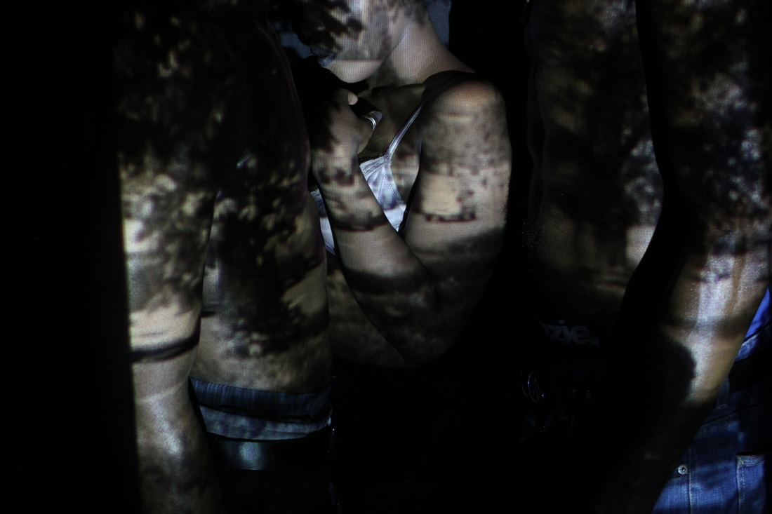
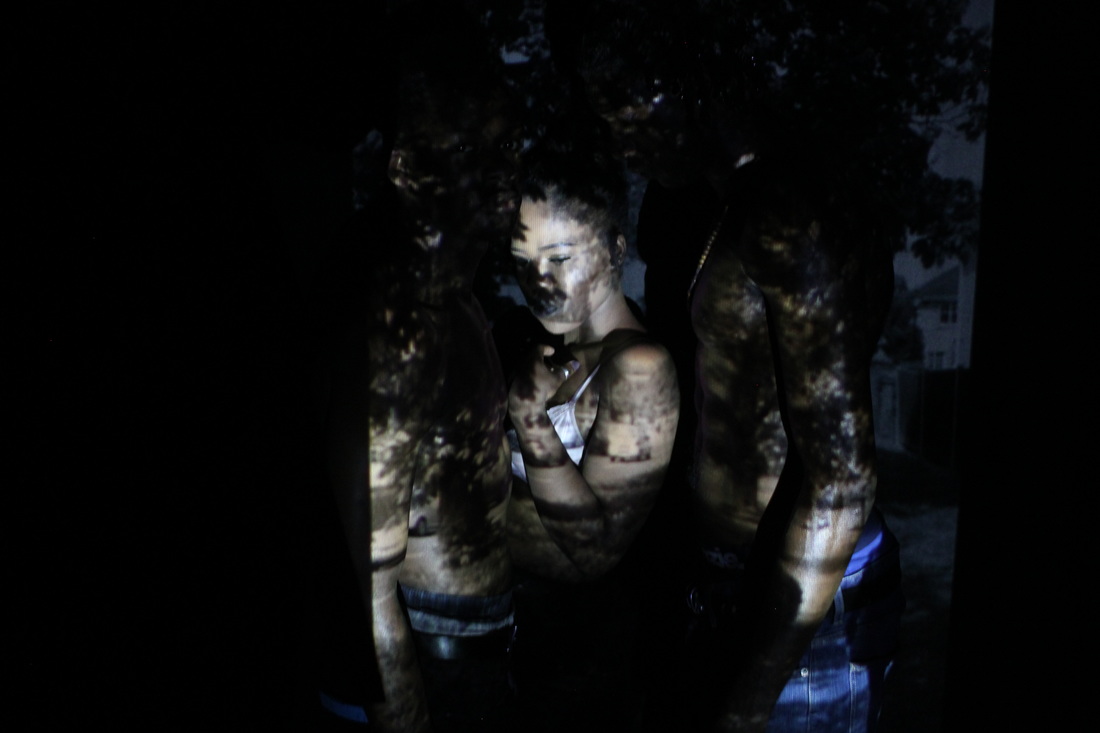
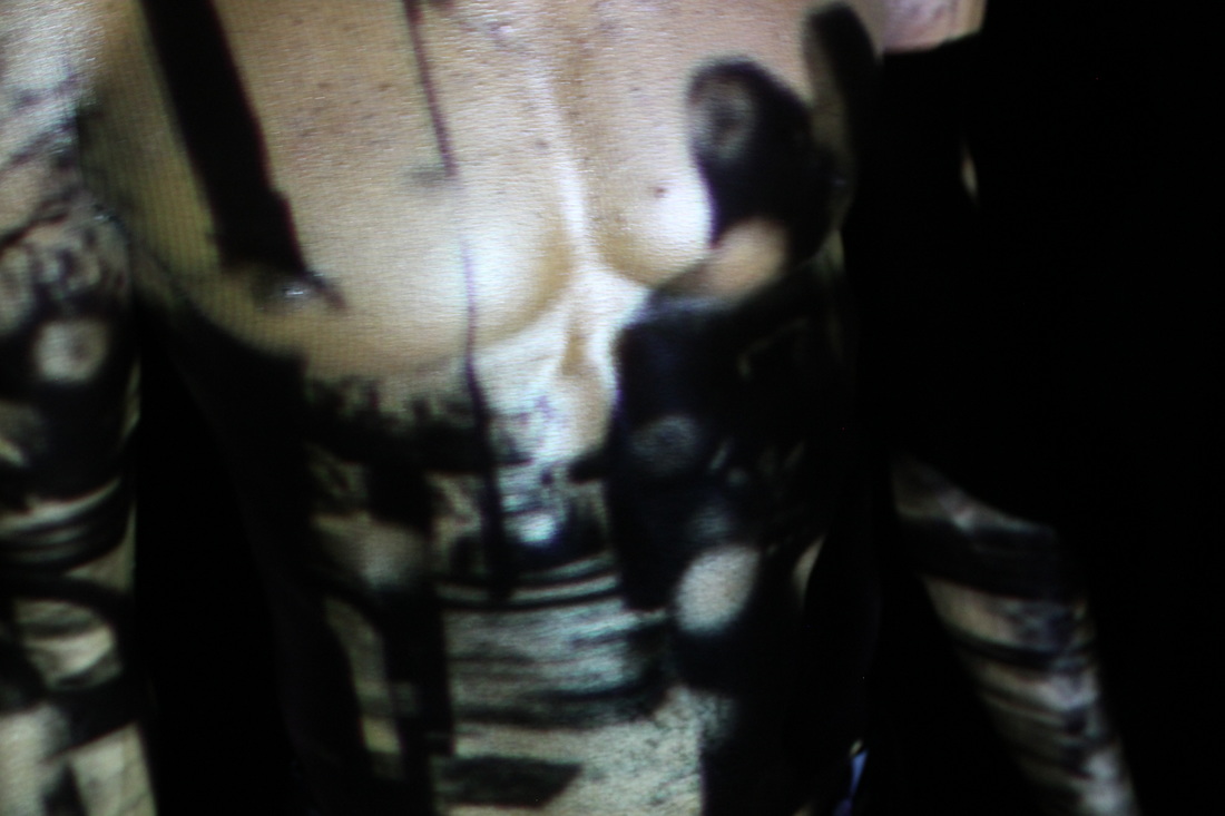
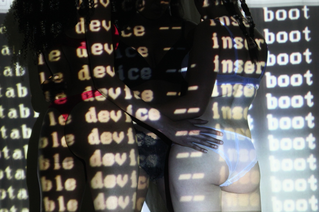
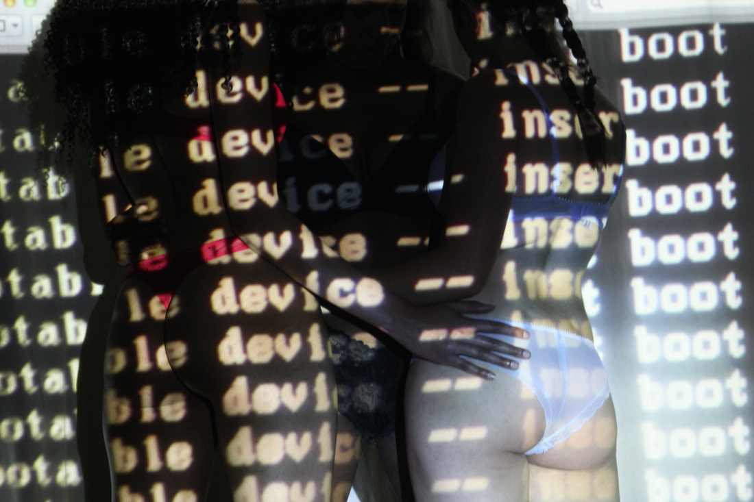
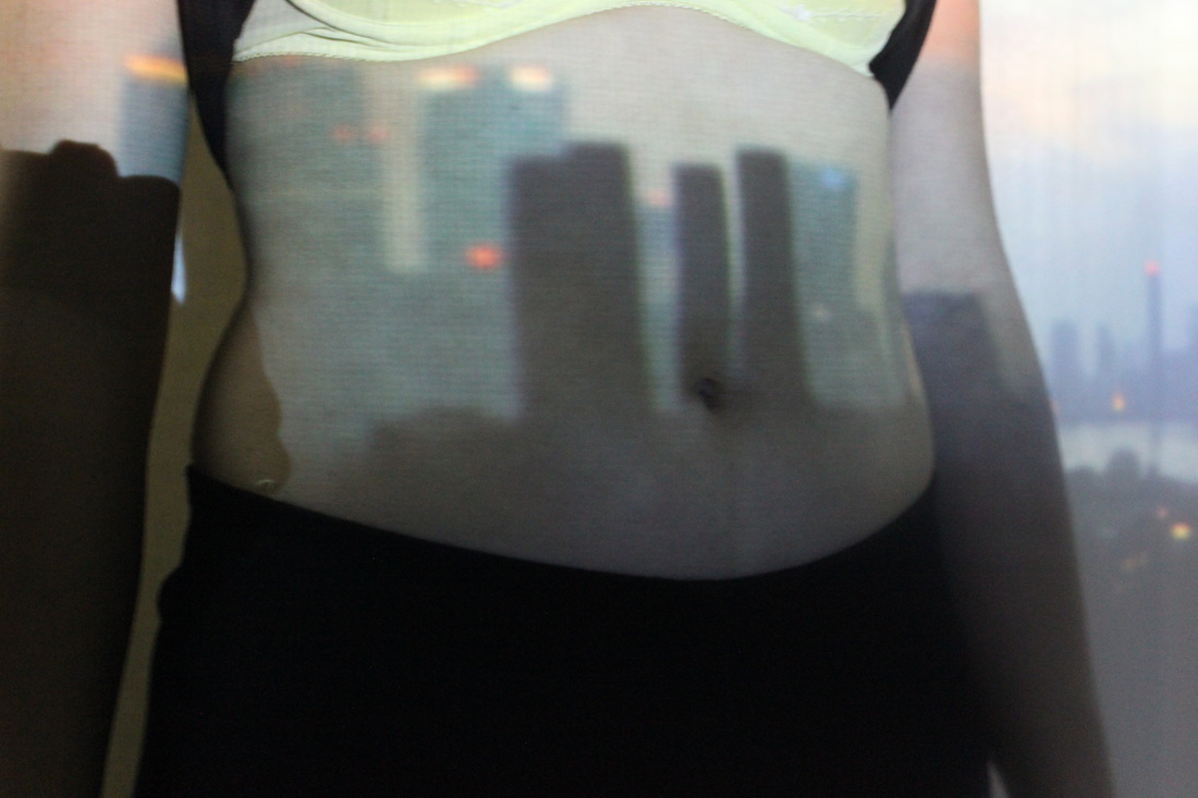
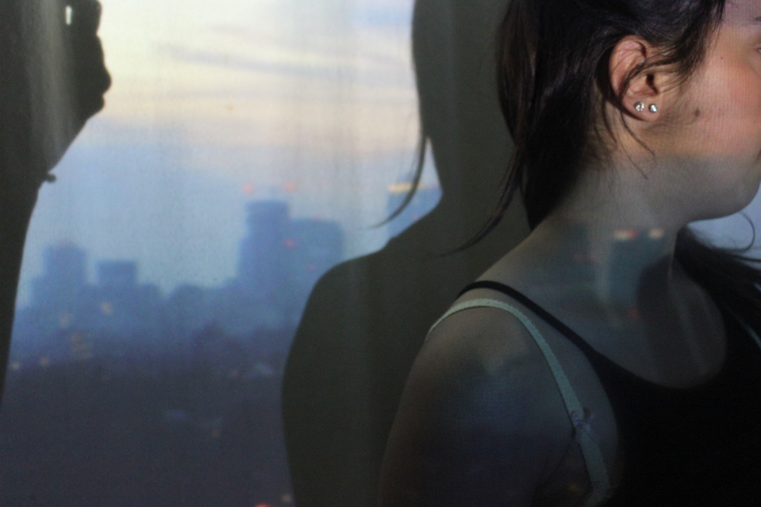
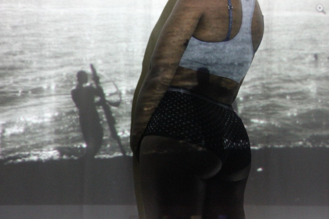
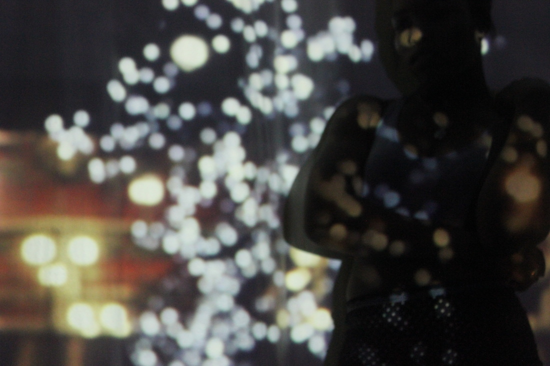
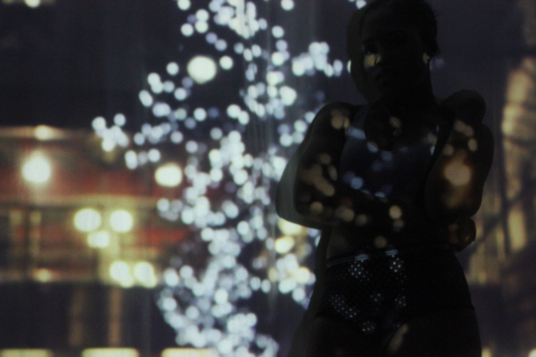
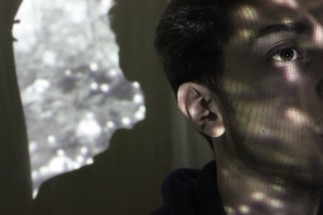
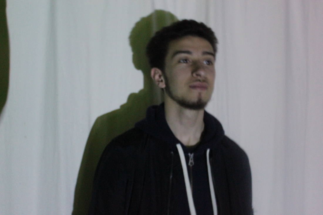
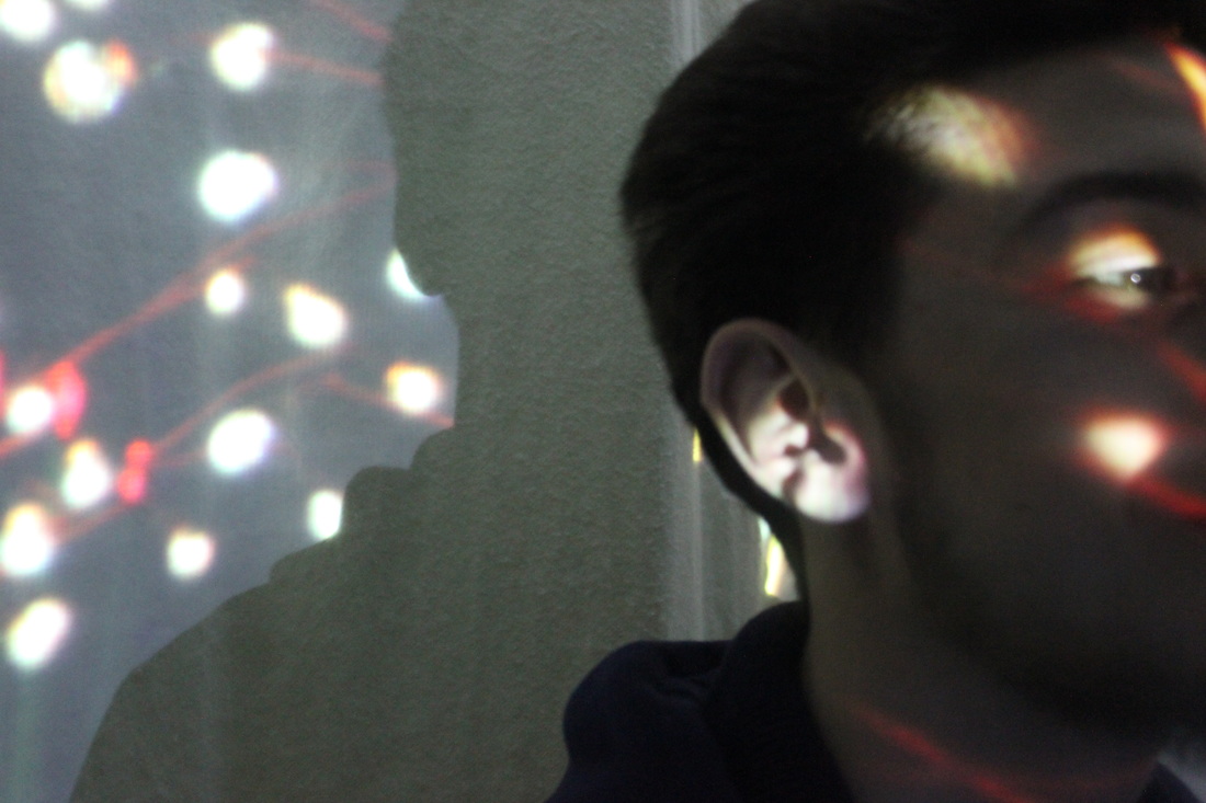
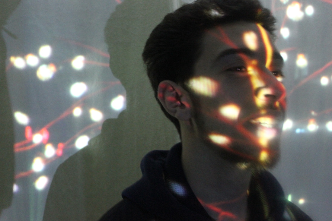
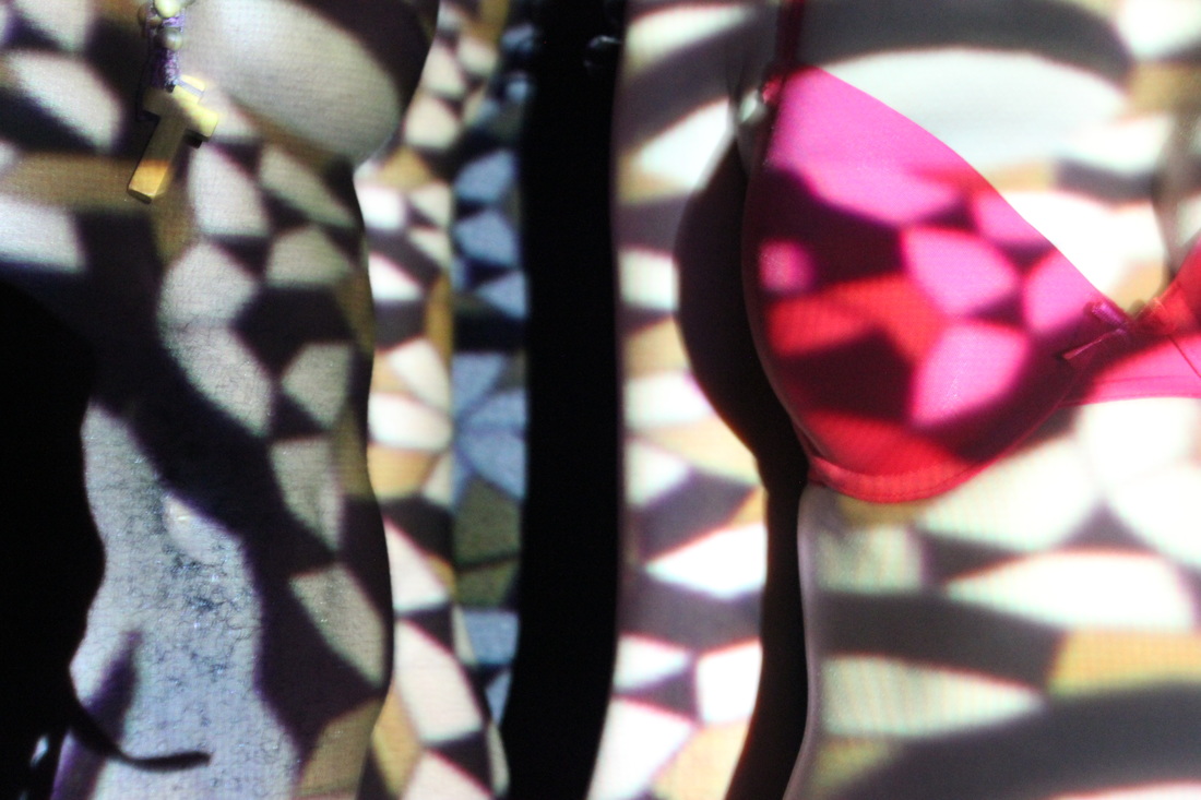
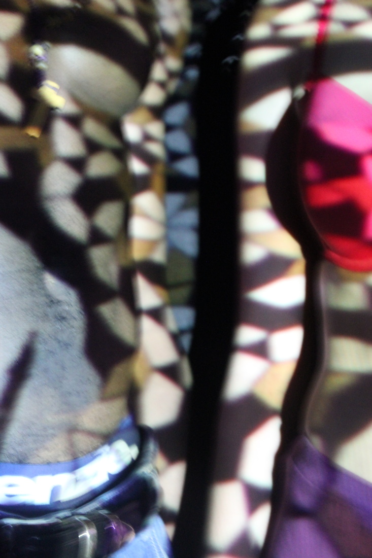
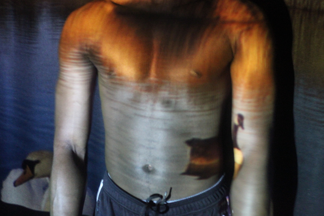
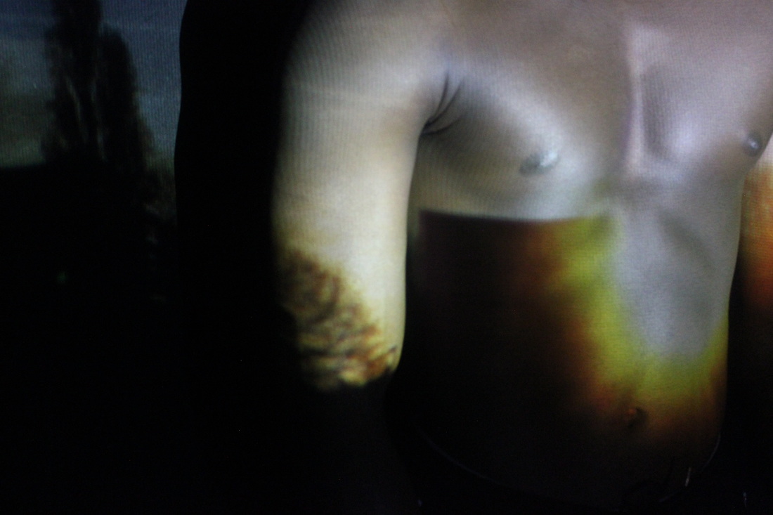
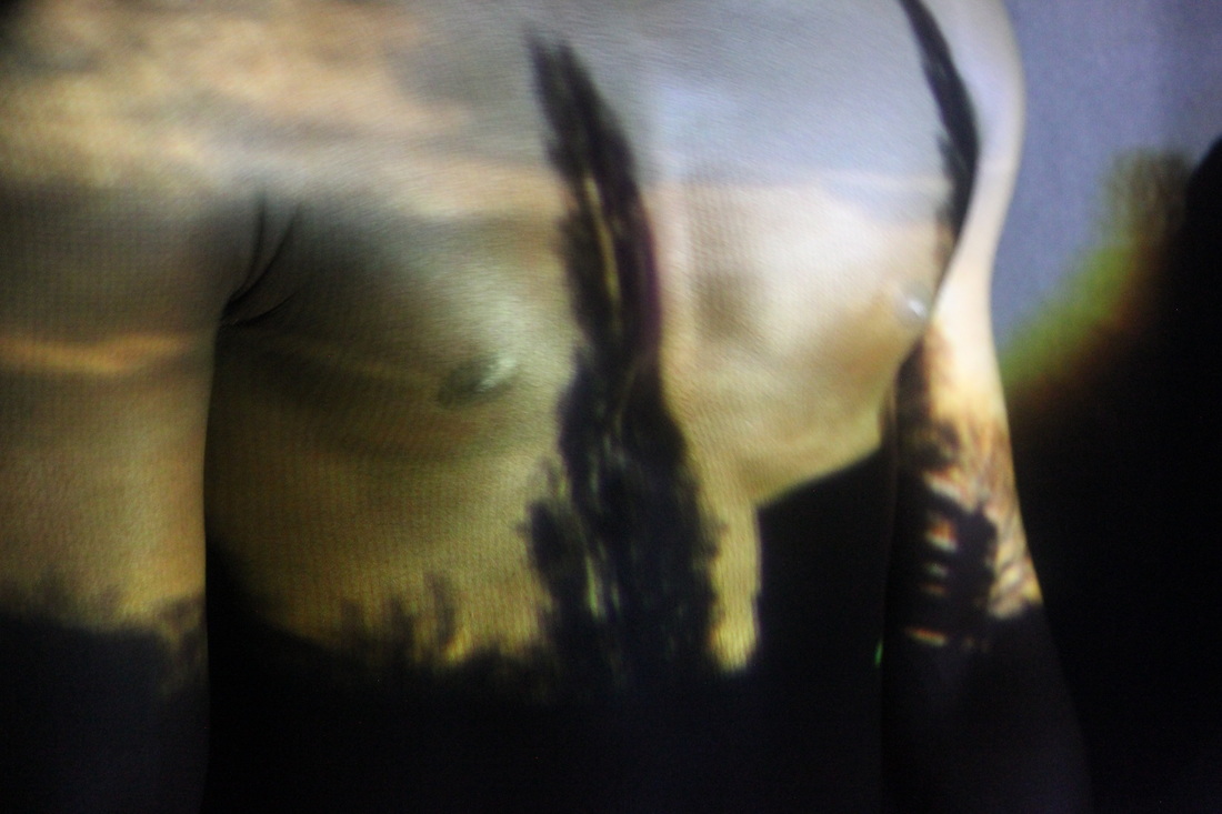
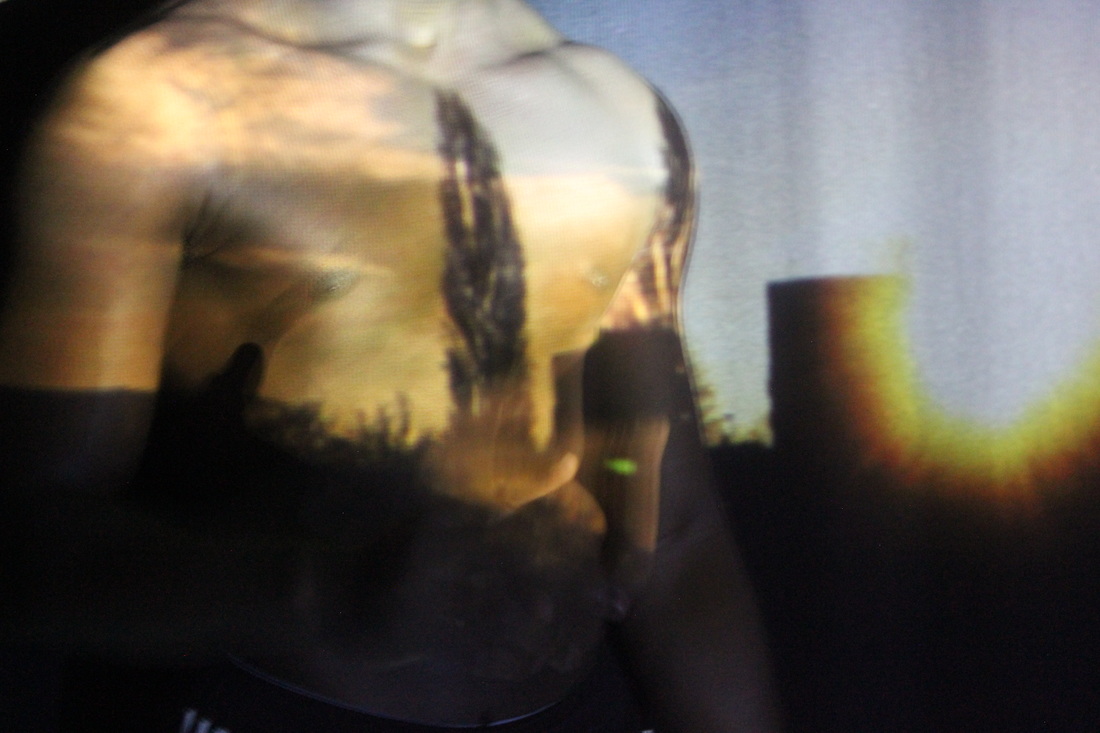
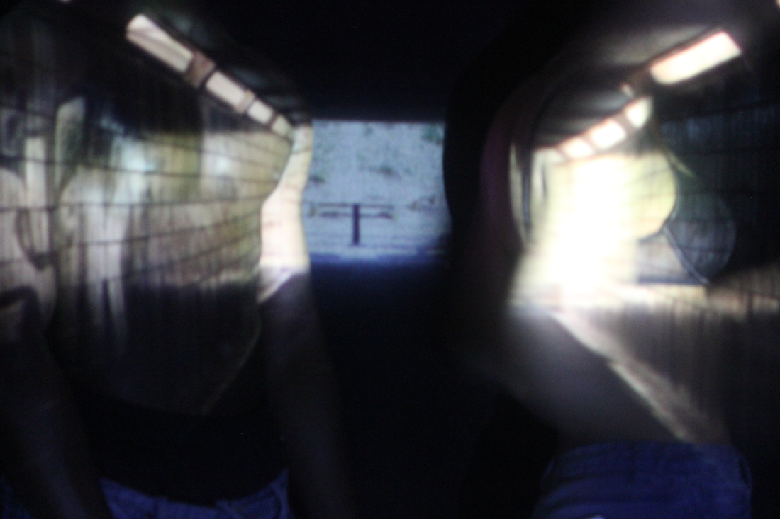
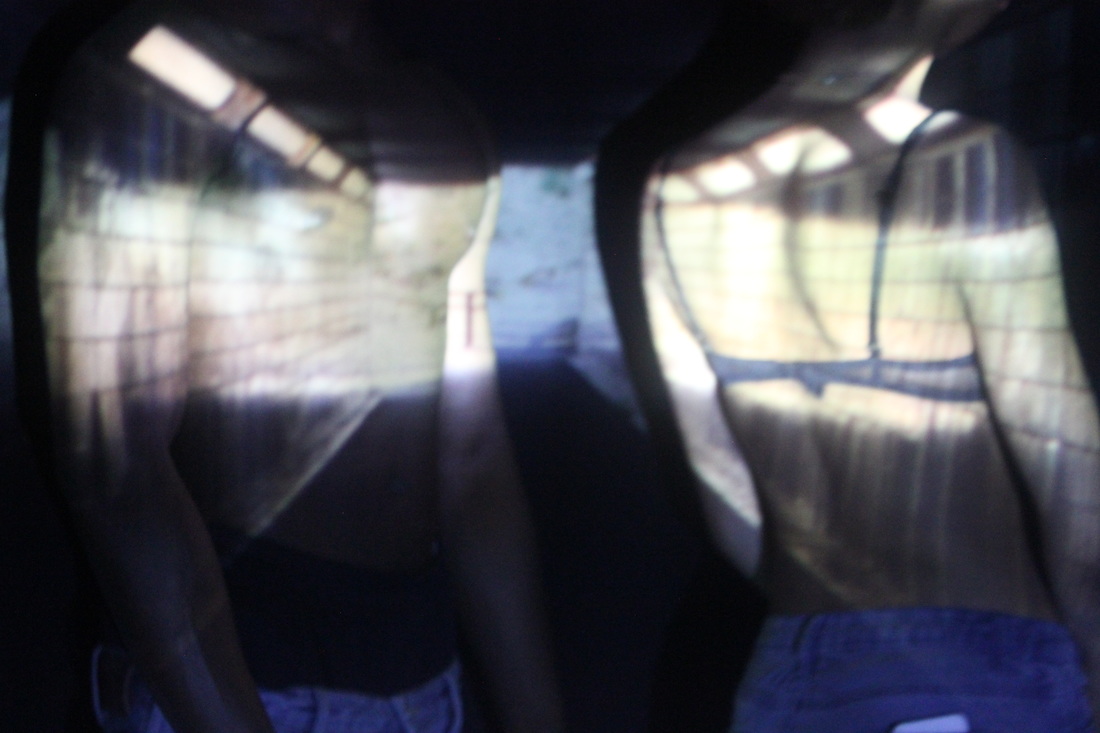
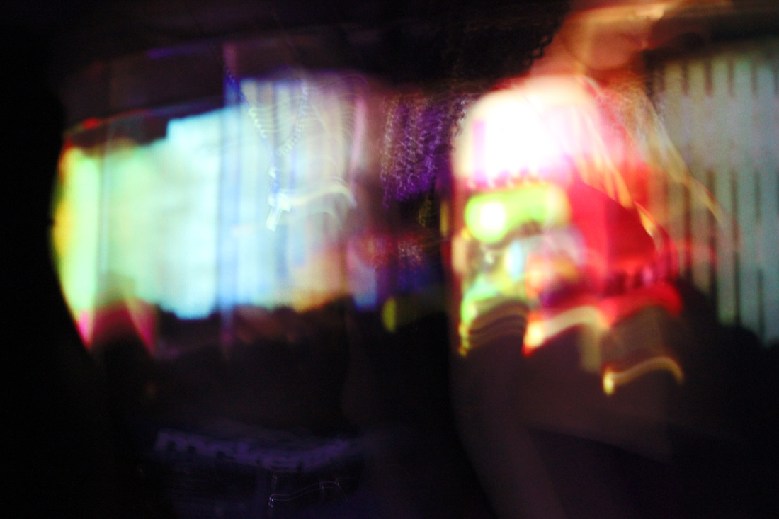
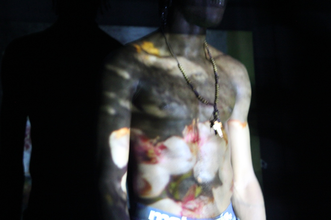
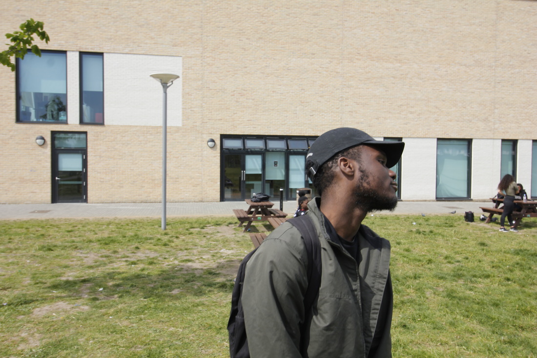
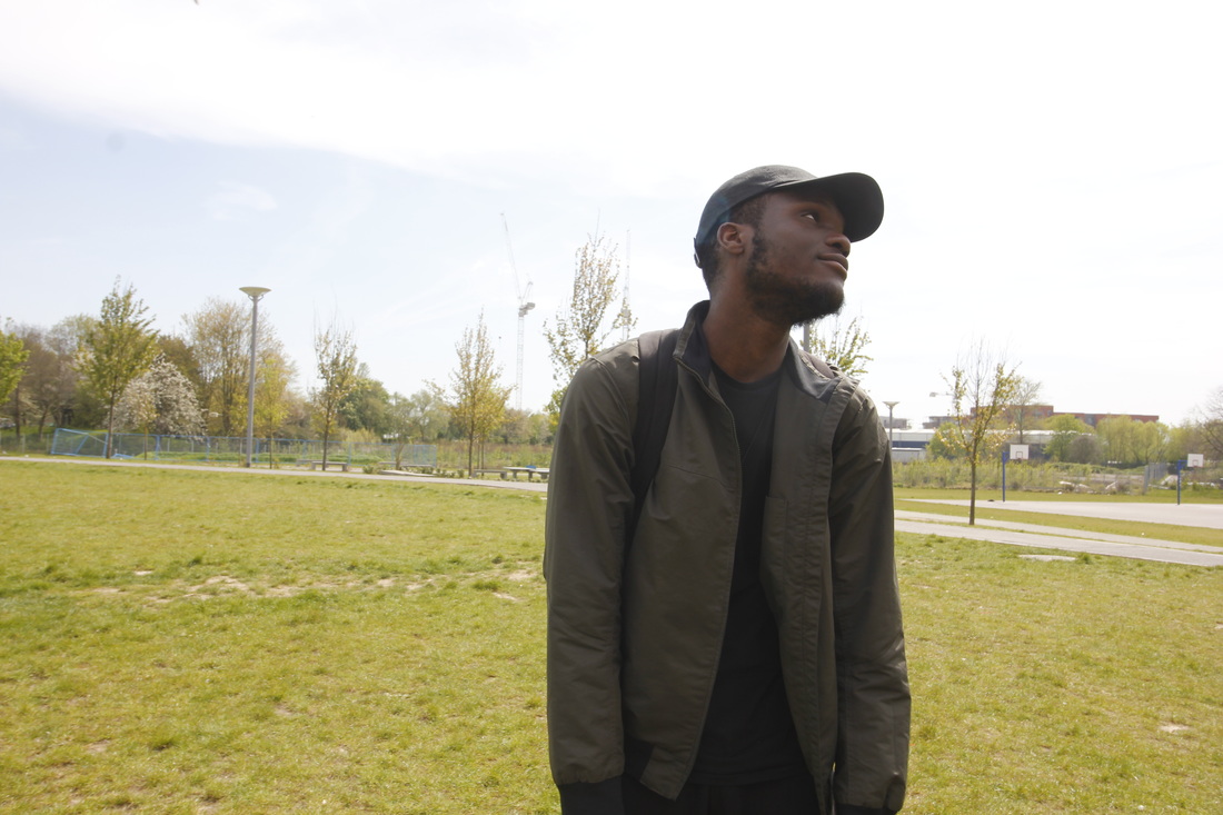
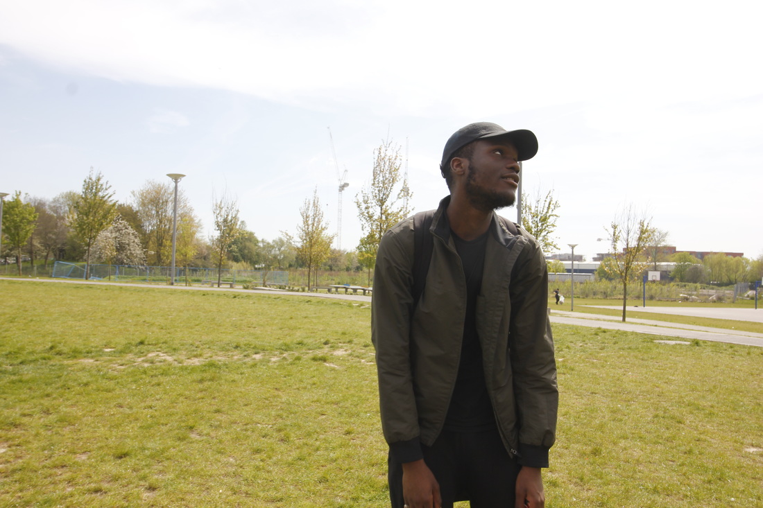
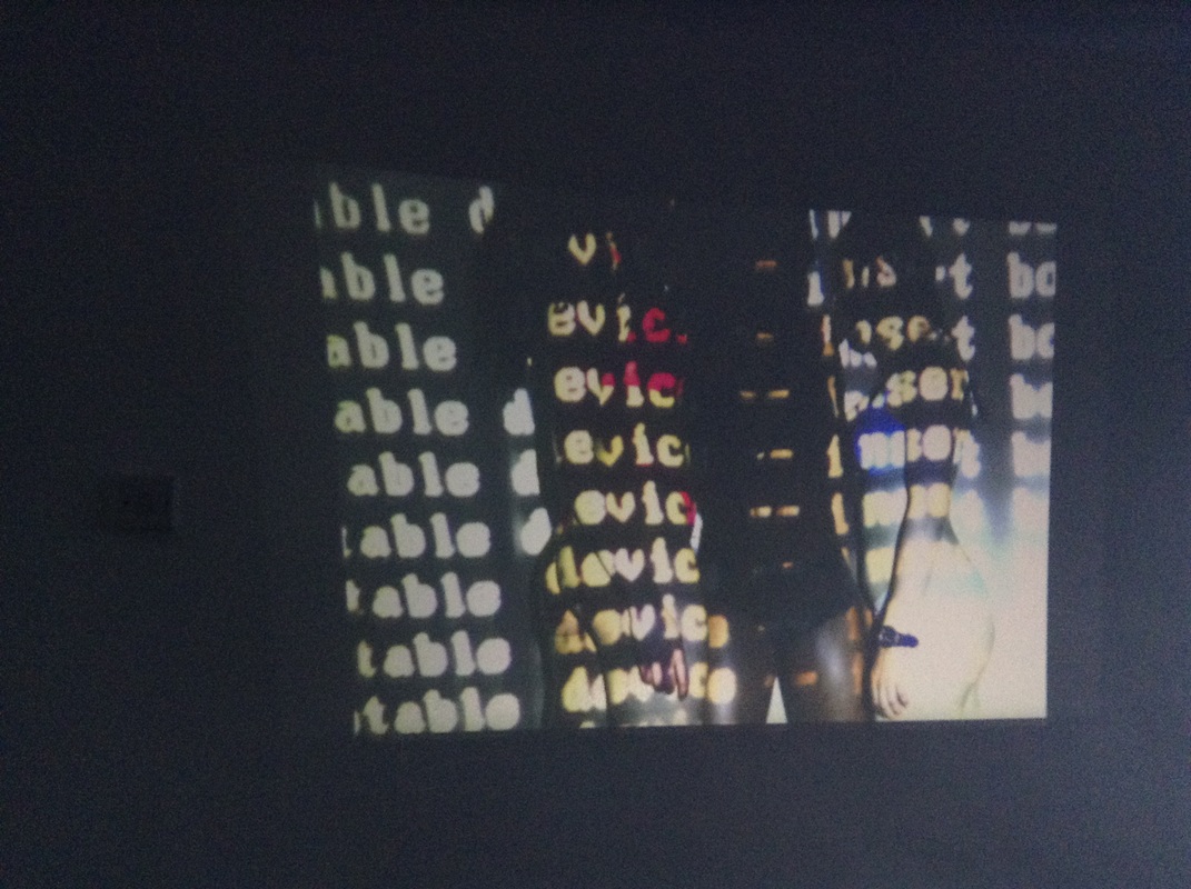
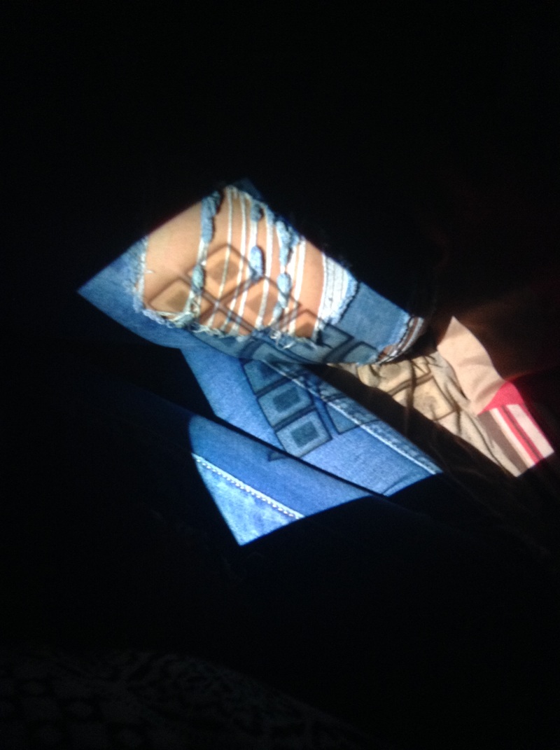
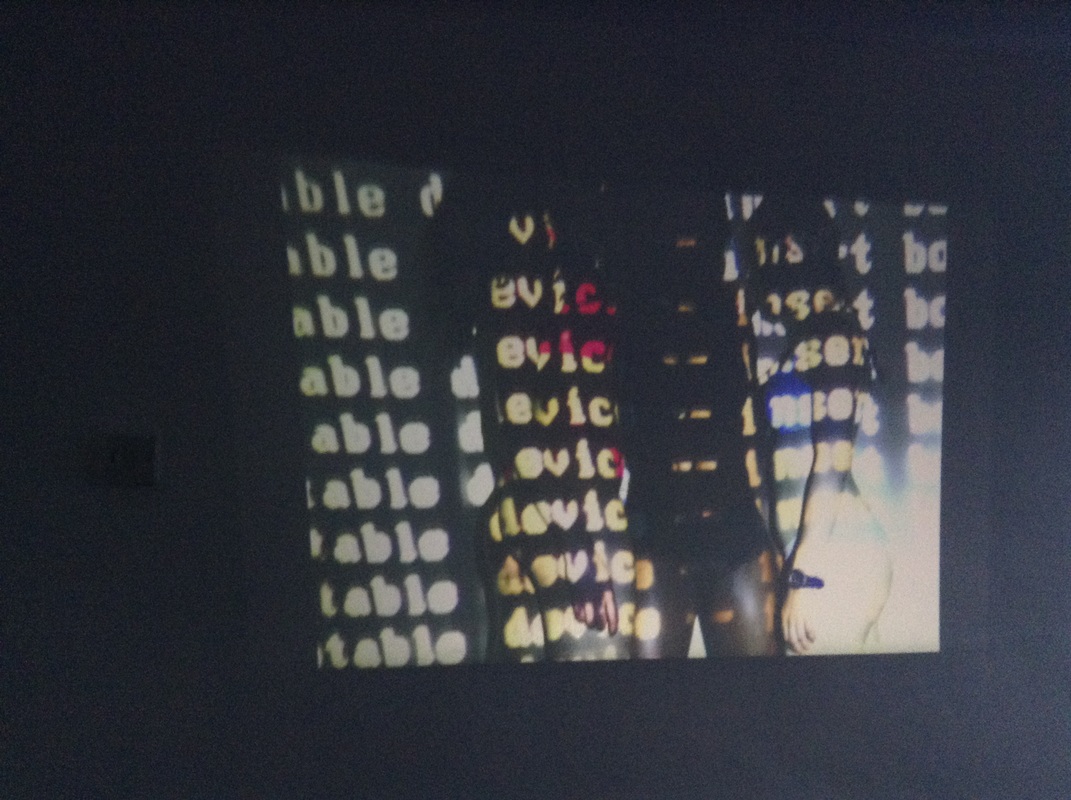
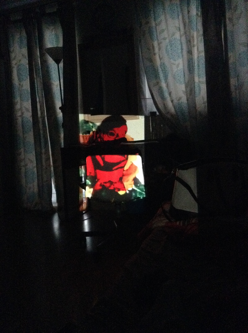
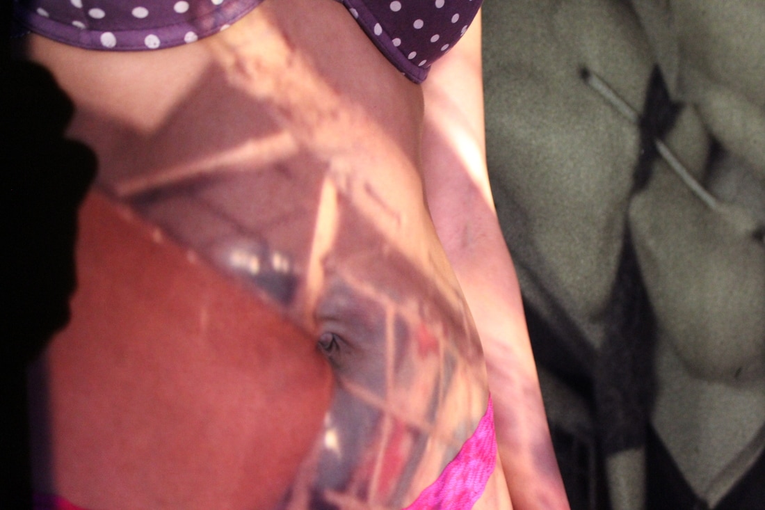
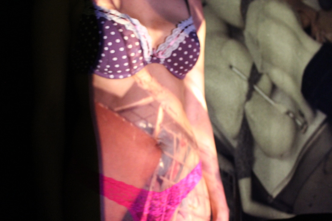
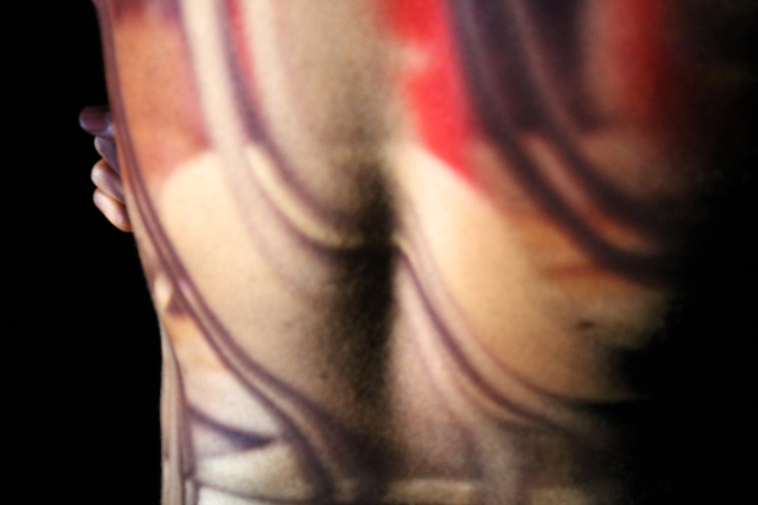
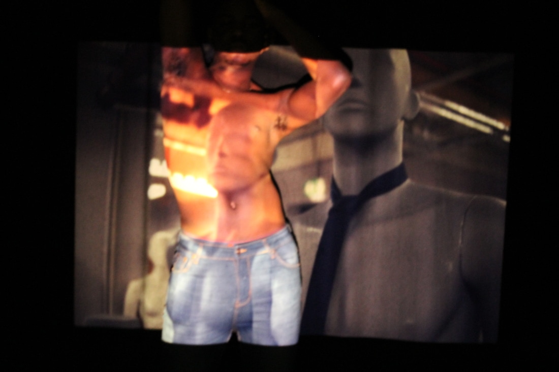
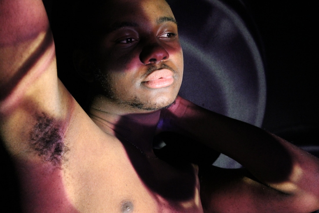
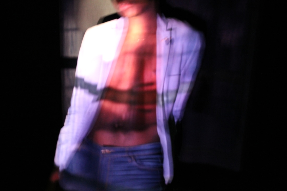
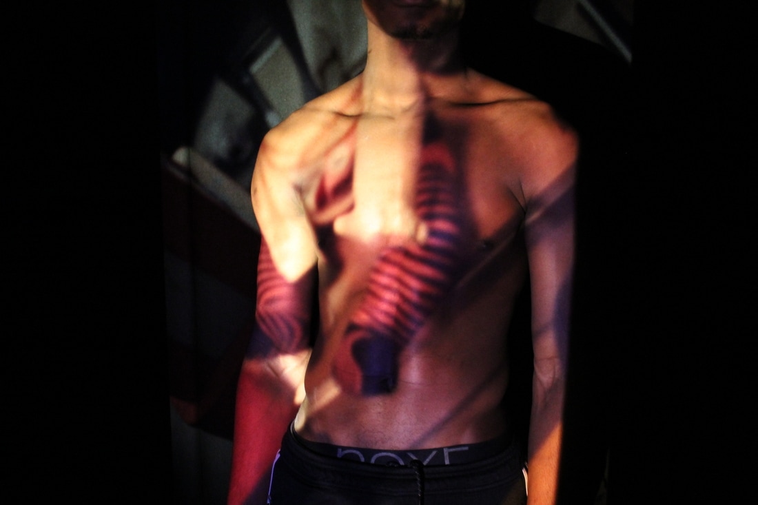
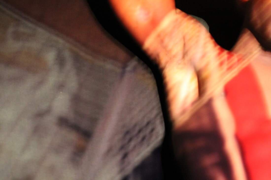
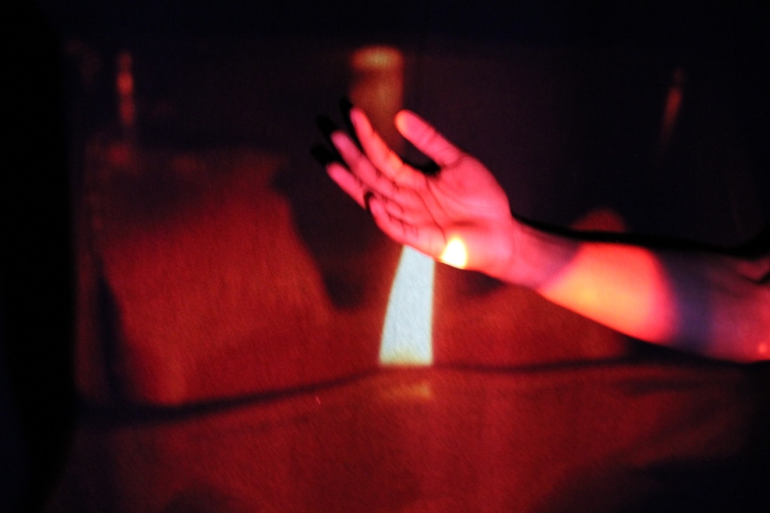
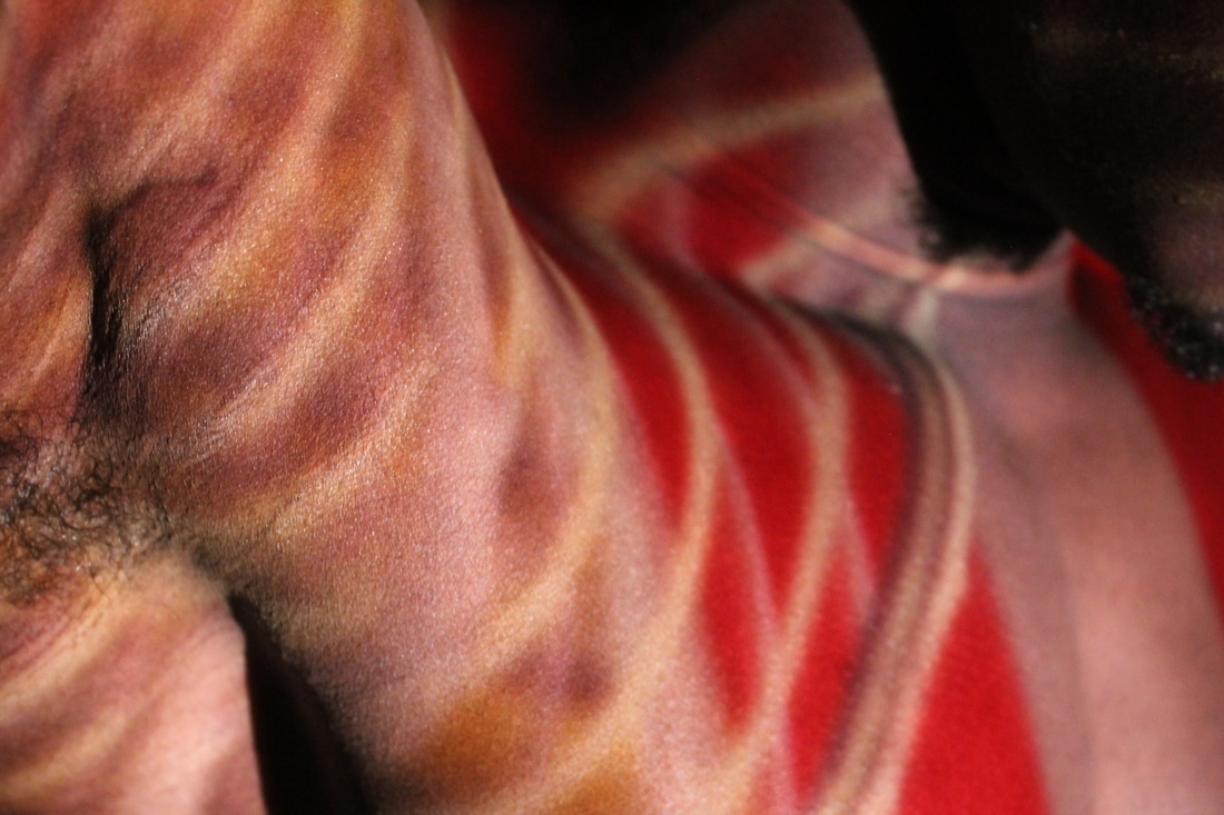
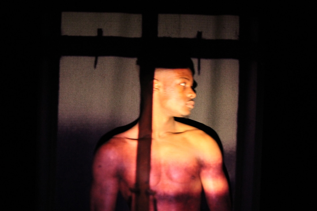
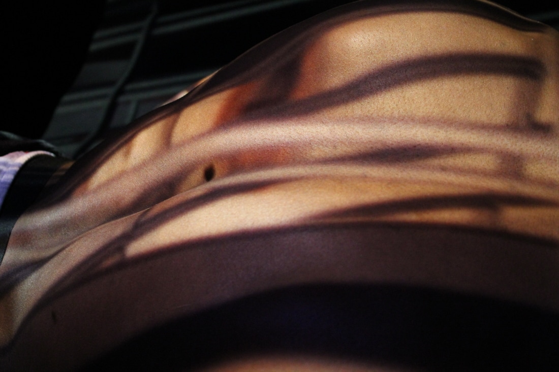
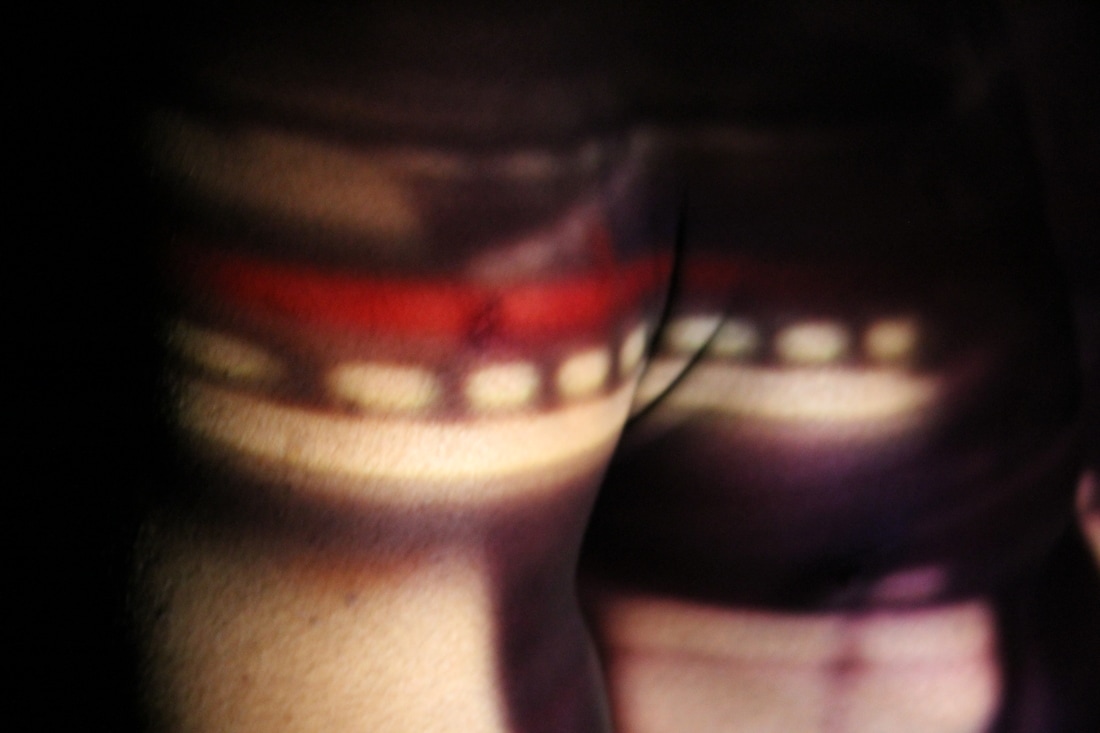
Focusing on the whole projections idea I wanted to expand on it more so I decided to go back to where it all started with my first photo shoot, with the projections on the human body. However this time I'm going to project my slide film onto the human body instead of random images I've previously taken. While doing this I'm going to film the whole process with three cameras, one on either side of the room with a standard lens; once finished I will then edit the videos together thus creating one of my final pieces. Unfortunately I don't have as many models doing it as before, there are going to be more male bodys than female, if any. I wanted to vary with the sexes however this time it wasn't very likely.
To improve my images I could focus them, most of them are strangely not in focused which confused me slightly when I found out because when I took the images I thought they were in focus; now I have to concentrate more when looking through the view finder and make sure that the object I want is in focus insetead of trying to get everything in focus.
Focusing on the whole projections idea I wanted to expand on it more so I decided to go back to where it all started with my first photo shoot, with the projections on the human body. However this time I'm going to project my slide film onto the human body instead of random images I've previously taken. While doing this I'm going to film the whole process with three cameras, one on either side of the room with a standard lens; once finished I will then edit the videos together thus creating one of my final pieces. Unfortunately I don't have as many models doing it as before, there are going to be more male bodys than female, if any. I wanted to vary with the sexes however this time it wasn't very likely.
*These models knew the purpose of these images and were happy for me to take a video during the photoshoot.*
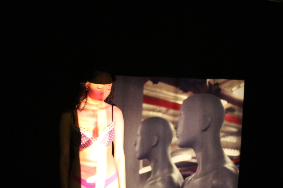
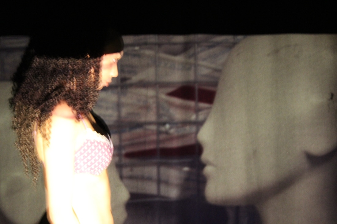
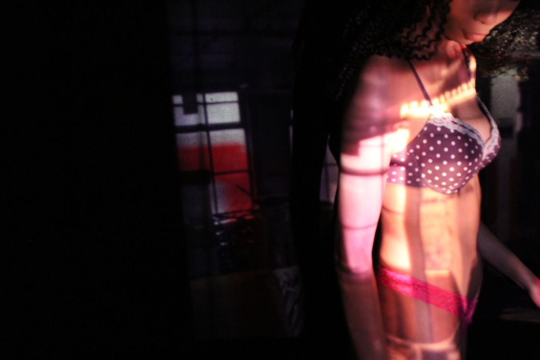
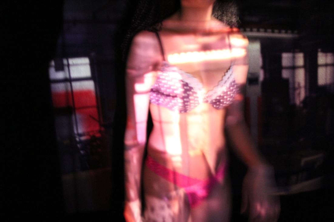
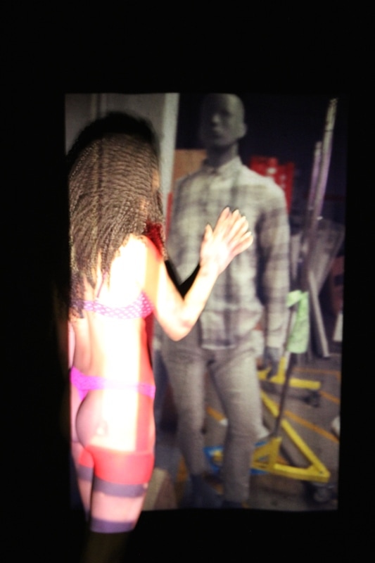
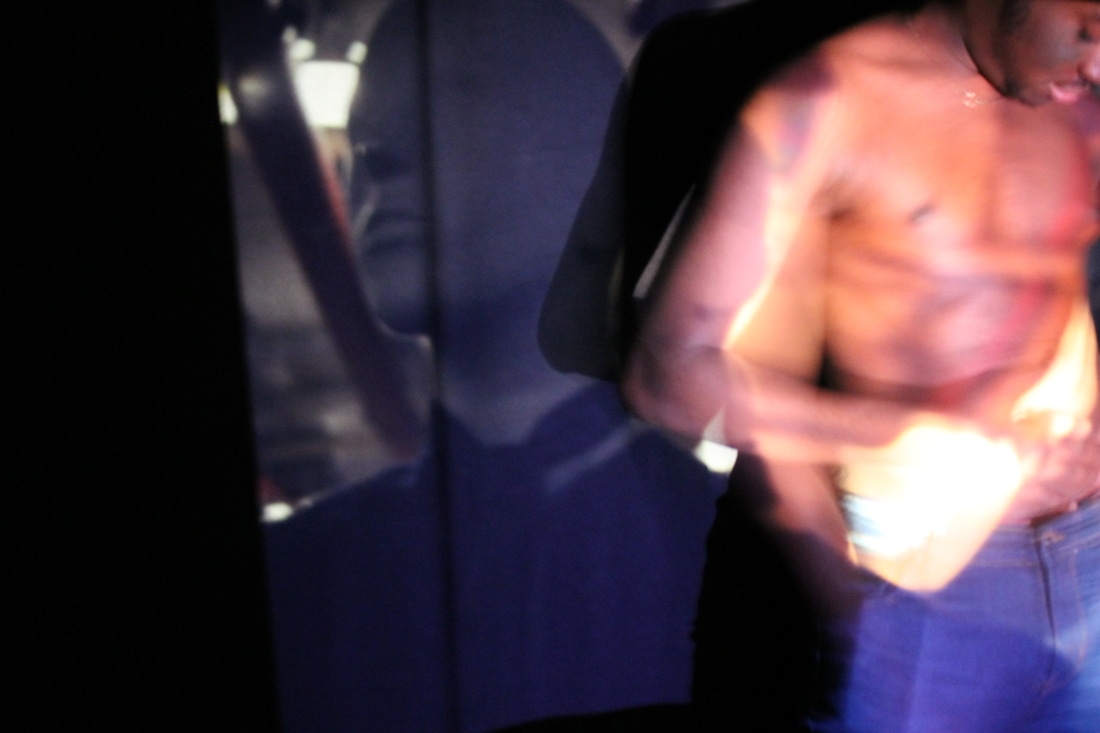
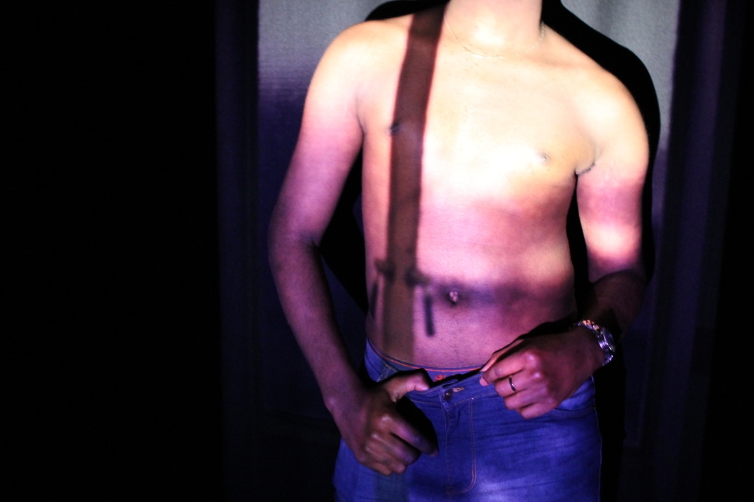
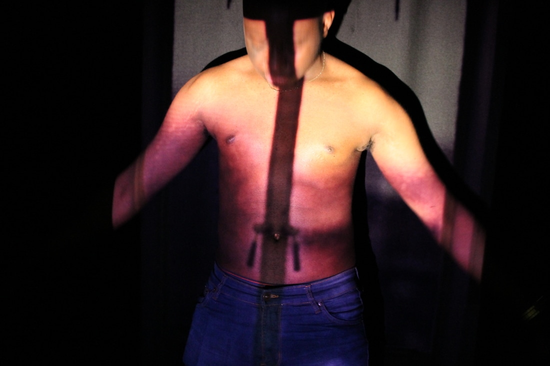
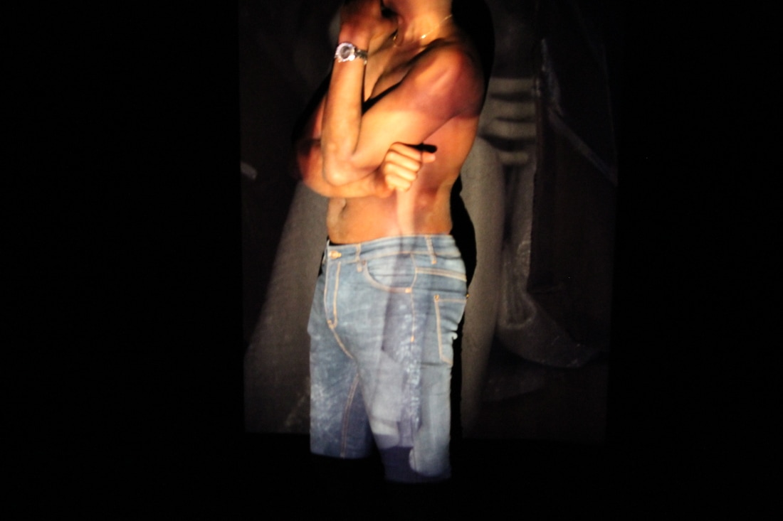
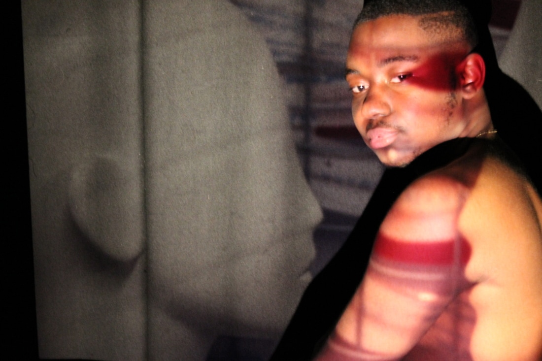
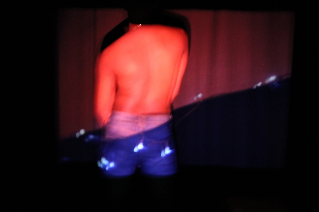
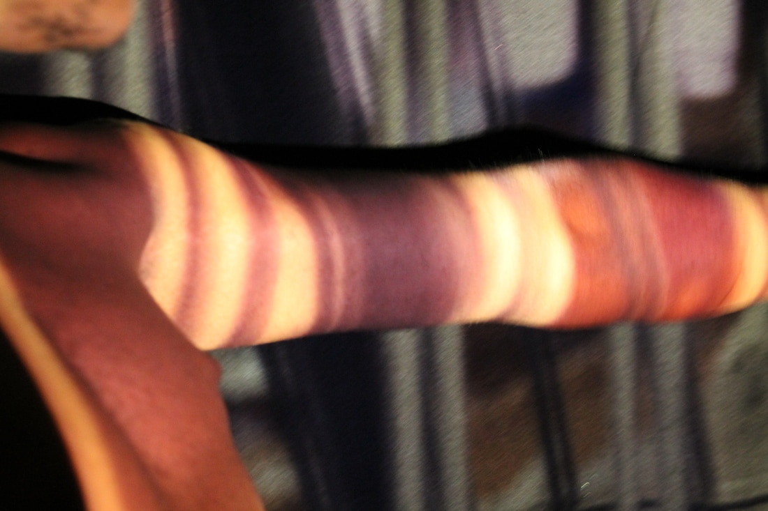
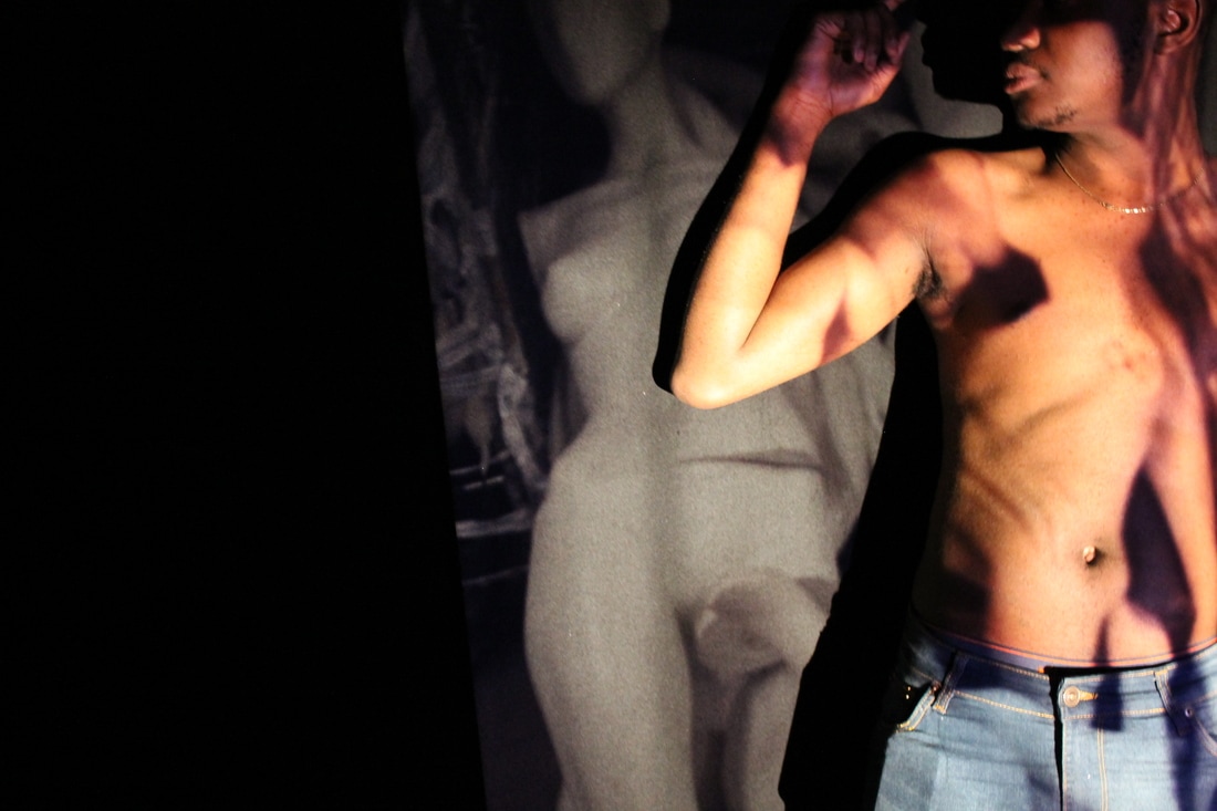
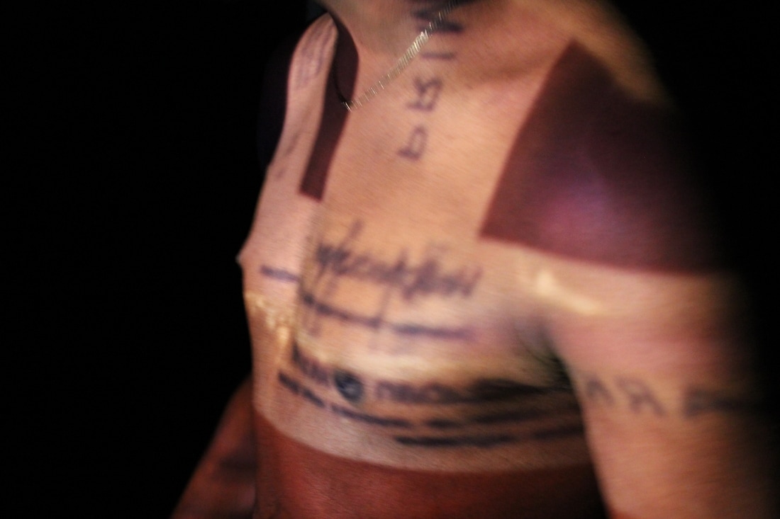
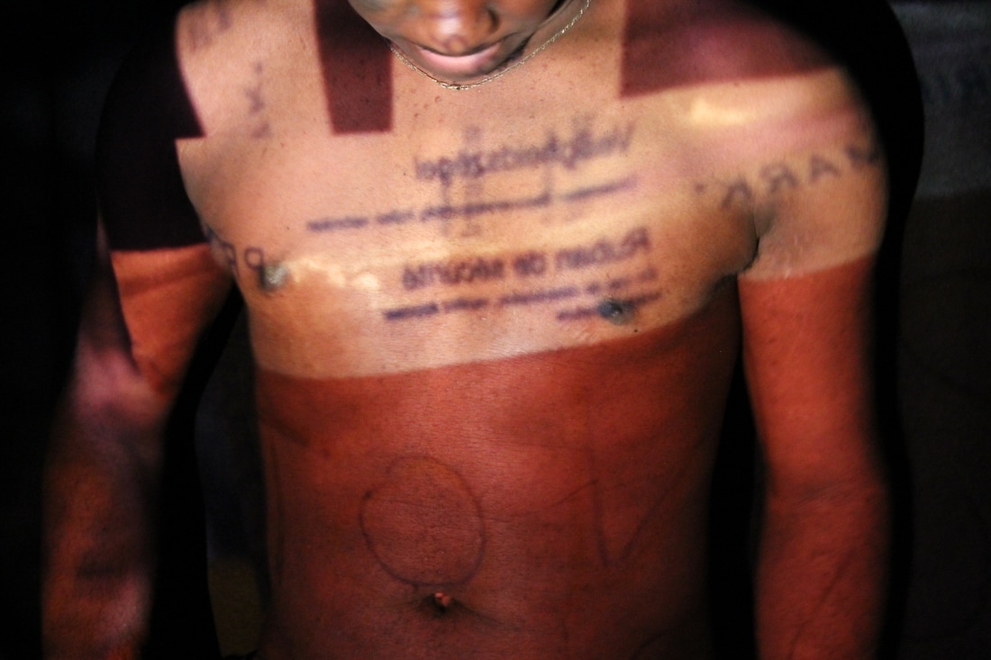
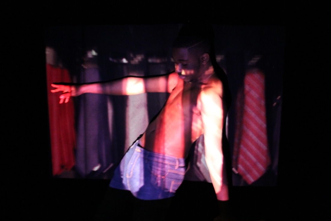
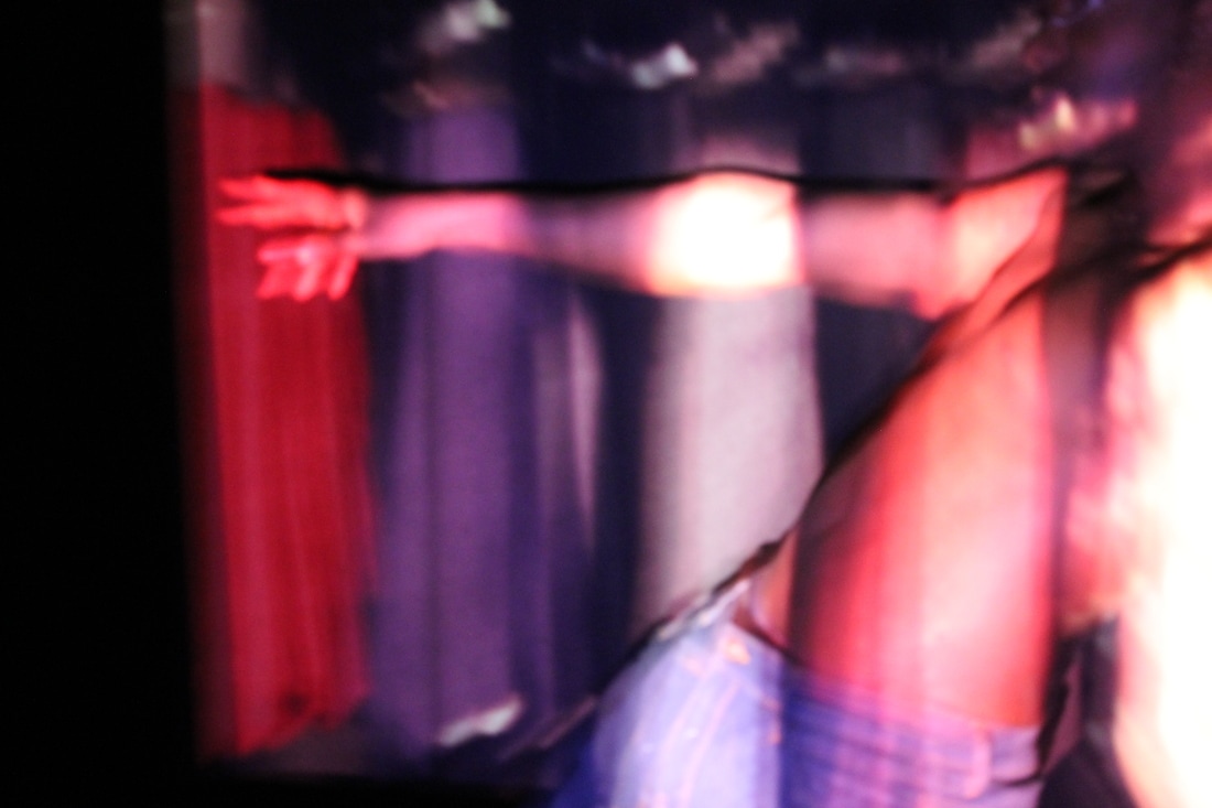
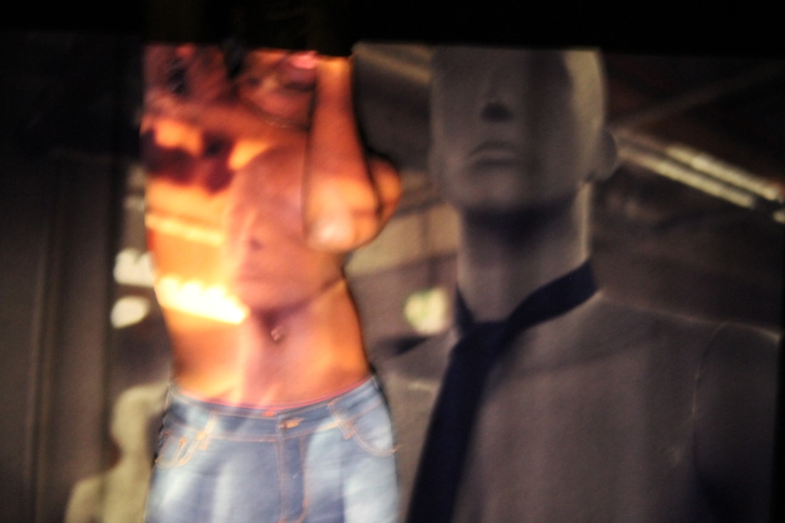
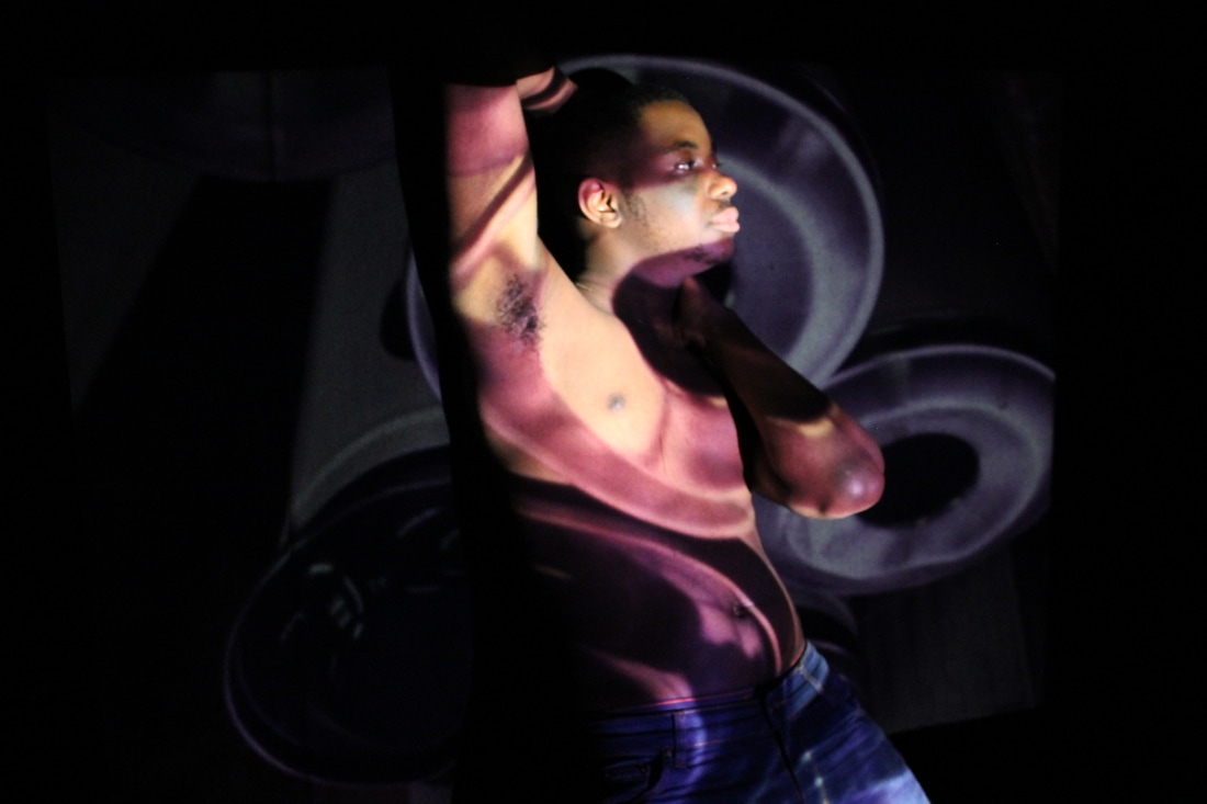
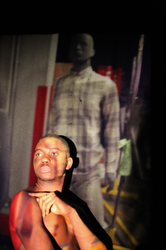
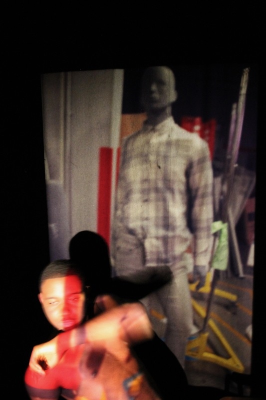
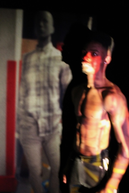
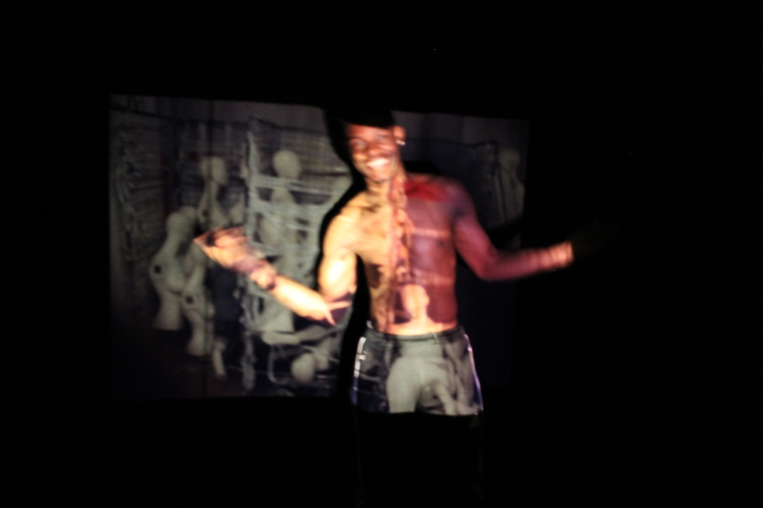
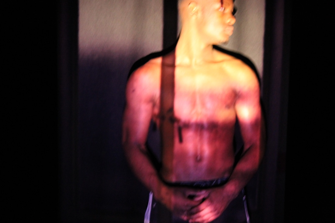
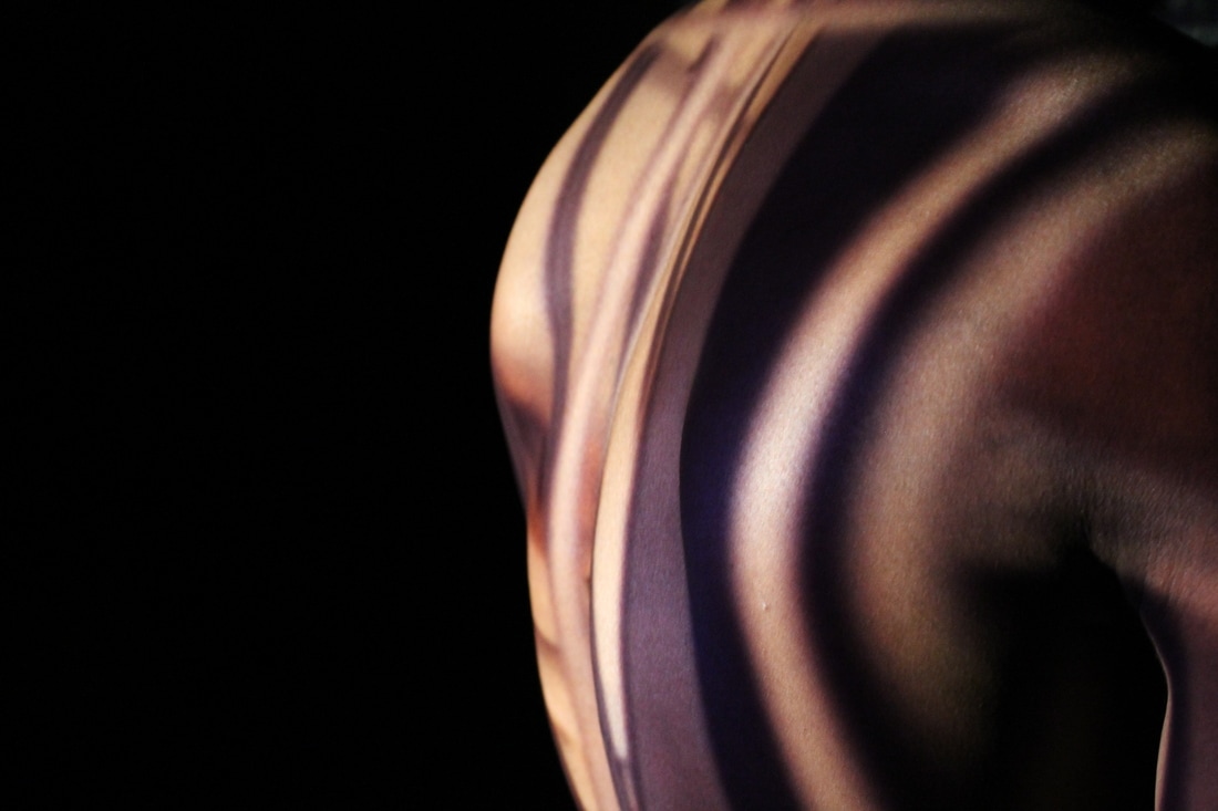

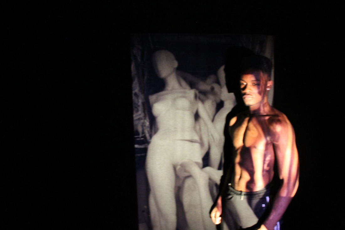
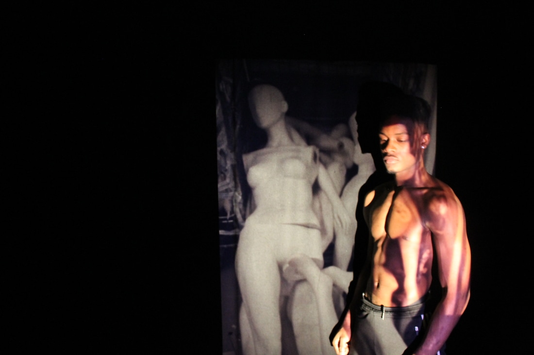
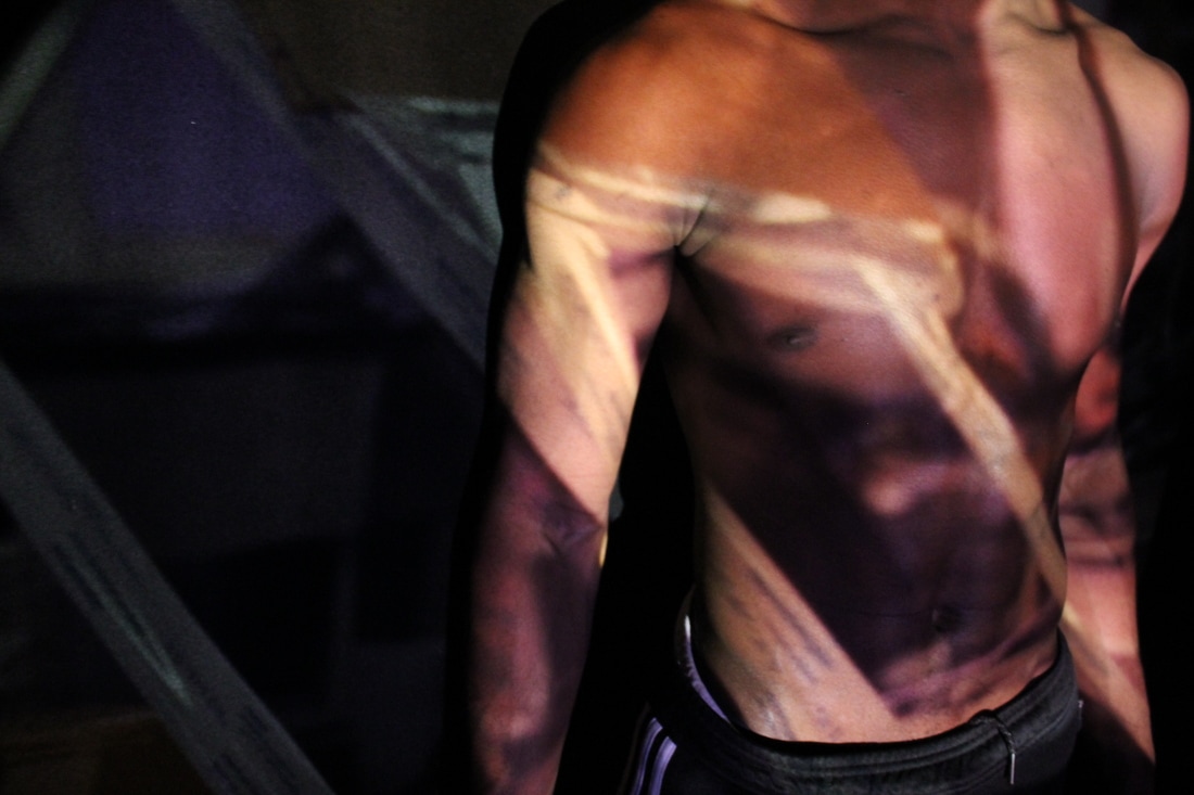
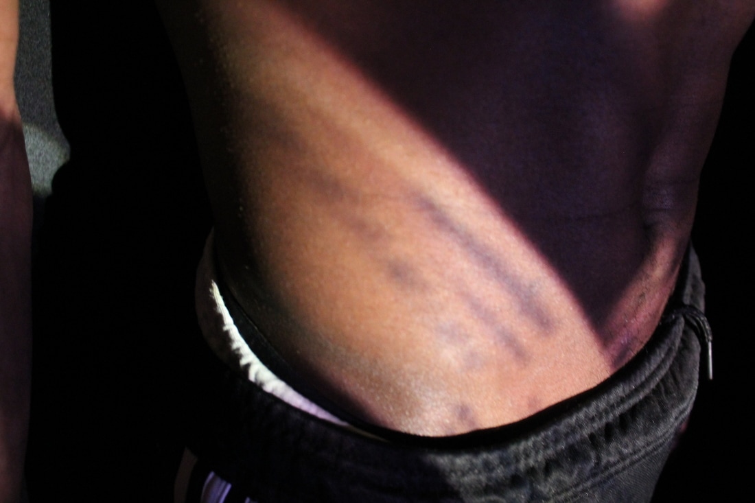
One of the cameras will have a full view of the photoshoot and the second camera is going to be zoomed into the actual projection and model. For my first trial the second camera that was zoomed in had died half way through the photoshoot and so I wasn't able to use that footage, however the video I do have is the one of the whole photoshoot but zoomed out. On the other hand for the other shoots both cameras worked. Because each photo shoot did take a long time to do and the videos are at least 12/20 minutes long I had to make edits to all videos. Firstly I merged all videos that way the audience gets an idea on how every photoshoot went; the first edit was taking out the sound because the conversation(s) that where taking place were quite personal to the model(s) and they didn't want that to be on it and the second edit was to speed up some parts because of how long the video(s) are. Unfortunately I wasn't able to get the videos off of the camera's SD card because they had been deleted off the camera.
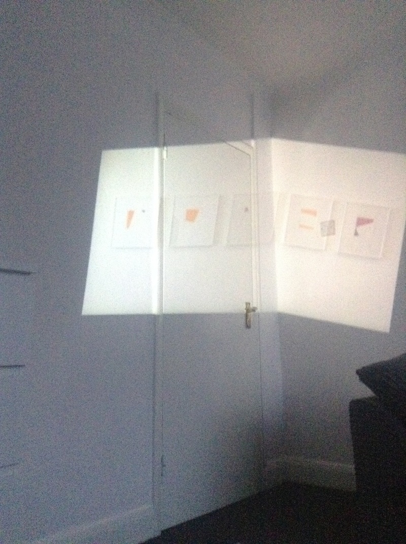
Final Piece(s) for Component One
These are the chosen images that I want to use as final pieces, because I revolved my personal investigation around projections I'm going to have the film projected images going down in a row on the left hand side of the wall and the camera projected images on the right hand side of the wall. In between these two rows of images I'm going to have a film projector project my slides and a normal projector projecting my digital images on top.
**Link to my personal investigation evaluation is at top of this page.**
