What Is A Photo Book And The History Behind It ?
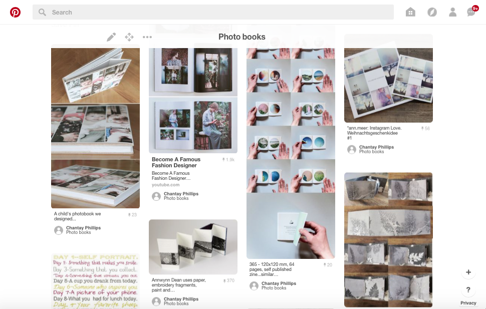
To give me a rough idea on how to start a photo book I went onto Pinterest and created a mood board of different photo books and the layout of them.
A photobook is a book in which photographers make a significant contribution. Early photo books are characterised by their use of photographic printing as part of their reprographic technology. Arguably the first phonebook: "Photographs of British Algae: Cyanotype impression" (1843 - 53) was created by Anna Atkins. Some sources claim that she was the first woman to create a photo book. The photo book is the 'supreme platform' for photographers in order to publicise their work to a mass audience, giving an increase in self-publishing ; this has made the creation of photo books more popular over the years.
Every artist has a way that they display their work, painters have art exhibitions, poets have books and photographers have photo books. To start my research I began to look at multiple artists that had created photo books, the first artist I found was Rinko Kawauchi.
Every artist has a way that they display their work, painters have art exhibitions, poets have books and photographers have photo books. To start my research I began to look at multiple artists that had created photo books, the first artist I found was Rinko Kawauchi.
Rinko Kawauchi - Utatane; 2005
|
Rinko Kawauchi works in Tokyo and had created not one but three photo books that turned out to be most outstanding photo books in the photography world of Japan.
Personally I don't think that this photo book had a specific subject matter. The images slightly coincide however they don't concentrate on a specific subject, apart from the fact that she was trying to capture the details of everyday life that is easily missed, almost like a daily routine. Similarly to how Kawauchi presents her images in her photo book; making them look like polaroid images, she uses one of them as her book cover photo. On some versions of her book the sober |
|
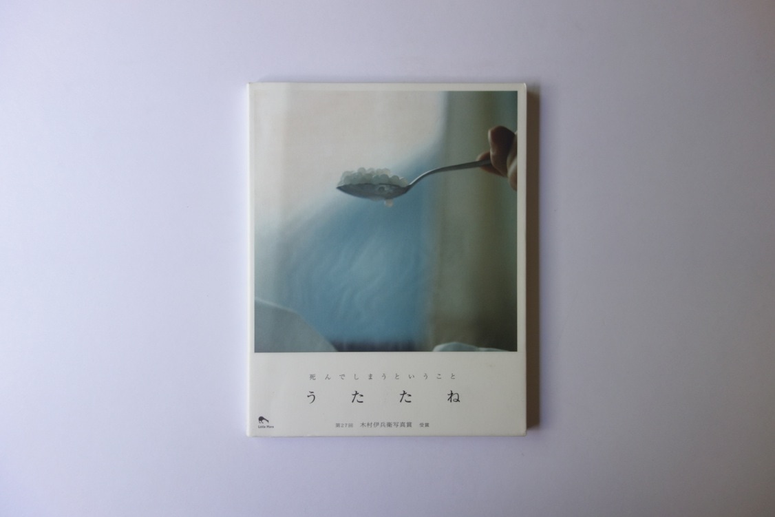
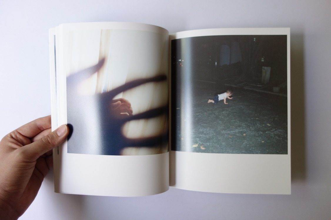
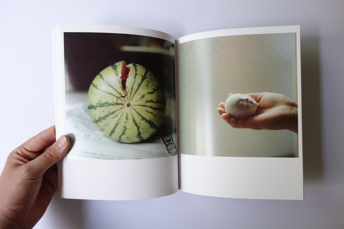
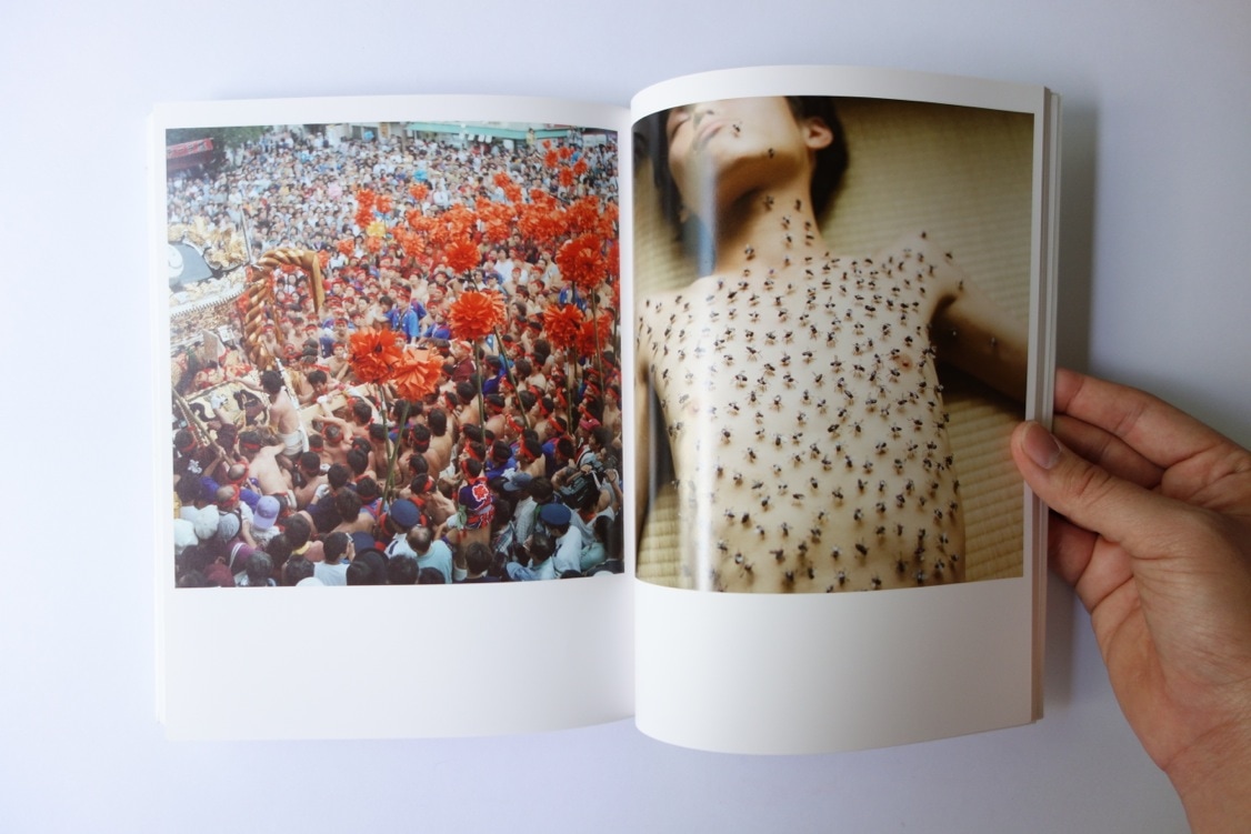
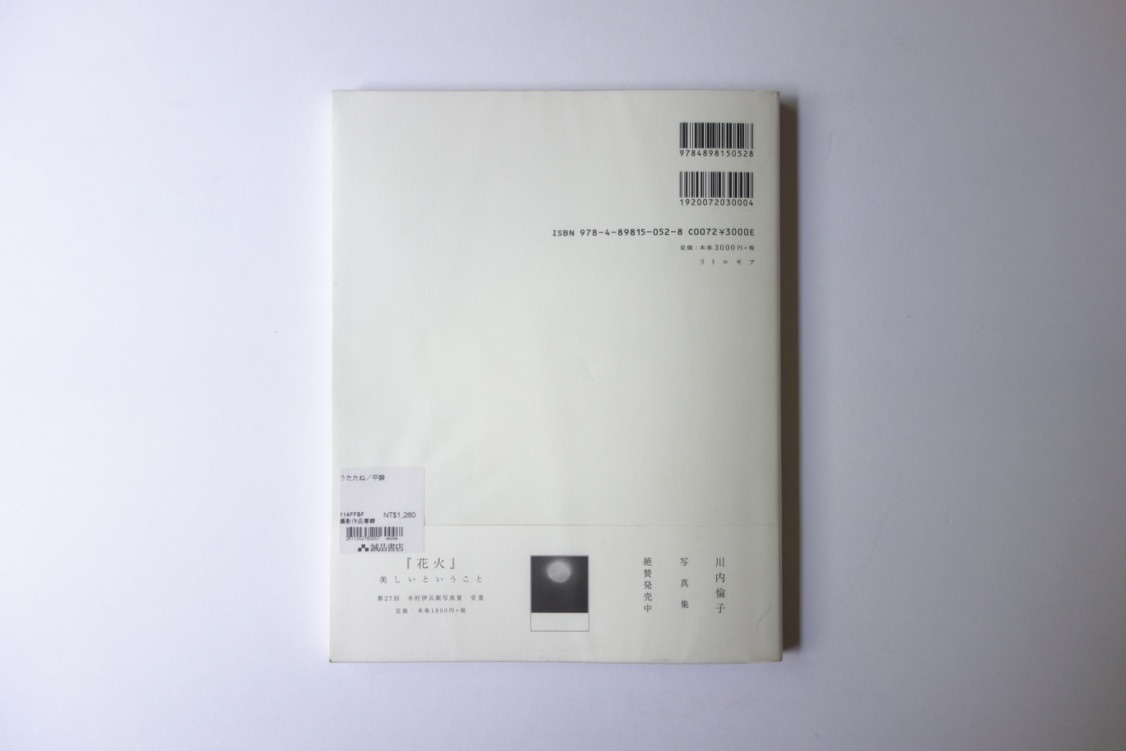
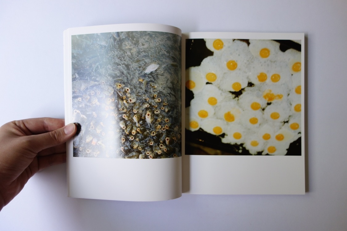
photo has no writing; however on the original (first Japanese edition) there is the title " Utatane" in Japanese. The image is teaspoons that has a white substance that is circular and is very small. Because the cover image looks like a polaroid picture the title is placed at the bottom were written is normally place. I think that this is one of the most creative cover design for a photo book; it's almost like an introduction to what the actual photo book contains.
I personally feel like the collection of images stand out because of how they are presented throughout the whole photo book. They all have a "vintage" theme towards them. I think that the images do communicate the photographers intention by showing us the audience her everyday routine. The image both look and feel very aesthetically sophisticated, like the image was set up before it was taken. For example, on every double page the pictures happen to coincide because of how similar they look, for instance, one of the double pages has water rotating in a washing machine with no lid on it whereas next to this image is a big cloud with a circular hole in the middle of it. They coincide because of the circle shape that is presented throughout both images. I found out on her website that she doesn't edit her images, but only uses a camera. The camera she uses is called "Rolliflex", this camera gives the images a soft character when produced, nonetheless for her other two photo books she uses both a digital camera and photo editing software.
The layout of the images is very simple and don't run cross the gutter or bleed of the page, each picture has a picture has a page of it's own corresponding to the one beside it.
The layout feels very dated and simple I think that Kawauchi thought about how she was presenting her images very carefully because the book doesn't look over designed nor is it it cramped with images on any of the page. In my opinion I think that the placement of the images was a conscious decision made by Kawauchi. I like this photo book, from the order she places her images to the position of the text , I found her images truly inspiring.
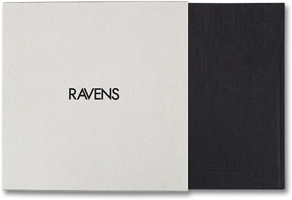
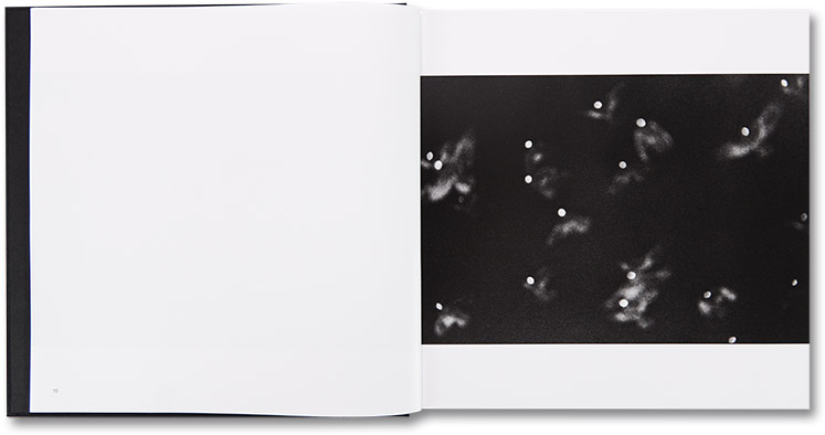
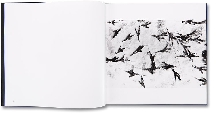
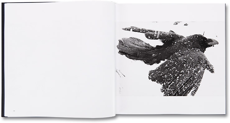
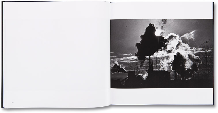
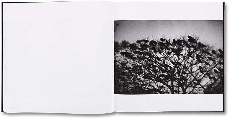
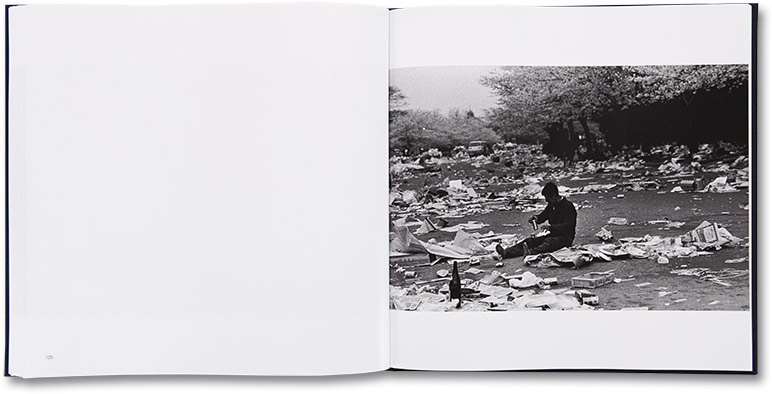
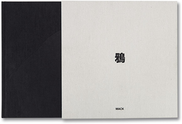
Masahisa Fukase - Ravens; 1986
|
|
Masahisa Fukase was a freelance photographer who had published multiple photo books. He to has had both solo and group exhibitions featuring his work, unfortunately he had died in 2012 by suffering a traumatic brain injury.
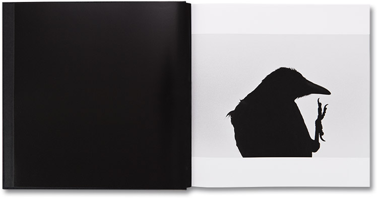
I like Fukase's work because of how he had presented the images in his photo book; one image on the right page with a blank white page on the opposing side. I think this makes his photo book simpler, allowing the audience to spend more time appreciating and admiring the single images, focusing on the detail in the image(s). Masahisa's photo book is called "Ravens" and does include ravens, however not portrait images of ravens but angled images, for example close up's of their features, then flying, them in a group and their foot print. Nonetheless there are a couple of images of models, I don't think they relate to the theme of ravens because the images of the models are just of them and no raven present. This throws the audience off guard because these images don't relate to the rest of the photo book. |
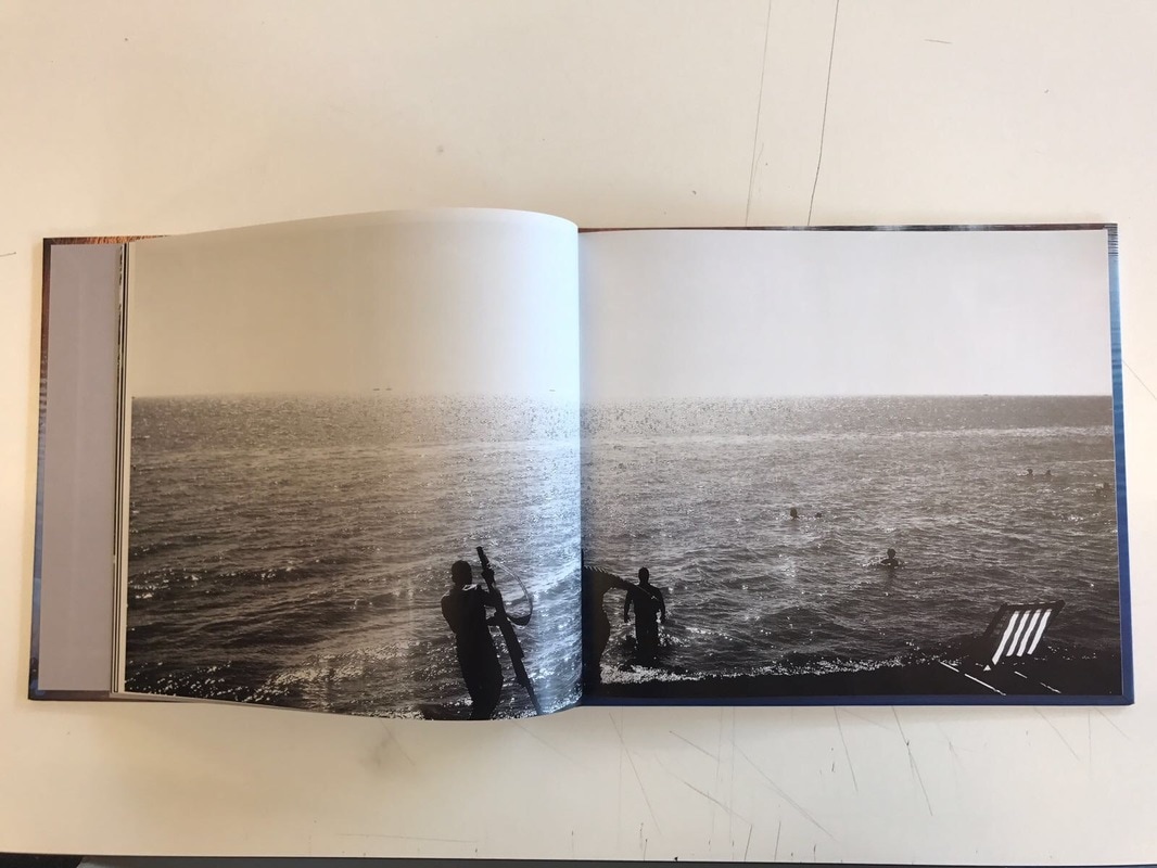
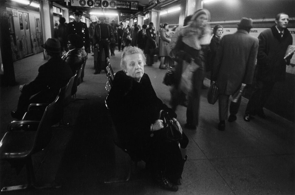
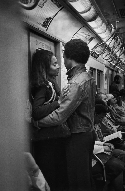
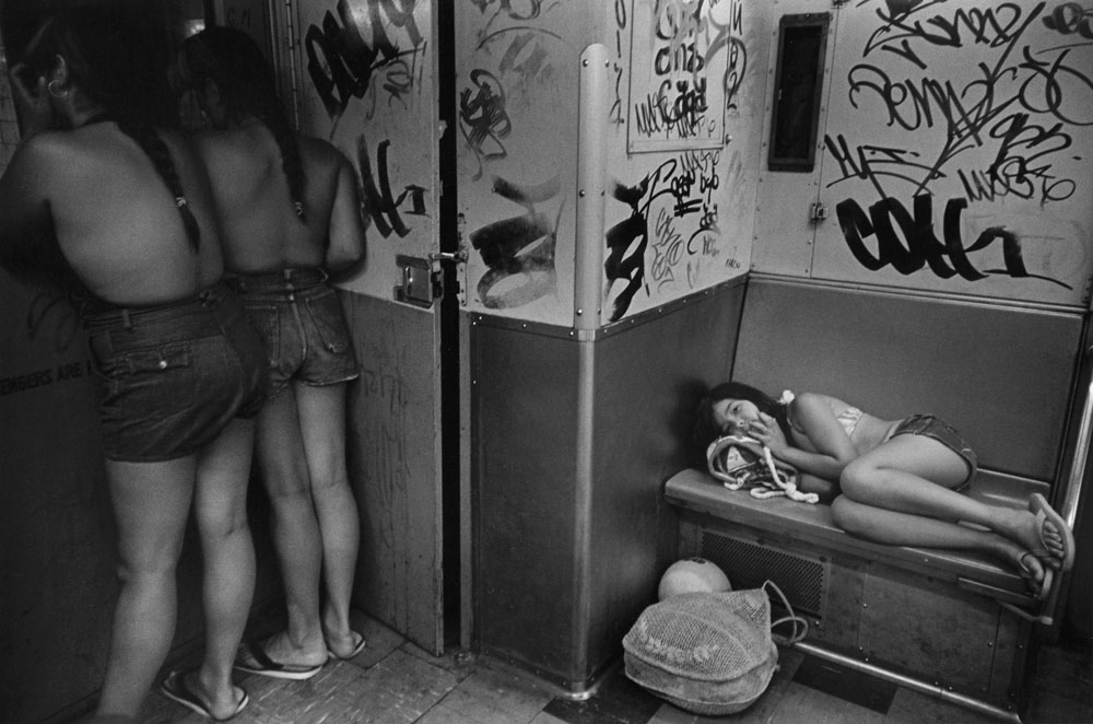
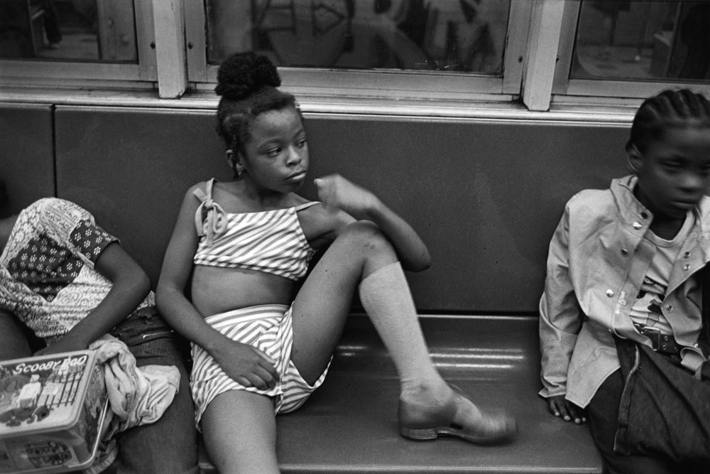
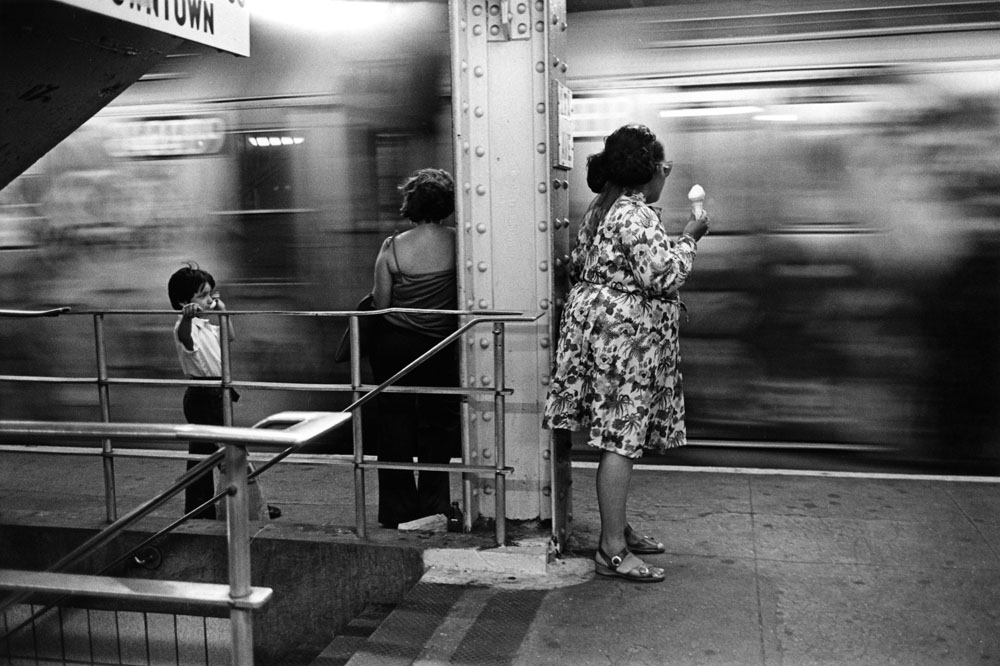
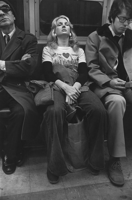
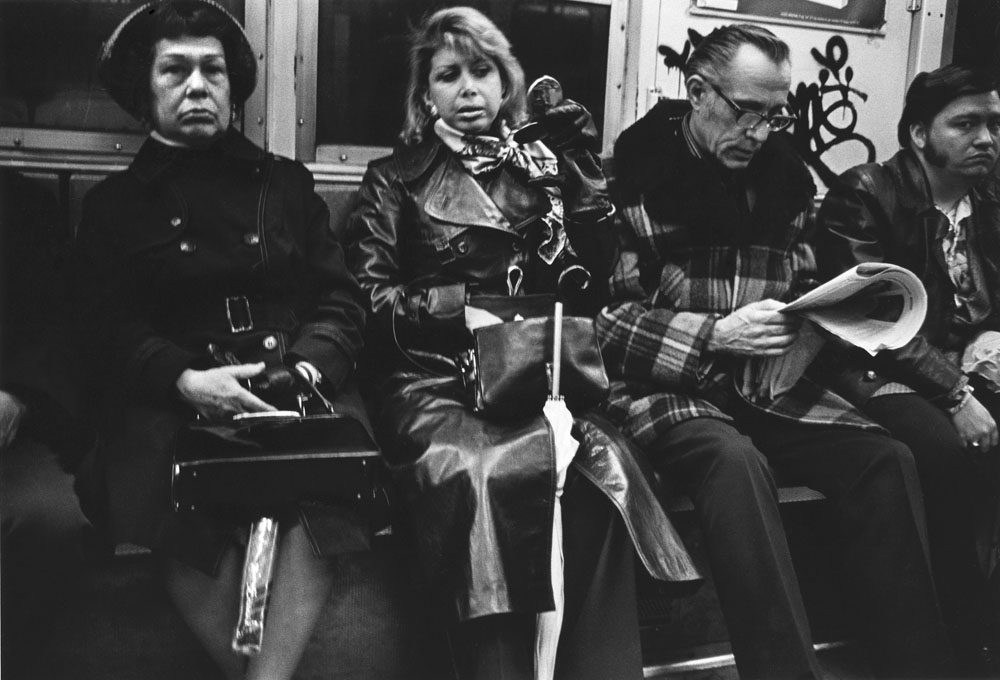
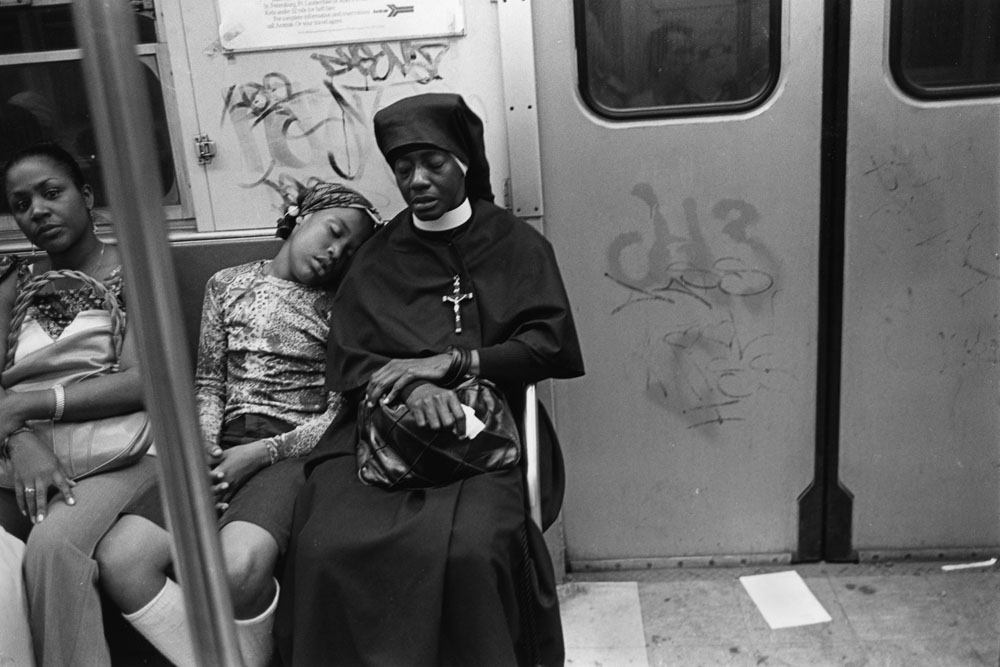
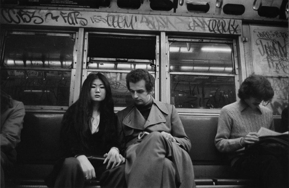
Joni Sternbach - The Passengers; 2014
|
Joni Sternbach has been in a variety of both group and solo exhibitions. She not only uses film but also different early photographic processes in order to create in images.
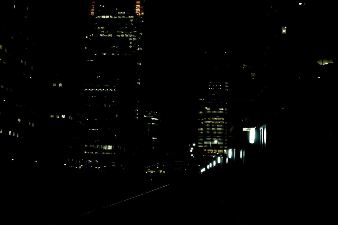
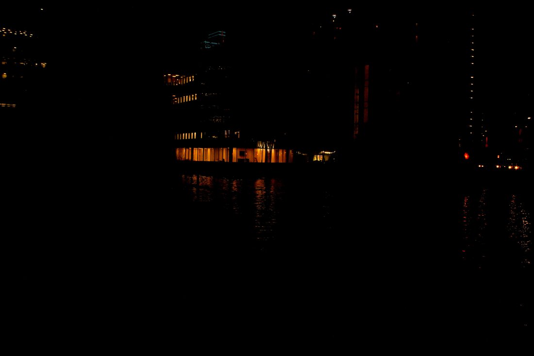
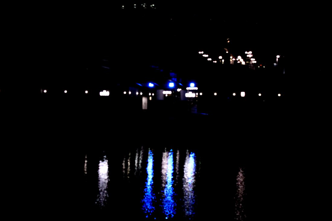
When I came across Joni Sternbach photo book it automatically reminded me of the theme 'street photography', this is because of how her images are taken of people on the train, they're in black and white because of the camera she used; a Leica (M3). Personally I fell like these images work better in black and white, only because you're not subjected to look at particular colours that stand out more but to the detail of the images that arises with the black and white filter. With black and white images I think that the audience concentrates more on the image itself, noticing all the little things that may not be noticed if the images was in colour, for example the patterns on the clothes, the way the clothes crease when the model is sitting etc. There are 36 pages in the whole of her photo book. |
|
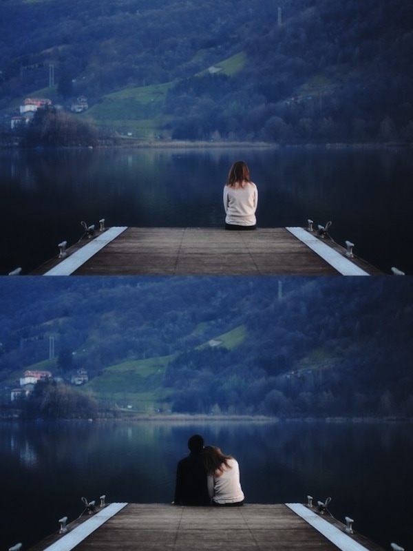
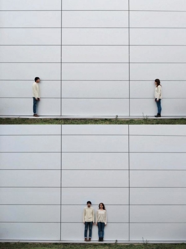
Two Frame Film / Diptychs
|
As a class we start to focus on diptychs, also known as two framed film. This is because a phonebook is like a diptych; two images on opposite pages that somewhat relate to each other. Because of this I think that I would be a good decision to research and a response to it, this way it gives me an idea on how I could possibly design the layout of my personal photo book.
|
|
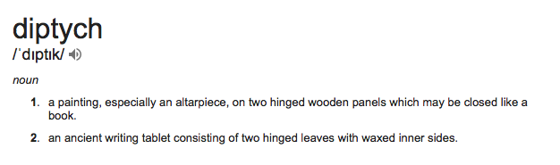
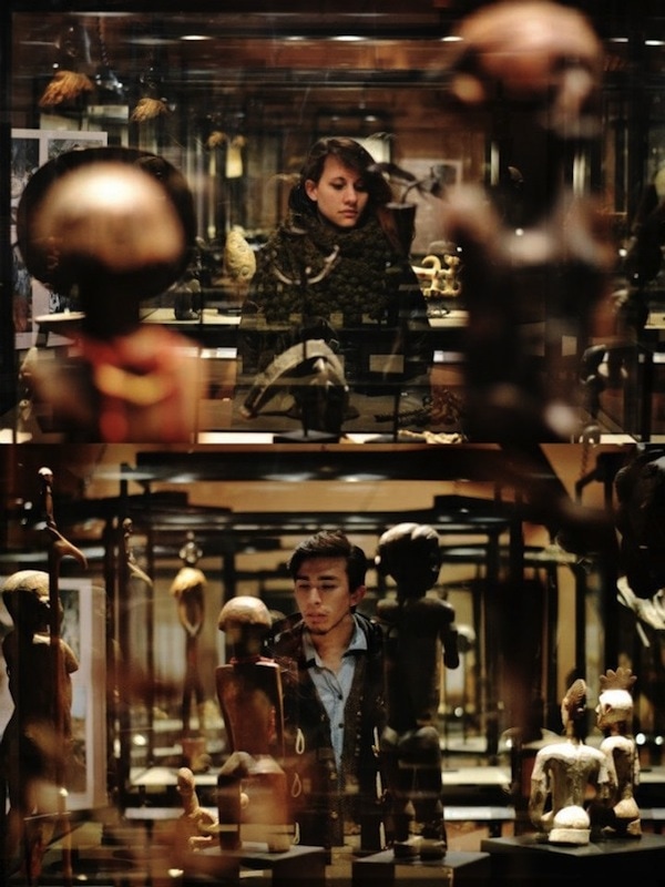
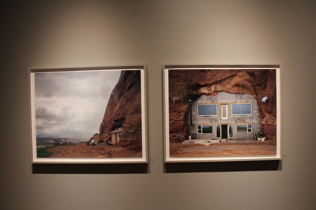
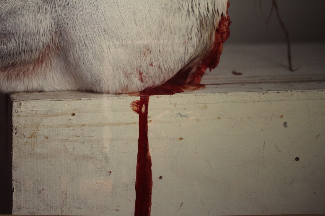
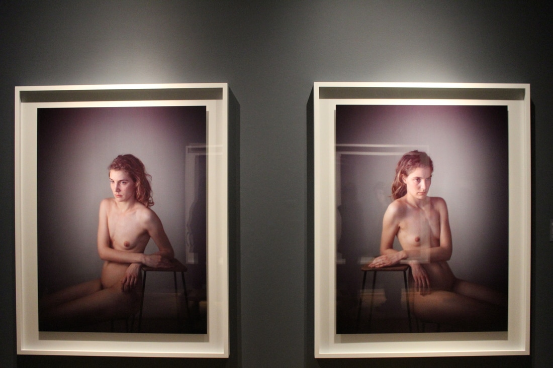
I found these diptychs on Pinterest. Two photographers, Silva Sala and Freddy Viera who collaborated together in order to make various beautiful and inspirational diptychs. Below are the images they had created.
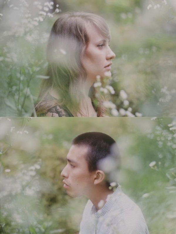
My Response
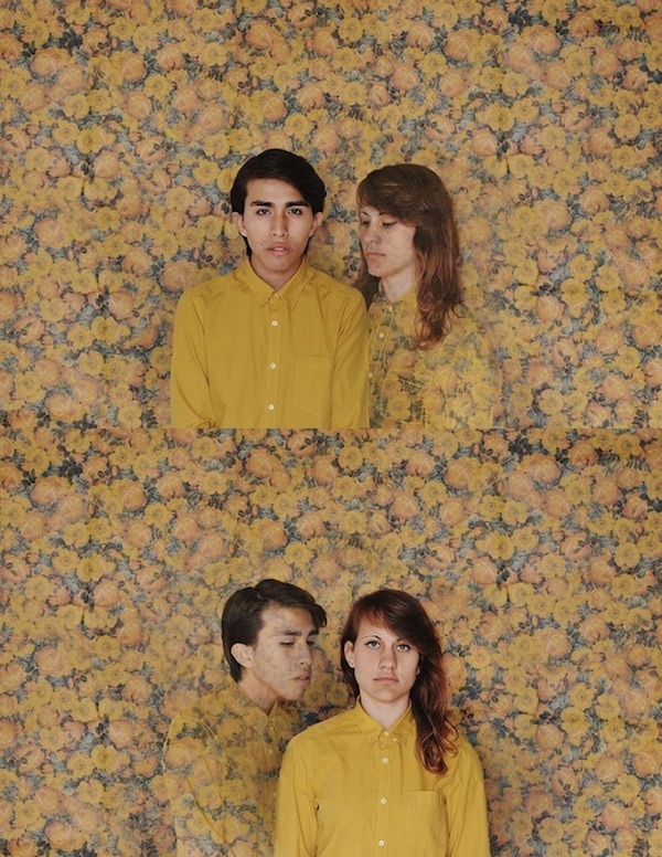
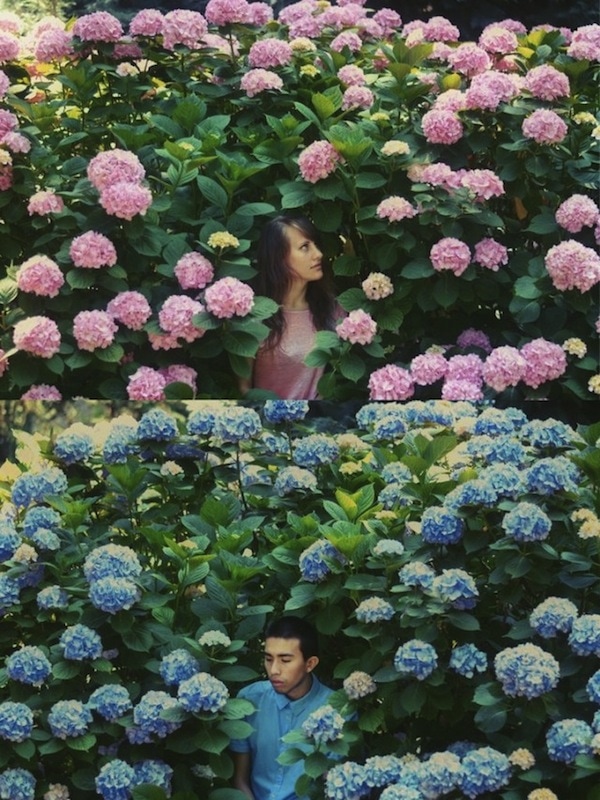
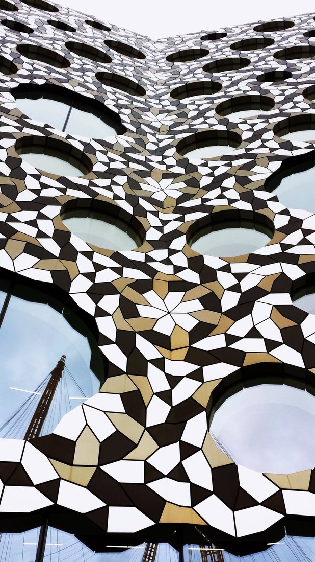
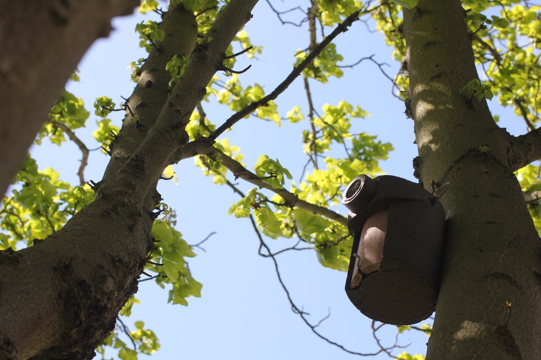
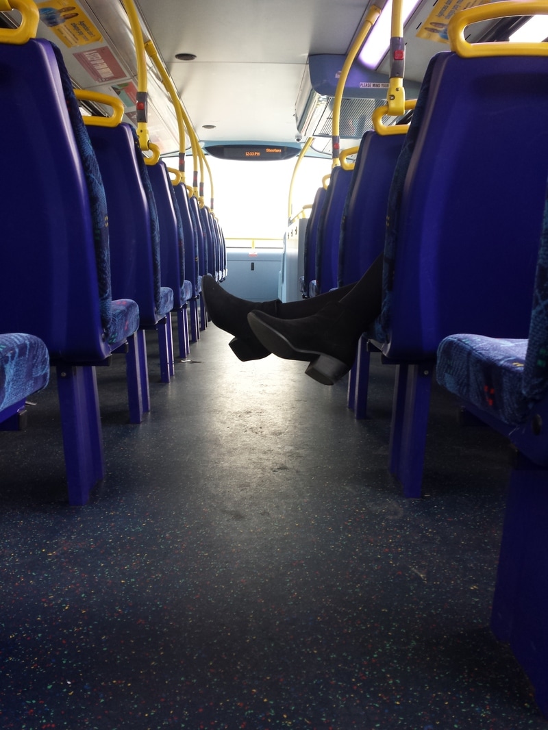
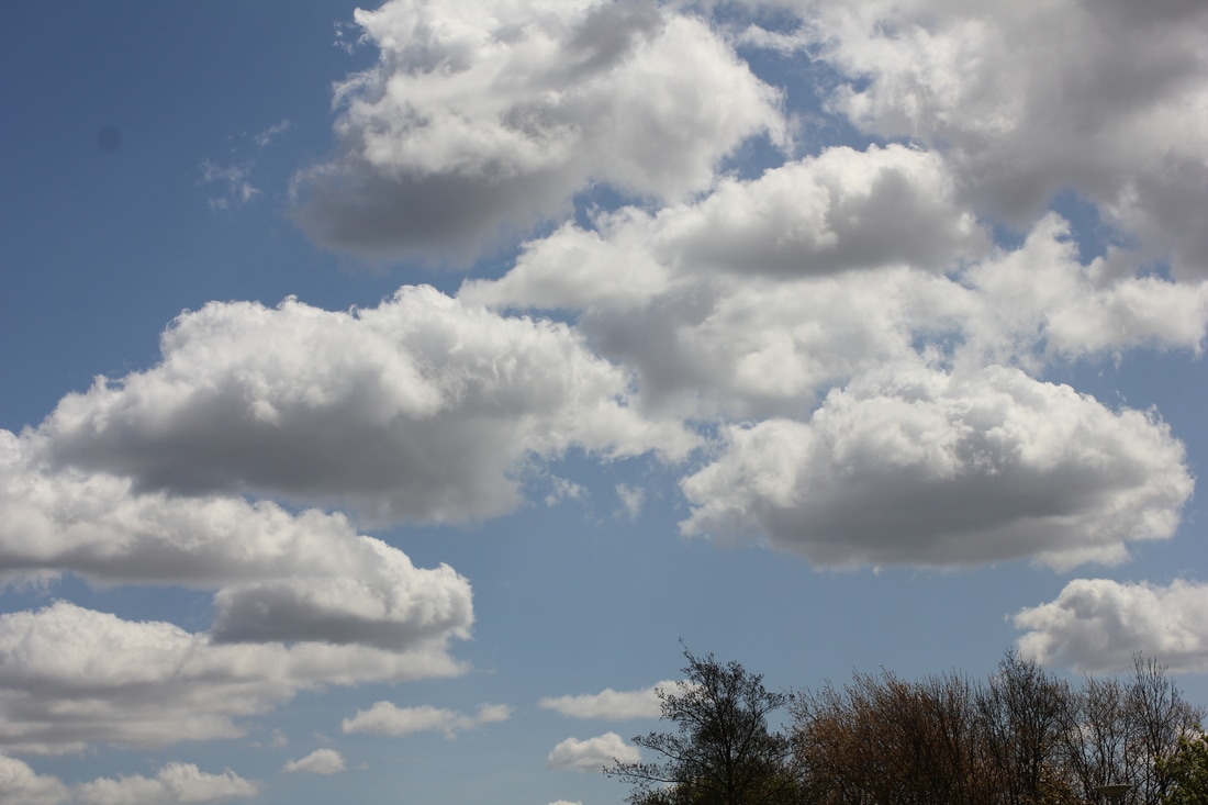
To start off my diptychs I chose the images that I thought relate to each other, some of these images I had taken specifically for this project and some of the images are ones that I had taken in my personal time, I thought that this would be a great way to incorporate them anatomy work. Here are those images:

Experimenting
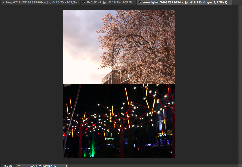
In order to create my diptychs I had chosen to use Adobe Photoshop, this is because with phone shops its easier to manipulate images. I started by uploading the images I need to create my diptych and selecting the two that I believed should be together.
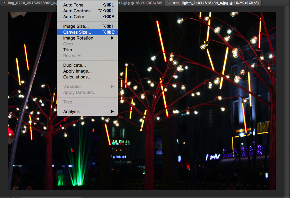
- I'm using one image as a base image and enlarging it's canvas size this was I would be able to place my other image next to it.
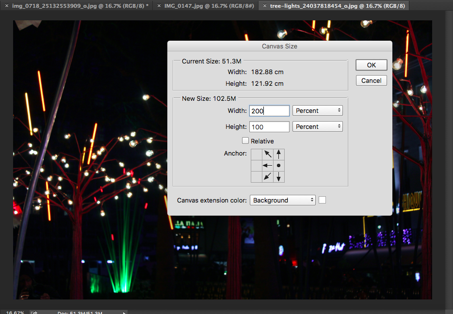
- I wanted for the extra canvas space to be exactly the same size as the base image so I doubled it's size and selected the area to where I wanted the extra space to be.
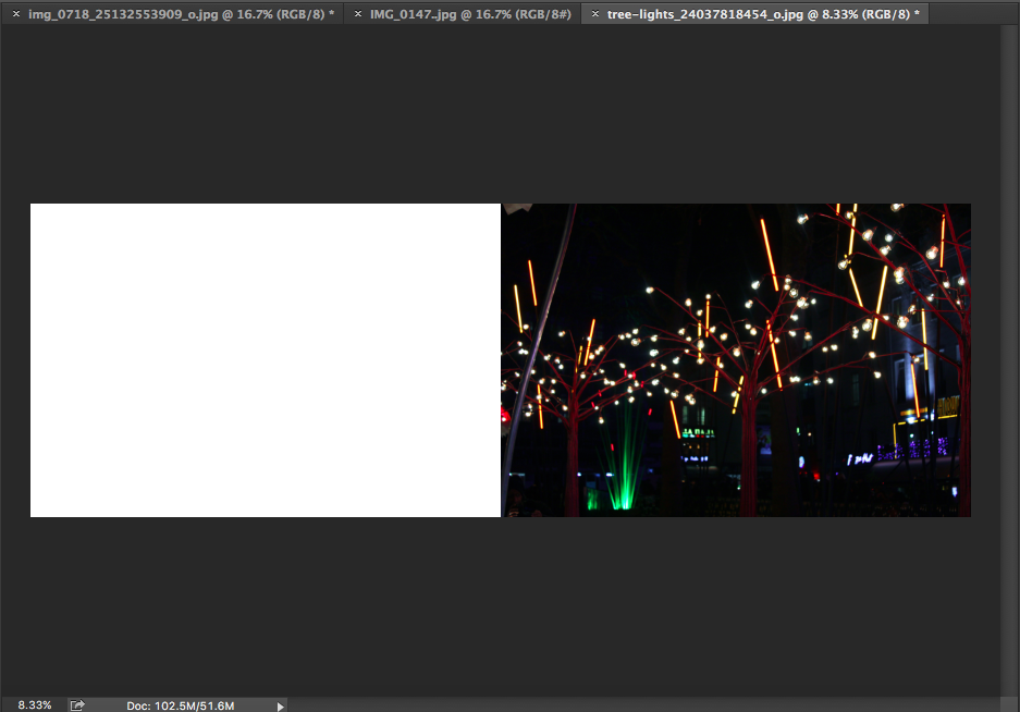
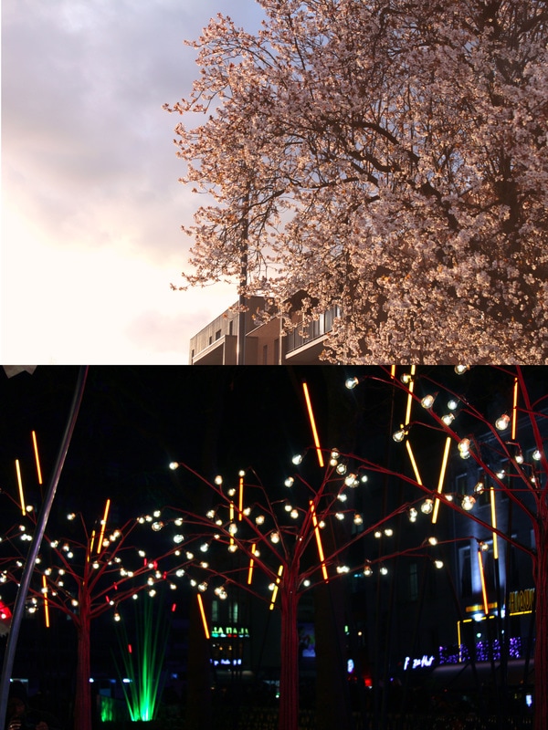
- Once the extra space had been added I selected my other image and pasted it onto the new canvas I made. After this I realised there was more ways I could present a diptych; by having it onto of each other rather than side by side. Once realising this I had gone back to my base image and enlarged the canvas again but this time I done it vertically; below are the final outcomes of both.
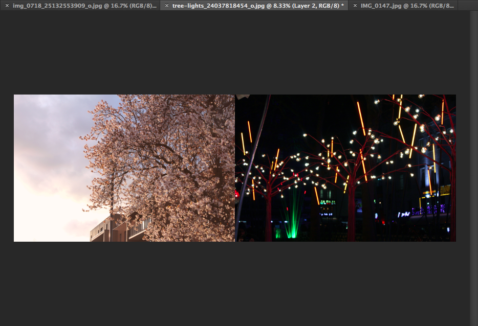
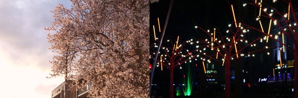
Personally I like the outcome of the vertical diptych because I think that that it's easier to look at, allowing the audiences eyes to flow freely , whereas with the horizontal diptych you can only look in a straight light. I also think that the vertical diptych allows the audience to see more detail within the two images. Because I prefer this option I'm going to carry on creating my diptychs like this. |
|
My Final Outcomes
**Click on the images to see the image enlarged.**
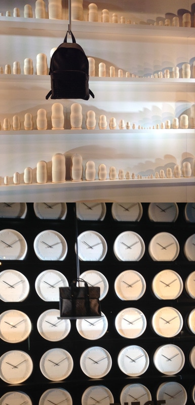

Here are the final outcomes of the diptychs I had created, at first I didn't like them because I didn't see any connection that could be made with the pairs I had put together however, when I showed my class mates they had automatically seen similarities between each of the images, this gave me some form of confidence. Nonetheless I began to like these diptychs, if I had enough time I think I would have experimented more by with using two framed film and a film camera in order to create some diptychs.
My First Photo Book - Handmade
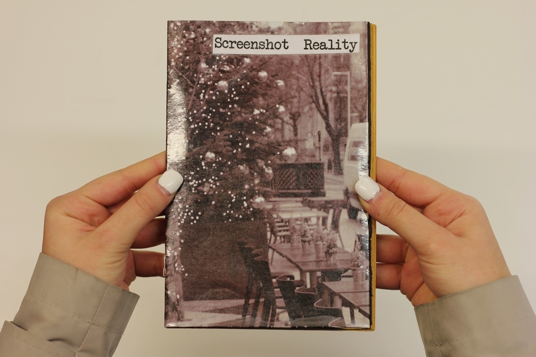
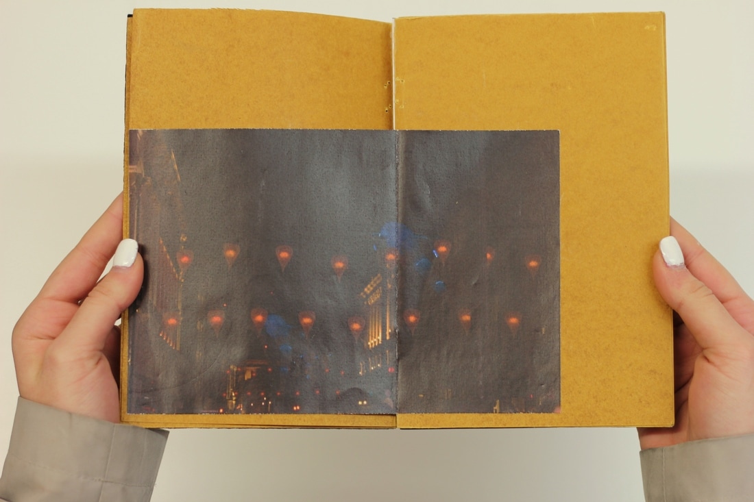
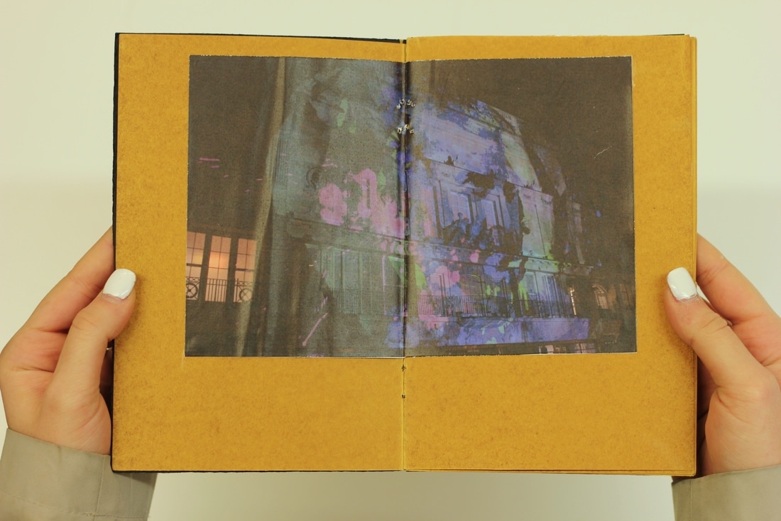
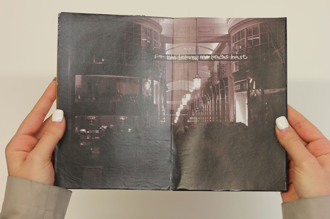
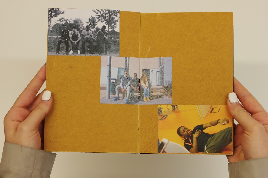
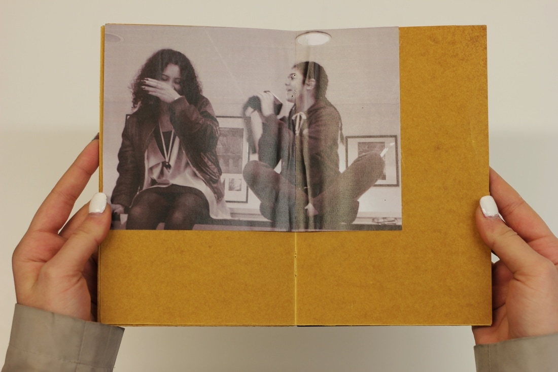
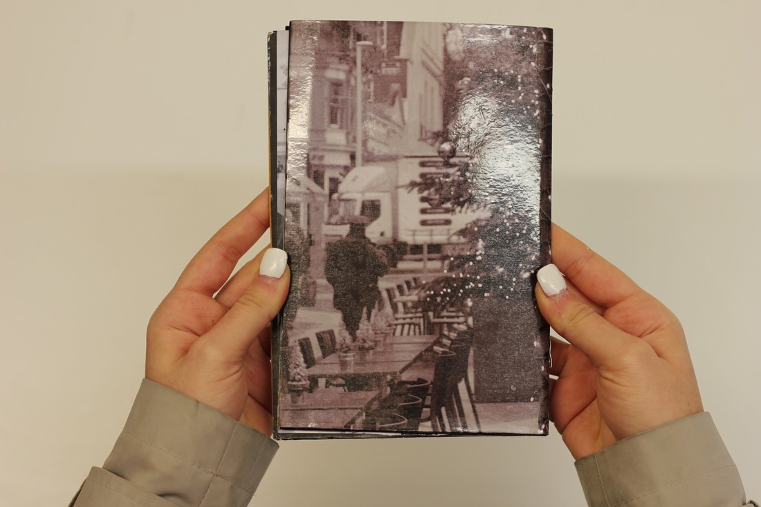
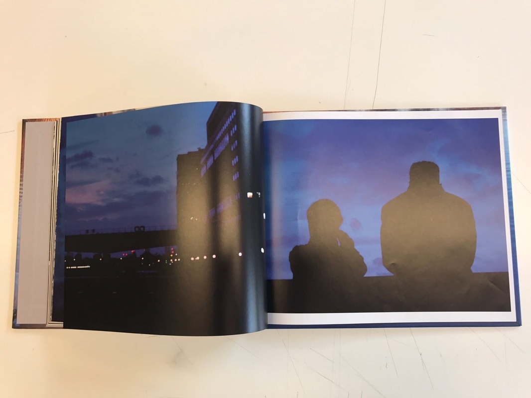
Here is my first handmade photo book, I believe that the images that I had used don't correlate with each other, they're images I had taken purposely for this project. Page three and the cover image was edited into a black and white filter however I printed off with a sepia effect on it, although I didn't plan for it to print off like that I was happy with the outcome. Nonetheless it was quite disappointing that I wasn't able to manipulate this effect for a digital version.
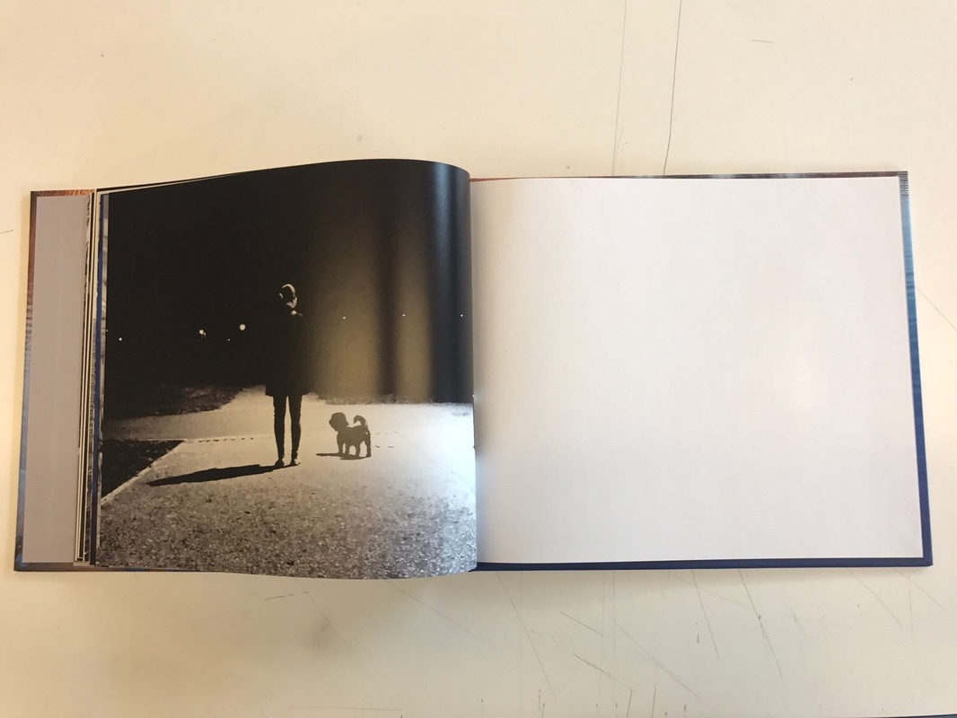
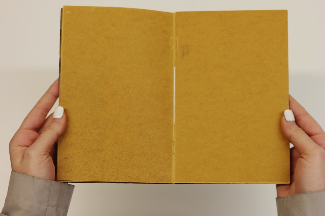
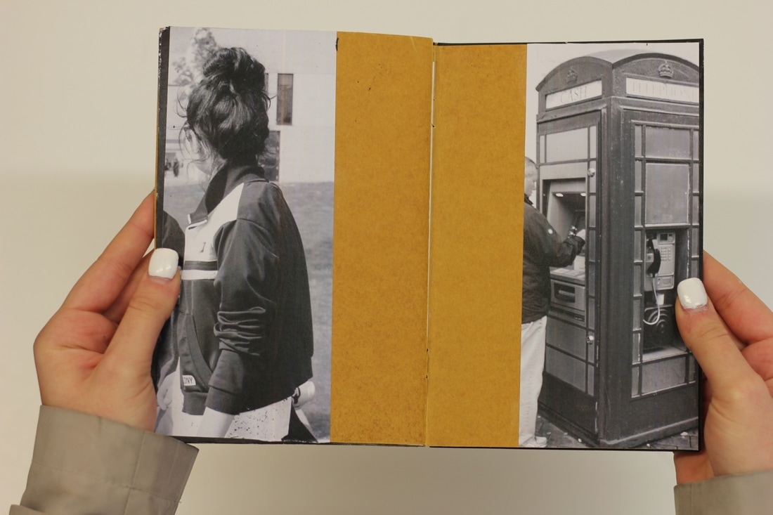
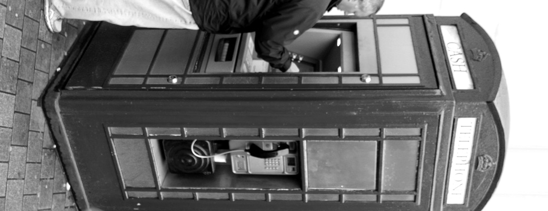
I tried to relate the images together as much as I can for example on the seventh page I put a vertical image of a girl standing with her back towards the camera with a vertical image of a postbox on the opposing side; both images are filtered to be black and white. Similarly I had added a double blank page to give a sense of mystery, making the reader imagine what could possibly go there.
I called this practice photo book “screenshot reality” because I believe that it’s what photography as a whole is; taking an image captures a moment, freezes time almost like screenshotting reality. I realised while making my handmade photo book that I wanted for my real photo book to be quite meaningful and personal to me, in order to do this I'm planning to add an image, or images, that has a meaning to me whether that's of a particular person/people or a location that has similar value.
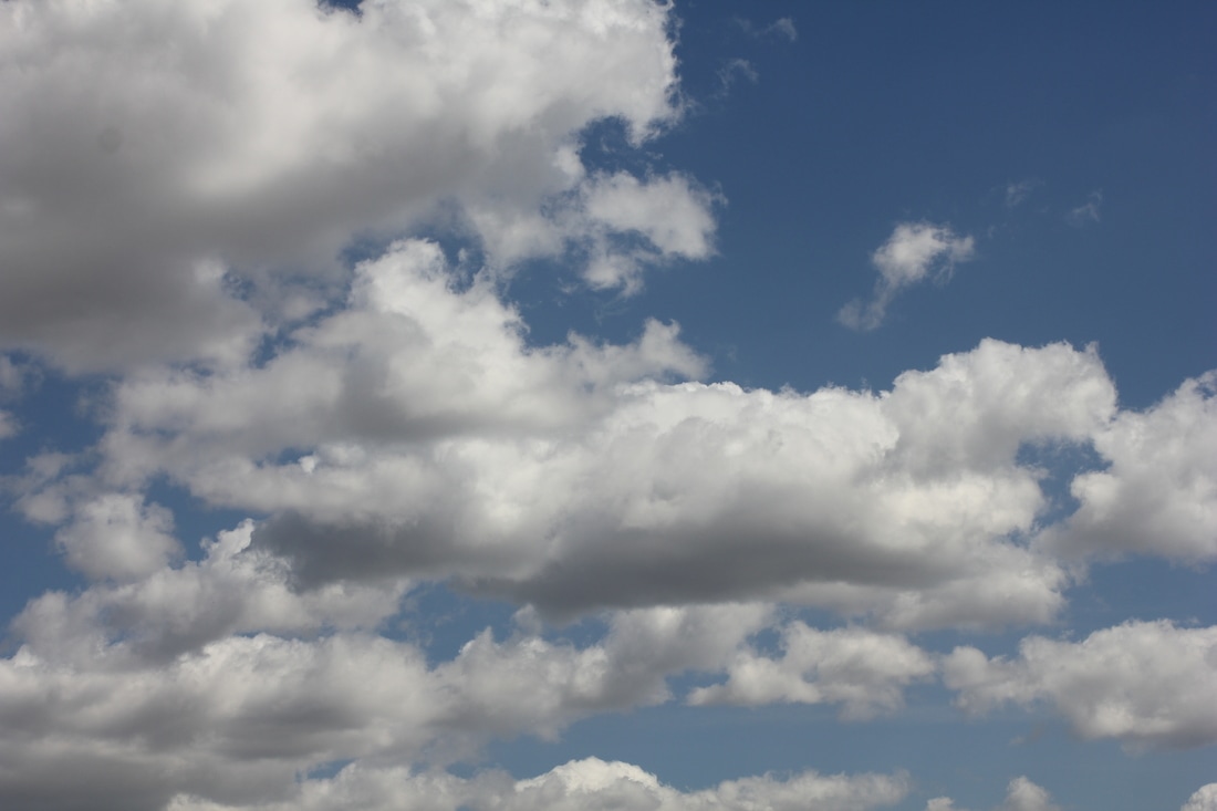
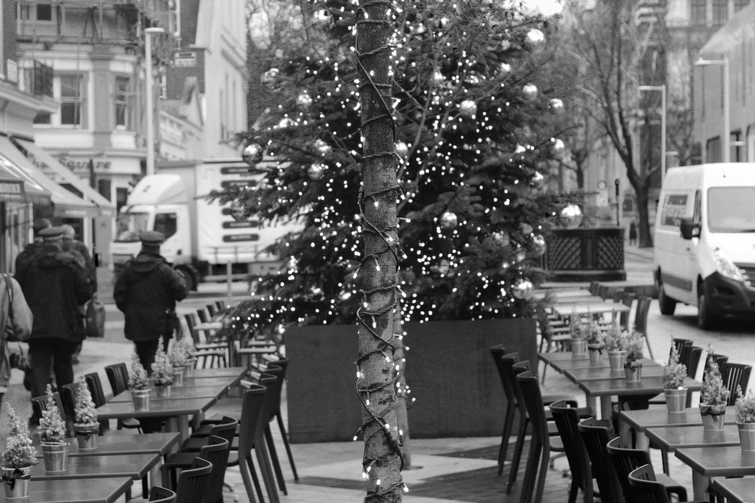
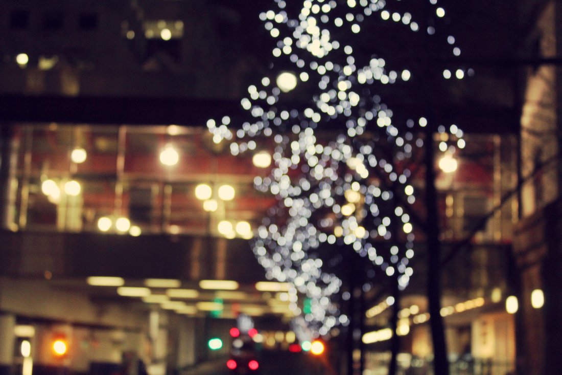
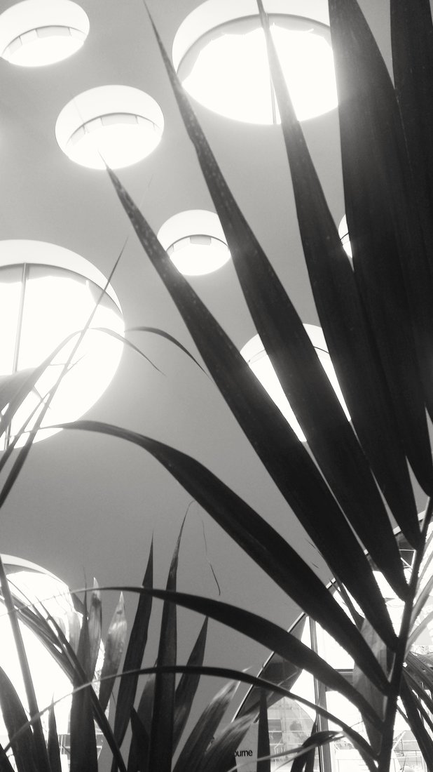
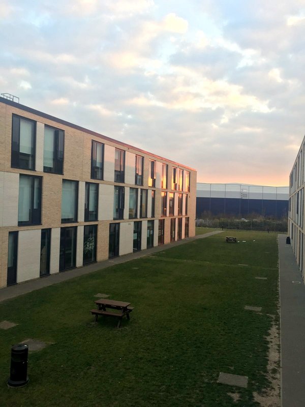
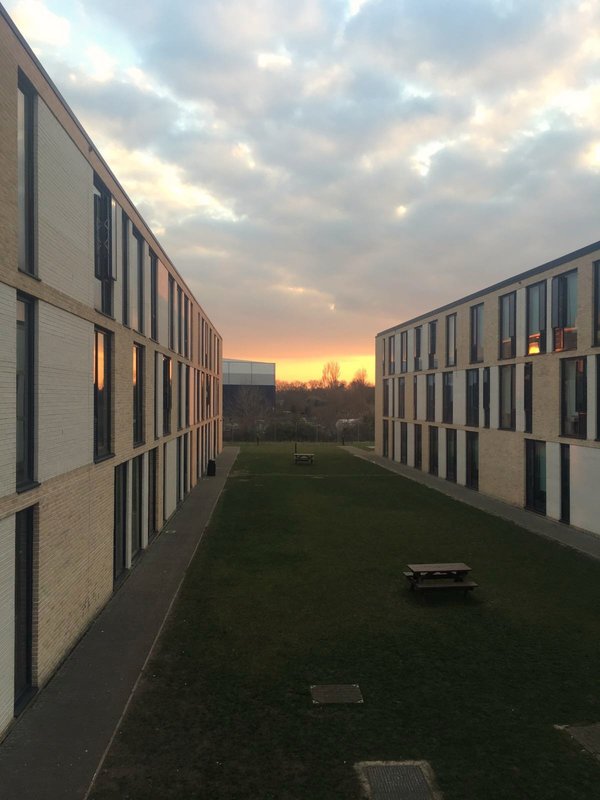
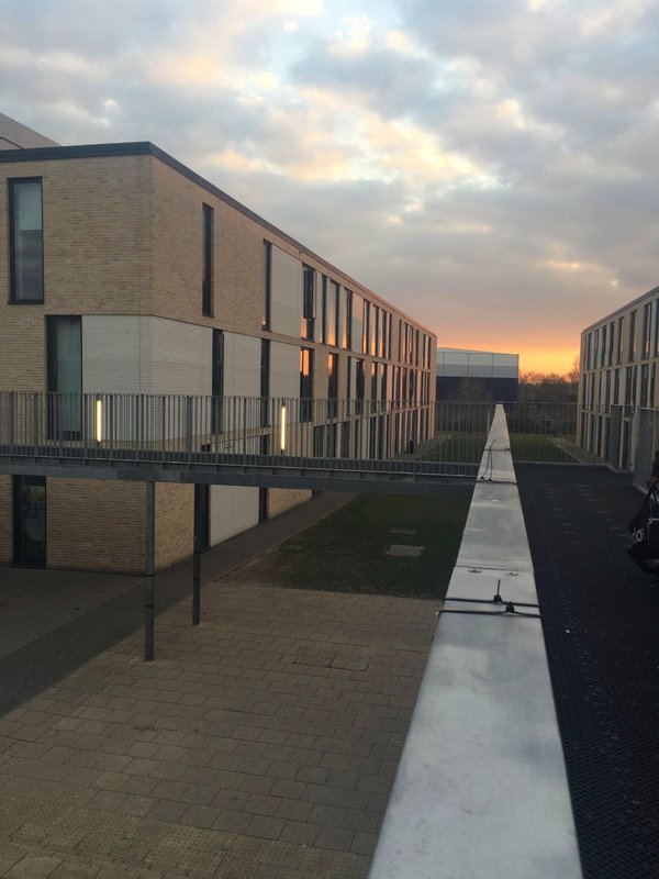
Below are images I had both taken and edited specifically for my photo book, I don't know if I',m going to use all of them but I do know that theres a chance I may decide to use some images I had taken previously for my handmade photo book.
I tried to relate the images together as much as I can for example on the seventh page I put a vertical image of a girl standing with her back towards the camera with a vertical image of a postbox on the opposing side; both images are filtered to be black and white. Similarly I had added a double blank page to give a sense of mystery, making the reader imagine what could possibly go there.
I called this practice photo book “screenshot reality” because I believe that it’s what photography as a whole is; taking an image captures a moment, freezes time almost like screenshotting reality. I realised while making my handmade photo book that I wanted for my real photo book to be quite meaningful and personal to me, in order to do this I'm planning to add an image, or images, that has a meaning to me whether that's of a particular person/people or a location that has similar value.
Below are images I had both taken and edited specifically for my photo book, I don't know if I',m going to use all of them but I do know that theres a chance I may decide to use some images I had taken previously for my handmade photo book.
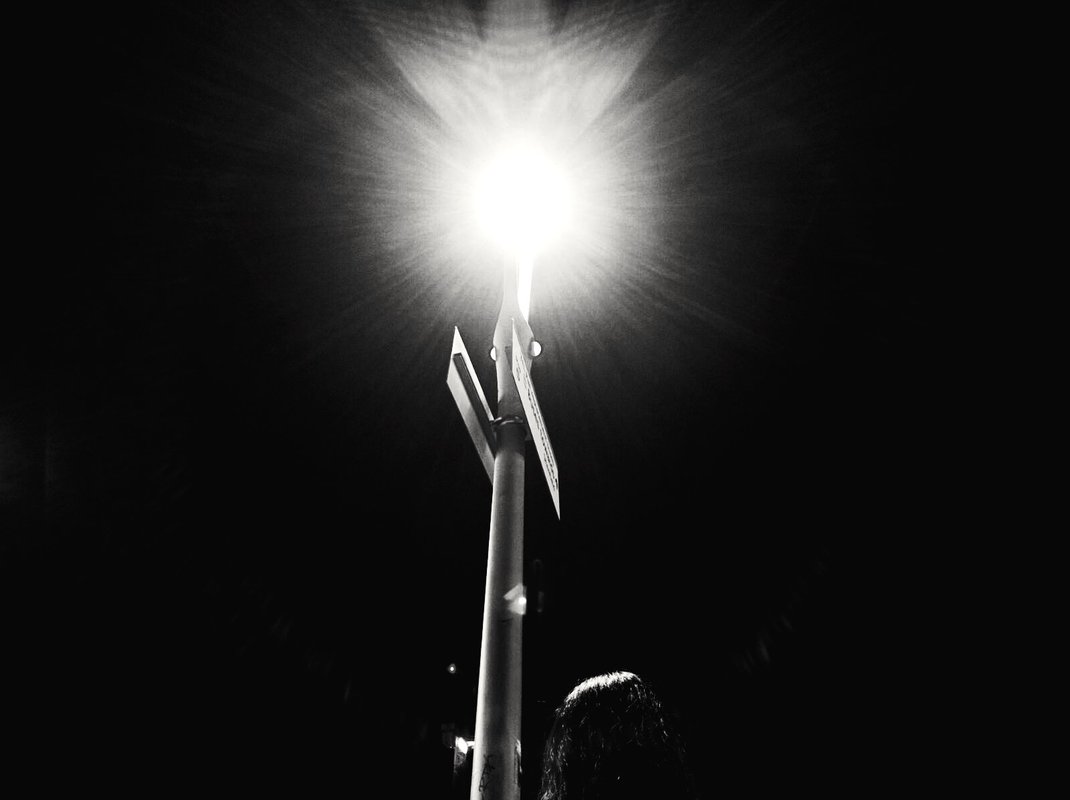
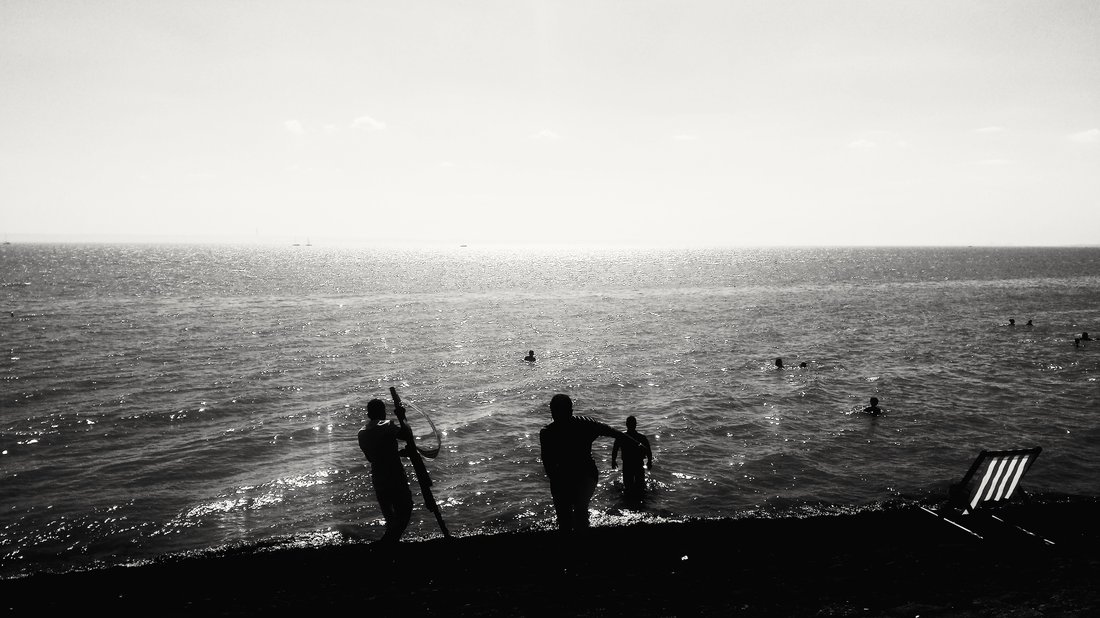
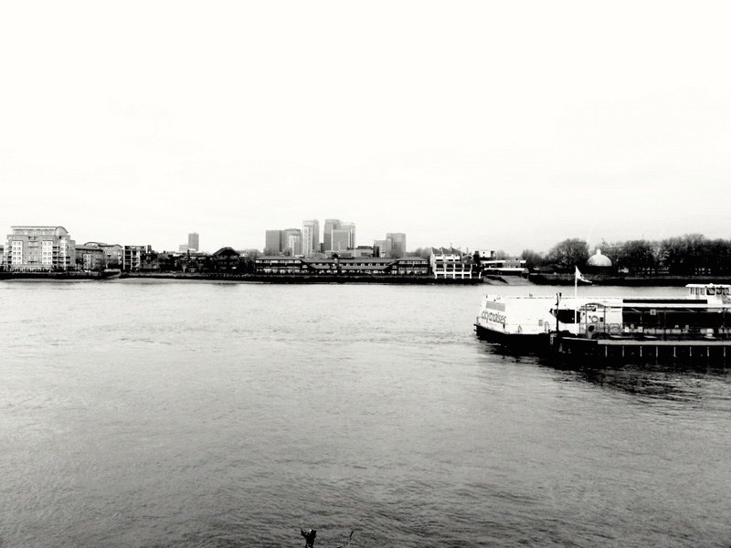
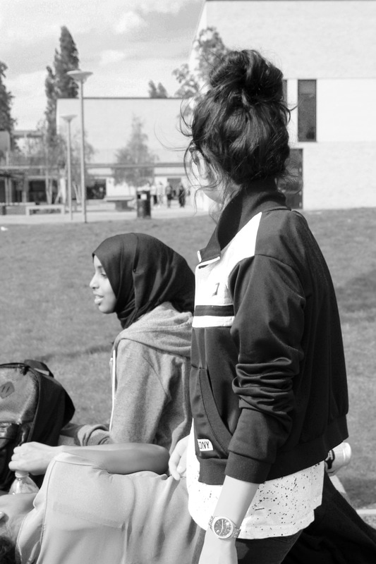
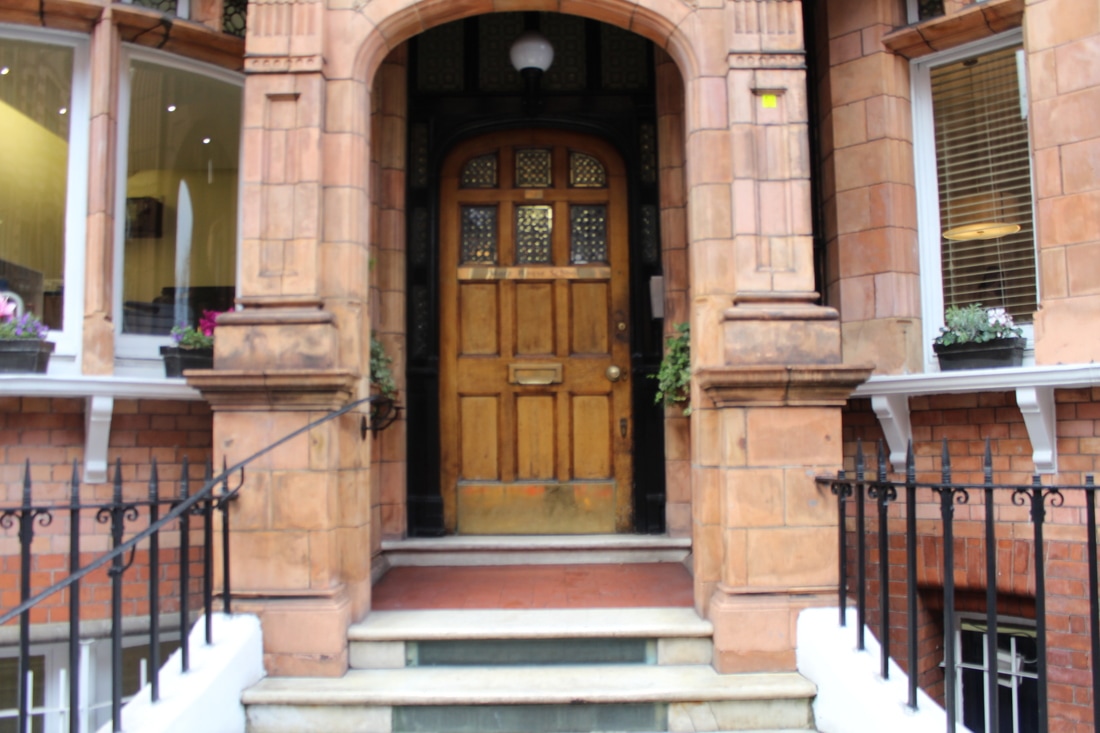
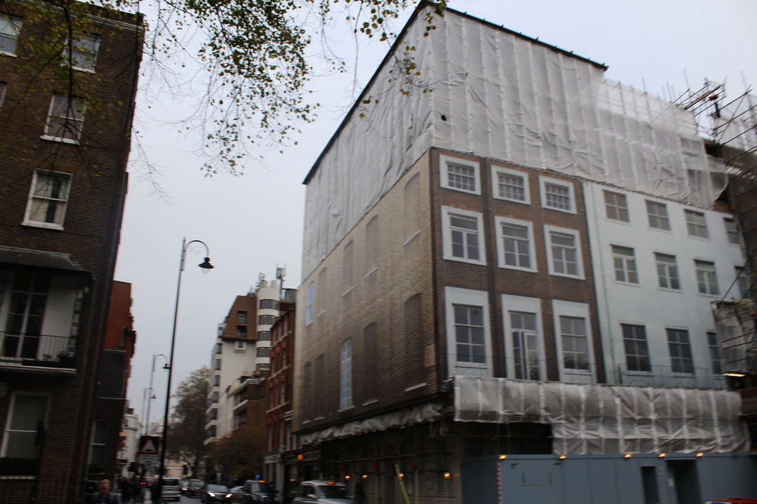
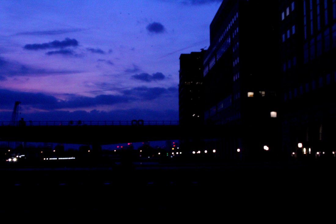
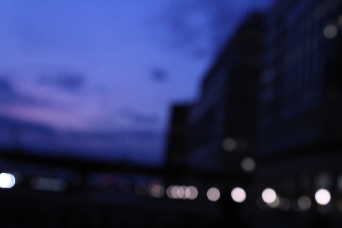
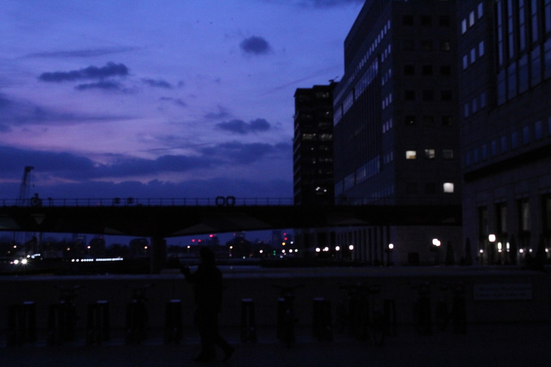
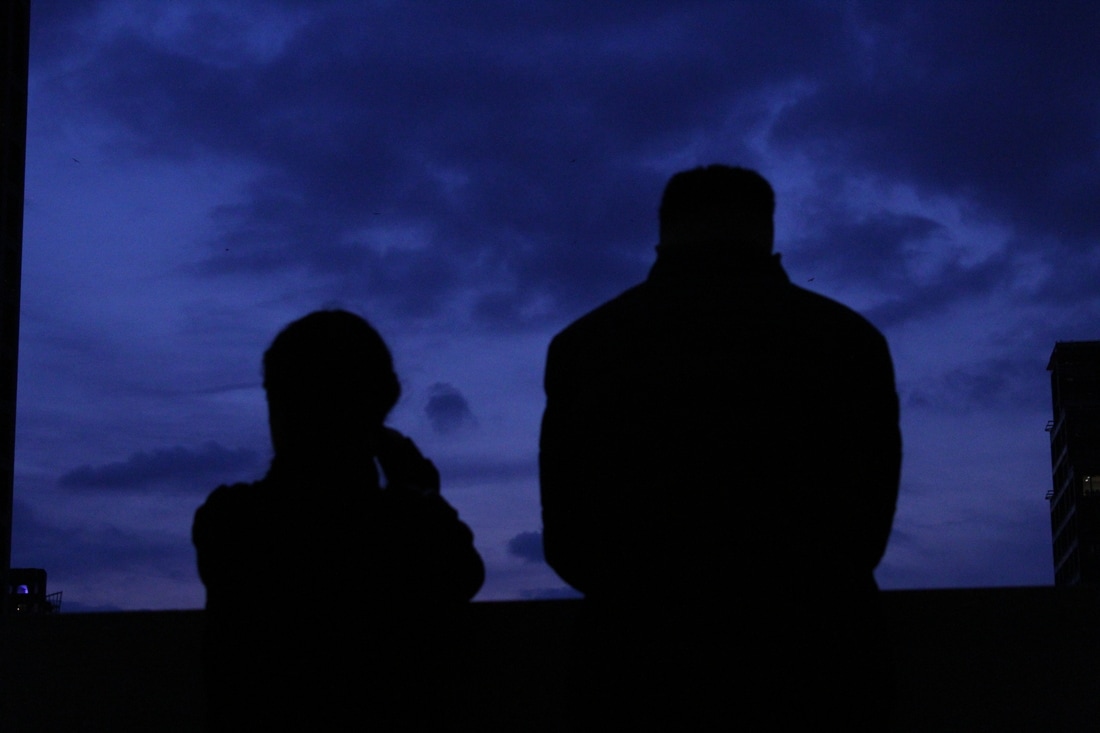
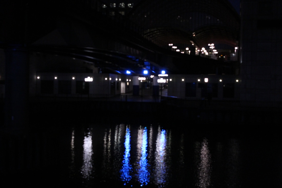
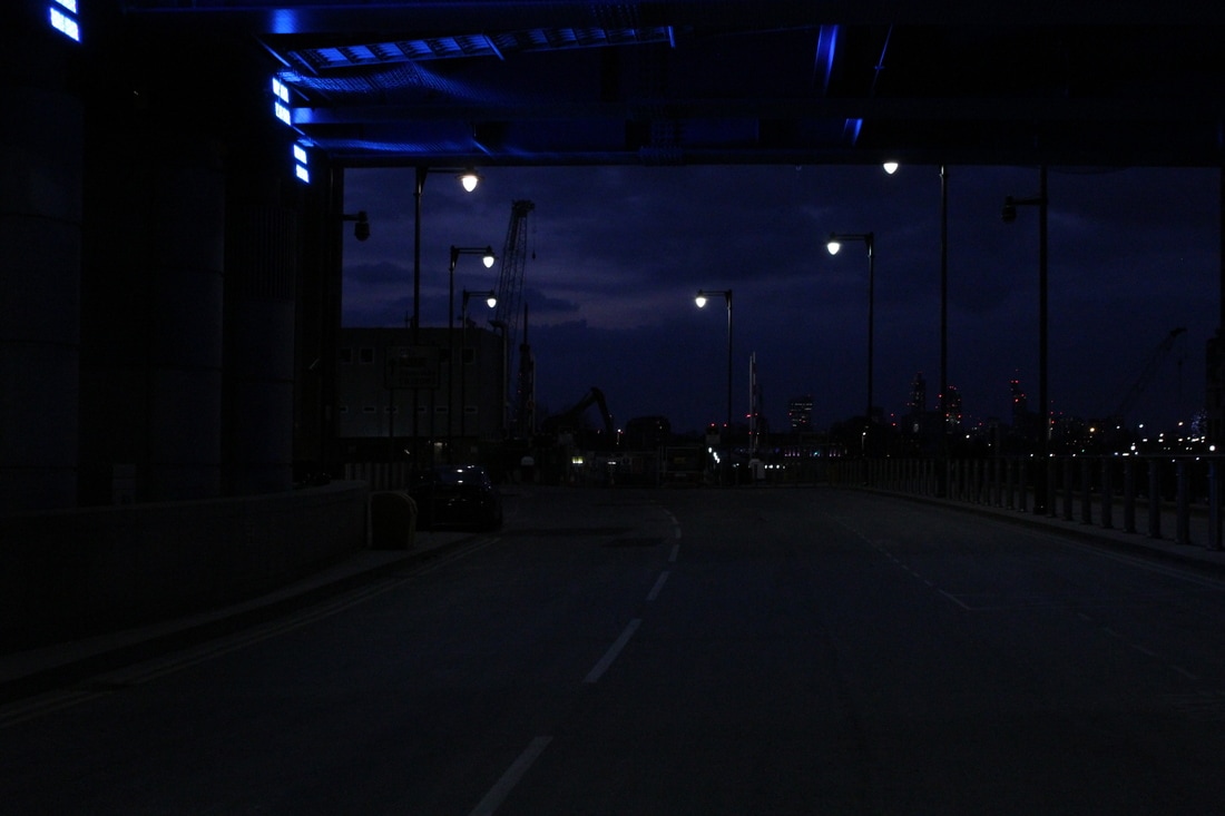
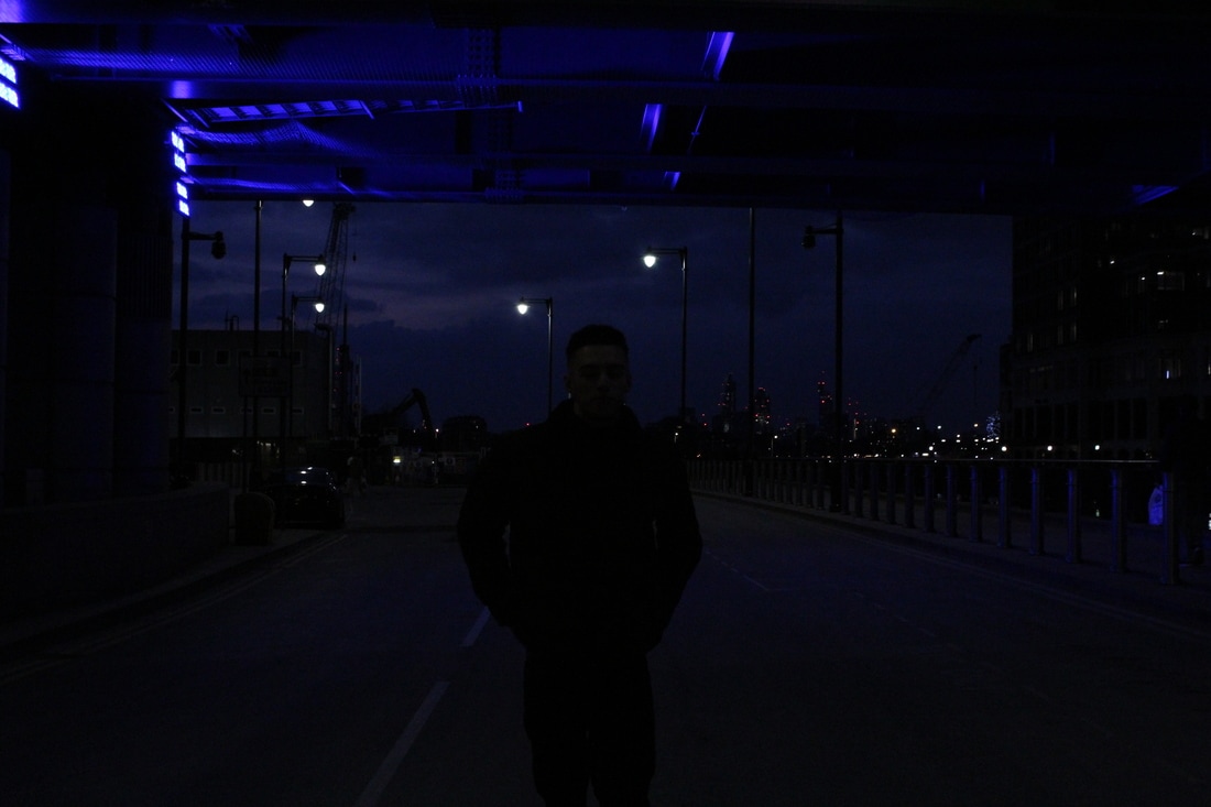
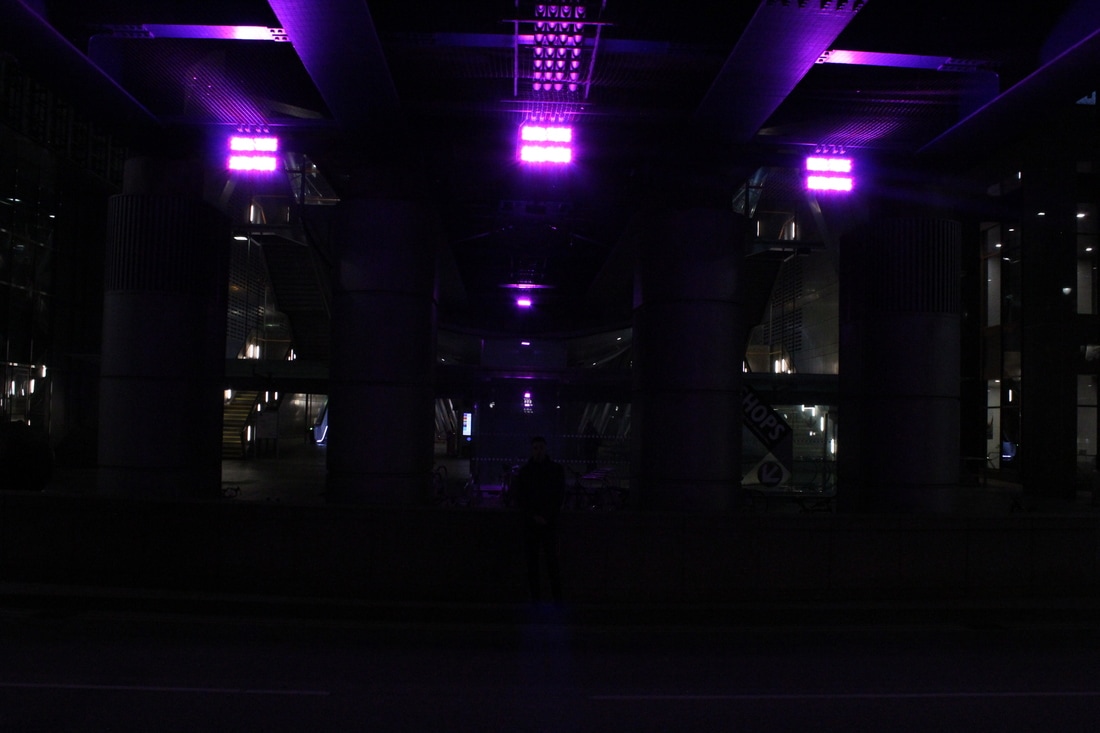
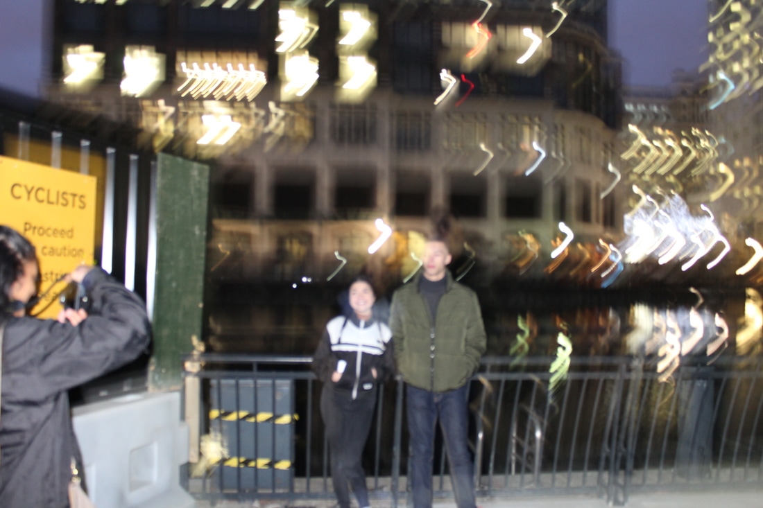
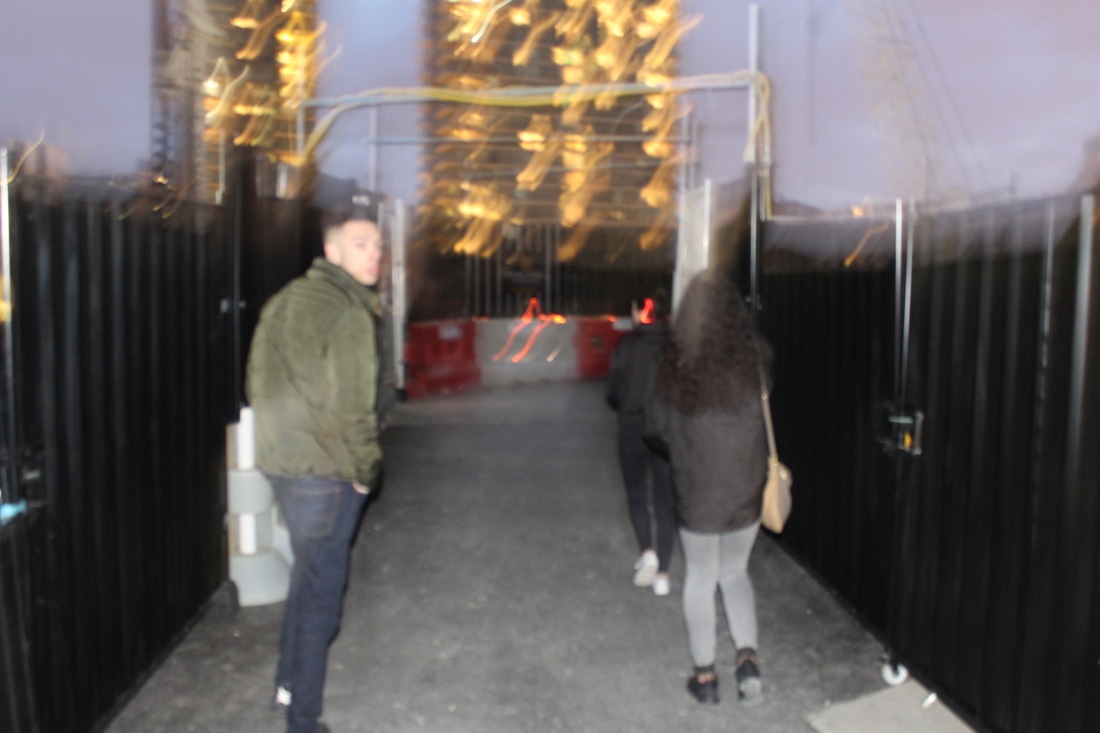
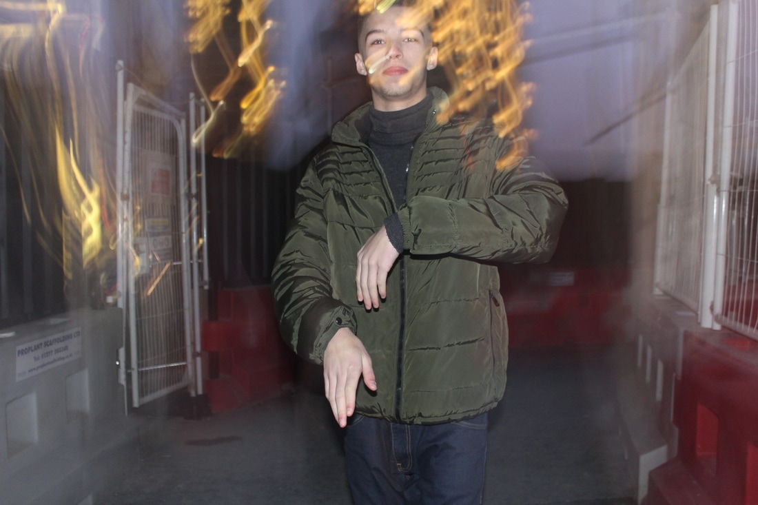
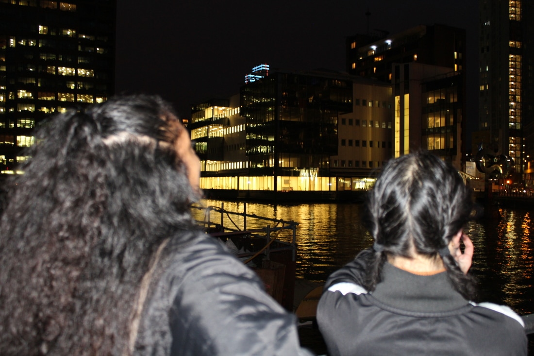
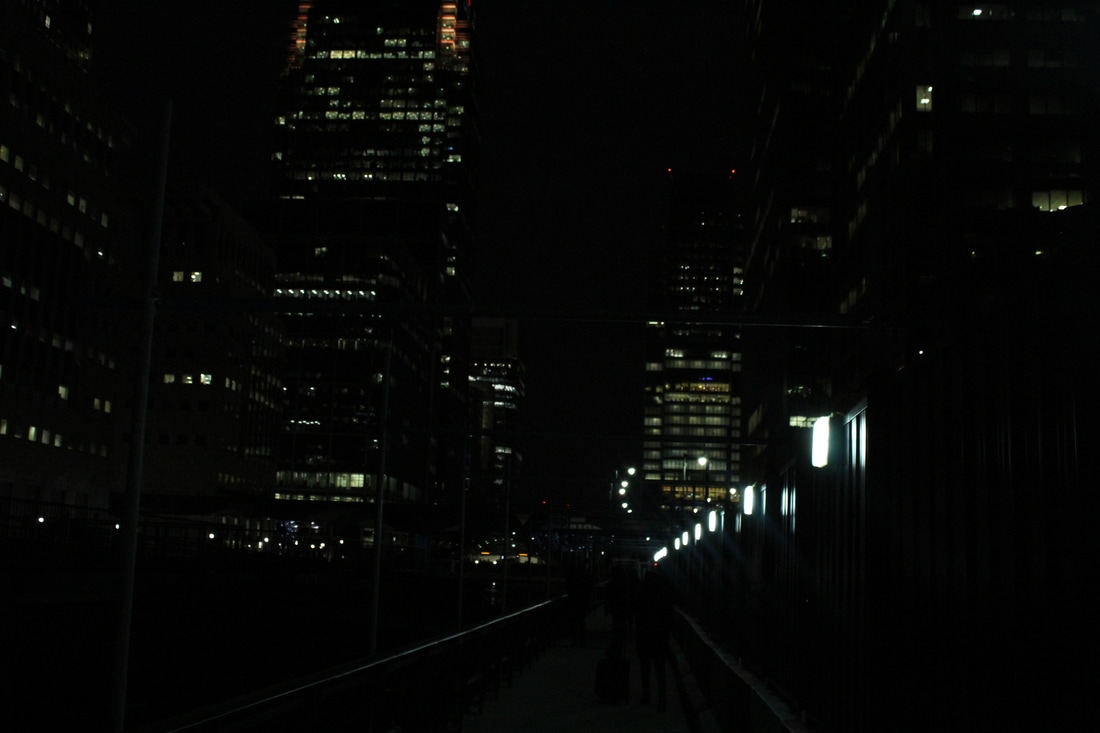
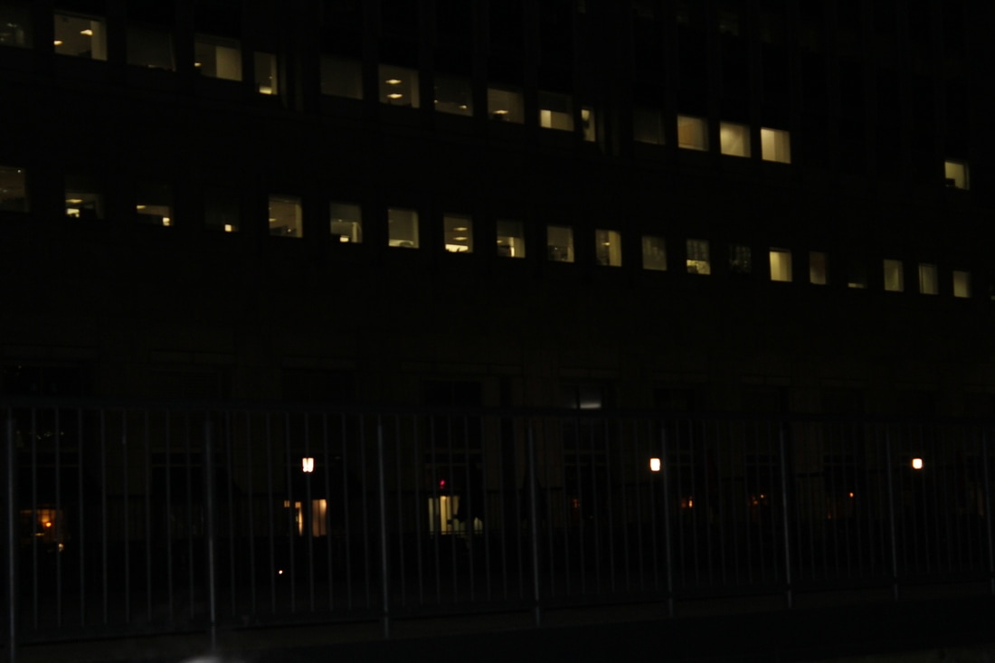
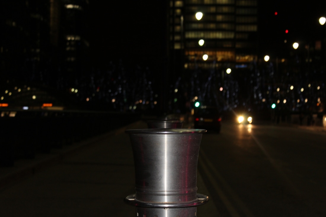
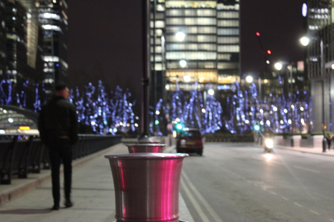
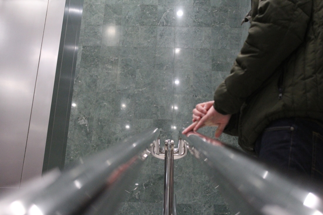
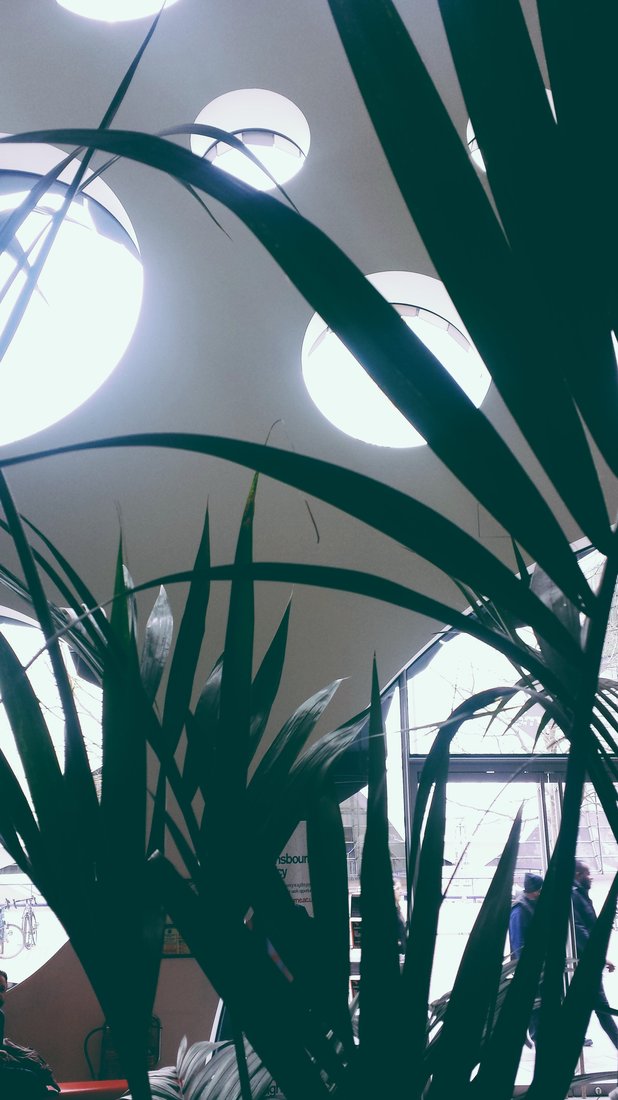
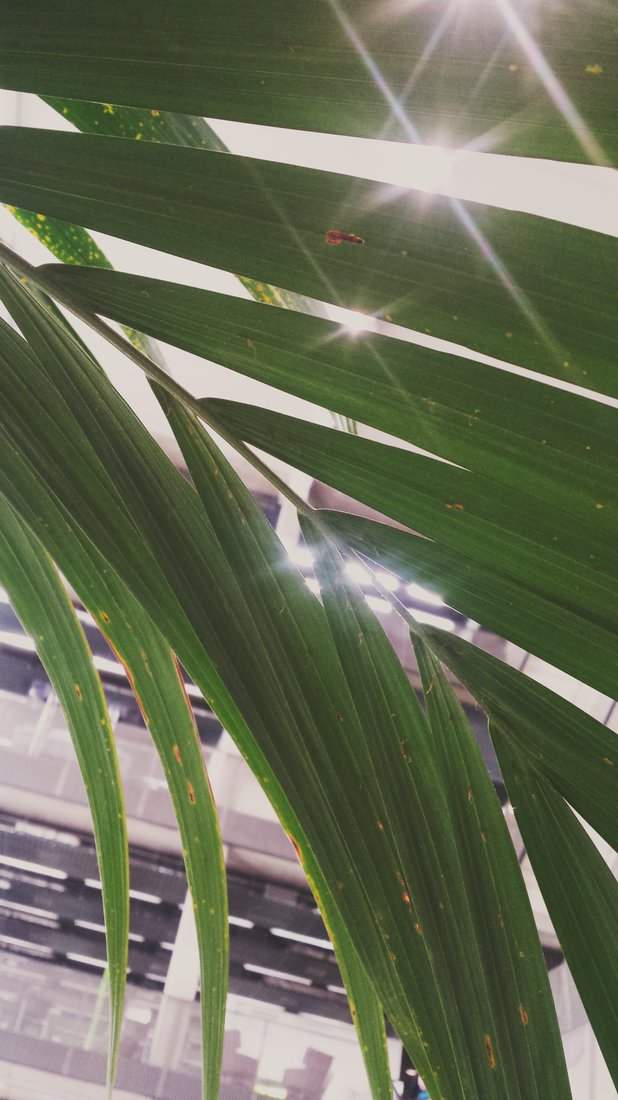
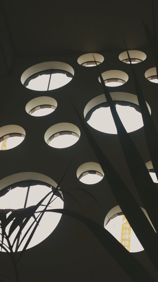

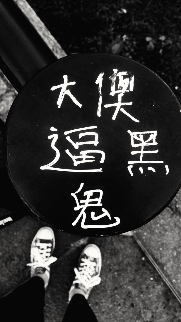
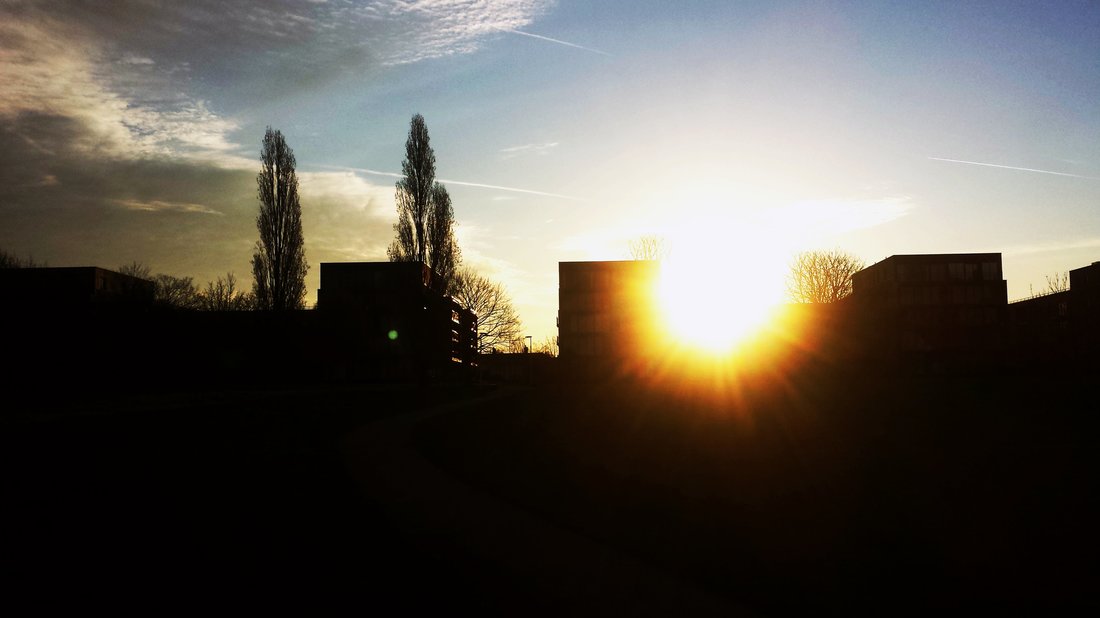
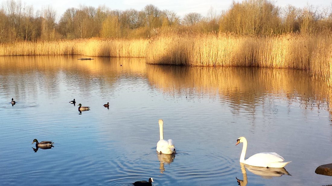
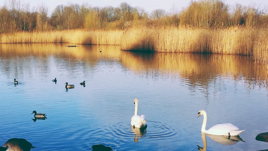
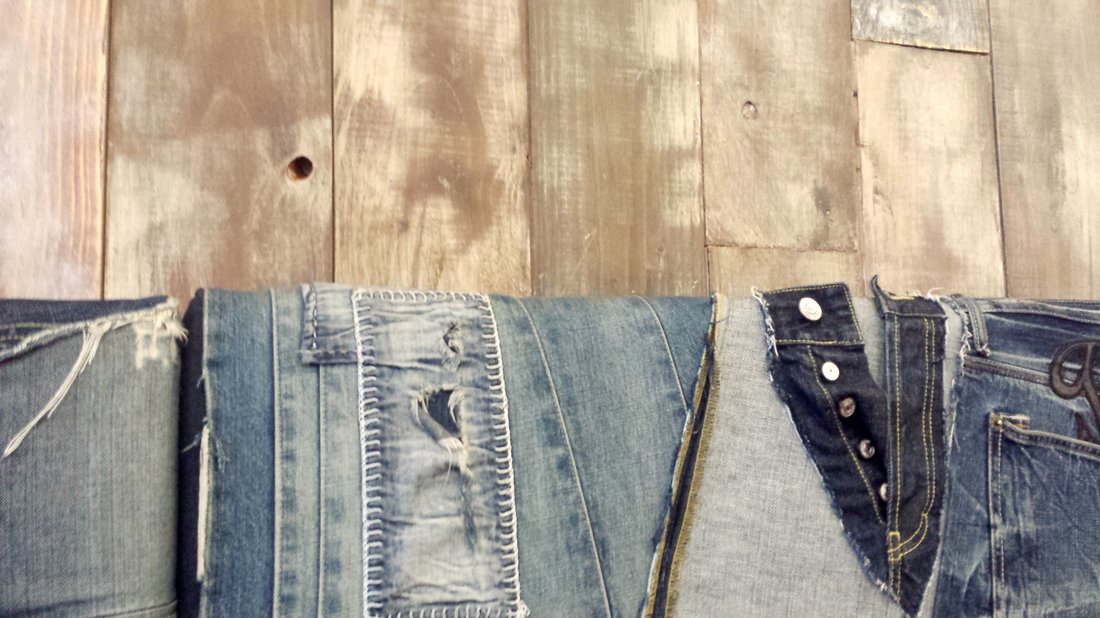
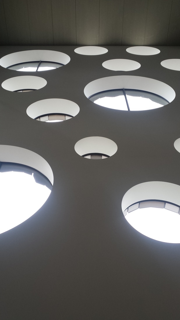
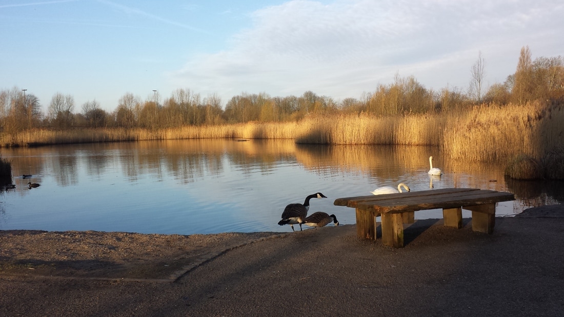
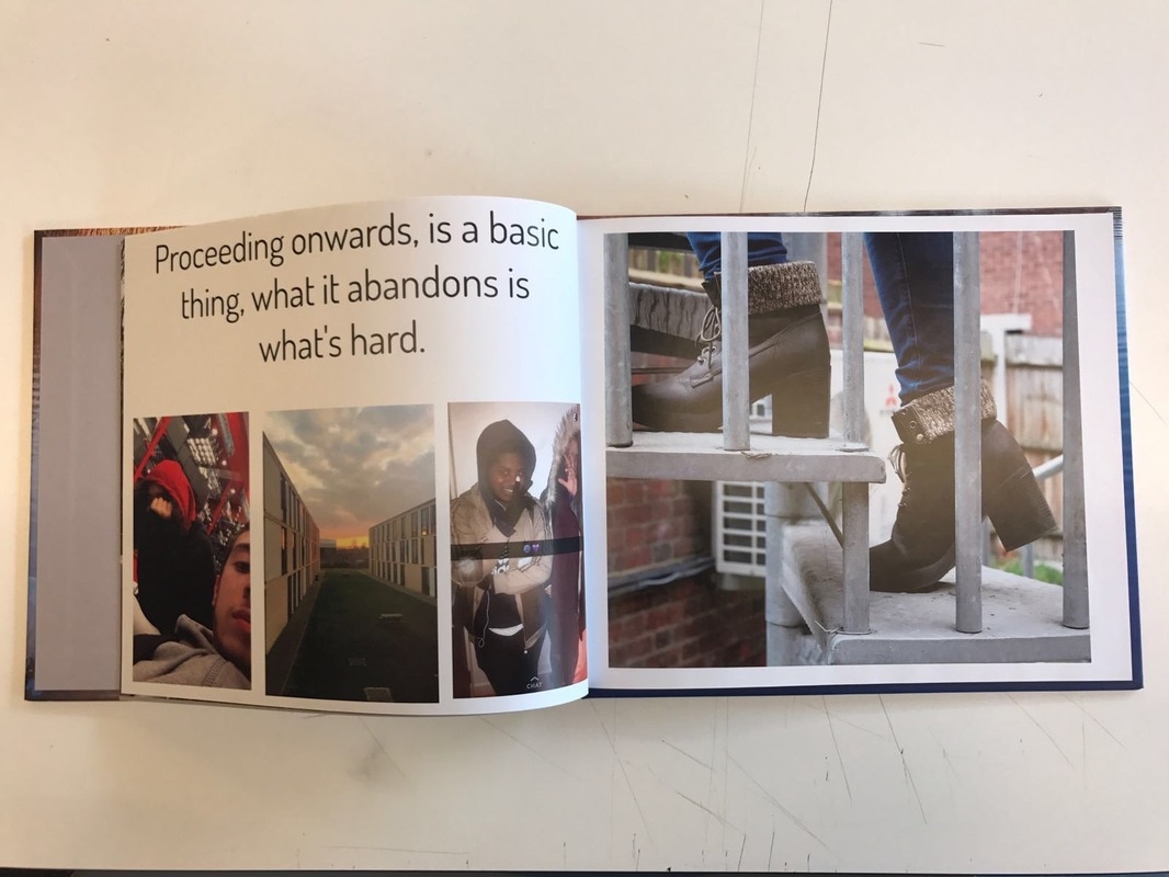
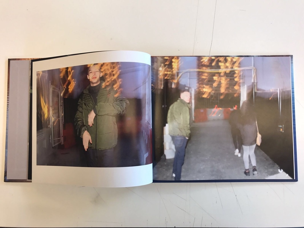
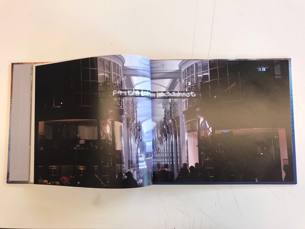
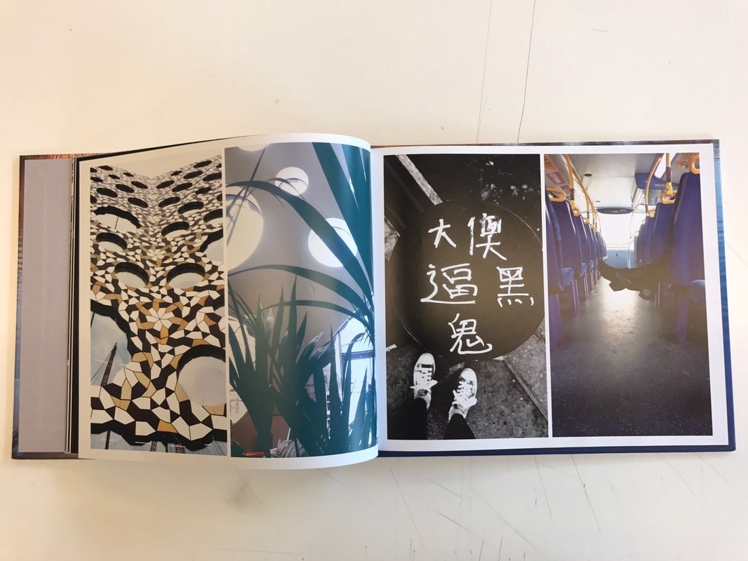
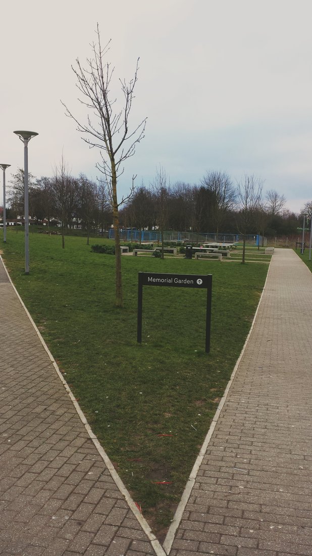
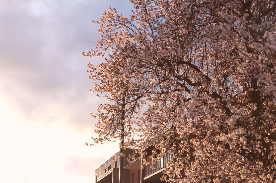
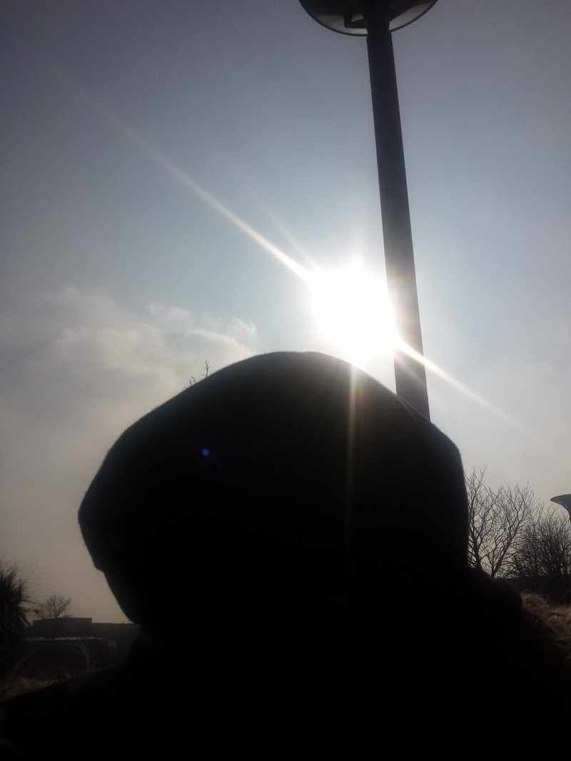
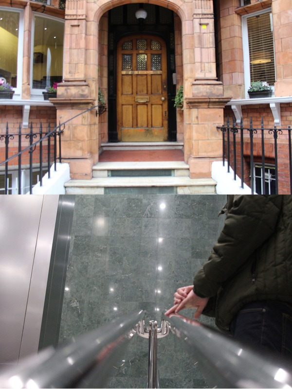
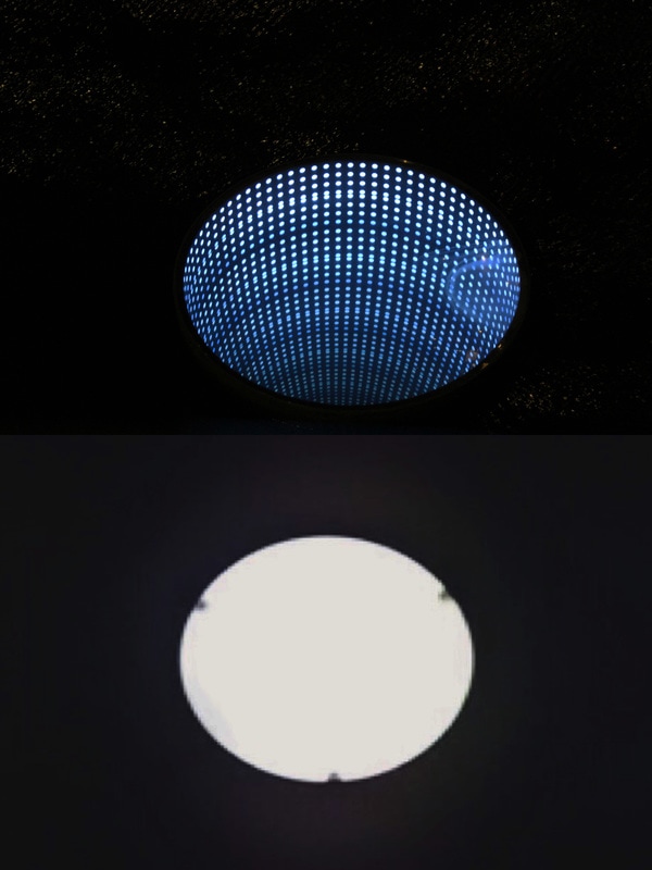
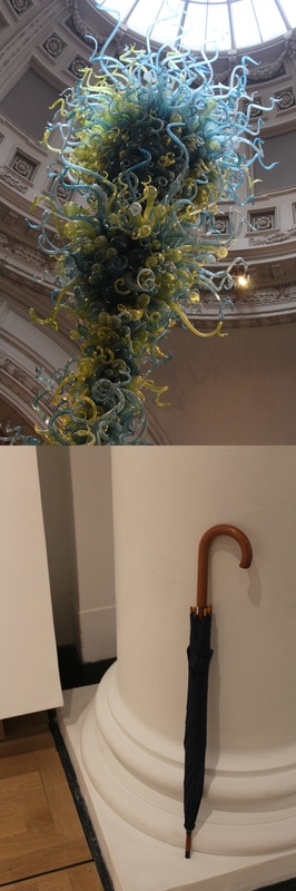
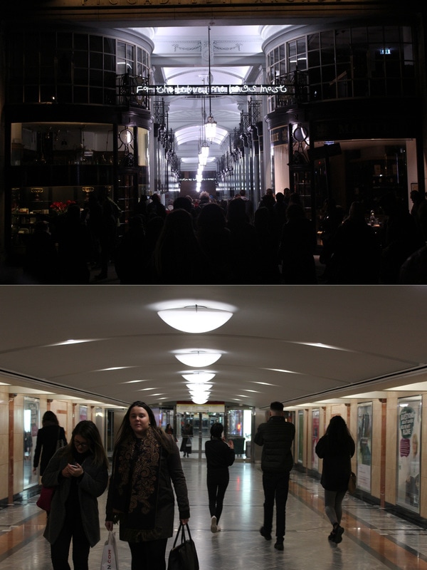
Taking on my pervious idea, most of my images are of people and places that have meaningful value to me, I know that I won't be using ever single image, the hard part would be deciding how and were I'm going to be placing each image.
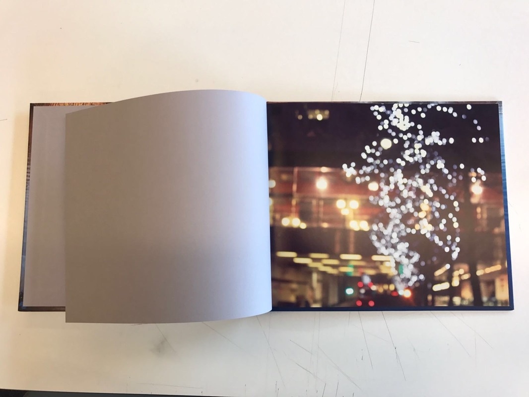
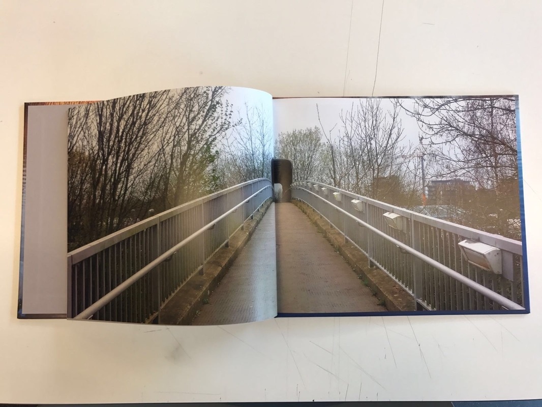
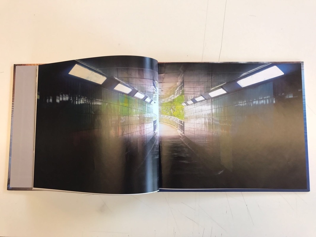
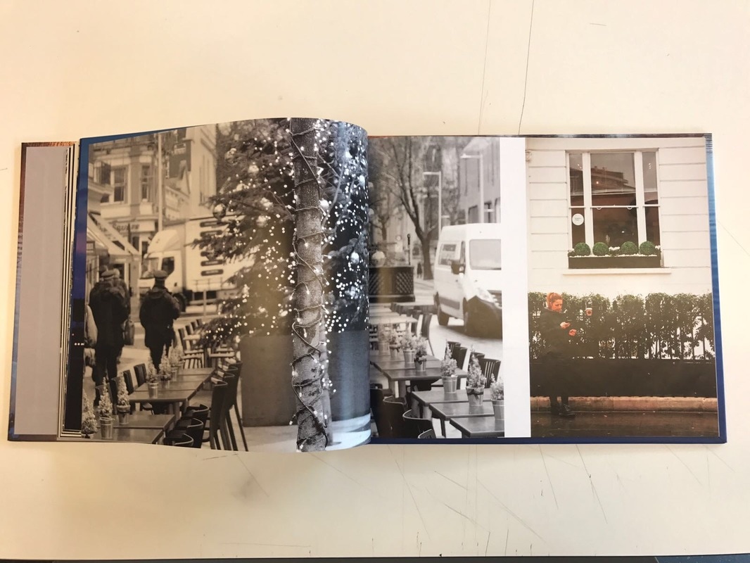
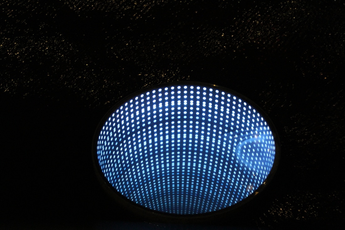
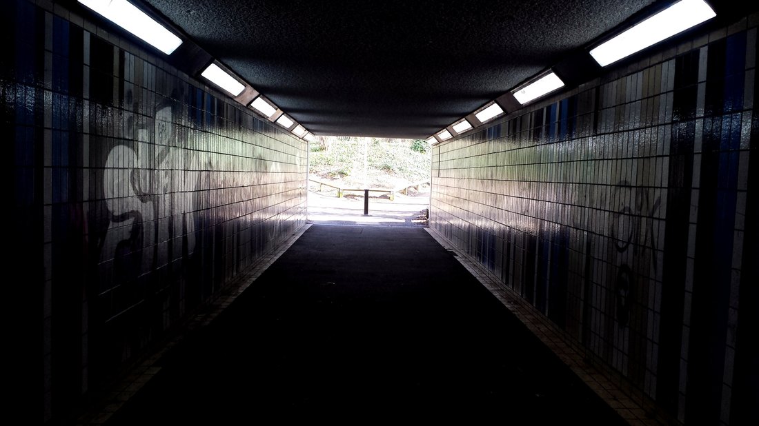
When constructing my photo book I carefully planned what image was going to what something similar to diptychs, were the images some what correlate with each other. I then realised that every other page I had a double full-bleed image of a path, for example the image of the tunnel. I like this idea and carried it out throughout the photo book.
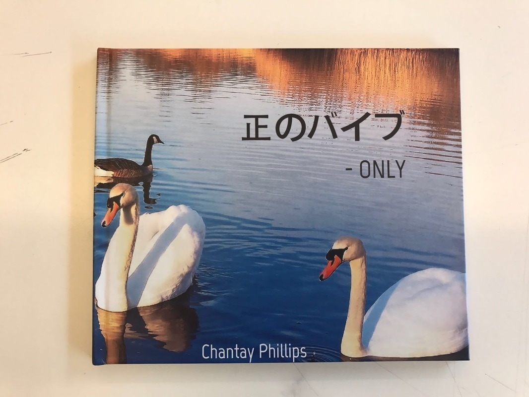
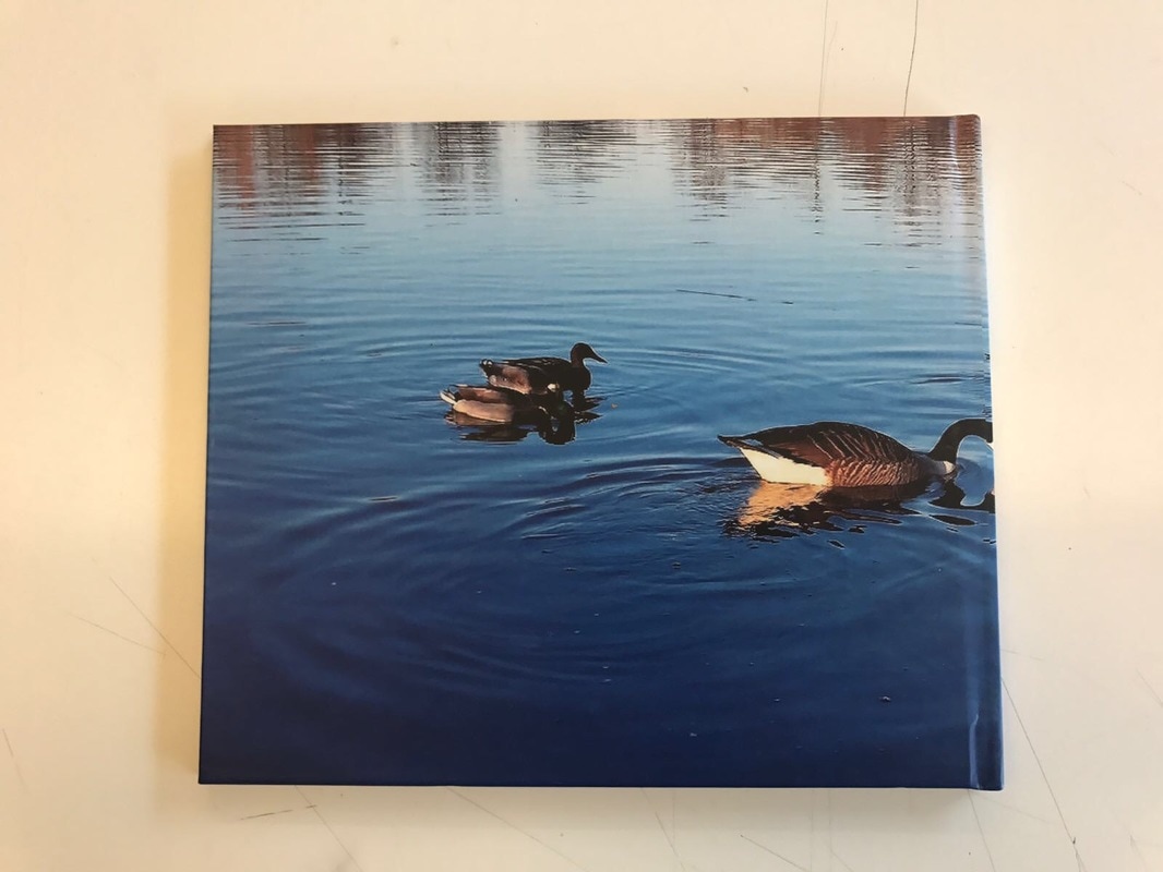
I used an online website called "Photobox"to create the final design of my photo book, from that website I got it printed and here is the final outcome.
When constructing my photo book I carefully planned what image was going to what something similar to diptychs, were the images some what correlate with each other. I then realised that every other page I had a double full-bleed image of a path, for example the image of the tunnel. I like this idea and carried it out throughout the photo book.
I used an online website called "Photobox"to create the final design of my photo book, from that website I got it printed and here is the final outcome.